Draw — 10 posts
1
Coordinates
10 coordinates
10 selected
▼
| # | Code | Theme | Subject | Style | Awareness | Source |
|---|---|---|---|---|---|---|
| 1 | C3S1 | clinic | C3 — Auto-accident and work-injury patients in recovery | photography | — | CURATED |
| 2 | T7S2A1 | treatments | T7 — Shoulder Pain | graphic-design | A1 — Unaware | CURATED |
| 3 | T2S3A4 | treatments | T2 — Neck Pain | illustrative-3D | A4 — Product-aware | CURATED |
| 4 | T3S4A2 | treatments | T3 — Sciatica | comparison-card | A2 — Problem-aware | CURATED |
| 5 | L3S5A4 | lifestyle | L3 — Improper lifting and overexertion | qa-card | A4 — Product-aware | CURATED |
| 6 | T5S6A3 | treatments | T5 — Whiplash | myth-buster | A3 — Solution-aware | CURATED |
| 7 | T12S7A2 | treatments | T12 — TMD/TMJ | list-tips | A2 — Problem-aware | CURATED |
| 8 | T4S8A2 | treatments | T4 — Headaches & Migraines | stat-card | A2 — Problem-aware | CURATED |
| 9 | L4S9A2 | lifestyle | L4 — Ignoring early aches until they become chronic | checklist | A2 — Problem-aware | CURATED |
| 10 | T8S7A3 | treatments | T8 — Hip Pain | list-tips | A3 — Solution-aware | CURATED |
2
Content Briefs
10 briefs · 2026-06-03T10:04
10 briefs generated
▼
1.
C3S1
photography
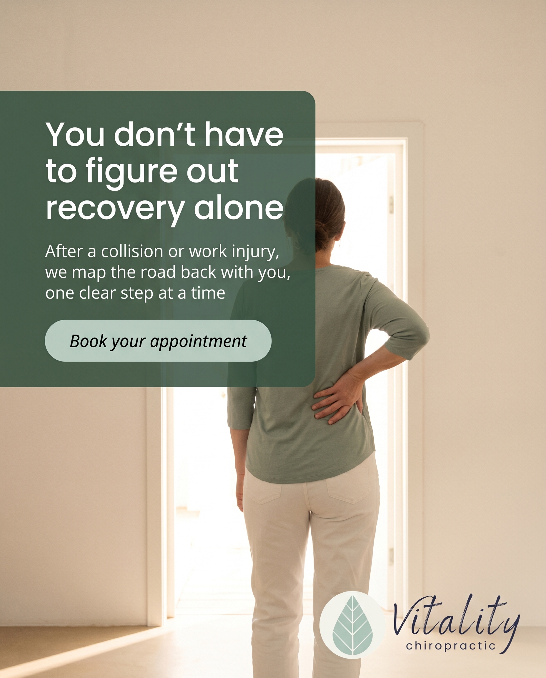
A grounded, real-world portrait of recovery after a car accident or workplace injury — the kind of patient who walks in unsure and overwhelmed and finds a clear path forward. The message: if you're rebuilding after a collision or work injury, this is a place that knows your road and walks it with you.
Content: A grounded, real-world portrait of recovery after a car accident or workplace injury — the kind of patient who walks in unsure and overwhelmed and finds a clear path forward. The message: if you're rebuilding after a collision or work injury, this is a place that knows your road and walks it with you.
Style: photography
2.
T7S2A1
graphic-design
Unaware
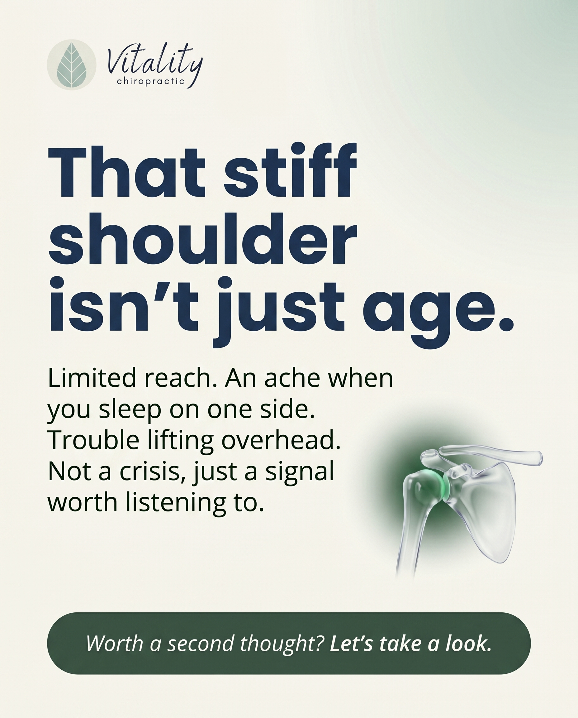
Open by reframing that 'stiff shoulder' the reader has quietly worked around for months as something worth a second thought — not a crisis, just a signal. The post nudges an unaware reader to notice that limited reach, the ache when sleeping on one side, or trouble lifting overhead aren't just normal aging.
Content: Open by reframing that 'stiff shoulder' the reader has quietly worked around for months as something worth a second thought — not a crisis, just a signal. The post nudges an unaware reader to notice that limited reach, the ache when sleeping on one side, or trouble lifting overhead aren't just normal aging.
Style: graphic-design
3.
T2S3A4
illustrative-3D
Product-aware
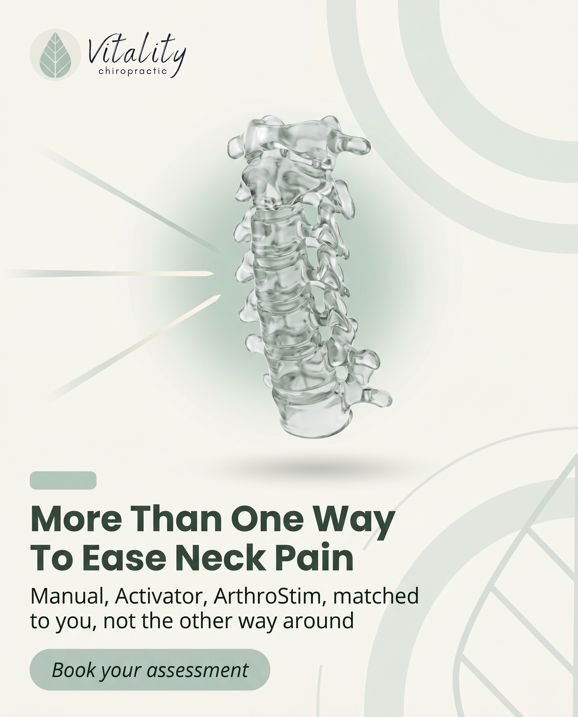
For the reader already weighing where to go for neck pain, contrast the range of approaches available here — from traditional manual adjustments to gentle instrument-assisted Activator and ArthroStim methods — and make the point that the right technique is matched to the patient, not the other way around. The why-you is choice: more than one way to deliver relief under one roof.
Content: For the reader already weighing where to go for neck pain, contrast the range of approaches available here — from traditional manual adjustments to gentle instrument-assisted Activator and ArthroStim methods — and make the point that the right technique is matched to the patient, not the other way around. The why-you is choice: more than one way to deliver relief under one roof.
Style: illustrative-3D
4.
T3S4A2
comparison-card
Problem-aware
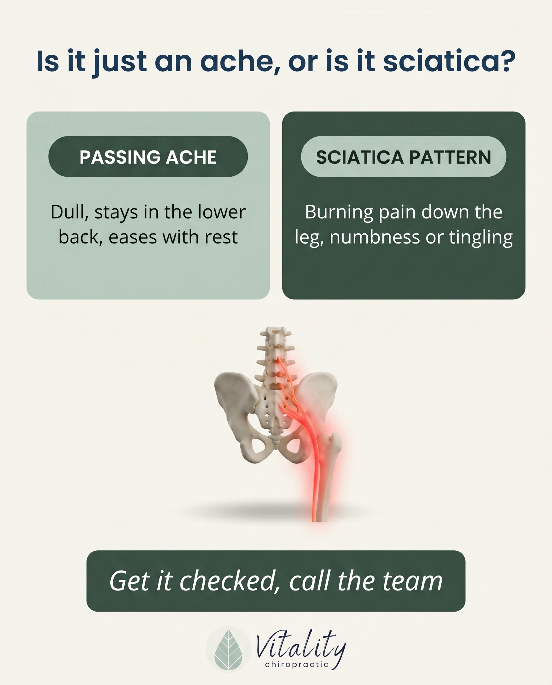
Validate that the burning line of pain running from the lower back down through the leg is a real, identifiable problem — sciatica — and not something to dismiss as a passing twinge. Help the reader recognize their experience (numbness, tingling, leg pain worse than back pain) as a genuine pattern worth addressing.
Content: Validate that the burning line of pain running from the lower back down through the leg is a real, identifiable problem — sciatica — and not something to dismiss as a passing twinge. Help the reader recognize their experience (numbness, tingling, leg pain worse than back pain) as a genuine pattern worth addressing.
Style: comparison-card
5.
L3S5A4
qa-card
Product-aware
A Q&A answering the product-aware reader who's strained their back lifting and wants to know what to actually do about it — and why here. Frame the answer around structured care: assessment, manual or instrument-assisted adjustment, soft tissue work, and corrective exercises to rebuild safe movement.
Content: A Q&A answering the product-aware reader who's strained their back lifting and wants to know what to actually do about it — and why here. Frame the answer around structured care: assessment, manual or instrument-assisted adjustment, soft tissue work, and corrective exercises to rebuild safe movement.
Style: qa-card
6.
T5S6A3
myth-buster
Solution-aware
Bust the myth that whiplash only matters if you feel it right away, or that you have to wait it out. Reframe care around what actually helps a strained, jolted neck — gentle adjustments, soft tissue work, and intersegmental traction to restore motion — for the reader asking what fixes it.
Content: Bust the myth that whiplash only matters if you feel it right away, or that you have to wait it out. Reframe care around what actually helps a strained, jolted neck — gentle adjustments, soft tissue work, and intersegmental traction to restore motion — for the reader asking what fixes it.
Style: myth-buster
7.
T12S7A2
list-tips
Problem-aware
A short list helping the reader connect dots they hadn't linked — jaw clicking, morning soreness, headaches near the temples, difficulty fully opening the mouth — as signs of a real TMJ problem. The goal is recognition: 'this scattered set of annoyances is one thing, and it's treatable.'
Content: A short list helping the reader connect dots they hadn't linked — jaw clicking, morning soreness, headaches near the temples, difficulty fully opening the mouth — as signs of a real TMJ problem. The goal is recognition: 'this scattered set of annoyances is one thing, and it's treatable.'
Style: list-tips
8.
T4S8A2
stat-card
Problem-aware
Use a single striking figure about how common recurring headaches and migraines are to reassure the reader that frequent head pain is a legitimate problem, not something to push through. The stat anchors the realization that regular headaches deserve attention rather than another painkiller.
Content: Use a single striking figure about how common recurring headaches and migraines are to reassure the reader that frequent head pain is a legitimate problem, not something to push through. The stat anchors the realization that regular headaches deserve attention rather than another painkiller.
Style: stat-card
9.
L4S9A2
checklist
Problem-aware
A checklist that helps the reader honestly assess whether they've been ignoring an early ache that's quietly becoming chronic — pain that's lasted weeks, keeps returning, or that they've started working around. The message: the fact you keep dismissing it is itself the warning sign.
Content: A checklist that helps the reader honestly assess whether they've been ignoring an early ache that's quietly becoming chronic — pain that's lasted weeks, keeps returning, or that they've started working around. The message: the fact you keep dismissing it is itself the warning sign.
Style: checklist
10.
T8S7A3
list-tips
Solution-aware
A practical list of what actually addresses nagging hip pain for the reader asking how it gets fixed — manual or gentle instrument-assisted adjustments, Active Release soft tissue work, and corrective stretches and exercises. Frame it as a layered approach that treats the joint, the surrounding tissue, and the movement habits feeding the pain.
Content: A practical list of what actually addresses nagging hip pain for the reader asking how it gets fixed — manual or gentle instrument-assisted adjustments, Active Release soft tissue work, and corrective stretches and exercises. Frame it as a layered approach that treats the joint, the surrounding tissue, and the movement habits feeding the pain.
Style: list-tips
3
Developed Posts
10 posts · 2026-06-03T10:07
10 developed
▼
1.
C3S1
Rough Image Prompt
Elevated, grounded health-and-recovery lifestyle photograph communicating the journey of rebuilding after a car accident or workplace injury. Depict a single person from behind or focusing on hands, torso, or limbs only — no face visible at all. Concept: someone at the start of recovery finding steadiness and a clear path forward. Consider a quiet, hopeful moment — a person standing facing an open doorway of natural light, hands resting on the back of their neck or lower back suggesting lingering ache, or walking forward along a simple outdoor path. The mood should feel honest and human, not staged or stock-like: someone who walked in unsure and is now moving forward. Convey the sense of guided support and being walked alongside through the atmosphere — steady, reassuring, not clinical. Generic, neutral setting (soft natural light through a window, an open doorway, a calm outdoor path) with no clinic interior, no treatment table, no medical decor. Soft natural lighting, calm and warm atmosphere, considered editorial composition. Integrate brand colour cues naturally through clothing, light tones, or environment. Brand palette to draw from: #7AB648 green, #1B3A5C navy, #F4F6F8 light grey, #0E1419 near-black, #FFFFFF white, #5C8A35 deeper green. Typography: Poppins for headline, Open Sans for supporting text, Open Sans italic for CTA. Text content to render: headline 'You don't have to figure out recovery alone', supporting text 'After a collision or work injury, we map the road back with you — one clear step at a time', CTA 'Book your appointment'. Logo placement varies by composition and is finalised downstream.
Text Overlay
Caption
The walk in is often the hardest part. After a car accident or a work injury, you arrive carrying more than the ache — there's the worry, the paperwork, the not knowing what comes next. We get it. And you don't have to carry it alone.
Recovery isn't a single appointment. It's a road, and it helps to walk it with someone who knows the terrain. The team starts where you are — assessing what the collision or injury actually did, then building a clear, step-by-step plan to rebuild strength, ease pain, and get you moving like yourself again.
No guesswork. No being handed a list and sent out the door. Just a steady path forward, mapped with you.
If you're rebuilding after a collision or work injury in Rochester, we'd be glad to walk that road with you.
📞 (507) 416-3538
🌐 https://vitalityrochester.com
Starting your recovery? Tell us where you are on the road — we're here for the next step.
Hashtags
#RochesterMN #AutoInjuryRecovery #WorkInjury #ChiropracticCare #VitalityRochester
2.
T7S2A1
Rough Image Prompt
Typography-led graphic-design post for a chiropractic clinic, reframing a long-ignored stiff shoulder as a signal worth a second thought, not a crisis. Richly designed, calm and reassuring in character. Anchor the composition around the headline text. Include a small, supporting anatomical illustration of a shoulder joint (glenohumeral joint, clean 3D translucent glass-like render) with a soft green accent glow on the joint to draw attention without alarm — supporting accent only, not full-frame. Optional subtle abstract accent shapes or a soft gradient field. Components: headline, supporting text, CTA. Use exact brand colours only: green #7AB648, deeper green #5C8A35, navy #1B3A5C, light grey #F4F6F8, near-black #0E1419, white #FFFFFF. Typography: Poppins for headline, Open Sans for supporting text, Open Sans italic for CTA. Render this exact text only: headline 'That stiff shoulder isn't just age.', supporting text 'Limited reach. An ache when you sleep on one side. Trouble lifting overhead. Not a crisis — just a signal worth listening to.', CTA 'Worth a second thought? Let's take a look.' Logo placement varies by composition and is finalised downstream. Keep the look intentional, editorial, and reassuring — typographic in character with a small anatomical accent.
Text Overlay
Caption
You've probably worked around it for months. Reaching for the top shelf with the other arm. Sleeping on your good side. Calling it age and moving on.
Here's the thing — a stiff shoulder that quietly limits how you reach, lift, or rest isn't just part of getting older. It's a signal. Limited overhead movement, an ache when you lie on one side, that catch when you lift — these are your body letting you know something's changed.
Not a crisis. Just worth a second thought before you keep working around it for another six months.
The shoulder is built to move freely. When it stops, there's usually a reason worth understanding. The earlier you notice, the more options you have.
Noticing one of these? It might be time to take a closer look.
📞 (507) 416-3538
🌐 https://vitalityrochester.com
Which shoulder do you baby without even thinking about it?
Hashtags
#ChiropracticCare #ShoulderPain #RochesterMN #MoveBetter #VitalityChiropractic
3.
T2S3A4
Rough Image Prompt
Illustrative-3D anatomical render concept communicating that neck pain relief can be delivered through more than one technique, matched to the person. Central subject: an anatomically accurate 3D illustration of the cervical spine (neck vertebrae) shown in a clean, translucent glass-like rendering style with subtle internal structure visible. Apply a gentle green accent glow (#7AB648) around the cervical region to signal focus and care rather than a red pain glow — the message is options and relief, not injury. Render the spine isolated on a neutral or softly graded brand-coloured background with no environmental or clinical context, so it reads as an editorial illustration rather than a treatment scene. Subtle supporting accent shapes or soft directional cues may suggest that several distinct approaches converge on the same focal area. Brand colour palette to draw from: #7AB648 green, #1B3A5C navy, #F4F6F8 light grey, #0E1419 near-black, #FFFFFF white, #5C8A35 deeper green. Typography: Poppins for headline, Open Sans for supporting text, Open Sans italic for CTA. Text to render: headline 'More Than One Way To Ease Neck Pain', supporting text 'Manual, Activator, ArthroStim — matched to you, not the other way around', CTA 'Book your assessment'. Clinical polish, calm and credible mood, smooth editorial lighting. Logo placement should vary by composition and is finalised downstream.
Text Overlay
Caption
Neck pain doesn't come in one shape, so relief shouldn't either. Some people do best with traditional manual adjustments. Others feel more at ease with the gentle, instrument-assisted Activator Method or ArthroStim — precise, low-force, and easy on the body. The difference matters. The right technique is matched to the patient, not the patient squeezed into a single approach. That's the advantage of having more than one path to relief under one roof in Rochester — your care fits you, your history, and how your neck actually responds. Not sure which approach is right for you? That's exactly what an assessment is for. We'll talk through what's going on and find the technique that suits your body best.
📞 (507) 416-3538
🌐 https://vitalityrochester.com
Which would you reach for first — gentle and instrument-assisted, or traditional hands-on?
Hashtags
#NeckPainRelief #RochesterMN #Chiropractic #ActivatorMethod #FeelBetter
4.
T3S4A2
Rough Image Prompt
Comparison-card concept educating the reader on how to tell ordinary lower-back ache apart from genuine sciatica. Two distinct content sides with concrete labels: 'PASSING ACHE' and 'SCIATICA PATTERN'. The PASSING ACHE side communicates a localised, dull soreness that stays in the lower back and eases with movement and rest. The SCIATICA PATTERN side communicates a burning, radiating line of pain travelling from the lower back through the buttock and down the leg, often with numbness or tingling, where the leg symptoms can feel worse than the back itself. Typographic-led design with a small supporting anatomical illustration accent: a clean, editorial 3D rendering of the lower spine, pelvis and sciatic nerve pathway shown isolated on a neutral background, with a soft red glow tracing the nerve route down the leg to signal the radiating pattern. Use brand colours only: green #7AB648, navy #1B3A5C, light grey #F4F6F8, near-black #0E1419, white #FFFFFF, deeper green #5C8A35. Typography: Poppins for headline and side labels, Open Sans for supporting text, Open Sans italic for the CTA. Text content to render: headline 'Is it just an ache — or is it sciatica?', label 'PASSING ACHE', under it 'Dull, stays in the lower back, eases with rest', label 'SCIATICA PATTERN', under it 'Burning pain down the leg, numbness or tingling', CTA 'Get it checked — call the team'. Both sides given equal visual weight. Logo placement varies by composition and is finalised downstream.
Text Overlay
Caption
That burning line running from your lower back down through your leg? It deserves a name. It is not just a passing ache you should wait out — it is a pattern, and it has one.
True sciatica tends to travel. The pain follows the nerve from the lower back into the buttock and down the leg. You might feel numbness, tingling, or a burning that makes the leg feel worse than the back itself. A simple ache, on the other hand, usually stays put and settles with a little rest.
Knowing the difference matters. When leg symptoms are involved, ignoring them rarely makes them quieter — it often makes them louder. The good news is sciatica is identifiable, and once we understand what is irritating the nerve, there is a clear path forward.
If this sounds like your experience, do not dismiss it. Get it looked at properly.
📞 (507) 416-3538
🌐 https://vitalityrochester.com
Does your pain stay in the back, or does it travel down the leg? Tell us below.
Hashtags
#Sciatica #ChiropractorRochesterMN #BackPainRelief #NervePain #VitalityChiropractic
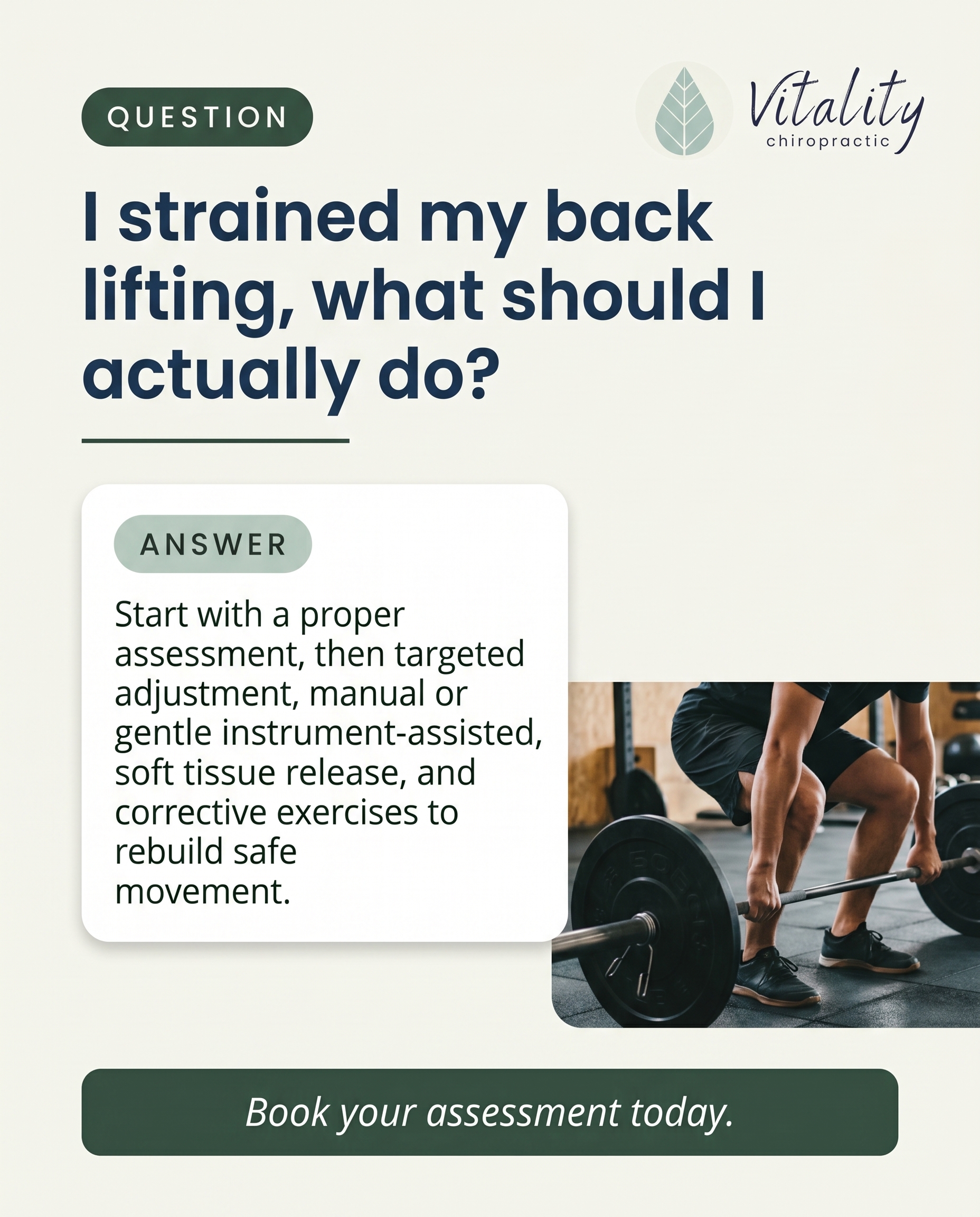
5.
L3S5A4
Rough Image Prompt
Create a clean, editorial Q&A card for a chiropractic clinic answering someone who has strained their back lifting. The visual register is typographic-led graphic design with a single supporting anatomical illustration. Include a 3D anatomical illustration of a lower spine and lumbar region rendered in a translucent, glass-like clinical style, with a soft red glow highlighting the lower back to indicate strain — kept small and supporting, not full-frame. Components required: a clear QUESTION line, a structured ANSWER, and a CTA. Render this text content exactly: question 'I strained my back lifting — what should I actually do?' and answer framed as a structured-care sequence 'Start with a proper assessment, then targeted adjustment — manual or gentle instrument-assisted — soft tissue release, and corrective exercises to rebuild safe movement.' and CTA 'Book your assessment today.' Typography: Poppins for the headline and question, Open Sans for the supporting answer text, Open Sans italic for the CTA. Do not specify font weight. Brand colour palette to draw from (exact hex): #7AB648 green, #1B3A5C navy, #F4F6F8 light grey, #0E1419 near-black, #FFFFFF white, #5C8A35 deeper green. Use a clear question-to-answer hierarchy with the anatomical render as a supporting accent. Logo should be included, with placement varied and finalised downstream. Keep the composition intentional, calm, and credible — anatomical accuracy with clinical polish. No faces, no clinic interiors, no treatment-room scenes, no practitioner-patient imagery.
Text Overlay
Caption
Strained your back lifting something heavier than it looked? You're not alone — and reaching for the heat pack and hoping isn't a plan.
Here's what actually helps. First, a proper assessment to understand what's going on, not just where it hurts. From there, targeted adjustment — traditional manual or gentle instrument-assisted, whichever suits your body and comfort. Then soft tissue work to release the muscles that tightened up to protect the area. And finally, corrective exercises so you rebuild safe, confident movement instead of bracing every time you bend.
That structure matters. A one-off crack might feel good for a day, but rebuilding how you move is what keeps it from coming back.
If your back is telling you something after a lift, listen early — the sooner we look, the simpler the fix.
📞 (507) 416-3538
🌐 https://vitalityrochester.com
Pulled something recently? Tell us where it twinged.
Hashtags
#RochesterMN #ChiropracticCare #BackPainRelief #LiftingInjury #MoveWell
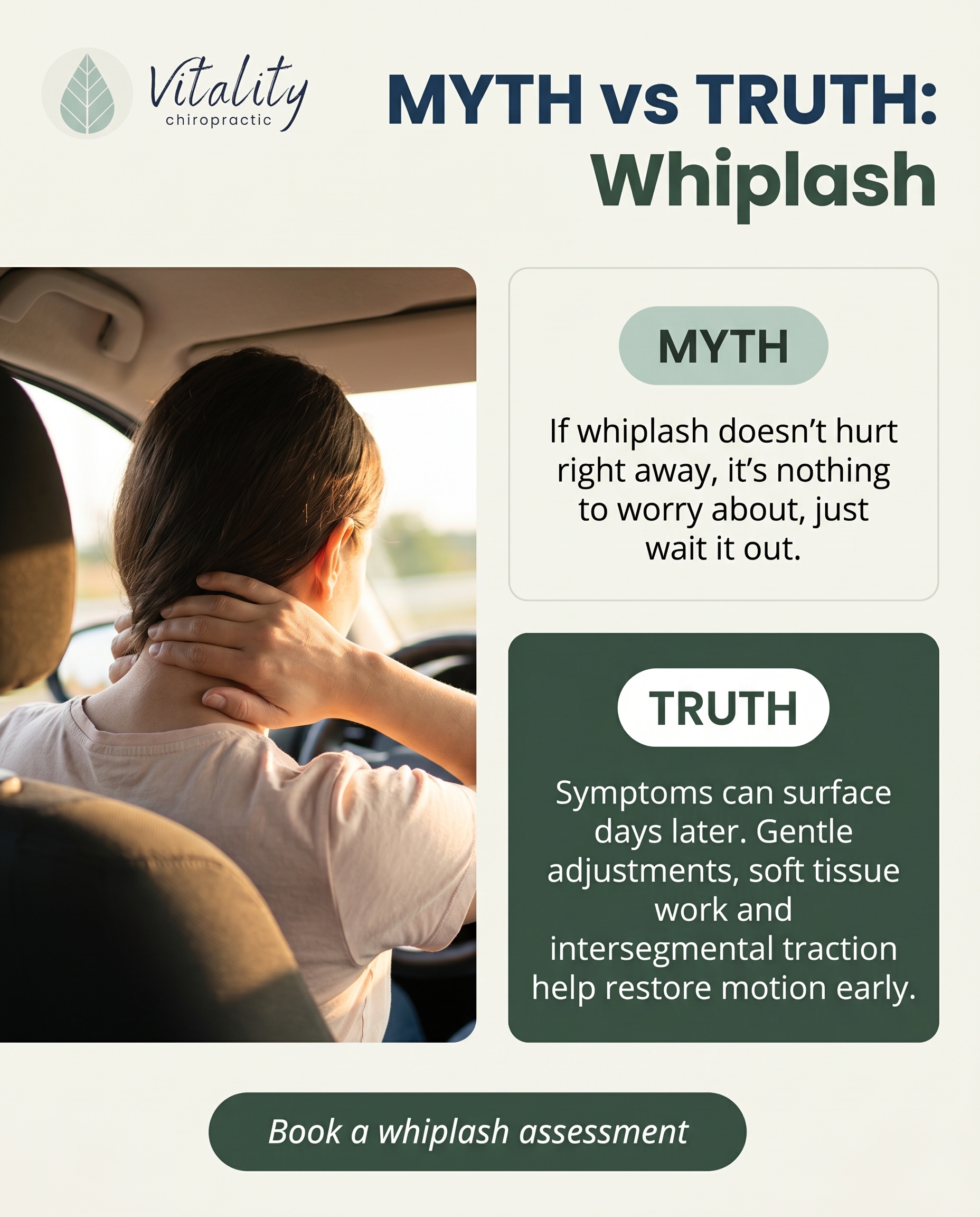
6.
T5S6A3
Rough Image Prompt
Myth-buster typographic post for a chiropractic clinic addressing whiplash recovery. The post contrasts a common wrong belief about whiplash with the correct understanding of how a strained, jolted neck actually recovers. Typography-led design using Poppins for the MYTH and TRUTH labels and headline, Open Sans for supporting text, Open Sans italic for the CTA. Include a small supporting anatomical illustration as an accent element: a clean 3D rendering of the cervical spine (neck vertebrae) in a translucent, glass-like clinical style with a soft red glow at the strained segments to indicate irritation and a subtle green accent suggesting restored motion. The anatomical accent should support, not dominate, the typography. Draw from these exact brand colours: #7AB648 green, #1B3A5C navy, #F4F6F8 light grey, #0E1419 near-black, #FFFFFF white, #5C8A35 deeper green. Text to render: MYTH label 'MYTH', myth statement 'If whiplash doesn't hurt right away, it's nothing to worry about — just wait it out.', TRUTH label 'TRUTH', truth statement 'Symptoms can surface days later. Gentle adjustments, soft tissue work and intersegmental traction help restore motion early.', CTA 'Book a whiplash assessment'. Clear visual contrast between the myth side and the truth side. Logo placement varies by composition and is finalised downstream. Keep all text crisp and legible.
Text Overlay
Caption
Here's something we see all the time: a fender-bender feels minor in the moment, so the neck gets ignored. Then a few days later the stiffness, headaches and tightness arrive — and now it's harder to move.
Whiplash doesn't always announce itself straight away. The jolt strains soft tissue and limits how the neck moves, even when the pain shows up late. Waiting it out often means waiting for it to settle into something stubborn.
The good news? You don't have to push through it. Gentle adjustments, soft tissue work and intersegmental traction help calm the irritation and restore proper motion — so the neck recovers the way it should.
If you've been in an accident recently, don't wait for it to get worse. Get it checked early.
📞 (507) 416-3538
🌐 https://vitalityrochester.com
Was your whiplash a slow-burn like this? Tell us below.
Hashtags
#WhiplashRecovery #RochesterMN #ChiropracticCare #NeckPainRelief #AutoInjury
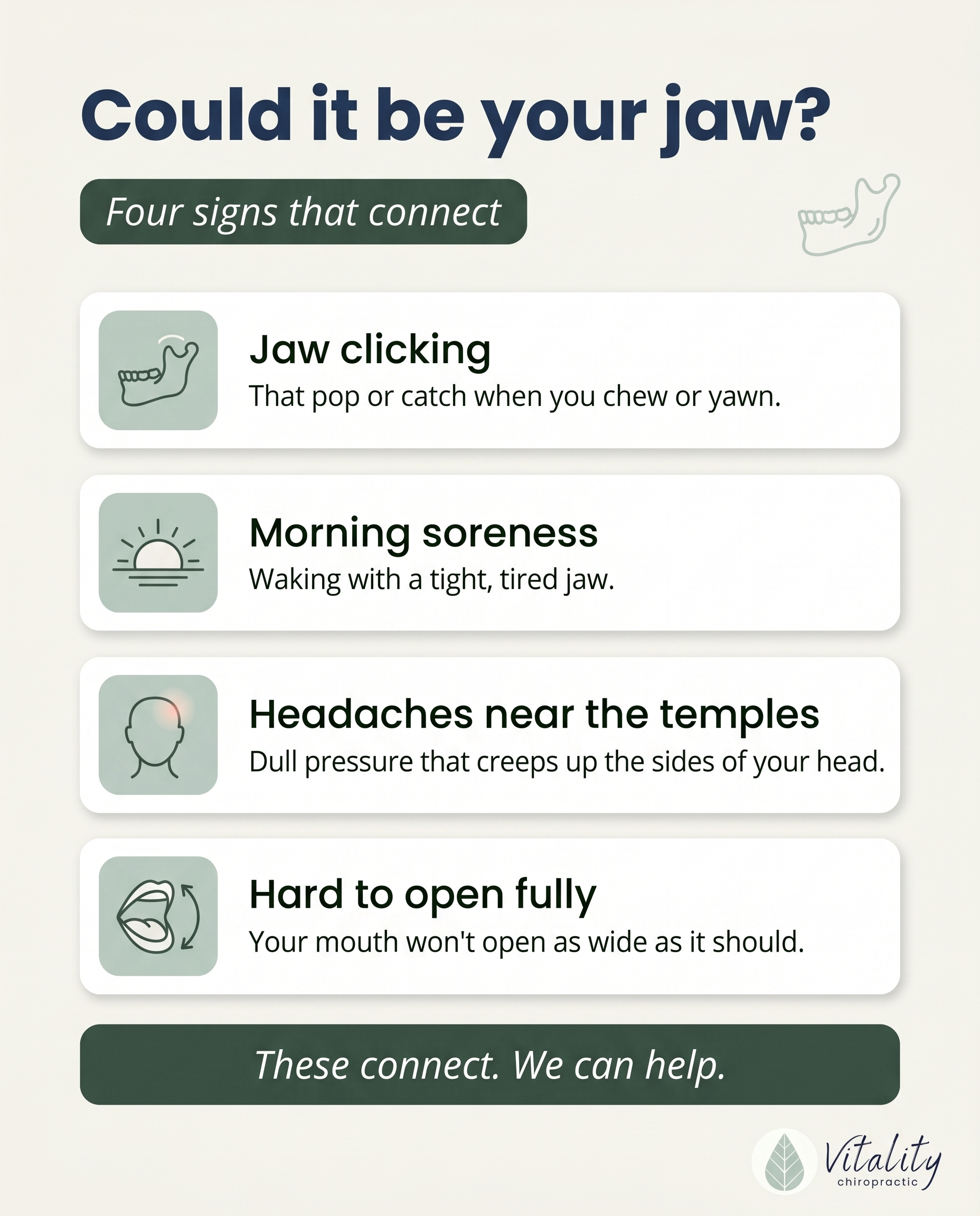
7.
T12S7A2
Rough Image Prompt
A clean, typographic-led list-tips graphic for a chiropractic practice that helps the reader connect scattered symptoms into one recognisable TMJ problem. Header introduces the concept, followed by four short list items, each pairing a small custom-illustrated icon with a short title and one-line explanation. Components required: header text, four numbered or icon-led list items (each with a short title line and one supporting line), and a soft CTA. Custom illustrated icons relating to each symptom — a subtle jaw/joint icon, a sunrise or morning icon, a temple/head icon with gentle highlight, an open-mouth motion icon — drawn in a simple line or soft-fill style. A small, anatomically suggestive jaw joint illustration may serve as a supporting accent, kept small and not full-frame. Brand palette to draw from (exact hex values): #7AB648 green, #1B3A5C navy, #F4F6F8 light grey, #0E1419 near-black, #FFFFFF white, #5C8A35 deeper green. Typography: Poppins for headline and item titles, Open Sans for supporting lines, Open Sans italic for the CTA. Text content to render: header 'Could it be your jaw?', item titles 'Jaw clicking', 'Morning soreness', 'Headaches near the temples', 'Hard to open fully', and CTA 'These connect. We can help.' Keep the design typographic in character with small icon accents and subtle gradient or solid brand-colour fields — no clinic photography, no treatment scenes, no faces. Logo placement varies by composition and is finalised downstream.
Text Overlay
Caption
Four small annoyances. One real problem.
Most people never link them. The jaw clicks when you yawn. You wake up with a tight, sore jaw. There's a dull headache near your temples by mid-afternoon. And opening your mouth all the way just feels stiff.
Separately, they're easy to ignore. Together, they point to one thing — your TMJ, the joint that connects your jaw to your skull. When it's not moving the way it should, the soreness, the tension, and even those temple headaches can all trace back to the same source.
The good news? It's treatable. Gentle work to settle the joint, ease the surrounding muscles, and get things moving freely again can make a real difference.
If you've been quietly putting up with two or more of these, it's worth a conversation.
📞 (507) 416-3538
🌐 https://vitalityrochester.com
Do any of these sound familiar? Let us know below.
Hashtags
#TMJrelief #ChiropracticCare #RochesterMN #JawPain #VitalityRochester
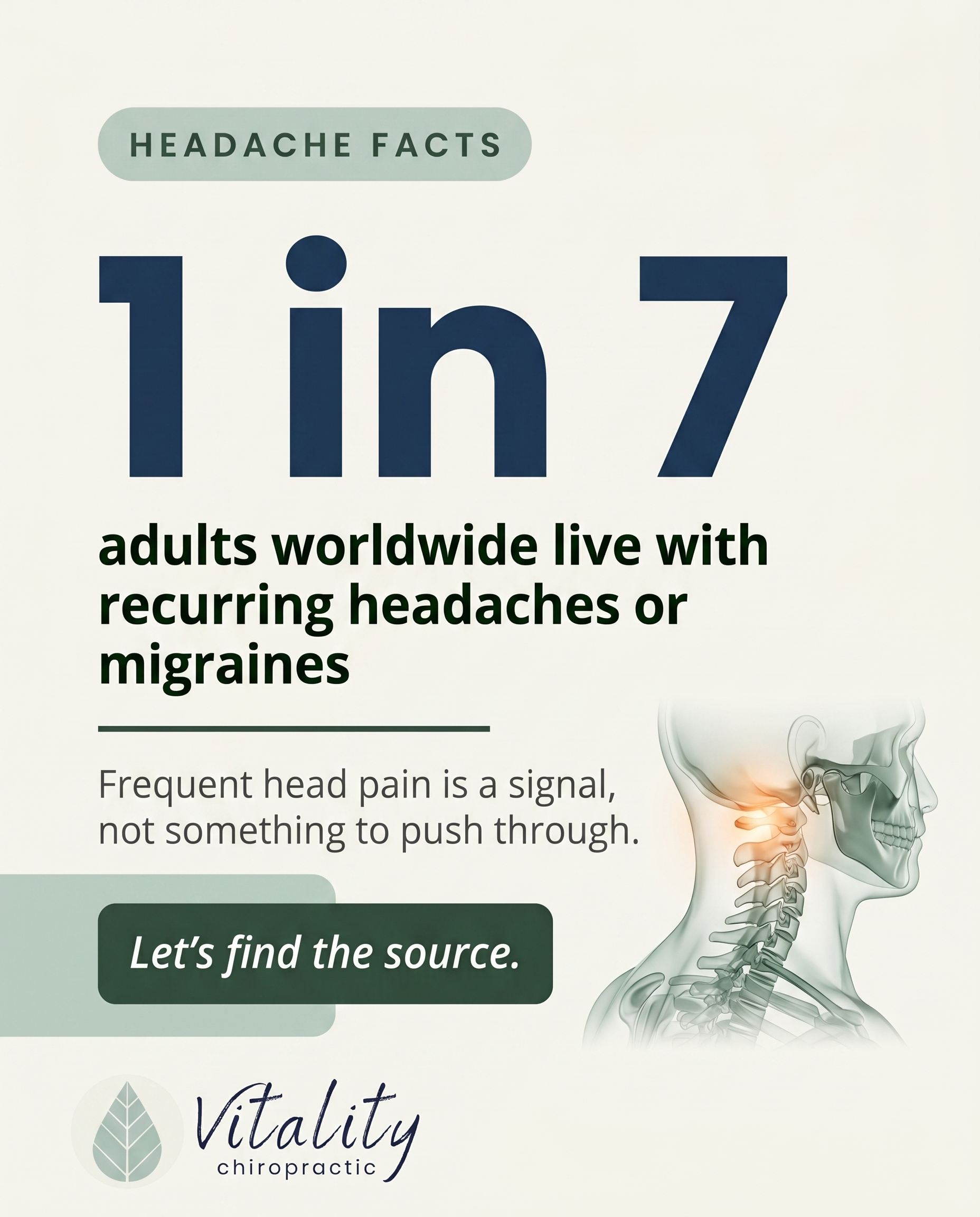
8.
T4S8A2
Rough Image Prompt
A stat-card in elevated typographic design style, anchored by one striking statistic about how common recurring headaches and migraines are. The statistic is the dominant visual anchor: '1 in 7'. Supporting context line: 'adults worldwide live with recurring headaches or migraines'. A short reframing line: 'Frequent head pain is a signal — not something to push through.' Closing CTA: 'Let's find the source.' Subtle supporting accent: a small, clean anatomical illustration suggesting the upper neck and base-of-skull region (suboccipital area) rendered in a translucent, glass-like style with a soft glow at the cervical spine to imply tension origin — kept small and supporting, not full-frame. Typographic-led composition, intentional and richly designed, not minimal-by-default. Brand colour palette to draw from: #7AB648 green, #1B3A5C navy, #F4F6F8 light grey, #0E1419 near-black, #FFFFFF white, #5C8A35 deeper green. Typography: Poppins for the statistic and headline, Open Sans for supporting text, Open Sans italic for the CTA. Render all text crisply and legibly. Logo placement should vary by composition and is finalised downstream. Clean, calm, credible health-brand aesthetic with strong figure-ground contrast so the statistic reads instantly.
Text Overlay
Caption
Reaching for another painkiller has quietly become the routine for a lot of people. But here's the thing — around 1 in 7 adults worldwide live with recurring headaches or migraines. That's not rare. And it's not something you're meant to just push through.
Frequent head pain is your body flagging something. Tension at the base of the skull, restricted movement in the upper neck, posture habits from long hours at a screen — these can all drive headaches that keep coming back. Masking the ache works for an afternoon. Finding the source is what changes the pattern.
If headaches have become part of your week, that's worth a proper look, not another tablet.
Have recurring headaches crept into your normal? Tell us how often they show up.
📞 (507) 416-3538
🌐 https://vitalityrochester.com
Hashtags
#ChiropracticCare #RochesterMN #HeadacheRelief #MigraineSupport #VitalityChiropractic
9.
L4S9A2
Rough Image Prompt
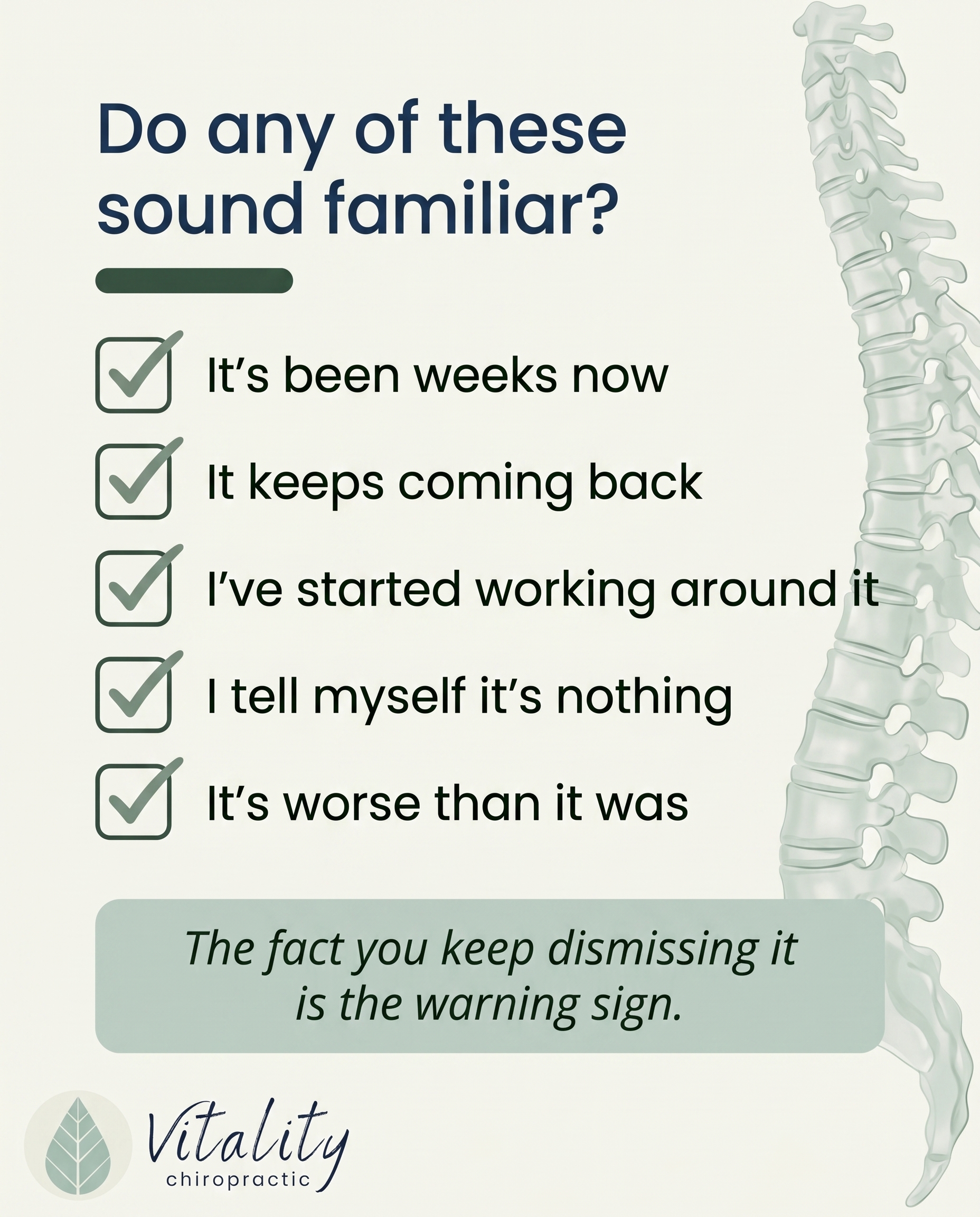
A typographic-led checklist post for a chiropractic clinic, designed to help the reader honestly assess whether they've been quietly ignoring an early ache that's becoming chronic. The composition is primarily typography with checkbox graphics, supported by a small subtle anatomical accent — a clean, semi-translucent illustration of a spine rendered in an editorial, glass-like style as a quiet supporting element, not full-frame. Components: a framing line, five short checklist items each paired with a checkbox graphic, and a soft CTA. Use only these brand colours: #7AB648 (green), #1B3A5C (navy), #F4F6F8 (light grey), #0E1419 (near-black), #FFFFFF (white), and #5C8A35 (deeper green) for depth or accent. Typography: Poppins for headline and checklist item titles, Open Sans for supporting lines, Open Sans italic for the CTA. Text content to render — framing line: 'Do any of these sound familiar?' Checklist items: 'It's been weeks now', 'It keeps coming back', 'I've started working around it', 'I tell myself it's nothing', 'It's worse than it was'. CTA: 'The fact you keep dismissing it is the warning sign.' Keep the design clean, intentional, and calm, with checkbox graphics clearly aligned to each item. Logo placement should vary by composition and is finalised downstream.
Text Overlay
Caption
Here's the thing about an ache you keep ignoring: the ignoring is the symptom.
It started small. A bit of stiffness, a twinge when you stood up. So you worked around it. Changed how you sit. Stopped lifting that way. Told yourself it would settle on its own.
Weeks later, it's still there. Maybe it comes and goes. Maybe it's quietly louder than it was. And you're still telling yourself it's nothing.
The body is good at adapting around discomfort. That's exactly the problem. The longer something lingers, the more your body compensates, and the more those compensations become the new normal. Early aches are easier to address than chronic patterns that have had months to settle in.
If you ticked more than one box, that's worth a conversation. Not panic, just a proper look.
📞 (507) 416-3538
🌐 https://vitalityrochester.com
Which one did you recognise first?
Hashtags
#ChiropracticCare #RochesterMN #BackPainRelief #SpinalHealth #VitalityChiropractic
10.
T8S7A3
Rough Image Prompt
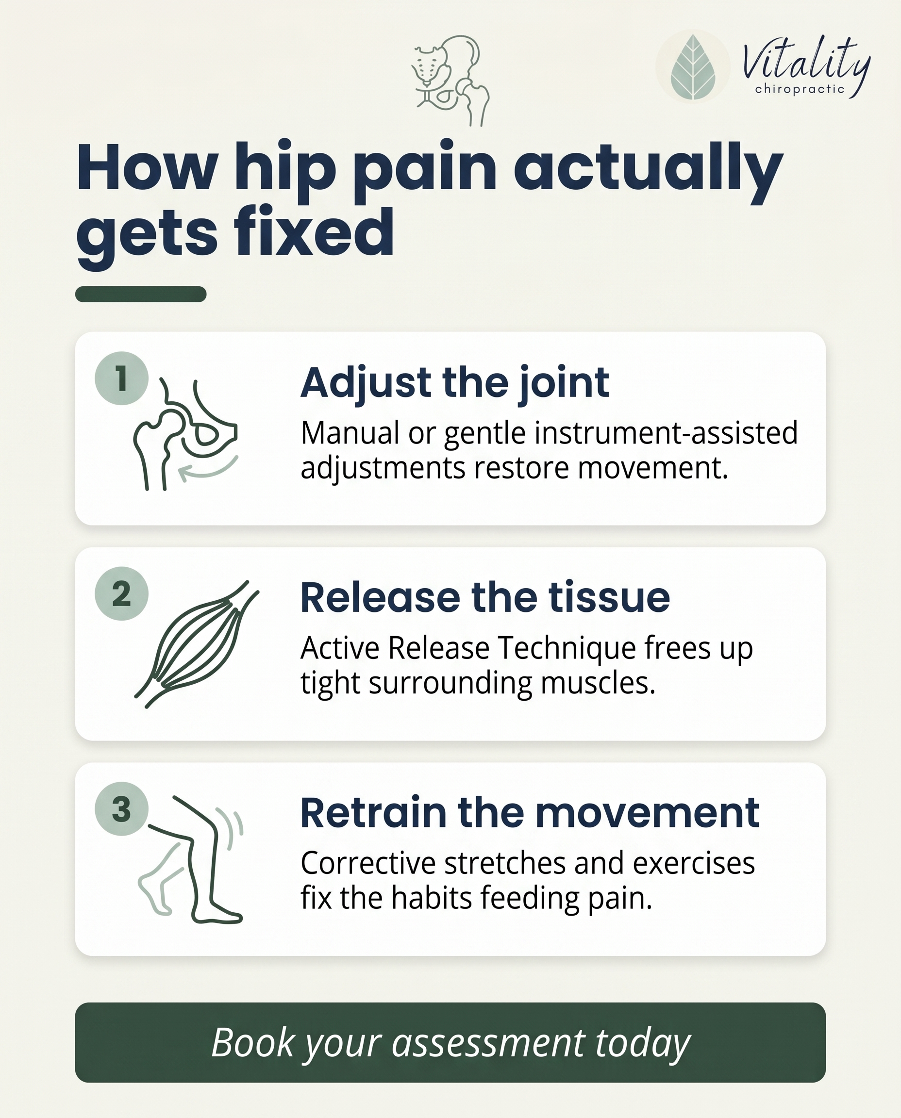
A clean, typographic-led list-tips graphic for a chiropractic practice explaining the layered approach to addressing ongoing hip pain. The post communicates that real progress comes from treating the joint, the surrounding soft tissue, and the movement habits feeding the discomfort. Components: a header line introducing the list, three numbered items each with a short custom illustrated icon, a short heading, and a one-line explanation, plus a CTA line. Item 1 icon: a simplified line illustration of a hip joint (ball-and-socket) suggesting an adjustment. Item 2 icon: a simplified muscle/fascia strand to suggest soft tissue release. Item 3 icon: a stretching/movement figure suggested through abstract motion lines or a leg-stretch silhouette. Icons should feel custom, illustrated, and consistent in stroke weight. Typographic-led design with small supporting icon accents only — no clinic photography, no treatment rooms, no practitioner-patient scenes, no faces. Optional small anatomical hip illustration as a supporting accent on a neutral or gradient field. Use only these exact brand colours: #7AB648 (green), #1B3A5C (navy), #F4F6F8 (light grey), #0E1419 (near-black), #FFFFFF (white), #5C8A35 (deeper green). Typography: Poppins for the header and item headings, Open Sans for supporting explanation lines, Open Sans italic for the CTA. Header text: 'How hip pain actually gets fixed'. Item 1 heading: 'Adjust the joint' with explanation 'Manual or gentle instrument-assisted adjustments restore movement.' Item 2 heading: 'Release the tissue' with explanation 'Active Release Technique frees up tight surrounding muscles.' Item 3 heading: 'Retrain the movement' with explanation 'Corrective stretches and exercises fix the habits feeding pain.' CTA text: 'Book your assessment today'. Logo placement varies by composition and is finalised downstream.
Text Overlay
Caption
Nagging hip pain rarely comes from just one place. That dull ache when you stand up, the tightness on a long walk, the soreness after sitting too long — it usually has layers. So we treat it in layers.
First, the joint. Manual or gentle instrument-assisted adjustments help restore movement where the hip has lost it. Next, the surrounding tissue. Active Release Technique works on the tight muscles that build up around a stiff joint and keep it irritated. Then, the movement habits. Corrective stretches and exercises retrain the patterns that fed the pain in the first place.
Joint, tissue, habits. Address all three and you stop chasing the same ache over and over.
If hip pain has been hanging around longer than you'd like, our team in Rochester can help you map out a plan that fits you.
📞 (507) 416-3538
🌐 https://vitalityrochester.com
Where do you feel your hip tightness most — sitting, standing, or moving? Let us know below.
Hashtags
#HipPainRelief #RochesterMN #Chiropractic #MovementMatters #PainFreeLiving
4
Refined Image Prompts
10 prompts · 2026-06-24T09:15
10 prompts refined
▼
1.
C3S1
Refined Image Prompt
A grounded, editorial health-and-recovery lifestyle photograph capturing the quiet beginning of someone rebuilding after a car accident or workplace injury. The subject is a single person shown from behind, standing and facing an open doorway flooded with soft natural light, one hand resting gently on the back of their lower back to suggest a lingering ache. No face is visible at any point. The mood is honest and human, hopeful rather than staged, conveying steadiness and a clear path forward. The person wears calm, muted clothing in soft sage and warm off-white tones that echo the brand palette naturally. Setting is a generic, neutral interior space with warm light spilling through an open doorway onto a simple floor, no clinic interior, no treatment table, no medical decor of any kind. Soft, warm, diffused natural lighting, gentle shadows, a calm and reassuring atmosphere that feels like being walked alongside. Considered editorial composition with the figure placed slightly off-centre and generous negative space toward the upper portion for text.
Apply a calm natural-wellness register throughout: unhurried, organic, grounded and reassuring with no clinical sterility.
Overlay a soft semi-transparent forest green panel in #385145 across the upper-left region of the image, with moderate 8 to 12px rounded corners, holding the primary text and allowing the photograph to remain visible beneath at the edges. Within this panel, render the headline "You don't have to figure out recovery alone" in Poppins, in #FFFFFF, set in a comfortable multi-line stack with relaxed line spacing.
Below the headline, render the supporting text "After a collision or work injury, we map the road back with you, one clear step at a time" in Open Sans, in #F6F4EC, smaller and quietly set.
Beneath the supporting text, place a soft pill-shaped button with moderate rounded corners filled in #BACDC2 soft sage, containing the CTA "Book your appointment" in Open Sans italic, in #2B372F near-black green, centred within the pill.
As a supporting accent, place a small solid sage block in #BACDC2 with moderate rounded corners as a subtle marker above or beside the headline to draw the eye, keeping the overall attention treatment gentle and uncluttered.
Place the supplied Vitality chiropractic logo, the leaf mark with script wordmark, in the lower-right corner at a modest scale, sitting directly on the photographic surface where the lighting is soft and even. Preserve the logo exactly as supplied, never recolour it, never distort its proportions, and do not place any white box or background panel behind it.
Constraints: keep the subject's face entirely out of frame; show only the back of the body, hands, torso, or limbs. Maintain a warm, natural, editorial photographic quality with no stock-photo staging. Keep all text legible against its panel. Use only the specified hex colours. Render all text exactly as quoted with correct spelling. Keep corners on every rectangular surface and pill consistently rounded at 8 to 12px.
2.
T7S2A1
Refined Image Prompt
A typography-led, editorial graphic design composition for a chiropractic wellness clinic, calm and reassuring in character, anchored around a large headline. The overall register is calm natural-wellness chiropractic: unhurried, warm, considered, with generous breathing space and a soft natural-light mood.
Surface and palette. Use the light scheme. Fill the entire background with a warm off-white #F6F4EC surface, with an optional very subtle soft gradient field drifting toward a faint #BACDC2 soft sage in one upper corner, kept gentle and atmospheric. No texture noise, clean and intentional.
Layout. Build a clear vertical hierarchy with comfortable margins on all sides. Position the headline in the upper-middle third as the dominant element, set large and confident. Place the supporting text block below the headline at a markedly smaller size. Position the CTA lower in the composition. Reserve the lower-right or mid-right area for the small anatomical accent illustration so it supports rather than competes with the type.
Headline. Render in Poppins, colour #1B3A5C navy, in the text exactly: "That stiff shoulder isn't just age." Set it across two or three lines for editorial balance, left aligned, with the phrase reading as the clear focal point. Allow the phrase "isn't just age." to optionally sit on its own line for emphasis.
Supporting text. Render in Open Sans, colour #2B372F near-black green, smaller and quieter than the headline, left aligned, in the text exactly: "Limited reach. An ache when you sleep on one side. Trouble lifting overhead. Not a crisis, just a signal worth listening to." Set the line length comfortably narrow so it reads as a calm paragraph beneath the headline.
CTA. Render the CTA inside a soft pill button with a solid #385145 forest green fill and moderate rounded corners. Place the CTA text in Open Sans italic, colour #FFFFFF white, centred within the pill, in the text exactly: "Worth a second thought? Let's take a look." Keep the pill modestly sized and positioned in the lower portion of the layout.
Anatomical accent. Include a small supporting anatomical illustration of a shoulder joint, the glenohumeral joint, rendered as a clean translucent glass-like 3D object with soft refractions and gentle highlights. Add a soft #385145 forest green accent glow concentrated on the joint to draw attention quietly without any sense of alarm. Keep this illustration small and supportive, occupying only a corner region of the frame, never full-frame, integrated softly against the off-white surface so it feels like a calm accent rather than a clinical diagram.
Embellishments. Apply moderate 8 to 12px rounded corners to every rectangular surface and the CTA pill uniformly. Use the accent treatment of solid blocks and soft pills only: a small solid #BACDC2 soft sage block or thin pill marker may sit behind or beside a key phrase as a supporting accent, kept understated. Maintain the calm natural-wellness register throughout with soft, even, daylight-like lighting and no harsh shadows.
Logo. Place the supplied Vitality chiropractic logo, the leaf mark with script wordmark, small in the upper-left corner with clear surrounding space. Preserve the logo exactly as supplied, never recolour, redraw, or distort it, and do not place any white box or panel behind it. Let it sit directly on the off-white surface.
Constraints. Use only the brand colours specified: #F6F4EC, #FFFFFF, #1B3A5C, #2B372F, #385145, #BACDC2, #67666A. Render only the exact text strings provided, spelled correctly, with no additional words, labels, or numbers. Keep the composition spacious, editorial, and reassuring. Keep the anatomical illustration small and supportive. Maintain accurate, legible typography throughout.
3.
T2S3A4
Refined Image Prompt
An editorial illustrative-3D anatomical render. Central subject: an anatomically accurate 3D illustration of the cervical spine, the neck vertebrae, rendered in a clean translucent glass-like material with subtle internal structure visible through the surface. The spine is isolated and floating in the upper-centre of the composition, oriented vertically with a slight three-quarter turn so the individual vertebrae read clearly. A gentle green accent glow in #BACDC2 surrounds the cervical region, signalling focus, care and relief rather than injury. Three soft directional cues, thin tapering light streaks in #BACDC2 and #FFFFFF, converge from the left toward the glowing focal area, suggesting that several distinct approaches meet at the same point of care.
Setting and surface: no environmental or clinical context. A softly graded brand background moving from #385145 forest green at the top edge to a slightly deeper #2B372F near-black green toward the lower edge, smooth and seamless, so the spine reads as a refined editorial illustration. Dark scheme throughout.
Composition: vertical editorial layout. The glass cervical spine occupies the upper-middle visual weight. Lower third reserved for the text block, left-aligned. Generous calm negative space around the subject. Smooth editorial studio lighting with a soft key light from the upper left and gentle ambient fill, producing clean specular highlights across the glass material and a subtle soft shadow beneath the spine.
Text elements, all left-aligned in the lower third:
Headline in Poppins, colour #FFFFFF, in two to three lines: "More Than One Way To Ease Neck Pain"
Supporting text directly below in Open Sans, colour #F6F4EC: "Manual, Activator, ArthroStim, matched to you, not the other way around"
CTA below the supporting text, set inside a soft pill button with moderate 10px rounded corners, solid fill #BACDC2, with the text in Open Sans italic colour #2B372F: "Book your assessment"
Embellishments: all rectangular and pill surfaces use moderate 8 to 12px rounded corners. Attention is drawn using solid blocks and soft pills only, consistent with the CTA pill. A small solid accent block in #BACDC2 with 10px corners may sit as a short marker above or beside the headline. Overall register is calm natural-wellness chiropractic, credible, clean and unhurried.
Logo placement: position the supplied Vitality chiropractic logo, the leaf mark with script wordmark, small in the top-left corner. Preserve the logo exactly as supplied, do not recolour it, do not redraw it, do not place any box or panel behind it, let it sit directly on the graded background.
Constraints: render the accent glow in calm green and soft sage tones only, no red glow and no injury cues. Keep the background free of any room, furniture, clinic equipment or people. Keep the spine anatomically clean and editorial. Maintain consistent rounded corners across all rectangular and pill elements. Preserve all specified hex colours exactly. Keep text legible with strong contrast against the dark surface.
4.
T3S4A2
Refined Image Prompt
A clean editorial comparison-card layout on a warm off-white surface in colour #F6F4EC, designed with a calm natural-wellness chiropractic register: composed, uncluttered, soft and reassuring with generous breathing room throughout.
At the top, a headline reading "Is it just an ache, or is it sciatica?" set in Poppins, in navy #1B3A5C, centred, occupying the upper portion with comfortable margins on both sides. The headline sits at a confident size that anchors the composition without crowding.
Below the headline, the layout splits into two equal-width comparison cards sitting side by side with a small even gap between them, each card given identical visual weight. Both cards use moderate rounded corners at roughly 10px.
The left card uses a soft sage surface in colour #BACDC2. At its top sits a solid pill-shaped label block in forest green #385145 with rounded corners, containing the text "PASSING ACHE" set in Poppins, in white #FFFFFF, centred within the pill. Below the pill, supporting text reading "Dull, stays in the lower back, eases with rest" set in Open Sans, in near-black green #2B372F, centred, with relaxed line spacing.
The right card uses a forest green surface in colour #385145. At its top sits a solid pill-shaped label block in soft sage #BACDC2 with rounded corners, containing the text "SCIATICA PATTERN" set in Poppins, in near-black green #2B372F, centred within the pill. Below the pill, supporting text reading "Burning pain down the leg, numbness or tingling" set in Open Sans, in white #FFFFFF, centred, with relaxed line spacing.
Between or beneath the two cards as a supporting accent, a small clean editorial 3D rendering of the lower spine, pelvis and sciatic nerve pathway, isolated cleanly on the off-white background with no hard frame, rendered in soft matte realism with gentle natural lighting. A soft warm red glow traces the sciatic nerve route from the lower back through the buttock and down the leg, signalling the radiating pattern. The illustration is modest in scale, positioned to support rather than dominate the typographic layout, with soft shadowing grounding it on the surface.
Toward the lower portion, a solid CTA block in forest green #385145 with moderate rounded corners at roughly 10px, spanning a comfortable central width, containing the text "Get it checked, call the team" set in Open Sans italic, in white #FFFFFF, centred.
Place the supplied logo file in the lower section beneath the CTA, centred and small, preserving it exactly as supplied with its original colours and proportions intact, never recoloured, resized out of proportion, or altered. Do not place any box or panel behind the logo; let it sit directly on the off-white surface.
Lighting across the composition is soft, even and natural with no harsh contrast. Composition is balanced, symmetrical between the two cards, and calm.
Constraints: use only the specified brand hex colours #F6F4EC, #BACDC2, #385145, #1B3A5C, #2B372F and #FFFFFF, with a soft warm red reserved solely for the nerve glow in the illustration. Keep all rectangular surfaces at consistent moderate rounded corners. Keep the two comparison sides visually equal. Maintain generous spacing and an uncluttered editorial feel. Render all text exactly as quoted with correct spelling.
5.
L3S5A4
Refined Image Prompt
A clean editorial Q&A card for a chiropractic clinic, typographic-led graphic design with a single supporting anatomical illustration, set on a warm off-white #F6F4EC surface. The overall register is calm, natural-wellness, credible and clinical, with generous breathing space and an intentional, unhurried layout.
Composition is built around a clear question-to-answer hierarchy reading top to bottom. In the upper-left area, a small soft pill badge in forest green #385145 with moderately rounded 10px corners holds the short label "QUESTION" in Poppins, in white #FFFFFF, set small and tracked out.
Directly beneath the badge, the question reads "I strained my back lifting, what should I actually do?" in Poppins, in navy #1B3A5C, set large as the dominant headline across roughly two lines on the left two-thirds of the canvas. A thin solid forest green #385145 underline accent sits beneath the question to mark the hierarchy break.
Below the question, the structured answer is presented inside a soft rounded card in white #FFFFFF with moderately rounded 12px corners and a very subtle soft shadow for gentle lift. A small soft pill badge in soft sage #BACDC2 with 10px corners holds the label "ANSWER" in Poppins, in near-black green #2B372F. The answer text reads "Start with a proper assessment, then targeted adjustment, manual or gentle instrument-assisted, soft tissue release, and corrective exercises to rebuild safe movement." in Open Sans, in near-black green #2B372F, set comfortably with relaxed line spacing.
In the lower-right region, supporting the composition without dominating it, a small 3D anatomical illustration of a lower spine and lumbar region rendered in a translucent, glass-like clinical style, with smooth refractive surfaces and soft clinical lighting. A soft diffuse red glow highlights the lower lumbar area to indicate strain, kept gentle and contained. The render is anatomically accurate, polished, and kept small and supporting, not full-frame, floating cleanly against the off-white surface with soft contact shadow.
At the bottom, a solid forest green #385145 CTA block with moderately rounded 12px corners contains the call to action "Book your assessment today." in Open Sans italic, in white #FFFFFF, centred within the block.
Lighting across the whole composition is soft, even, and natural, evoking calm wellness with clinical clarity. Colour application stays restrained: off-white surface, navy and near-black green for text, forest green and sage for accents and pills, white for the answer card.
Place the supplied logo, the leaf mark with the "Vitality chiropractic" script wordmark, in the top-right corner at a modest scale. Preserve the logo exactly as supplied, keep its original colours and proportions, do not recolour it, do not distort it, and do not place any white box or panel behind it.
Constraints: keep all rectangular surfaces, cards, badges, pills, and blocks at consistent moderate rounded corners. No faces, no clinic interiors, no treatment-room scenes, no practitioner-patient imagery. Keep the anatomical render small and supporting rather than full-frame. Maintain a calm, intentional, credible composition with accurate spelling of all text exactly as quoted.
6.
T5S6A3
Refined Image Prompt
A typography-led myth-buster social media post for a chiropractic clinic, split into two clear vertical zones contrasting a myth against a truth about whiplash recovery. The overall mood is calm, natural and grounded in clinical wellness, clean and reassuring rather than alarming.
The upper portion sits on a warm off-white surface in #F6F4EC. At the very top, a centred headline in Poppins reading "MYTH vs TRUTH: Whiplash" with "MYTH vs TRUTH:" in #1B3A5C navy and "Whiplash" in #385145 forest green, generously spaced and confident.
Below the headline, the MYTH zone. A soft pill badge with moderate 10px rounded corners, filled in #BACDC2 soft sage, containing the word "MYTH" in Poppins in #2B372F near-black green, small caps style with comfortable letter spacing. Beneath this pill, the myth statement in Open Sans in #67666A warm grey, set in a relaxed measure: "If whiplash doesn't hurt right away, it's nothing to worry about, just wait it out." The colour and lighter treatment subtly signal this is the misconception.
A clean horizontal divider in #BACDC2 sage separates the two zones, sitting comfortably between them with calm breathing room.
The lower portion is the TRUTH zone, set on a solid #385145 forest green block with moderate 10px rounded corners, spanning the lower section as a contained card. Inside, a soft pill badge with 10px corners filled in #FFFFFF white containing the word "TRUTH" in Poppins in #385145 forest green. Beneath it, the truth statement in Open Sans in #FFFFFF white, clear and legible: "Symptoms can surface days later. Gentle adjustments, soft tissue work and intersegmental traction help restore motion early." This reversed treatment gives the truth side authority and warmth.
To the right side of the TRUTH card, integrated as a supporting accent and not dominating the layout, a clean 3D rendering of the cervical spine, the neck vertebrae, in a translucent glass-like clinical style. A soft #BACDC2 sage and subtle warm glow marks the strained segments to indicate gentle irritation, with a soft restorative highlight suggesting returning motion. The anatomy is refined, semi-transparent and elegant, sitting quietly as an illustrative accent against the green field with soft ambient light.
Near the base, the CTA in Open Sans italic reading "Book a whiplash assessment" in #F6F4EC warm off-white, set inside a soft pill button with moderate 10px rounded corners filled in #566C61 muted green tint, centred and inviting.
The supplied Vitality chiropractic logo, the leaf mark with script wordmark, placed in the top left corner of the off-white upper zone at a modest, balanced size. Preserve the logo exactly as supplied, never recolour or distort it, and do not place a white box or panel behind it.
Lighting is soft, even and natural with gentle clinical clarity. Composition is balanced, spacious and uncluttered with generous margins. All rectangular surfaces, cards, pills and buttons use consistent moderate 8 to 12px rounded corners.
Constraints: keep all text crisp, sharp and fully legible. Maintain a calm, reassuring, natural-wellness tone throughout. Keep the anatomical illustration supporting and secondary to the typography. Use only the specified hex colours. Preserve the logo exactly as supplied.
7.
T12S7A2
Refined Image Prompt
A clean, typographic-led list-tips graphic for a calm natural-wellness chiropractic practice, designed in the LIGHT SCHEME on a warm off-white #F6F4EC background surface. The overall mood is calm, grounded and naturally restorative, with generous breathing room and a quiet editorial register. No clinic photography, no treatment scenes, no faces.
Composition is vertical and structured. At the top, a header zone introduces the concept. The headline "Could it be your jaw?" is set in Poppins, in navy #1B3A5C, large and confident, left-aligned with comfortable margins. Directly beneath the headline sits a small soft pill block in forest green #385145 with moderate 10px rounded corners, holding a short kicker line in Open Sans italic in white #FFFFFF reading "Four signs that connect". Keep this pill compact and to the left, acting as the primary accent that draws the eye into the list.
Below the header, four list items are stacked vertically with even spacing. Each item is a soft card surface in white #FFFFFF with moderate 10px rounded corners, sitting on the off-white background with a very gentle soft shadow for quiet separation. Each card is laid out horizontally: on the left, a small custom-illustrated icon inside a soft sage #BACDC2 rounded square (10px corners); to the right of the icon, a short title line above a single supporting line.
Item one: a subtle jaw and joint icon drawn in simple soft-fill line style in forest green #385145. Title "Jaw clicking" in Poppins, near-black green #2B372F. Supporting line in Open Sans, warm grey #67666A: "That pop or catch when you chew or yawn."
Item two: a gentle sunrise and morning icon in forest green #385145. Title "Morning soreness" in Poppins, near-black green #2B372F. Supporting line in Open Sans, warm grey #67666A: "Waking with a tight, tired jaw."
Item three: a temple and head icon with a soft highlight near the temple, drawn in forest green #385145. Title "Headaches near the temples" in Poppins, near-black green #2B372F. Supporting line in Open Sans, warm grey #67666A: "Dull pressure that creeps up the sides of your head."
Item four: an open-mouth motion icon suggesting limited opening, in forest green #385145. Title "Hard to open fully" in Poppins, near-black green #2B372F. Supporting line in Open Sans, warm grey #67666A: "Your mouth won't open as wide as it should."
All four icons share the same simple, soft-fill line illustration language, calm and minimal, consistent stroke weight, no harsh detail.
At the bottom, a CTA band in forest green #385145 with moderate 10px rounded corners spans most of the width, holding the line "These connect. We can help." in Open Sans italic, in white #FFFFFF, centred. This solid block is the closing accent that grounds the composition.
A small, anatomically suggestive jaw joint line illustration sits as a subtle supporting accent in soft sage #BACDC2 in a quiet corner near the header, kept small, low-contrast and never full-frame.
Lighting is soft and even, flat editorial illustration lighting with no dramatic shadows. The palette stays restrained: off-white surface, white cards, forest green and navy accents, sage supporting panels, warm grey secondary text.
Place the supplied Vitality chiropractic logo, the leaf mark with script wordmark, in the bottom corner at a small, balanced scale. Preserve the logo exactly as supplied, do not recolour it, do not redraw it, do not place any white box or panel behind it, render it cleanly on the off-white background.
Constraints: keep the design typographic in character with small icon accents only. Use only the exact hex colours specified. Maintain consistent moderate 10px rounded corners across every card, pill, icon container and CTA band. No clinic photography, no treatment scenes, no human faces, no full-frame anatomical imagery. Keep ample negative space and a calm, uncluttered layout.
8.
T4S8A2
Refined Image Prompt
A richly designed stat-card composition in an elevated typographic style, calm natural-wellness chiropractic register, built on a warm off-white surface of #F6F4EC. The layout is anchored by one dominant statistic and arranged with intentional vertical rhythm and generous breathing space, credible and clean rather than minimal-by-default.
Top-left zone holds a small soft pill badge with moderately rounded 10px corners, filled in solid #BACDC2 soft sage, containing the eyebrow text "HEADACHE FACTS" set in Poppins, letter-spaced, in #385145 forest green.
The visual centre is the statistic "1 in 7" set very large in Poppins, in #1B3A5C navy, rendered crisply as the unmistakable focal anchor, occupying the upper-middle of the frame. The "1 in 7" sits left-aligned with strong figure-ground contrast against the off-white surface.
Directly beneath the statistic, a supporting context line "adults worldwide live with recurring headaches or migraines" set in Open Sans, in #2B372F near-black green, kept to a comfortable measure of two lines.
Below that, separated by a thin solid underline accent in #385145 forest green spanning a short width, a reframing line "Frequent head pain is a signal, not something to push through." set in Open Sans, in #67666A warm grey.
The closing CTA "Let's find the source." set in Open Sans italic, in #FFFFFF white, placed inside a solid forest green #385145 block with moderately rounded 10px corners, positioned lower-left as a clear call-to-action button.
In the right portion of the composition, occupying the mid-to-lower right and kept small and supporting rather than full-frame, a clean anatomical illustration of the upper neck and base-of-skull suboccipital region rendered in a translucent, glass-like style, with a soft warm glow concentrated at the upper cervical spine to imply the origin of tension. The glass illustration carries subtle sage #BACDC2 and forest green #385145 tints and overlaps gently behind the text margin without competing with the statistic.
A subtle supporting surface anchors the lower third: a soft sage #BACDC2 panel with moderately rounded 12px corners sitting behind the CTA zone to add depth, kept understated.
Lighting is soft, even and natural, evoking a calm wellness clinic mood with gentle dimensionality on the glass anatomical element. Composition is balanced and airy, every rectangular element carrying uniform moderate 8-12px rounded corners.
The Vitality chiropractic logo, the leaf mark with its script wordmark, placed in the lower-left corner at modest scale. Preserve the logo exactly as supplied in the attached reference, do not recolour it, do not redraw it, do not place any box or panel behind it, render it directly on the off-white surface.
Constraints: render all text crisply, accurately and legibly with strong figure-ground contrast so the statistic reads instantly. Keep the anatomical illustration small and supporting. Maintain generous negative space and a calm, credible, natural-wellness health-brand aesthetic. Use only the specified hex colours.
9.
L4S9A2
Refined Image Prompt
A vertical typographic-led checklist post for a calm, natural-wellness chiropractic clinic, with an editorial, intentional, quietly reassuring mood. The design uses the LIGHT SCHEME on a warm off-white surface of #F6F4EC, with generous breathing space throughout and a clean, considered layout.
The composition is primarily typography supported by a single subtle anatomical accent. In the right portion of the canvas, vertically centred and bleeding gently off the right edge, place a semi-translucent illustration of a human spine rendered in an editorial, glass-like style, tinted in soft sage #BACDC2 with delicate forest green #385145 edge definition, kept at low opacity so it reads as a quiet supporting element behind and beside the text rather than a full-frame subject. It should feel like a watermark with dimension, never competing with the words.
At the top of the canvas, set the framing line "Do any of these sound familiar?" in Poppins, in navy #1B3A5C, as the headline. Beneath it, place a short solid pill in forest green #385145 with moderate 10px rounded corners as a subtle accent marker under the headline.
In the central area, arrange five checklist rows stacked vertically with even, comfortable spacing. Each row begins on the left with a checkbox graphic: a square outline with moderate 8px rounded corners, drawn in forest green #385145 on the off-white surface, each checkbox containing a soft check mark in forest green #385145. To the right of each checkbox, set the checklist item title in Poppins, in near-black green #2B372F. The five items, top to bottom, read:
"It's been weeks now"
"It keeps coming back"
"I've started working around it"
"I tell myself it's nothing"
"It's worse than it was"
Keep every checkbox precisely left-aligned in a clean vertical column and every text item baseline-aligned to its checkbox for a calm, orderly rhythm.
Below the checklist, place a CTA block: a soft pill panel in soft sage #BACDC2 with moderate 12px rounded corners, spanning a comfortable width. Inside it, set the CTA "The fact you keep dismissing it is the warning sign." in Open Sans italic, in forest green #385145, centred within the pill.
Use Open Sans for any incidental supporting line styling where present, keeping it in warm grey #67666A.
Place the supplied logo, the leaf mark with the "Vitality chiropractic" script wordmark, in the bottom left corner at a modest, balanced size. Preserve the logo exactly as supplied, never recolour it, never distort its proportions, and do not place a white box or any panel behind it. Let it sit directly on the off-white surface.
Lighting and finish: soft, even, natural light with no harsh shadows, a clean editorial flatness with just enough dimension on the glass spine illustration to give it presence.
Constraints: keep the layout clean, intentional, and calm. Use only the brand colours specified: #F6F4EC, #FFFFFF, #385145, #1B3A5C, #BACDC2, #566C61, #2B372F, and #67666A. Keep all checkbox graphics clearly and consistently aligned to their items. Maintain moderate rounded corners on every rectangular surface, card, pill, badge, and checkbox. Keep the spine illustration subtle and supporting rather than dominant. Render all quoted text exactly as written with correct spelling and apostrophes. Preserve the logo exactly as supplied.
10.
T8S7A3
Refined Image Prompt
A clean, typographic-led list-tips graphic for a chiropractic practice, designed in a calm natural-wellness register with generous breathing room and a composed, editorial feel. Vertical composition on a warm off-white background surface in #F6F4EC.
At the top, a header band introducing the list. The headline reads "How hip pain actually gets fixed" set in Poppins, in navy #1B3A5C, large and confident, left-aligned with comfortable margins. Beneath the headline sits a short solid soft pill in forest green #385145 with moderate 10px rounded corners, acting as a small accent marker that anchors the header to the list below. Above or beside the headline, a small custom-illustrated anatomical hip joint accent rendered as a thin single-weight line illustration in muted green tint #566C61, sitting on the neutral field as a quiet supporting detail.
Below the header, three numbered list items stacked vertically with even spacing. Each item sits inside its own soft card in white #FFFFFF with moderate 10px rounded corners and a very soft shadow for gentle depth. Each card contains, on the left, a small circular soft pill badge in soft sage #BACDC2 with moderate rounded corners holding the item number in Poppins in forest green #385145. Beside the number, a short custom-illustrated icon rendered as a clean single-weight line illustration in forest green #385145, all three icons consistent in stroke weight and style.
Item 1 icon: a simplified ball-and-socket hip joint line illustration suggesting a gentle adjustment. Item 1 heading "Adjust the joint" in Poppins in navy #1B3A5C, with the explanation line below it "Manual or gentle instrument-assisted adjustments restore movement." set in Open Sans in warm grey #67666A.
Item 2 icon: a simplified muscle and fascia strand line illustration suggesting soft tissue release. Item 2 heading "Release the tissue" in Poppins in navy #1B3A5C, with the explanation line "Active Release Technique frees up tight surrounding muscles." set in Open Sans in warm grey #67666A.
Item 3 icon: an abstract leg-stretch silhouette with light motion lines suggesting movement retraining. Item 3 heading "Retrain the movement" in Poppins in navy #1B3A5C, with the explanation line "Corrective stretches and exercises fix the habits feeding pain." set in Open Sans in warm grey #67666A.
At the bottom, a CTA presented as a solid forest green #385145 block with moderate 10px rounded corners spanning a comfortable width. Inside it, the CTA reads "Book your assessment today" in Open Sans italic in white #FFFFFF, centred.
The supplied Vitality chiropractic logo, the leaf mark with script wordmark, placed in the top corner or bottom corner in a clear area of the off-white surface, sized small and balanced. Preserve the logo exactly as supplied, keep its original colours, do not recolour it, do not place any box or panel behind it.
Soft, even, natural daylight quality across the whole composition with no harsh contrast. Calm, balanced, generous negative space throughout.
Constraints: keep all rectangular surfaces, cards, badges, pills and the CTA block at a consistent moderate 10px corner radius. Use only these exact colours: #385145 forest green, #1B3A5C navy, #BACDC2 soft sage, #F6F4EC warm off-white, #566C61 muted green tint, #2B372F near-black green, #67666A warm grey, #FFFFFF white. Keep all icons as consistent single-weight line illustrations. Render all text exactly as quoted with correct spelling. Keep the design typographic-led with small supporting icon accents only. No clinic photography, no treatment rooms, no practitioner-patient scenes, no faces, no people.
5
Rendered Images
10 rendered · 2026-06-24T09:35
10 rendered
▼
C3S1
v3
1856×2304
T7S2A1
v2
1856×2304
T2S3A4
v3
1856×2304
T3S4A2
v2
1856×2304
L3S5A4
v3
1856×2304
T5S6A3
v6
1856×2304
T12S7A2
v2
1856×2304
T4S8A2
v2
1856×2304
L4S9A2
v2
1856×2304
T8S7A3
v3
1856×2304
6
Samples Page
Ready to build
Part A — Practice Name
saved
Part B — Select 4 Images
(0/4 selected)
1
2
3
4
Part C — Build Page