Draw — 10 posts
1
Coordinates
10 coordinates
10 selected
▼
| # | Code | Theme | Subject | Style | Awareness | Source |
|---|---|---|---|---|---|---|
| 1 | L3S1A2 | lifestyle | L3 — Training load mismanagement and overuse in sport (martial arts, running, lifting) | photography | A2 — Problem-aware | CURATED |
| 2 | C1S2 | clinic | C1 — Desk-bound professionals managing posture-related neck and back strain | graphic-design | — | CURATED |
| 3 | T11S3A1 | treatments | T11 — Shoulder Pain | illustrative-3D | A1 — Unaware | CURATED |
| 4 | T1S4A4 | treatments | T1 — Back Pain | comparison-card | A4 — Product-aware | CURATED |
| 5 | T4S5A3 | treatments | T4 — Plantar Fasciitis | qa-card | A3 — Solution-aware | CURATED |
| 6 | T5S6A2 | treatments | T5 — Herniated Disc | myth-buster | A2 — Problem-aware | CURATED |
| 7 | T2S7A1 | treatments | T2 — Neck Pain | list-tips | A1 — Unaware | CURATED |
| 8 | T6S8A4 | treatments | T6 — Sciatica | stat-card | A4 — Product-aware | CURATED |
| 9 | L5S9A3 | lifestyle | L5 — Prolonged standing on hard surfaces during long work shifts | checklist | A3 — Solution-aware | CURATED |
| 10 | T10S2A4 | treatments | T10 — Pinched Nerve | graphic-design | A4 — Product-aware | CURATED |
2
Content Briefs
10 briefs · 2026-06-03T09:55
10 briefs generated
▼
1.
L3S1A2
photography
Problem-aware
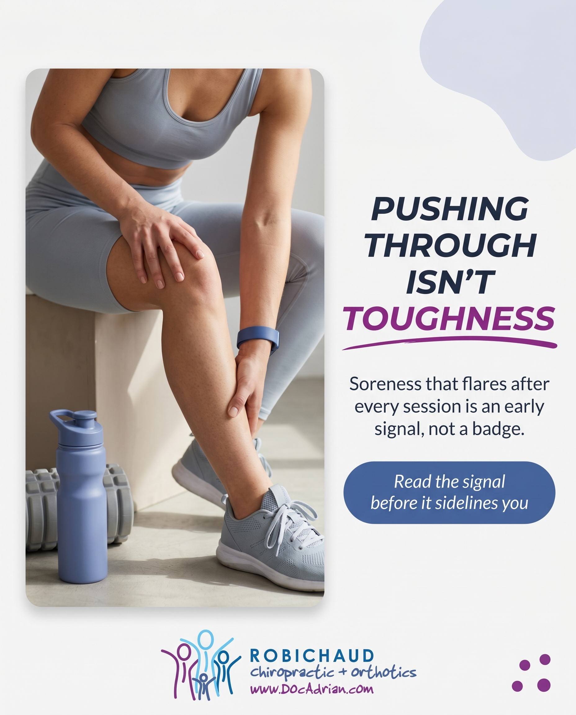
A photo-led post showing the line between productive training and overuse — the recurring soreness that flares after every session and never fully settles. The message: pushing through repeated aches in your sport isn't toughness, it's an early signal that load management has slipped, and it's worth taking seriously before it sidelines you.
Content: A photo-led post showing the line between productive training and overuse — the recurring soreness that flares after every session and never fully settles. The message: pushing through repeated aches in your sport isn't toughness, it's an early signal that load management has slipped, and it's worth taking seriously before it sidelines you.
Style: photography
2.
C1S2
graphic-design
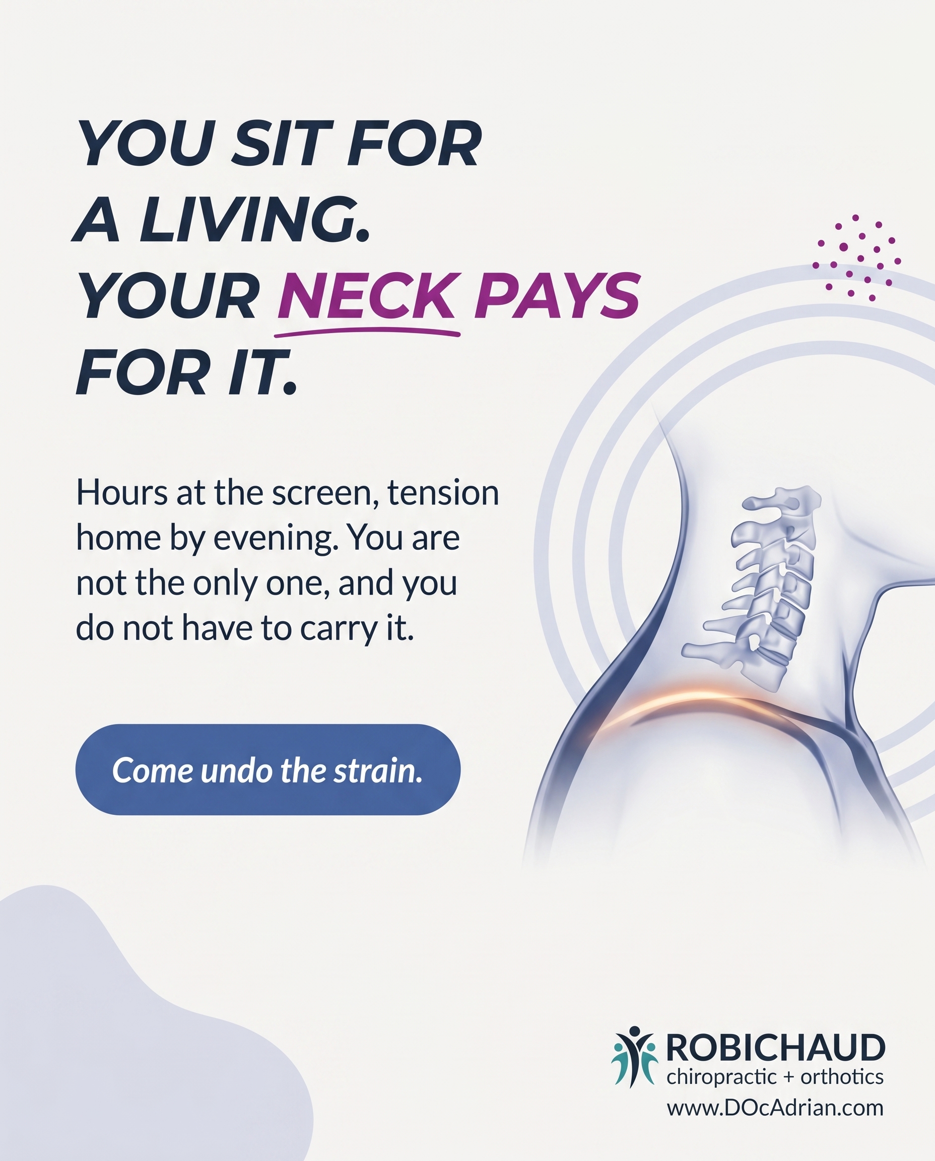
A recognition piece for the desk-bound crowd who spend their days hunched over screens and feel it in their neck and shoulders by evening. The angle: this is a clinic where people who sit for a living come to undo the strain — you belong here, and you're far from the only one carrying tension home from the office.
Content: A recognition piece for the desk-bound crowd who spend their days hunched over screens and feel it in their neck and shoulders by evening. The angle: this is a clinic where people who sit for a living come to undo the strain — you belong here, and you're far from the only one carrying tension home from the office.
Style: graphic-design
3.
T11S3A1
illustrative-3D
Unaware
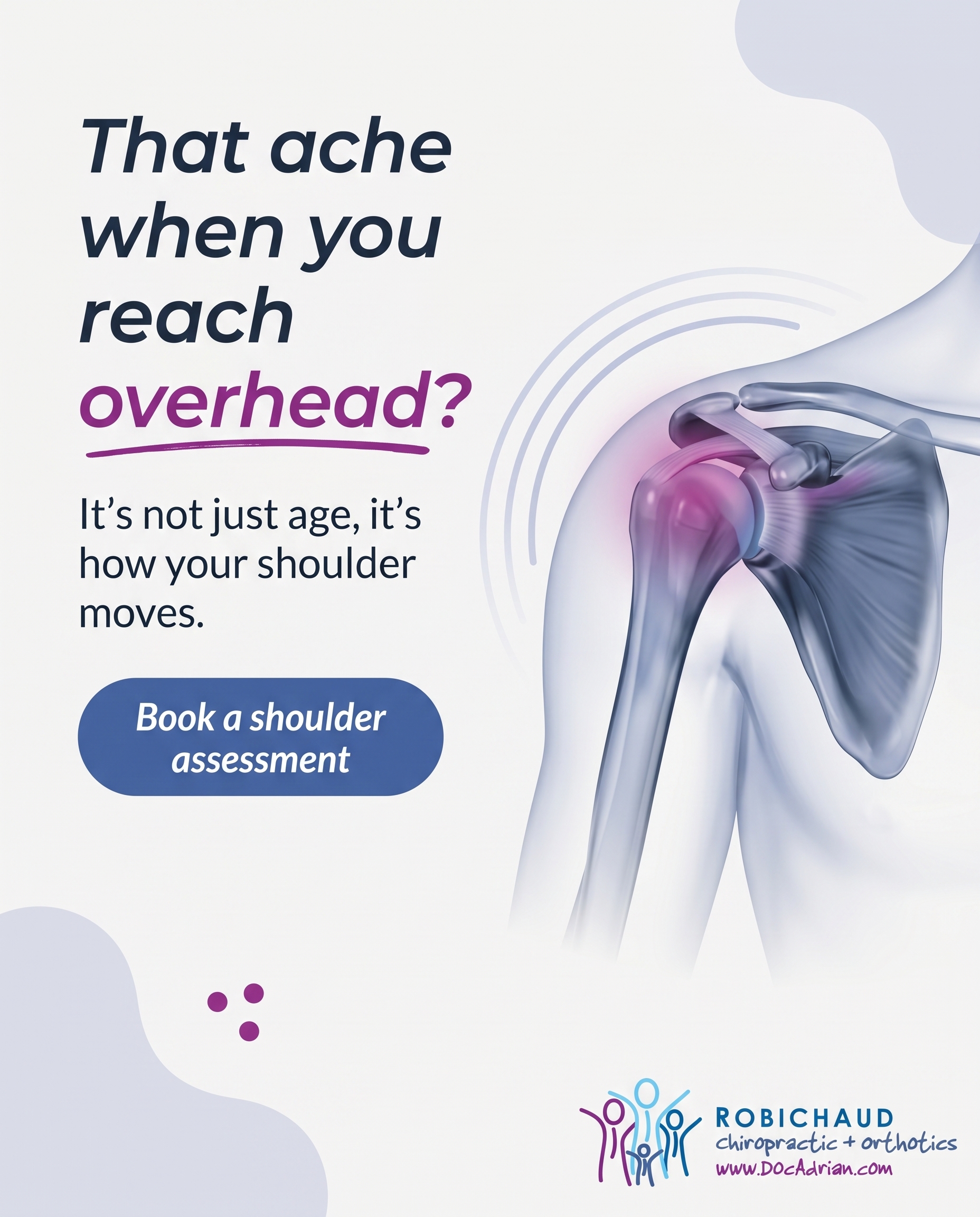
A 3D-illustrated look at the shoulder joint that reframes everyday stiffness most people shrug off as 'just getting older.' The hook is curiosity: that ache when you reach overhead or sleep on one side isn't random, and showing how the shoulder actually moves makes the reader care about something they'd been ignoring.
Content: A 3D-illustrated look at the shoulder joint that reframes everyday stiffness most people shrug off as 'just getting older.' The hook is curiosity: that ache when you reach overhead or sleep on one side isn't random, and showing how the shoulder actually moves makes the reader care about something they'd been ignoring.
Style: illustrative-3D
4.
T1S4A4
comparison-card
Product-aware
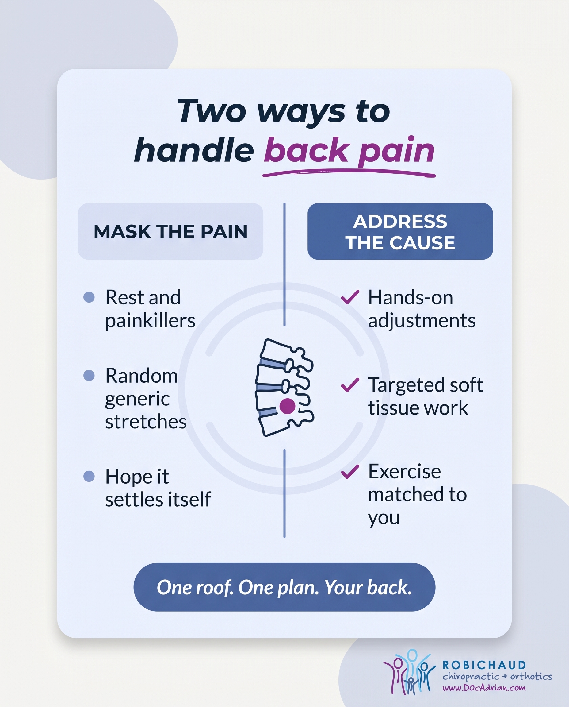
A comparison-card weighing common routes for back pain — rest and painkillers, generic stretches, or hands-on care backed by a structured plan — and showing why a multidisciplinary clinic combining chiropractic adjustments, soft tissue work, and corrective exercise addresses the cause rather than masking it. The 'why us' is the breadth of tools under one roof matched to your specific back.
Content: A comparison-card weighing common routes for back pain — rest and painkillers, generic stretches, or hands-on care backed by a structured plan — and showing why a multidisciplinary clinic combining chiropractic adjustments, soft tissue work, and corrective exercise addresses the cause rather than masking it. The 'why us' is the breadth of tools under one roof matched to your specific back.
Style: comparison-card
5.
T4S5A3
qa-card
Solution-aware
A Q&A-format post answering the question heel-pain sufferers are already asking: what actually fixes plantar fasciitis? The answer walks through the real options Robichaud offers — custom orthotics from gait analysis and casting, BioFlex laser therapy, and soft tissue work — explaining what each does so the reader understands the path forward.
Content: A Q&A-format post answering the question heel-pain sufferers are already asking: what actually fixes plantar fasciitis? The answer walks through the real options Robichaud offers — custom orthotics from gait analysis and casting, BioFlex laser therapy, and soft tissue work — explaining what each does so the reader understands the path forward.
Style: qa-card
6.
T5S6A2
myth-buster
Problem-aware
A myth-buster tackling the fear that a herniated disc means surgery or permanent damage. The angle validates that the symptoms are real while correcting the catastrophe — many disc cases respond to conservative care, so the reader can take their back and leg symptoms seriously without assuming the worst.
Content: A myth-buster tackling the fear that a herniated disc means surgery or permanent damage. The angle validates that the symptoms are real while correcting the catastrophe — many disc cases respond to conservative care, so the reader can take their back and leg symptoms seriously without assuming the worst.
Style: myth-buster
7.
T2S7A1
list-tips
Unaware
A list-tips post surfacing small daily habits — phone angle, pillow height, how long you hold a screen position — that quietly load the neck before any pain shows up. The job is to make an unaware reader notice these for the first time and start caring about their neck before it becomes a problem.
Content: A list-tips post surfacing small daily habits — phone angle, pillow height, how long you hold a screen position — that quietly load the neck before any pain shows up. The job is to make an unaware reader notice these for the first time and start caring about their neck before it becomes a problem.
Style: list-tips
8.
T6S8A4
stat-card
Product-aware
A stat-card using a striking number about how common sciatica is and how often it lingers without proper care, then pointing to why a clinic with Cox Flexion-Distraction, laser therapy, and a tailored plan is positioned to handle nerve-related leg pain. The figure earns attention; the 'why us' is having the specific tools sciatica calls for.
Content: A stat-card using a striking number about how common sciatica is and how often it lingers without proper care, then pointing to why a clinic with Cox Flexion-Distraction, laser therapy, and a tailored plan is positioned to handle nerve-related leg pain. The figure earns attention; the 'why us' is having the specific tools sciatica calls for.
Style: stat-card
9.
L5S9A3
checklist
Solution-aware
A checklist for workers on their feet all shift on hard floors, laying out what actually relieves the load — supportive footwear, custom orthotics, recovery habits, and when to get gait assessed. It answers the solution-aware question by naming concrete fixes for aching feet, legs, and lower back from prolonged standing.
Content: A checklist for workers on their feet all shift on hard floors, laying out what actually relieves the load — supportive footwear, custom orthotics, recovery habits, and when to get gait assessed. It answers the solution-aware question by naming concrete fixes for aching feet, legs, and lower back from prolonged standing.
Style: checklist
10.
T10S2A4
graphic-design
Product-aware
A clean graphic-design post for someone weighing how to handle a pinched nerve, contrasting wait-and-see against active care and showing why Robichaud's combination of gentle adjusting tools, IFC electrotherapy, and laser therapy targets the irritation directly. The 'why us' is matching the right modality to a nerve that needs decompressing, not just numbing.
Content: A clean graphic-design post for someone weighing how to handle a pinched nerve, contrasting wait-and-see against active care and showing why Robichaud's combination of gentle adjusting tools, IFC electrotherapy, and laser therapy targets the irritation directly. The 'why us' is matching the right modality to a nerve that needs decompressing, not just numbing.
Style: graphic-design
3
Developed Posts
10 posts · 2026-06-03T09:58
10 developed
▼
1.
L3S1A2
Rough Image Prompt
Elevated athletic lifestyle photography communicating the line between productive training and overuse. Depict a recovery moment after sport — a person shown from behind or focused on limbs only (no face visible at all), seated and pressing a hand into a sore calf or hamstring after training, or gripping the back of a tightened shoulder. The mood is honest and reflective rather than dramatic — the quiet pause where soreness keeps showing up. Generic setting: a neutral outdoor track edge, gym corner without identifiable branded equipment, or home floor with a foam roller nearby. Soft natural lighting, calm and considered composition, athletic clothing in neutral tones with subtle brand colour cues woven in naturally (a teal water bottle, a blue training band, or fabric accents). Integrate brand colours from this palette where natural: #1B6FA8, #3CA99C, #F4F6F8, #13222B, #FFFFFF, #145880. Typography: Montserrat for headline, Lato for supporting text, Lato italic for CTA. Text content to render: headline 'PUSHING THROUGH ISN'T TOUGHNESS', supporting text 'Soreness that flares after every session is an early signal — not a badge.', CTA 'Read the signal before it sidelines you'. Logo placement varies by composition and is finalised downstream. Show the body in honest recovery, hands-on with the sore area, framing-only on limbs and torso, athletic and grounded.
Text Overlay
Caption
There's a difference between good training fatigue and the same ache showing up after every single session.
Productive load leaves you tired but recovered by the next day. Overuse is the soreness that flares, settles a little, then flares again — never quite clearing. It's easy to file that under toughness and keep training through it. But repeated aches in the same spot aren't a sign you're getting stronger. They're an early signal that load management has slipped.
The athletes who stay in their sport longest aren't the ones who push through everything. They're the ones who read the signal early — adjust the load, address the tightness, and keep training before a small twinge becomes the thing that sidelines them for weeks.
If the same ache keeps coming back after every session, it's worth taking seriously now.
📞 905-571-0821
🌐 https://docadrian.com
✉️ info@docadrian.com
What's the ache that keeps following you after training? Tell us below.
Hashtags
#SportsInjury #OshawaChiropractor #LoadManagement #TrainSmart #DurhamRegion
2.
C1S2
Rough Image Prompt
Typographic-led graphic design poster recognising desk-bound professionals who carry neck and shoulder tension home after a day at the screen. The concept: this is a place where people who sit for a living come to undo the strain, and they are far from alone. Visual register is primarily typography with a small supporting anatomical accent — a clean, editorial 3D illustration of the cervical spine and upper shoulder region (neck and trapezius area) with a soft warm glow indicating tension across the shoulder line, rendered translucent and glass-like, isolated on a clean field, sized as a supporting accent rather than a full-frame background. No faces, no people, no clinic interior. Use only these brand colours: #1B6FA8 medical blue, #3CA99C teal, #F4F6F8 off-white surface, #13222B near-black text, #FFFFFF white, #145880 deep blue. Typography: Montserrat for the headline, Lato for supporting text, Lato italic for the CTA. Render exactly this text: headline 'YOU SIT FOR A LIVING. YOUR NECK PAYS FOR IT.', supporting text 'Hours at the screen, tension home by evening. You are not the only one — and you do not have to carry it.', CTA 'Come undo the strain.' Keep text crisp and clean with clear hierarchy. Logo placement should vary by composition and is finalised downstream. Subtle gradient and accent shapes in brand colours are welcome to add depth.
Text Overlay
Caption
If your shoulders are up near your ears by 5pm, you are in good company.
The desk crowd makes up a huge part of who walks through our doors. Long hours at the screen, the slow creep forward of the head and shoulders, the tightness that builds quietly until it follows you home. By evening it is in your neck, your upper back, sometimes climbing into a headache.
That strain is not just something you have to live with. Chiropractic care, soft tissue work, and corrective exercise can take the load off and teach the body to hold itself better through the workday.
You sit for a living. That does not mean you have to ache for it.
If this sounds like your week, you belong here — and you are far from the only one carrying tension home from the office.
📞 905-571-0821
🌐 https://docadrian.com
✉️ info@docadrian.com
Does your neck feel this by the end of the day? Tell us where you hold your tension.
Hashtags
#OshawaChiropractor #DeskPosture #NeckAndShoulders #DurhamRegion #TextNeck
3.
T11S3A1
Rough Image Prompt
Illustrative-3D anatomical render of the human shoulder joint (glenohumeral joint with rotator cuff musculature, deltoid, and upper arm bone). Translucent, glass-like rendering style with clinical polish and anatomical accuracy, showing the ball-and-socket structure and the soft tissues that wrap it. A subtle red glow highlights the area of tension where stiffness and overhead-reach discomfort commonly originate. Editorial illustration on a clean neutral background — representational, not documentary, no clinic context. Components: the anatomical shoulder subject as the visual anchor, a red glow indicator on the irritation zone, and three text elements. Brand colour palette to draw from: #1B6FA8 medical blue, #3CA99C teal, #F4F6F8 off-white, #13222B near-black, #FFFFFF white, #145880 deep blue. Typography: Montserrat for the headline, Lato for supporting text, Lato italic for the CTA. Headline text: 'That ache when you reach overhead?'. Supporting text: 'It's not just age — it's how your shoulder moves.'. CTA text: 'Book a shoulder assessment'. Logo placement varies by composition and is finalised downstream. Show a polished, curiosity-driven anatomical study that makes everyday stiffness feel worth understanding.
Text Overlay
Caption
That twinge when you reach for the top shelf, or the soreness when you sleep on one side — most people shrug it off as just getting older. But your shoulder is one of the most mobile joints in the body, and that mobility comes at a cost. A ball-and-socket built for reach, surrounded by soft tissue that has to work hard to keep everything stable.
When movement gets restricted, that ache isn't random. It's your shoulder telling you something about how it's moving — and the good news is, it's often very treatable.
We look at the whole picture: the joint, the surrounding tissue, and the daily habits feeding the tightness. From there, the right plan follows.
Still reaching and wincing? Don't wait for it to settle on its own.
📞 905-571-0821
🌐 https://docadrian.com
✉️ info@docadrian.com
Which shoulder gives you trouble — left or right?
Hashtags
#ShoulderPain #ChiropracticCare #OshawaHealth #JointMobility #MoveBetter
4.
T1S4A4
Rough Image Prompt
Comparison-card graphic design weighing two distinct approaches to back pain, presented as two equal-weight sides. Side one represents the symptom-masking route, labelled 'MASK THE PAIN' with supporting items: rest and painkillers, random generic stretches, hoping it settles on its own. Side two represents the structured care route, labelled 'ADDRESS THE CAUSE' with supporting items: hands-on chiropractic adjustments, targeted soft tissue work, corrective exercise matched to your spine. Typographic-led design with a small supporting anatomical illustration of a lumbar spine segment rendered as a clean, translucent, glass-like 3D element with a subtle teal accent glow on the lower spine to signal focus. Use only these exact brand colours: medical blue #1B6FA8, teal #3CA99C, off-white #F4F6F8, near-black #13222B, white #FFFFFF, deep blue #145880. Typography: Montserrat for headline and side labels, Lato for supporting items, Lato italic for CTA. Headline text: 'Two ways to handle back pain'. Side one label: 'MASK THE PAIN'. Side one items: 'Rest and painkillers', 'Random generic stretches', 'Hope it settles itself'. Side two label: 'ADDRESS THE CAUSE'. Side two items: 'Hands-on adjustments', 'Targeted soft tissue work', 'Exercise matched to you'. CTA text: 'One roof. One plan. Your back.'. Clean editorial finish, intentional and trust-forward. Logo placement varies by composition and is finalised downstream.
Text Overlay
Caption
Back pain gives you options. Rest it, reach for painkillers, scroll for a stretch that worked for someone else online — and wait. Sometimes it quiets down. Often it comes back, because nothing actually changed.
The other route looks different. Find out why your back is hurting in the first place, then build a plan around it. Hands-on adjustments to restore movement. Soft tissue work to release what's tight and guarding. Corrective exercise so the relief actually holds.
The difference isn't one magic technique. It's having the full toolkit under one roof and matching it to your specific back — not a generic one. Masking the pain buys you quiet. Addressing the cause buys you back your day.
Which side has your back been living on?
📞 905-571-0821
🌐 https://docadrian.com
✉️ info@docadrian.com
Hashtags
#BackPainRelief #OshawaChiropractor #DurhamRegion #SpineHealth #RootCauseCare
5.
T4S5A3
Rough Image Prompt
A clean, trust-forward Q&A card answering a common heel-pain question, with a small supporting anatomical accent rather than full-frame imagery. Subject and content character: typographic-led design with a clear question-and-answer hierarchy, communicating that plantar fasciitis has a real, structured path forward. Components: a question text element, an answer text element broken into three short labelled options, a CTA, and one small supporting anatomical illustration of the underside of a foot with a subtle warm glow at the heel and along the arch (the plantar fascia band) to indicate the area of pain — translucent, glass-like clinical render style, isolated on a neutral or gradient brand-colour background, no environmental context. Brand colours available (draw from this palette): #1B6FA8 medical blue, #3CA99C teal, #F4F6F8 off-white, #13222B near-black, #FFFFFF white, #145880 deep blue. Typography: Montserrat for the question headline and option labels, Lato for supporting answer text, Lato italic for the CTA. Text content to render: question 'What actually fixes plantar fasciitis?', three short option labels 'CUSTOM ORTHOTICS', 'BIOFLEX LASER THERAPY', 'SOFT TISSUE WORK', and CTA 'Book a gait assessment'. Keep labelled elements minimal and clean — use colour highlight and the heel glow rather than extra labels. Logo placement should vary by composition and is finalised downstream. Show crisp legible typography, a polished editorial anatomical accent, and a calm clinical atmosphere.
Text Overlay
Caption
Heel pain that bites with your first steps in the morning? That is the classic plantar fasciitis pattern — and the good news is it responds well to the right plan.
There is no single magic fix. What works is addressing the cause from a few angles at once. Custom orthotics, made from your own gait analysis and casting, correct the mechanics that overload the arch in the first place. BioFlex laser therapy helps calm inflammation and supports the tissue as it repairs. Soft tissue work releases the tight fascia and calf muscles that keep tugging on the heel.
The sooner you start, the quicker that first-step pain settles. If you have been pushing through it for weeks hoping it sorts itself out, that is usually the thing that keeps it hanging around.
Serving Oshawa and Durham Region.
📞 905-571-0821
🌐 https://docadrian.com
✉️ info@docadrian.com
Still waking up to that heel twinge? Tell us how long it has been going on.
Hashtags
#PlantarFasciitis #OshawaChiropractor #HeelPainRelief #CustomOrthotics #DurhamRegion
6.
T5S6A2
Rough Image Prompt
A myth-buster graphic-design social post for a chiropractic clinic, correcting the fear that a herniated disc automatically means surgery or permanent damage. Typographic-led composition with bold impact. Include a clear MYTH label paired with the statement 'A herniated disc means surgery or permanent damage.' and a REALITY label paired with the statement 'Most disc cases settle with conservative care — not the operating table.' Supporting line: 'Take your symptoms seriously without assuming the worst.' CTA line: 'Book an assessment to understand your options.' Use a small supporting anatomical illustration accent of a lumbar spine segment with a single disc gently highlighted (subtle glow), rendered clean and editorial, not full-frame — it supports the typography rather than competing with it. Typography: Montserrat for headline and labels, Lato for supporting text, Lato italic for CTA. Brand colours to draw from: #1B6FA8 medical blue, #3CA99C teal, #F4F6F8 off-white surface, #13222B near-black text, #FFFFFF white, #145880 deep blue. Clear visual contrast between the myth and the reality sides. Logo placement varies by composition and is finalised downstream. Keep the look clean, trustworthy, and clinically polished.
Text Overlay
Caption
That sharp back pain shooting down your leg is real — and it deserves to be taken seriously. But a herniated disc does not automatically mean surgery or permanent damage.
Here is what often gets missed: many disc cases respond well to conservative care. Hands-on adjusting, flexion-distraction technique, soft tissue work, and a tailored exercise plan can settle symptoms and get you moving again — without ever reaching the operating table.
The worst thing you can do is ignore it and hope it fades. The second worst thing is assuming the catastrophe before anyone has actually looked at it.
Your back and leg symptoms are information, not a verdict. Get them assessed early, understand what is actually going on, and explore your options with someone who treats the whole picture.
Feeling those symptoms now? Let's get you assessed before you start guessing at the worst.
📞 905-571-0821
🌐 https://docadrian.com
✉️ info@docadrian.com
Hashtags
#ChiropracticCare #HerniatedDisc #BackPainRelief #OshawaChiropractor #DurhamRegion
7.
T2S7A1
Rough Image Prompt
A list-tips graphic-design post for a chiropractic clinic surfacing small daily neck-loading habits that quietly build up before any pain shows. Typographic-led composition with custom illustrated icon accents for each tip — a phone tilted at a low angle, a stacked pillow showing height, a clock or hourglass for held screen time, a curved neck line. Each icon is simple, line-based or softly filled, sitting beside its tip. NO clinic photography, NO treatment scenes, NO faces — typographic with supporting icon accents only. Use exact brand colours: medical blue #1B6FA8, teal #3CA99C, off-white surface #F4F6F8, near-black text #13222B, white #FFFFFF, deeper blue #145880. Typography: Montserrat for headline and item titles, Lato for supporting lines, Lato italic for the CTA. Header text: 'Your neck is keeping score'. Subheader: '4 daily habits loading your neck before pain shows'. Four tips, each with short title and one supporting line: '1. Phone below eye level' / 'Looking down adds up to 27kg of strain.'; '2. Pillow too high or too flat' / 'Your neck should stay neutral all night.'; '3. Holding one screen position' / 'Stillness loads joints more than movement.'; '4. The 20-minute scroll' / 'Set a timer to reset your posture.'; CTA: 'Notice it now, not later.' Logo placement varies by composition and is finalised downstream. Clean, trustworthy, wellness-forward styling with generous spacing and an intentional, designed feel.
Text Overlay
Caption
Here's the thing about neck pain — it rarely shows up out of nowhere. It builds quietly, one small habit at a time, long before you feel a thing.
The phone you tilt down to read this. The pillow that's a little too high. The screen position you've been holding for the last 40 minutes without moving. None of it hurts today. That's exactly why it's easy to ignore.
Your neck holds the weight of your head all day — and the angle you hold it at changes everything. Looking down at your phone can load the neck with the equivalent of a small child sitting on it.
The good news? Awareness is the first adjustment. Lift the phone. Check the pillow. Move every 20 minutes. Small changes, real difference.
Noticing your posture before it becomes a problem is one of the easiest things you can do for your spine. If you've already got tension building, the team can help you sort it before it settles in.
📞 905-571-0821
🌐 https://docadrian.com
✉️ info@docadrian.com
Which of these four did you catch yourself doing?
Hashtags
#TextNeck #PostureMatters #OshawaChiropractor #NeckPainRelief #DurhamRegion
8.
T6S8A4
Rough Image Prompt
A stat-card design centred on one striking statistic about how common sciatica is and how often it lingers without proper care. Concept: the number earns attention, then the messaging points to having the specific tools that nerve-related leg pain calls for — Cox Flexion-Distraction, laser therapy, and a tailored plan. Typographic-led composition where the statistic dominates the visual field. Supporting visual accent: a small, clean anatomical illustration of the lower spine and sciatic nerve pathway tracing down the leg, with a subtle warm highlight or glow along the nerve route to indicate irritation — composed as an editorial illustration on a neutral or gradient background, supporting the typography rather than competing with it. Brand colours available to draw from: #1B6FA8 (medical blue), #3CA99C (teal), #F4F6F8 (off-white surface), #13222B (near-black text), #FFFFFF (white), #145880 (deep blue shade). Typography: Montserrat for the statistic and headline, Lato for supporting text, Lato italic for the CTA. Text to render: large statistic '40%' as the visual anchor, headline 'Up to 40% of people will experience sciatica in their lifetime', supporting line 'And without the right plan, nerve pain can linger for months', CTA 'Cox Flexion-Distraction. Laser therapy. A plan built for you.' Logo placement varies by composition and is finalised downstream. Clean, trust-forward, clinical polish with the number commanding the layout.
Text Overlay
Caption
Sciatica is more common than most people realise. Up to 40% of us will feel that sharp, radiating leg pain at some point — and for many, it lingers far longer than it should.
Here's the thing: nerve-related leg pain isn't something to wait out. The longer it's left, the more stubborn it tends to get. The right approach matters.
That's where the tools come in. Cox Flexion-Distraction gently decompresses the spine and takes pressure off an irritated nerve. BioFlex laser therapy supports tissue recovery. And a tailored plan ties it together so you're not guessing your way through it.
If that aching, shooting pain down your leg sounds familiar, it doesn't have to be your normal.
📞 905-571-0821
🌐 https://docadrian.com
✉️ info@docadrian.com
Dealing with leg pain that won't settle? Tell us where it hurts.
Hashtags
#SciaticaRelief #OshawaChiropractor #DurhamRegion #NervePain #BackHealth
9.
L5S9A3
Rough Image Prompt
A clean, typographic-led checklist post for a multidisciplinary chiropractic clinic addressing workers who stand all shift on hard floors. The visual register is typographic with checkbox graphics — NOT a clinic or photography background. Include a small supporting anatomical accent illustration of a foot and lower-leg in a translucent, glass-like 3D render style with a subtle teal accent highlight along the arch, kept small and supporting so the typography leads. Background should be a clean field drawn from the brand palette. Components: a framing line, four short checklist items each with a checkbox graphic and a short title plus one short supporting line, and a soft CTA. Use exact brand colours only: #1B6FA8 (medical blue), #3CA99C (teal), #F4F6F8 (off-white surface), #13222B (near-black text), #FFFFFF (white), #145880 (deep blue). Typography: Montserrat for the headline and item titles, Lato for supporting lines, Lato italic for the CTA. Text content to render: framing line 'On your feet all shift? Try this.'; item 1 title 'Supportive footwear' with line 'Cushioned, structured soles over flat work shoes'; item 2 title 'Custom orthotics' with line 'Built from your gait to spread the load'; item 3 title 'Recovery habits' with line 'Stretch calves and feet, ice after long shifts'; item 4 title 'Get your gait assessed' with line 'Aching feet, legs or low back? Book a check'; CTA 'Book a gait assessment today'. Logo placement should vary by composition and is finalised downstream. Render clean, accurate checkbox graphics and crisp legible text. Modern, trustworthy, calm health-brand feel.
Text Overlay
Caption
Standing on hard floors for hours adds up. By the end of a long shift, the ache shows up in your feet, creeps into your calves, and settles into your lower back. The good news? A few concrete fixes make a real difference.
Start with supportive footwear — structured, cushioned soles beat flat work shoes every time. Add custom orthotics built from your own gait to spread the load evenly instead of letting one spot take the hit. Build in recovery habits: stretch your calves and feet, and ice after the longest shifts. And if the soreness keeps coming back, get your gait assessed so we can see exactly what's going on.
Your feet carry you all day. A little support goes a long way.
📞 905-571-0821
🌐 https://docadrian.com
✉️ info@docadrian.com
On your feet all day for work? Tell us your job in the comments.
Hashtags
#ChiropracticCare #Oshawa #CustomOrthotics #FootHealth #StandingAllDay
10.
T10S2A4
Rough Image Prompt
A typographic-led graphic-design social post addressing how to handle a pinched nerve, contrasting passive wait-and-see with active, targeted care. Communicate that the right combination of gentle decompression and direct modalities addresses nerve irritation at its source rather than masking it. Build the design primarily from typography with supporting accent elements. Headline set in Montserrat, supporting text in Lato, CTA in Lato italic. Render this text exactly: headline 'A PINCHED NERVE NEEDS DECOMPRESSING, NOT JUST NUMBING'; supporting line 'Wait-and-see lets irritation settle in. Active care targets it directly.'; small accent label group 'GENTLE ADJUSTING TOOLS', 'IFC ELECTROTHERAPY', 'LASER THERAPY'; CTA 'Book your nerve assessment'. Optional small supporting accent: a clean, editorial anatomical illustration of a spinal segment with a compressed nerve root subtly highlighted using a warm glow to indicate irritation, kept small and supporting, not full-frame. Draw only from these brand colours using exact hex values: #1B6FA8, #3CA99C, #F4F6F8, #13222B, #FFFFFF, #145880. Use brand colour to distinguish the irritation highlight from the calm structural tone. Logo placement should vary by composition and is finalised downstream. Keep the treatment clean, intentional, clinical and trust-forward; typography dominates with the anatomical accent and modality labels as supporting elements.
Text Overlay
Caption
A pinched nerve rarely sorts itself out by waiting.
The wait-and-see approach hopes the irritation calms down on its own. Sometimes it eases for a bit. Often it settles in, and the ache, tingling, or weakness keeps coming back.
Active care works differently. The goal isn't just to numb the signal. It's to take pressure off the nerve and calm the tissue around it.
That's why we match the modality to what the nerve actually needs. Gentle adjusting tools to ease the joint and create room. IFC electrotherapy to settle the irritation. BioFlex laser therapy to support healing at the source.
Different tools, one aim: decompress the nerve, don't just mask it.
If you've been waiting on a pinched nerve to fix itself, let's take a proper look first.
📞 905-571-0821
🌐 https://docadrian.com
✉️ info@docadrian.com
What's your go-to when something flares up — wait it out, or get it checked?
Hashtags
#PinchedNerve #ChiropracticCare #OshawaChiropractor #DurhamRegion #NerveHealth
4
Refined Image Prompts
10 prompts · 2026-06-25T13:14
10 prompts refined
▼
1.
L3S1A2
Refined Image Prompt
A semi-realistic, warm painterly editorial composition built on a split layout. The left two-thirds holds a recovery-moment photograph; the right third is a clean text stack on the page surface.
Page surface is warm off-white #F4F4F4, airy and uncrowded with generous negative space.
On the left, a softly rounded image card with a generous 24px corner radius, inset into the page with a subtle low-opacity drop shadow. Inside the card, a semi-realistic painterly rendering of an athlete in an honest recovery moment after training. Frame on the limbs and torso only, composed so the focus rests on the hands and the sore area: the athlete is seated on a neutral gym floor, one hand pressing firmly into a tightened calf, the other resting on a bent knee. Athletic clothing in neutral tones, a slate-royal blue #4C6BA6 training band visible on the wrist as a natural brand-colour cue, and a periwinkle #7A8FB6 water bottle resting on the floor beside a foam roller. The mood is honest, reflective and grounded, not dramatic. Soft natural side lighting, calm and considered, warm skin tones, painterly texture. The body fills the card edge-to-edge with the figure bleeding slightly off the bottom edge.
To the right, the text stack on the off-white surface, left-aligned, vertically centred:
Headline in Montserrat italic, navy #1E2B3E, stacked across three lines: "PUSHING THROUGH" on the first line, "ISN'T" on the second, and "TOUGHNESS" on the third with the word "TOUGHNESS" set in magenta-purple #9C2A95 and finished with a hand-drawn purple #9C2A95 underline sweeping beneath it.
Below the headline, supporting text in Lato, navy #1E2B3E, regular, set across two lines with comfortable line spacing: "Soreness that flares after every session is an early signal, not a badge."
Beneath the supporting text, a fully-rounded pill in solid slate-royal blue #4C6BA6 with white Lato italic text centred inside, reading "Read the signal before it sidelines you". No purple on the pill.
In the upper-right empty zone of the page, a soft organic blob in muted lavender-grey #DBE0EA at low opacity, kept clear of the text. A small cluster of three purple #9C2A95 dots as a finishing accent in the lower-right empty corner, away from the text and the image card.
Logo placement bottom-centre on the off-white surface beneath the image card: render the supplied ROBICHAUD logo exactly as provided in the attached logo file, the stacked figures-mark with the "ROBICHAUD" wordmark, the "chiropractic + orthotics" strapline and "www.DOcAdrian.com" beneath. Preserve the logo exactly as supplied, do not recolour it, do not place it in a white box, do not alter the strapline spelling, do not redraw or distort it.
Overall register: clean, clinical, trust-forward, friendly and accessible. Soft and airy, approachable clinic professionalism, not luxe or stark.
Constraints: render all on-image text a single time with no duplicated words. Keep the athlete's face out of frame, framing only on limbs and torso. Keep the painterly rendering warm and natural. Keep all arcs, blobs and dot clusters confined to empty zones away from text and the image. Use teal nowhere in the graphics. Keep the composition uncrowded with generous off-white negative space.
2.
C1S2
Refined Image Prompt
A clean, editorial typographic poster on a warm off-white page surface in #F4F4F4, airy and uncrowded with generous negative space. Split layout: a tall text column occupies the left two-thirds, and a supporting anatomical illustration sits inset in the right third.
In the right third, render a clean editorial illustration of the cervical spine and upper shoulder region, the neck vertebrae and the trapezius muscle line across the shoulders, in a subtle soft 3D glassy style, translucent and glass-like, isolated on the clean field. Use navy #1E2B3E and periwinkle #7A8FB6 for the form and contours, with a single soft warm glow tracing across the shoulder line to indicate tension, kept gentle and not glaring. Size it as a supporting accent, roughly waist-height of the column, not a full-frame background. Behind it place two or three faint concentric arc rings in periwinkle #7A8FB6 at low opacity, sitting in the empty zone away from the type. No faces, no people, no clinic interior.
The text column is left-aligned with clear vertical hierarchy. At the top, the headline in Montserrat italic, navy #1E2B3E, set in three short stacked lines: "YOU SIT FOR A LIVING. YOUR NECK PAYS FOR IT." Set the words "NECK PAYS" in purple #9C2A95 with a single hand-drawn underline in purple #9C2A95 beneath them.
Below the headline, leave a comfortable gap, then the supporting text in Lato, navy #1E2B3E, regular, set across two or three lines at a calm reading width: "Hours at the screen, tension home by evening. You are not the only one, and you do not have to carry it."
Below the supporting text, a fully-rounded pill button in solid slate-royal blue #4C6BA6 with white type in Lato italic, centred within the pill, single line: "Come undo the strain." No purple on the pill.
Place a soft organic blob in muted lavender-grey #DBE0EA at low opacity in the bottom-left corner, well away from text, and a small cluster of purple #9C2A95 dots as a finishing accent in the upper-right empty zone near the arcs.
Place the attached ROBICHAUD logo in the bottom-right corner at a modest, balanced size. Preserve the logo exactly as supplied: full stacked wordmark with figures-mark and the strapline "chiropractic + orthotics" and "www.DOcAdrian.com", correct spelling, original colours including its teal, no recolouring, no white box behind it, no distortion or cropping.
Overall register: clean, clinical, trust-forward, friendly and educational, soft and airy approachable clinic professionalism, not luxe and not stark.
Constraints: render all on-image text exactly once with no duplicated words. Keep arcs, blobs and dots confined to empty zones away from text and the illustration. Use only these colours: #1E2B3E, #9C2A95, #4C6BA6, #7A8FB6, #F0F4FD, #FFFFFF, #F4F4F4, #DBE0EA. Keep type crisp with strong hierarchy and generous spacing. No faces, no people, no clinic interior.
3.
T11S3A1
Refined Image Prompt
A clean, airy editorial composition on a warm off-white page surface in #F4F4F4, built as a split layout with the anatomical hero on the right two-fifths and a text stack on the left three-fifths. Approachable clinic professionalism, soft and trust-forward, never stark or luxe.
On the right, a subtle soft-3D glassy anatomical render of the human shoulder joint, the glenohumeral ball-and-socket structure with rotator cuff musculature, deltoid, and the upper arm bone. Translucent, glass-like clinical rendering with anatomical accuracy, showing the soft tissues wrapping the joint. The render uses navy #1E2B3E and periwinkle #7A8FB6 as its dominant structural tones, kept subtle and friendly rather than documentary. A soft warm purple #9C2A95 glow sits over the area of tension at the upper rotator cuff where overhead-reach stiffness commonly originates, the single purple accent element of the illustration. Behind the shoulder, two or three faint concentric arcs in pale periwinkle suggest gentle motion, confined to the empty zone around the hero. No clinic context, no background props, representational study only.
In the bottom-left corner and top-right corner, soft organic blobs in muted lavender-grey #DBE0EA at low opacity, kept well away from text and the hero. A small cluster of three purple #9C2A95 dots placed as a finishing accent in an empty zone near the lower-left.
The text stack sits on the left over generous negative space. Headline in Montserrat italic, navy #1E2B3E, reading "That ache when you reach overhead?" across two or three lines, with the word "overhead" set in purple #9C2A95 carrying a hand-drawn purple #9C2A95 underline beneath it. Below the headline, supporting text in Lato, navy #1E2B3E, reading "It's not just age, it's how your shoulder moves." set across two lines.
Beneath the supporting text, a fully-rounded pill button in solid slate-royal blue #4C6BA6 with white Lato italic text reading "Book a shoulder assessment", centred within the pill, no purple on the pill.
Place the attached ROBICHAUD logo in the bottom-right corner at a small, tasteful scale. Render the logo exactly as supplied: the full stacked figures-mark with "ROBICHAUD", "chiropractic + orthotics", and "www.DOcAdrian.com" strapline intact. Do not recolour, redraw, restyle, or place it inside a white box. Preserve its original colours and proportions completely, including any teal in the mark.
Lighting is soft and even with gentle diffusion, no harsh shadows. All on-image text appears exactly once, with no duplicated or repeated words. Faces are not present in this anatomical study. Keep arcs, blobs, and dots in empty zones away from the headline and the hero. Maintain airy, uncrowded spacing throughout.
4.
T1S4A4
Refined Image Prompt
A clean editorial comparison-card graphic weighing two approaches to back pain, built as two equal-weight columns on a warm off-white page surface in #F4F4F4. The composition is airy and uncrowded with generous negative space framing a central content card.
A softly rounded content card with a 24px corner radius fills the central area, in pale blue #F0F4FD, floating on the off-white page with a soft low-opacity drop shadow. In the empty top-left and bottom-right corners of the page, outside the card, place muted lavender-grey #DBE0EA soft organic blobs at low opacity, kept well away from text.
At the top of the card, centred, the headline reads "Two ways to handle back pain" set in Montserrat italic, near-black navy #1E2B3E, with the words "back pain" set in magenta-purple #9C2A95 carrying a hand-drawn purple #9C2A95 underline beneath them.
Below the headline the card divides into two equal vertical columns separated by a thin periwinkle #7A8FB6 vertical line running down the centre.
Left column header is a label badge with a 12px corner radius reading "MASK THE PAIN" in Montserrat, near-black navy #1E2B3E, set on a soft pale periwinkle tint. Beneath it, three supporting items stacked vertically in Lato, navy #1E2B3E, each preceded by a small periwinkle #7A8FB6 dot marker: "Rest and painkillers", "Random generic stretches", "Hope it settles itself".
Right column header is a label badge with a 12px corner radius reading "ADDRESS THE CAUSE" in Montserrat, white type #FFFFFF, set on a solid slate-royal blue #4C6BA6 block. Beneath it, three supporting items stacked vertically in Lato, navy #1E2B3E, each preceded by a small magenta-purple #9C2A95 tick marker: "Hands-on adjustments", "Targeted soft tissue work", "Exercise matched to you".
Between the two columns, sitting just below the centre divider in clear empty space, a small clean line-art illustration of a single lumbar spine segment rendered in navy #1E2B3E and periwinkle #7A8FB6 strokes, flat and diagrammatic, with one magenta-purple #9C2A95 accent dot marking a focus point on the lower vertebra. Keep the illustration compact and subtle. Behind it, a faint concentric arc in periwinkle #7A8FB6 at low opacity to suggest gentle focus, confined to the empty zone.
At the bottom of the card, centred, a fully-rounded pill in solid slate-royal blue #4C6BA6 containing the CTA "One roof. One plan. Your back." in Lato italic, white #FFFFFF, on a single line. No purple on the pill.
Place the attached ROBICHAUD logo, the stacked figures-mark with "ROBICHAUD / chiropractic + orthotics / www.DOcAdrian.com" wordmark, in the bottom-right corner of the page just outside the card. Render the logo exactly as supplied, preserving its original colours, proportions and strapline spelling, with no white box behind it and no recolouring.
Lighting and finish are soft, bright and clinical with a clean trust-forward editorial register, approachable wellness professionalism, friendly and accessible.
Constraints: render all on-image text exactly once with no duplicated words. Keep all decorative arcs, blobs and dots confined to empty zones away from text and the illustration. Use only the specified hex colours. Keep faces out of this typographic layout entirely as no people appear. Do not place any teal in the graphics. Preserve the logo exactly as supplied.
5.
T4S5A3
Refined Image Prompt
A clean, trust-forward Q&A educational card on a warm off-white page surface #F4F4F4, built on a card-on-surface layout with generous airy negative space. A large softly rounded content card in pale blue #F0F4FD with a generous 24px corner radius floats centred on the page, casting a soft low-opacity drop shadow in lavender-grey #DBE0EA.
In the upper-left of the card sits a question label "Q:" in Montserrat italic, navy #1E2B3E, followed by the headline "What actually fixes plantar fasciitis?" set in Montserrat heavy italic, navy #1E2B3E, wrapping across two lines. The words "plantar fasciitis" are set in magenta-purple #9C2A95 with a hand-drawn purple #9C2A95 underline sweeping beneath them.
Below the headline, three short answer options stack vertically, each introduced by a small magenta-purple #9C2A95 dot marker. The option labels are set in Montserrat, navy #1E2B3E, in caps: "CUSTOM ORTHOTICS", "BIOFLEX LASER THERAPY", "SOFT TISSUE WORK". Beneath each label, a single line of supporting body text in Lato, navy #1E2B3E, regular: under CUSTOM ORTHOTICS read "Built from gait analysis and casting to correct the mechanics loading your arch."; under BIOFLEX LASER THERAPY read "Targets inflammation and supports tissue repair at the source."; under SOFT TISSUE WORK read "Releases the tight fascia and calf structures pulling on the heel." Keep comfortable line spacing between the three blocks so they read as a clean list.
On the right side of the card, inset into the lower-right corner, a small polished editorial anatomical illustration of the underside of a single human foot, viewed from the sole, rendered in a subtle translucent glass-like clinical style with soft periwinkle #7A8FB6 and navy #1E2B3E line definition. A gentle warm magenta-purple #9C2A95 glow highlights the heel and runs forward along the arch to trace the plantar fascia band, indicating the area of pain. The foot is isolated with no environmental context, sitting cleanly against the card surface with a faint pale periwinkle concentric arc behind it for soft structure. Keep the render subtle and calm, not dramatic.
At the bottom of the text column, a fully rounded pill button in slate-royal blue #4C6BA6 with white Lato italic text reading "Book a gait assessment", centred within the pill.
Place a soft organic blob in muted lavender-grey #DBE0EA at low opacity in the top-right corner of the page outside the card, and a small cluster of three magenta-purple #9C2A95 dots in the bottom-left empty zone of the page as a finishing accent. Keep all decorative elements in empty zones, well clear of text and the foot illustration.
Place the supplied logo, the stacked figures-mark with "ROBICHAUD chiropractic + orthotics www.DOcAdrian.com" wordmark, in the bottom-right corner of the page on the off-white surface. Preserve the logo exactly as supplied, full wordmark with correct strapline spelling, no white box behind it, and never recolour it.
Lighting and atmosphere: soft, even, calm clinical illustration light. Overall register clean, clinical, trust-forward, friendly and educational, soft and airy, approachable clinic professionalism.
Constraints: render all on-image text a single time with no duplicated words. Keep the foot anatomical accent small and supporting, not full-frame. Keep teal out of the graphics entirely, it belongs to the logo only. Use crisp, legible typography throughout. Maintain generous off-white negative space.
6.
T5S6A2
Refined Image Prompt
A typographic-led myth-buster social post for a chiropractic and orthotics clinic, built on a warm off-white page surface in #F4F4F4. The composition is a vertical split structure with a clear contrast between a MYTH zone in the upper portion and a REALITY zone in the lower portion, generous airy negative space throughout, clean and editorial.
Upper zone: a softly rounded content card in pale blue #F0F4FD with a generous 24px corner radius, sitting on the off-white surface with a faint soft shadow in #DBE0EA. Inside the card, top-left, a small solid slate-royal blue #4C6BA6 label pill with a fully rounded shape containing the word "MYTH:" in Montserrat italic, white type. Directly beneath, the statement "A herniated disc means surgery or permanent damage." set in Montserrat italic, navy #1E2B3E, large and impactful, left-aligned. The keyword "surgery" carries a hand-drawn underline in purple #9C2A95.
Lower zone: a clean area on the open off-white surface, no card, signalling the truth. A small solid slate-royal blue #4C6BA6 fully rounded label pill containing "REALITY:" in Montserrat italic, white type, top-left of this zone. Beneath it, the statement "Most disc cases settle with conservative care, not the operating table." in Montserrat italic, navy #1E2B3E, slightly smaller than the myth headline, left-aligned, with the keywords "conservative care" carrying a hand-drawn underline in purple #9C2A95. Below that, the supporting line "Take your symptoms seriously without assuming the worst." in Lato, navy #1E2B3E, regular, smaller and quieter.
A small supporting anatomical illustration accent sits to the right side, vertically centred between the two zones: a lumbar spine segment of three to four vertebrae rendered as clean line-art in navy #1E2B3E and periwinkle #7A8FB6 strokes, flat and diagrammatic, with a single intervertebral disc gently highlighted by a subtle soft purple #9C2A95 glow. The illustration is small and editorial, supporting the typography rather than competing, occupying roughly a quarter of the width on the right edge. Two or three faint concentric arc rings in periwinkle #7A8FB6 sit behind it in the empty zone, low opacity.
CTA: a solid slate-royal blue #4C6BA6 fully rounded pill, centred near the bottom, containing "Book an assessment to understand your options." in Lato italic, white type, centred on one or two lines. No purple on the pill.
Decorative finishing: one soft organic blob in muted lavender-grey #DBE0EA at low opacity in the top-right corner, well away from text. A small cluster of three purple #9C2A95 dots tucked in an empty zone near the bottom-left, away from the hero and copy.
Logo placement: the ROBICHAUD chiropractic and orthotics stacked logo, with figures-mark above the wordmark and the "www.DOcAdrian.com" strapline, positioned bottom-right. Render the attached logo file exactly as provided, preserving its full wordmark, correct strapline spelling, original colours including the teal mark, and proportions. Do not recolour, redraw, crop, or place it inside a white box. If the logo cannot render cleanly, leave clear space for it to be composited later.
Overall register: clean, clinical, trust-forward, friendly and educational, soft and airy, approachable clinic professionalism, not luxe or stark.
Constraints: render all on-image text exactly once with no duplicated words. Keep all arcs, blobs and dots confined to empty zones away from text and the spine illustration. Teal appears only in the logo, never in the post graphics. Keep the spine accent small and editorial, not full-frame. Maintain crisp legible typography and generous off-white negative space.
7.
T2S7A1
Refined Image Prompt
A typographic-led list-tips graphic for a chiropractic and orthotics clinic, designed in a clean, clinical, trust-forward and friendly wellness register, soft and airy with an intentional, designed feel. Full-bleed layout on a warm off-white page surface #F4F4F4 with generous negative space throughout.
At the top, a left-aligned headline in Montserrat italic reading "Your neck is keeping score" set in near-black navy #1E2B3E, with the word "score" set in magenta-purple #9C2A95 and finished with a hand-drawn purple #9C2A95 underline beneath it. Directly below, a supporting subheader line in Lato, navy #1E2B3E, reading "4 daily habits loading your neck before pain shows".
Below the header block, four softly rounded content cards arranged in a clean vertical stack or a balanced two-by-two grid, each card filled pale blue #F0F4FD with a generous soft corner radius of about 24px and a faint soft shadow in #DBE0EA. Each card holds a custom line-art icon accent on its left in navy #1E2B3E and periwinkle #7A8FB6 strokes, with a single small magenta-purple #9C2A95 accent detail per icon. The four icons are: a phone tilted at a low downward angle; a stacked pillow showing exaggerated height; an hourglass for held screen time; and a curved neck-line silhouette. To the right of each icon, an item title in Montserrat navy #1E2B3E and a single supporting line beneath in Lato navy #1E2B3E.
Card one title "1. Phone below eye level" with supporting line "Looking down adds up to 27kg of strain." Card two title "2. Pillow too high or too flat" with supporting line "Your neck should stay neutral all night." Card three title "3. Holding one screen position" with supporting line "Stillness loads joints more than movement." Card four title "4. The 20-minute scroll" with supporting line "Set a timer to reset your posture."
A small number badge sits at the start of each title set in magenta-purple #9C2A95 as the secondary accent marker.
At the bottom of the composition, centred, a fully rounded pill button in solid slate-royal blue #4C6BA6 containing white Lato italic text reading "Notice it now, not later." No purple on the pill.
Place the attached logo file in the bottom-right corner at a modest, balanced size. Render the logo exactly as supplied, preserving the full stacked figures-mark and the "ROBICHAUD / chiropractic + orthotics / www.DOcAdrian.com" wordmark with correct strapline spelling. Do not recolour, redraw, crop, or place a white box behind the logo.
Decorative finishing: a single low-opacity organic blob in muted lavender-grey #DBE0EA tucked into one empty corner away from text, and a small cluster of magenta-purple #9C2A95 dots in an otherwise empty zone. Keep all decorative elements clear of the headline, cards, and logo.
Lighting and mood: bright, even, airy and uncrowded, approachable clinic professionalism.
Constraints: render all on-image text exactly once with no duplicated words. Keep all icons simple, flat and diagrammatic. Use only the specified hex colours. No clinic photography, no treatment scenes, no people, no faces in this typographic post. No spine illustration. Keep teal out of the post graphics entirely; teal belongs to the logo only. Maintain generous off-white spacing around every element.
8.
T6S8A4
Refined Image Prompt
A typographic-led stat-card composition rendered in a clean, clinical, trust-forward and friendly educational register, soft and airy rather than stark. Use the light scheme: a warm off-white page surface in #F4F4F4 filling the full background, generous uncrowded negative space throughout.
Layout is split: the left two-thirds is a typographic text field where a single oversized statistic commands the visual hierarchy, and the right third holds a clean anatomical line-art accent. The statistic "40%" is set very large in Montserrat, navy #1E2B3E, anchoring the upper-left and dominating the field, with the "40" in navy and the "%" symbol in purple #9C2A95. Directly beneath the number, a short hand-drawn underline stroke in purple #9C2A95 sits in the empty zone just below the figure.
Below the statistic, the headline "Up to 40% of people will experience sciatica in their lifetime" in Montserrat italic, navy #1E2B3E, with the word "sciatica" set in purple #9C2A95. Under the headline, the supporting line "And without the right plan, nerve pain can linger for months" in Lato, navy #1E2B3E, regular, at comfortable reading size with relaxed line spacing.
At the bottom of the text column, a fully rounded pill button in solid slate-royal blue #4C6BA6 containing the centred text "Cox Flexion-Distraction. Laser therapy. A plan built for you." in Lato italic, white. No purple anywhere on the pill. Keep the pill to two lines, comfortably padded.
In the right third, a small, clean anatomical illustration of the lower spine and the sciatic nerve pathway tracing down the back of the leg, drawn in flat outline line-art style with navy #1E2B3E and periwinkle #7A8FB6 strokes. Along the nerve route down the leg, a single subtle soft warm highlight or low-opacity glow indicates irritation, kept gentle so it supports rather than competes. Behind the anatomical figure, faint concentric arc rings in periwinkle #7A8FB6 at low opacity add quiet motion. The illustration is supporting and secondary, never crowding the typography.
Place a soft organic blob in muted lavender-grey #DBE0EA at low opacity in the bottom-left corner and a smaller one near the top-right, confined to empty zones away from text and the figure. A small cluster of purple #9C2A95 dots sits as a finishing accent in one empty corner zone only. All rectangular surfaces and any panels carry a generous soft radius of roughly 20 to 28px; the CTA is a full pill.
The Robichaud logo, supplied as a separate attached file, placed in the bottom-right corner at modest scale. Render the logo exactly as supplied with no recolouring, no white box, no cropping, and preserve the full stacked wordmark and strapline spelling precisely as in the attached file.
Lighting is soft, even and bright, an airy clinic feel with gentle ambient softness and no harsh shadows.
Constraints: render every text string exactly once with no duplicated words. Keep all faces, if any appear, warm, natural and clearly visible, never blurred or hidden. Do not place teal anywhere in the graphics and never recolour the logo. Keep arcs, blobs and dots in empty zones only, away from text and the hero. Maintain generous off-white negative space and an uncrowded composition.
9.
L5S9A3
Refined Image Prompt
A clean, typographic-led checklist post for a multidisciplinary chiropractic and orthotics clinic, addressing workers who stand all shift on hard floors. This is a typographic layout with checkbox graphics, NOT a clinic interior or photography background. The register is clean, clinical, trust-forward, friendly and educational, soft and airy with approachable clinic professionalism.
Use a card-on-surface layout. The page surface is a warm off-white field in #F4F4F4. Centred and slightly above middle, place a softly rounded content card in #FFFFFF with a generous 24px corner radius and a gentle soft shadow in #DBE0EA, floating on the page with generous negative space all around. The card holds the framing line and the four checklist items.
In the empty zones outside the card, place low-opacity organic blobs in muted lavender-grey #DBE0EA in the top-left and bottom-right corners, kept well away from text. Add a small cluster of three or four small purple #9C2A95 dots in one empty corner only as a finishing accent.
At the top of the card, set the framing line in Montserrat italic, navy #1E2B3E: "On your feet all shift? Try this." Set the words "all shift" in purple #9C2A95 with a hand-drawn purple underline beneath them.
Below the framing line, stack four checklist rows with even spacing, each row left-aligned. Each row begins with a rounded-square checkbox chip with a 14px corner radius, filled in slate-royal blue #4C6BA6, holding a clean white checkmark, with a soft drop shadow for a subtle app-tile feel. To the right of each chip sits the item title in Montserrat, navy #1E2B3E, with its supporting line directly beneath in Lato, navy #1E2B3E.
Row one title: "Supportive footwear" with supporting line "Cushioned, structured soles over flat work shoes". Row two title: "Custom orthotics" with supporting line "Built from your gait to spread the load". Row three title: "Recovery habits" with supporting line "Stretch calves and feet, ice after long shifts". Row four title: "Get your gait assessed" with supporting line "Aching feet, legs or low back? Book a check".
Thin periwinkle #7A8FB6 structural divider lines may separate the rows lightly if needed, kept subtle.
In the lower-right area of the card, inset a small supporting anatomical illustration of a foot and lower leg in a translucent, glassy soft-3D render style, using navy #1E2B3E and periwinkle #7A8FB6 tones with a single soft teal arch highlight. Keep it small and clearly secondary so the typography leads. Add a few light concentric arcs in periwinkle #7A8FB6 behind it, contained to the empty zone.
Beneath the checklist rows, centred at the bottom of the card, place a fully rounded pill button in solid slate-royal blue #4C6BA6 with white Lato italic centred text reading "Book a gait assessment today". No purple on the pill.
Place the ROBICHAUD chiropractic and orthotics logo in the bottom-centre of the page below the card, at a modest size with clear breathing room. Render the supplied logo file EXACTLY as provided, preserving its full wordmark, figures-mark, strapline spelling and original colours. Do not recolour, redraw, crop, box, or alter the logo in any way.
Constraints: render every text string once with no duplicated words. Keep all type crisp and legible. Use only the specified hex colours. Teal appears only in the logo and as the single small arch highlight on the foot illustration, never elsewhere in the graphics. Keep faces irrelevant here as no people appear. Maintain generous off-white negative space, airy and uncrowded. Keep checkmarks accurate and clean.
10.
T10S2A4
Refined Image Prompt
A typographic-led editorial graphic design social post built on a card-on-surface layout, addressing how to handle a pinched nerve by contrasting passive wait-and-see care with active, targeted treatment. Clean, clinical, trust-forward and friendly, with an airy, uncrowded, accessible-wellness register.
Page surface is warm off-white #F4F4F4. A softly rounded content card in pale blue #F0F4FD floats centred on the surface with generous negative space around all edges and a soft drop shadow in muted lavender-grey #DBE0EA. The card uses a generous soft corner radius of roughly 24px. One muted lavender-grey #DBE0EA organic blob sits low-opacity in the top-left corner of the page surface, outside the card, kept well away from text. A small cluster of three purple #9C2A95 dots finishes the bottom-left empty zone of the page.
Typography dominates the composition. Inside the card, upper-left aligned, the headline reads in Montserrat italic, navy #1E2B3E, set across three to four lines: "A PINCHED NERVE NEEDS DECOMPRESSING, NOT JUST NUMBING". The word "DECOMPRESSING" is set in purple #9C2A95 with a hand-drawn purple #9C2A95 underline swept beneath it. The word "NUMBING" is set in navy #1E2B3E with no underline, so the contrast between the two ideas reads visually.
Below the headline, a supporting line in Lato, navy #1E2B3E, regular: "Wait-and-see lets irritation settle in. Active care targets it directly." Keep this to two lines, comfortable leading.
Beneath the supporting line, a horizontal row of three small accent labels, each set in a thin periwinkle #7A8FB6 outlined rounded-square chip with a moderate 14px radius and a soft drop shadow, app-tile feel. Label text in Lato, navy #1E2B3E, reading left to right: "GENTLE ADJUSTING TOOLS", "IFC ELECTROTHERAPY", "LASER THERAPY". The three chips connected to one another by short thin periwinkle #7A8FB6 dotted connector lines.
A clean editorial anatomical illustration of a single spinal segment with two stacked vertebrae and an emerging nerve root sits small and supporting in the lower-right area inside the card, drawn in flat line-art with navy #1E2B3E and periwinkle #7A8FB6 strokes. The compressed nerve root is subtly highlighted with a soft warm purple #9C2A95 glow to indicate irritation, distinguishing it from the calm periwinkle structural tone. Keep the illustration small, clean and diagrammatic, never full-frame, with one faint concentric arc in periwinkle #7A8FB6 behind it in the empty corner.
At the bottom of the text column, left-aligned, a fully-rounded solid pill in slate-royal blue #4C6BA6 with centred white Lato italic text reading "Book your nerve assessment". No purple on the pill, no outline.
The stacked Robichaud logo, figures-mark above "ROBICHAUD / chiropractic + orthotics / www.DOcAdrian.com", placed in the bottom-right corner of the page surface outside the card. Render the attached logo file exactly as provided, full wordmark, correct strapline spelling, no white box behind it, and do not recolour, redraw or distort it in any way.
Lighting is soft and even with gentle shadows. Render all on-image text a single time with no duplicated words. Keep arcs, blobs and dots confined to empty zones away from text and the anatomical illustration. Use only these exact hex values: #1E2B3E, #9C2A95, #4C6BA6, #7A8FB6, #F0F4FD, #F4F4F4, #DBE0EA, #FFFFFF. Keep teal out of all post graphics entirely. Maintain a clean, intentional, clinical and airy composition where typography leads and the anatomical accent plus modality chips stay supporting.
5
Rendered Images
10 rendered · 2026-06-25T14:31
10 rendered
▼
L3S1A2
v4
1856×2304
C1S2
v3
1856×2304
T11S3A1
v7
1856×2304
T1S4A4
v3
1856×2304
T4S5A3
v4
1856×2304
T5S6A2
v4
1856×2304
T2S7A1
v3
1856×2304
T6S8A4
v3
1856×2304
L5S9A3
v3
1856×2304
T10S2A4
v5
1856×2304
6
Samples Page
Ready to build
Part A — Practice Name
saved
Part B — Select 4 Images
(0/4 selected)
1
2
3
4
Part C — Build Page