Draw — 10 posts
1
Coordinates
10 coordinates
10 selected
▼
| # | Code | Theme | Subject | Style | Awareness | Source |
|---|---|---|---|---|---|---|
| 1 | L1S1A3 | lifestyle | L1 — Prolonged sitting and poor desk/screen posture | photography | A3 — Solution-aware | CURATED |
| 2 | T5S2A4 | treatments | T5 — Foot Pain | graphic-design | A4 — Product-aware | CURATED |
| 3 | T12S3A4 | treatments | T12 — TMJ Dysfunction | illustrative-3D | A4 — Product-aware | CURATED |
| 4 | T6S4A4 | treatments | T6 — Pelvic Pain | comparison-card | A4 — Product-aware | CURATED |
| 5 | L4S5A2 | lifestyle | L4 — Ignoring early symptoms until pain becomes chronic | qa-card | A2 — Problem-aware | CURATED |
| 6 | T1S6A4 | treatments | T1 — Back Pain | myth-buster | A4 — Product-aware | CURATED |
| 7 | T3S7A1 | treatments | T3 — Sports Injuries | list-tips | A1 — Unaware | CURATED |
| 8 | T4S8A3 | treatments | T4 — Shoulder Pain | stat-card | A3 — Solution-aware | CURATED |
| 9 | T9S9A1 | treatments | T9 — Knee Pain | checklist | A1 — Unaware | CURATED |
| 10 | C3S2 | clinic | C3 — Post-surgical and post-accident (MVA/WSIB) recovery patients | graphic-design | — | CURATED |
2
Content Briefs
10 briefs · 2026-06-29T09:44
10 briefs generated
▼
1.
L1S1A3
photography
Solution-aware
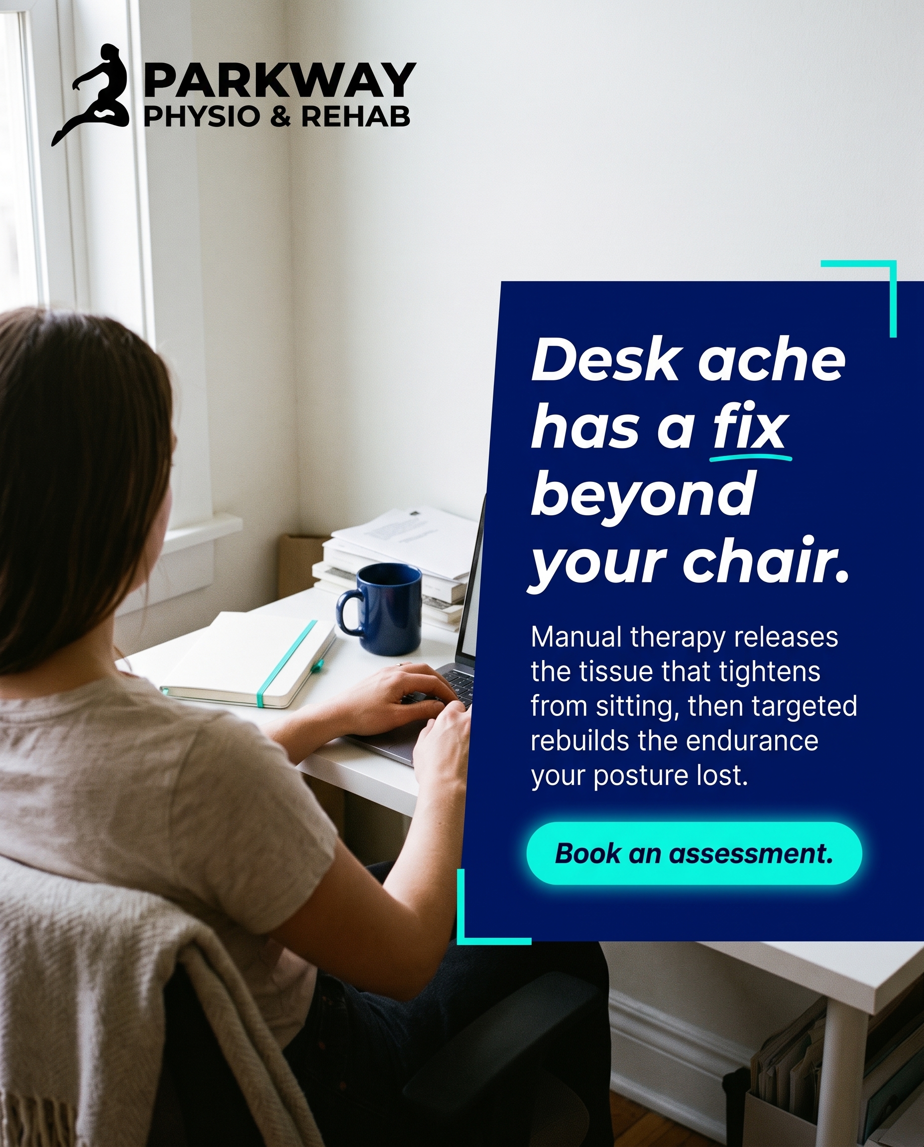
A real workspace photo paired with the message that desk-related ache responds to a clear plan: manual therapy to release tightened tissue plus targeted therapeutic exercise to rebuild postural endurance. The angle answers the solution-aware reader's question — here is what actually addresses sitting-related pain, not just how to sit better.
Content: A real workspace photo paired with the message that desk-related ache responds to a clear plan: manual therapy to release tightened tissue plus targeted therapeutic exercise to rebuild postural endurance. The angle answers the solution-aware reader's question — here is what actually addresses sitting-related pain, not just how to sit better.
Style: photography
2.
T5S2A4
graphic-design
Product-aware
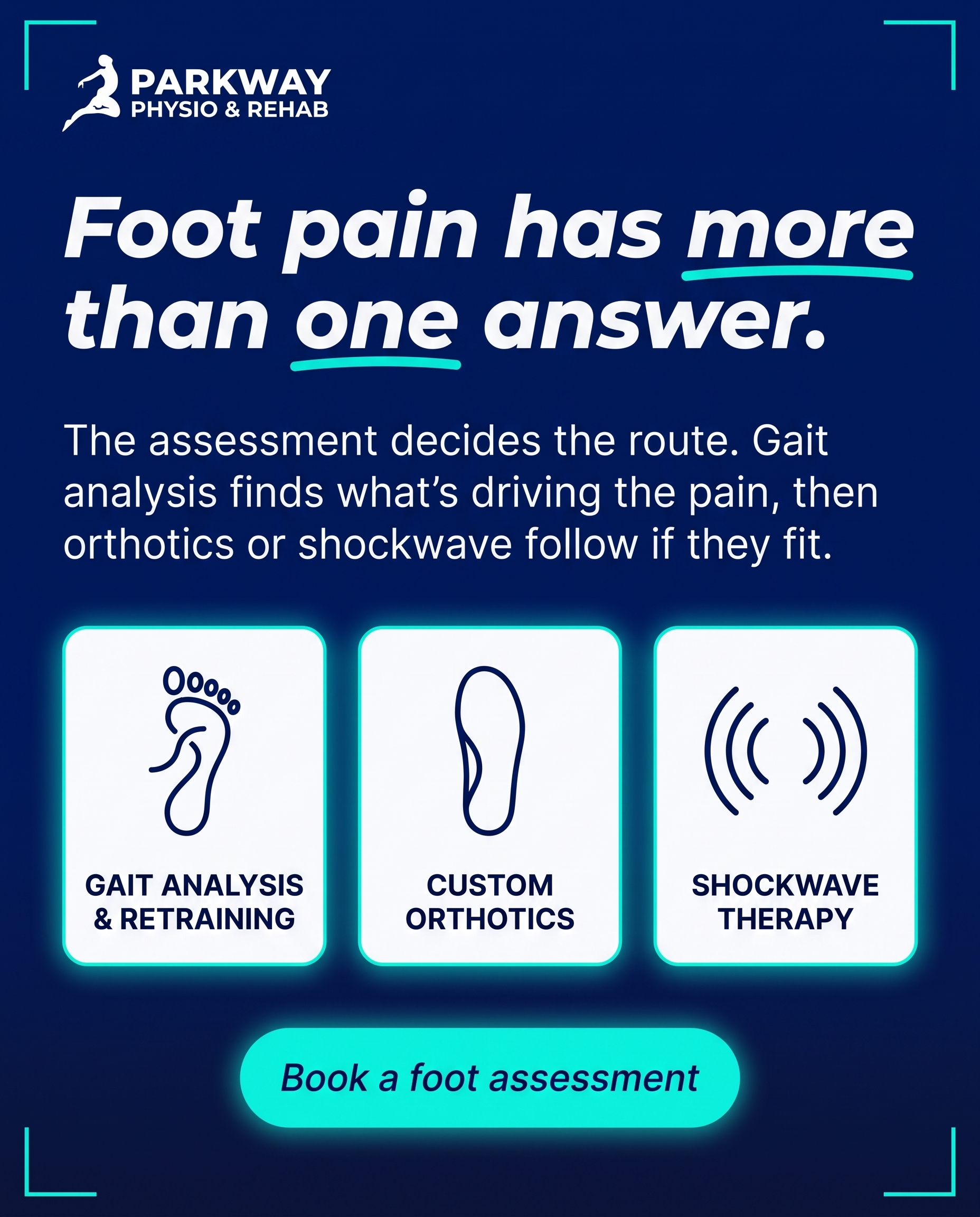
For the reader already weighing foot-pain options, this post positions Parkway's combined approach: gait analysis and retraining to find the root cause, custom orthotics where indicated, and shockwave therapy for stubborn cases. The why-you angle is that the assessment drives the option rather than defaulting to one fix.
Content: For the reader already weighing foot-pain options, this post positions Parkway's combined approach: gait analysis and retraining to find the root cause, custom orthotics where indicated, and shockwave therapy for stubborn cases. The why-you angle is that the assessment drives the option rather than defaulting to one fix.
Style: graphic-design
3.
T12S3A4
illustrative-3D
Product-aware
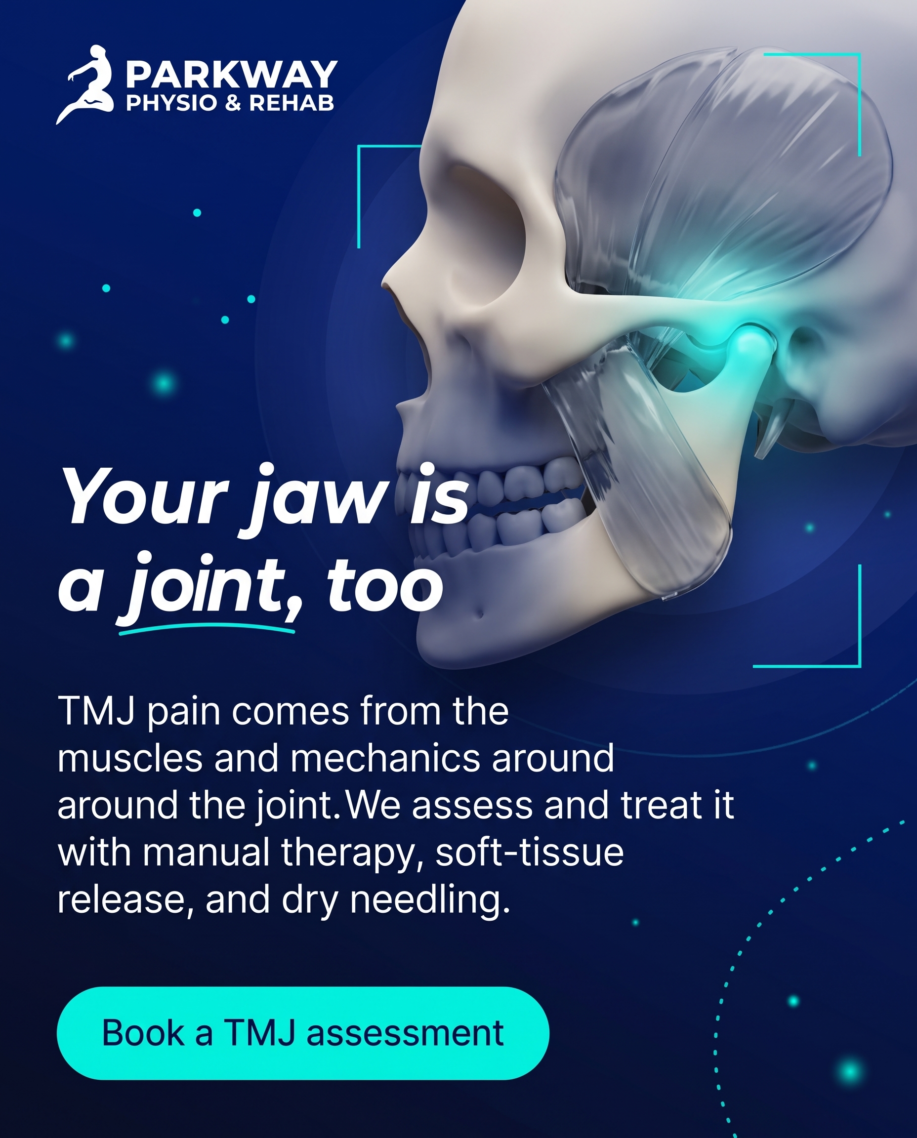
A clean 3D-illustrated jaw helps explain why TMJ discomfort is treatable through targeted manual therapy, soft-tissue release, and dry needling rather than living with it. The message to the product-aware reader: Parkway treats the jaw the same structured way it treats any joint, addressing the muscles and mechanics together.
Content: A clean 3D-illustrated jaw helps explain why TMJ discomfort is treatable through targeted manual therapy, soft-tissue release, and dry needling rather than living with it. The message to the product-aware reader: Parkway treats the jaw the same structured way it treats any joint, addressing the muscles and mechanics together.
Style: illustrative-3D
4.
T6S4A4
comparison-card
Product-aware
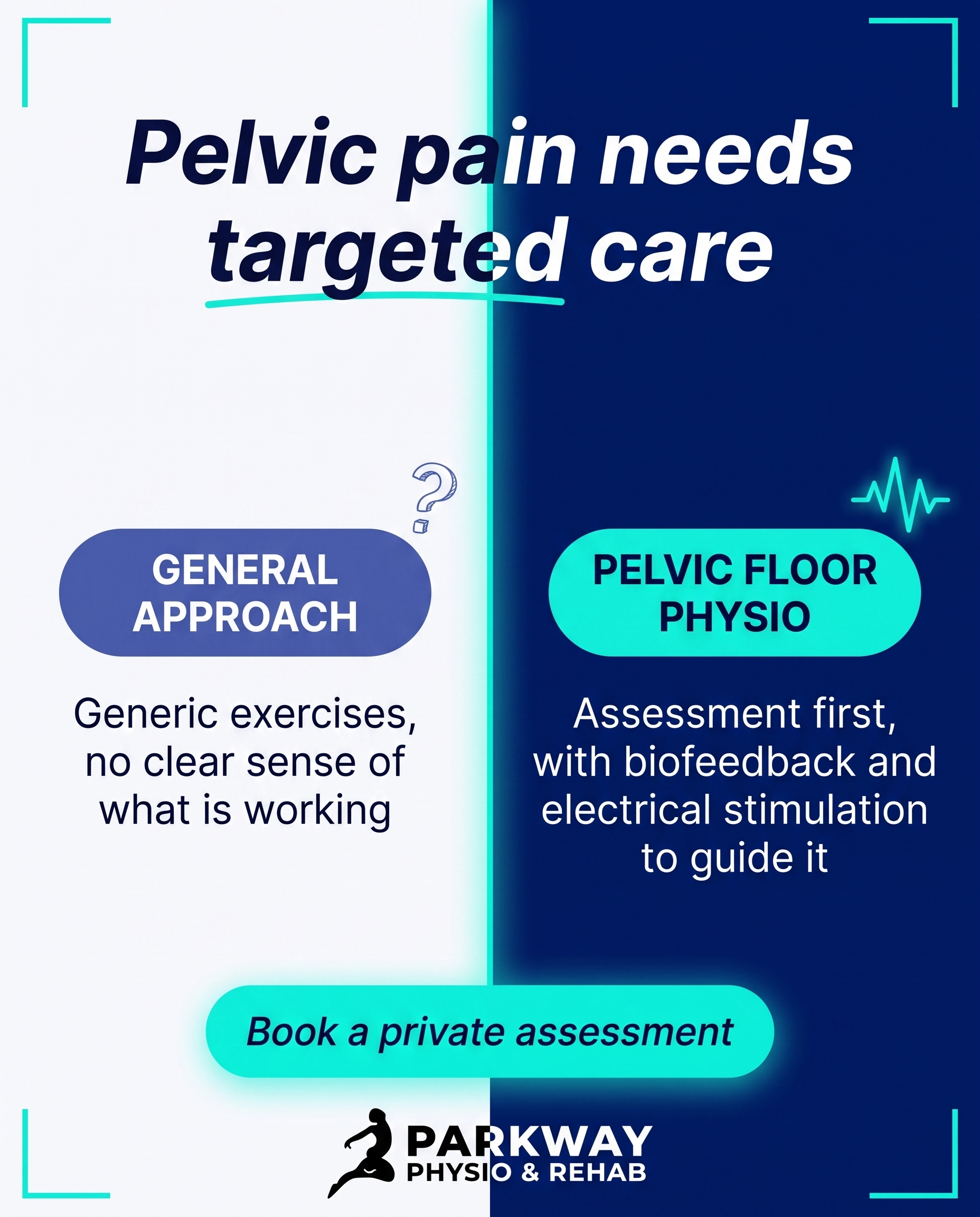
A comparison-card contrasting a general approach with dedicated pelvic floor physiotherapy — including biofeedback and electrical stimulation — so the reader sees why specialised care matters for pelvic pain. The why-you angle: this is a focused service, delivered privately and assessment-led, not an afterthought.
Content: A comparison-card contrasting a general approach with dedicated pelvic floor physiotherapy — including biofeedback and electrical stimulation — so the reader sees why specialised care matters for pelvic pain. The why-you angle: this is a focused service, delivered privately and assessment-led, not an afterthought.
Style: comparison-card
5.
L4S5A2
qa-card
Problem-aware
A Q&A card answering the quiet worry: 'It's only a small ache that comes and goes — is that actually a problem?' The message validates that recurring early symptoms are the body's signal, and that addressing them now is far easier than waiting until discomfort becomes chronic.
Content: A Q&A card answering the quiet worry: 'It's only a small ache that comes and goes — is that actually a problem?' The message validates that recurring early symptoms are the body's signal, and that addressing them now is far easier than waiting until discomfort becomes chronic.
Style: qa-card
6.
T1S6A4
myth-buster
Product-aware
A myth-buster dismantling 'rest is the best cure for back pain,' replacing it with the case for active, structured rehab — manual therapy paired with progressive therapeutic exercise. The why-you angle is that Parkway builds movement back in rather than telling you to wait it out.
Content: A myth-buster dismantling 'rest is the best cure for back pain,' replacing it with the case for active, structured rehab — manual therapy paired with progressive therapeutic exercise. The why-you angle is that Parkway builds movement back in rather than telling you to wait it out.
Style: myth-buster
7.
T3S7A1
list-tips
Unaware
A list of small, easy-to-miss habits that quietly raise injury risk during sport and activity — the kind of things active people never think twice about. The unaware angle simply plants the idea that these everyday patterns are worth caring about at all.
Content: A list of small, easy-to-miss habits that quietly raise injury risk during sport and activity — the kind of things active people never think twice about. The unaware angle simply plants the idea that these everyday patterns are worth caring about at all.
Style: list-tips
8.
T4S8A3
stat-card
Solution-aware
A stat-card using a recovery or prevalence figure for shoulder pain to frame the solution: manual therapy and joint mobilizations combined with targeted exercise restore range and strength. The message answers the solution-aware reader — here is what shoulder rehab actually involves.
Content: A stat-card using a recovery or prevalence figure for shoulder pain to frame the solution: manual therapy and joint mobilizations combined with targeted exercise restore range and strength. The message answers the solution-aware reader — here is what shoulder rehab actually involves.
Style: stat-card
9.
T9S9A1
checklist
Unaware
A checklist of subtle everyday moments — stairs, standing up, a slight stiffness after sitting — that people dismiss but that quietly involve the knees. The unaware angle is purely to make the reader notice these signals exist, before any talk of problems or fixes.
Content: A checklist of subtle everyday moments — stairs, standing up, a slight stiffness after sitting — that people dismiss but that quietly involve the knees. The unaware angle is purely to make the reader notice these signals exist, before any talk of problems or fixes.
Style: checklist
10.
C3S2
graphic-design
A graphic-design piece signalling that people recovering from surgery or a motor-vehicle/WSIB accident belong here, where structured rehab guides each stage of getting back to normal life. The message is recognition: if you're rebuilding after a major setback, this is a place that handles exactly that journey.
Content: A graphic-design piece signalling that people recovering from surgery or a motor-vehicle/WSIB accident belong here, where structured rehab guides each stage of getting back to normal life. The message is recognition: if you're rebuilding after a major setback, this is a place that handles exactly that journey.
Style: graphic-design
3
Developed Posts
10 posts · 2026-06-29T09:48
10 developed
▼
1.
L1S1A3
Rough Image Prompt
Elevated wellness-photography post for a physiotherapy clinic, showing a real home-office workspace moment that communicates desk-related back and neck ache responding to a clear treatment plan. Depict a person at a desk shown from behind or cropped at the shoulders, hands resting near a keyboard or pausing mid-task, torso angled forward in the familiar slump of prolonged sitting, no face visible at all. Natural light, calm and considered mood, lived-in real workspace feel rather than staged stock imagery. The image should read as honest daily life, not a clinical environment. Integrate brand colour cues naturally where they fit (a mug, notebook, fabric, or light tone). Include a text overlay using Poppins for the headline, Poppins for supporting text, and Poppins italic for the CTA. Headline text: "Desk ache has a fix beyond your chair." Supporting text: "Manual therapy releases the tissue that tightens from sitting, then targeted exercise rebuilds the endurance your posture lost." CTA text: "Book an assessment." Brand palette to draw from: deep navy #011A77, bright aqua #02F7E0, soft off-white #F4F6FB, near-black #06081C, white #FFFFFF, mid navy tint #5060B5. Logo placement varies by composition and is finalised downstream. Keep the scene focused on hands, torso, and the workspace only, no faces, no clinic setting, no treatment equipment.
Text Overlay
Caption
You've raised the monitor, swapped the chair, set a timer to stand up. The ache between your shoulders is still there by mid-afternoon.
Sitting all day shortens and tightens the tissue around your neck and upper back, and the deeper postural muscles stop holding you the way they should. Better desk setup helps, but it doesn't undo what's already tight or rebuild what's gone weak.
That's the part we work on. Manual therapy to release the tissue that's been locked up from hours at the screen, then a few specific exercises to bring back the endurance that keeps you upright without thinking about it.
If the ache always comes back by the end of the workday, an assessment is the place to start.
📞 (905) 239-0101
🌐 https://parkwayphysiorehab.ca
✉️ info@parkwayphysiorehab.ca
Where does sitting catch up with you first, neck or lower back?
Hashtags
#PhysiotherapyPickering #DeskPosture #BackPainRelief #PickeringOntario
2.
T5S2A4
Rough Image Prompt
A graphic-design post for a physiotherapy clinic communicating that foot pain treatment starts with assessment, not a default fix. Typographic-led composition with three small supporting icon accents representing the three treatment routes: a footprint or gait-path line motif (gait analysis and retraining), a generic insole shape on a clean neutral background (custom orthotics), and an abstract concentric-wave or pulse motif (shockwave therapy). The concept communicated: the assessment decides which route fits, the route is not chosen in advance. Components: headline, supporting explanatory line, three short route labels each with its icon accent, and a CTA. Brand colours to draw from: deep navy #011A77, bright aqua #02F7E0, soft off-white #F4F6FB, near-black #06081C, white #FFFFFF, mid navy #5060B5. Typography: Poppins for the headline, Poppins for supporting text, Poppins italic for the CTA. Headline text: "Foot pain has more than one answer." Supporting text: "The assessment decides the route. Gait analysis finds what's driving the pain, then orthotics or shockwave follow if they fit." Three route labels: "GAIT ANALYSIS & RETRAINING", "CUSTOM ORTHOTICS", "SHOCKWAVE THERAPY". CTA text: "Book a foot assessment". Icons should feel custom and clean, supporting the typography rather than competing with it. Logo placement varies by composition and is finalised downstream. Keep the treatment accents illustrative and isolated on neutral or gradient brand-colour fields, no clinic interior, no treatment scene.
Text Overlay
Caption
Foot pain rarely has one cause, so it shouldn't have one default fix. Plenty of clinics reach for orthotics or shockwave first and hope it lands.
We start with gait analysis. How you load through the foot, where the pressure goes, what your ankle and knee are doing above it. That tells us what's actually driving the ache. From there, custom orthotics make sense for some feet. Shockwave therapy works well for the stubborn cases that haven't settled. Others just need retraining and a load plan.
The point is the assessment picks the route, not the other way round. If your feet have been sore for weeks and you've been putting it off, that's worth looking at properly.
📞 (905) 239-0101
🌐 https://parkwayphysiorehab.ca
✉️ info@parkwayphysiorehab.ca
What does your foot pain feel like first thing in the morning?
Hashtags
#FootPain #Physiotherapy #PickeringOntario #GaitAnalysis #ShockwaveTherapy
3.
T12S3A4
Rough Image Prompt
An illustrative-3D anatomical render of the human jaw and temporomandibular joint, shown in clean editorial clinical style. The subject is the lower jawbone connecting to the skull at the TMJ, with the surrounding masseter and temporalis muscle structure visible in a translucent, glass-like rendering so the joint mechanics and soft tissue read as one connected system. Apply a soft glow accent on the TMJ hinge area to draw the eye to where the discomfort originates. The concept communicated: the jaw is a joint with muscles and mechanics, and it can be assessed and treated like any other joint. No face, no skin, no full head likeness, just the anatomical structure isolated on a clean neutral or gradient background drawn from the brand palette. Brand colours available: #011A77 deep navy, #02F7E0 bright aqua/cyan, #F4F6FB soft off-white, #06081C near-black, #FFFFFF white, #5060B5 mid navy tint. Use aqua as the highlight glow on the active joint area. Typography in Poppins for all text elements. Text to render: headline 'Your jaw is a joint, too', supporting line 'TMJ pain comes from the muscles and mechanics around the joint. We assess and treat it the same structured way we treat any other joint.', CTA 'Book a TMJ assessment'. Include the practice logo, placement finalised downstream. Keep the render anatomically accurate with clinical polish.
Text Overlay
Caption
Jaw pain, clicking, tightness when you chew or talk. Most people put up with it because they assume nothing can be done. The jaw is a joint like any other. It has muscles around it, it has mechanics, and when those get tight or move poorly you feel it.
We treat the TMJ the same structured way we treat a knee or a shoulder. That means looking at the soft tissue and the joint together, not just one or the other. Manual therapy and soft-tissue release ease the tight muscles. Dry needling settles the deeper trigger points that keep the area locked up.
If you've been living with it, you don't have to.
📞 (905) 239-0101
🌐 https://parkwayphysiorehab.ca
✉️ info@parkwayphysiorehab.ca
Have you been told to just wait it out? Tell us below.
Hashtags
#TMJrelief #PickeringPhysio #JawPain #Physiotherapy
4.
T6S4A4
Rough Image Prompt
A comparison-card style graphic contrasting two approaches to pelvic pain care: a generalised, do-it-yourself approach versus dedicated pelvic floor physiotherapy. The post is typographic-led with two distinct content sides given equal visual weight. Left concept labelled 'GENERAL APPROACH', right concept labelled 'PELVIC FLOOR PHYSIO'. Supporting text under each label communicates the difference: the general side describes guesswork and unguided effort, the dedicated side describes assessment-led care with biofeedback and electrical stimulation. Use small supporting accent elements only: a simple line-icon for the general side (a generic question mark or scattered abstract shape) and a clean line-icon for the dedicated side (a subtle pelvic anatomical line illustration or a biofeedback signal wave). Keep accents small and supporting, not full-frame. Brand colour palette to draw from: #011A77 deep navy, #02F7E0 bright aqua, #F4F6FB soft off-white, #06081C near-black, #FFFFFF white, #5060B5 mid navy tint. Typography: Poppins for headline and labels, Poppins for supporting text, Poppins italic for the CTA. Text to render exactly: label 'GENERAL APPROACH', label 'PELVIC FLOOR PHYSIO', supporting 'Generic exercises, no clear sense of what is working', supporting 'Assessment first, with biofeedback and electrical stimulation to guide it', headline 'Pelvic pain needs targeted care', CTA 'Book a private assessment'. Logo placement varies by composition and is finalised downstream. Clean, intentional editorial design with strong typographic contrast between the two sides.
Text Overlay
Caption
Pelvic floor problems rarely respond well to guesswork. The muscles involved sit deep, and you often cannot tell from the outside whether you are working them correctly or making things tighter.
That is why our pelvic floor physiotherapy starts with a proper assessment. From there we can use biofeedback and electrical stimulation to show what those muscles are actually doing, so the exercises you do at home are the right ones.
It is a focused service, delivered privately, with one practitioner you can talk to. Pelvic pain is common but it is not something you have to manage alone or figure out by trial and error.
📞 (905) 239-0101
🌐 https://parkwayphysiorehab.ca
✉️ info@parkwayphysiorehab.ca
Not sure if pelvic floor physio is right for you? Send us a message and ask.
Hashtags
#PelvicFloorPhysio #PelvicHealth #PickeringPhysio #WomensHealthPhysio
5.
L4S5A2
Rough Image Prompt
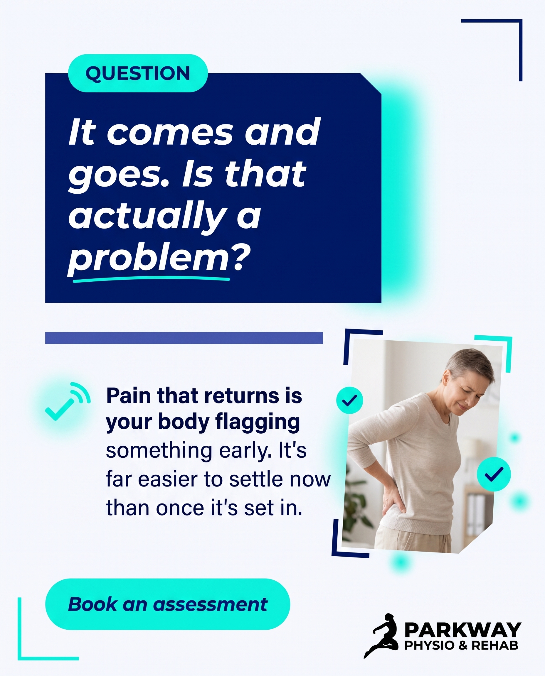
A clean, typographic question-and-answer card for a physiotherapy clinic addressing whether a small, recurring ache is worth taking seriously. The post communicates that intermittent early discomfort is a genuine signal from the body, and that acting early is easier than treating something that has become chronic. Typographic-led composition with a small supporting anatomical accent: a subtle, editorial 3D illustration of a spine or shoulder joint with a soft glow marker at one point to suggest an early warning signal, kept small and supporting rather than full-frame. Question and answer hierarchy is the focus. Brand palette to draw from: deep navy #011A77, bright aqua #02F7E0, soft off-white #F4F6FB, near-black #06081C, white #FFFFFF, mid navy tint #5060B5. Typography: Poppins for the question, Poppins for the answer text, Poppins italic for the CTA. Text to render: question 'It comes and goes. Is that actually a problem?', answer 'Pain that returns is your body flagging something early. It's far easier to settle now than once it's set in.', CTA 'Book an assessment'. Include a small checkmark or signal-style accent icon in aqua near the answer. Logo placement varies by composition and is finalised downstream. Keep the design intentional, calm, and confident, with clean contrast between the question and the answer.
Text Overlay
Caption
A small ache that shows up, fades, then comes back a week later is easy to talk yourself out of. Most people wait for it to get worse before they do anything.
The thing is, recurring discomfort usually means something is being overloaded or moving in a way it shouldn't. Left alone, that pattern tends to dig in. What was a quick fix turns into months of compensation.
An early assessment is short. We look at how the area is moving, find what's driving the ache, and give you something practical to work on. Often that's all it takes.
If an ache keeps returning, it's worth a look.
📞 (905) 239-0101
🌐 https://parkwayphysiorehab.ca
✉️ info@parkwayphysiorehab.ca
Hashtags
#Physiotherapy #PickeringOntario #EarlyIntervention #PainRelief #MoveWell
6.
T1S6A4
Rough Image Prompt
A myth-buster graphic post for a physiotherapy and rehab clinic dismantling the belief that resting is the best cure for back pain. Typographic-led design with bold contrast between a myth statement and a truth statement. Components: a 'MYTH' label, a 'TRUTH' label, the myth and truth text strings, and a CTA. Include a small supporting accent element: a clean, editorial-style anatomical illustration of the lower spine and surrounding muscle, rendered in a translucent glass-like style with a subtle aqua highlight along the lumbar region to suggest movement returning rather than pain. Keep the accent small and supporting so the typography carries the post. Brand colours to draw from: deep navy #011A77, bright aqua/cyan #02F7E0, soft off-white #F4F6FB, near-black #06081C, white #FFFFFF, mid navy tint #5060B5. Typography: Poppins for the MYTH and TRUTH labels and headline statements, Poppins for supporting text, Poppins italic for the CTA. Text to render: 'MYTH', 'TRUTH', 'Rest is the best cure for back pain.', 'Most backs recover faster with structured movement, not stillness.', 'Active rehab beats waiting it out.'. Logo placement varies by composition and is finalised downstream. Strong, clean typographic contrast, intentional and modern, on a brand-colour field with the anatomical accent integrated as a supporting detail.
Text Overlay
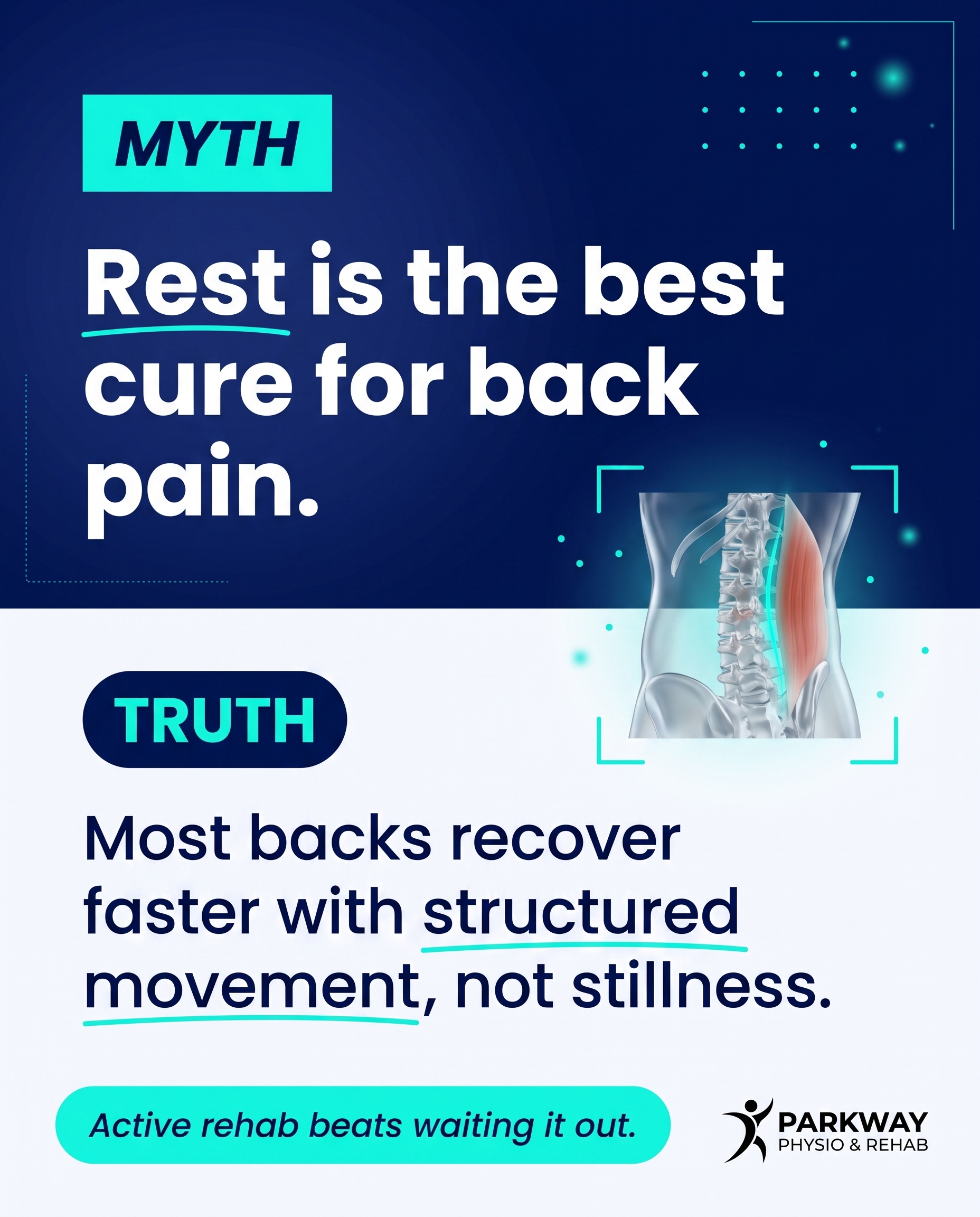
Caption
Lying flat and waiting it out feels like the safe option when your back is sore. For most cases it slows things down. Prolonged rest lets the surrounding muscles decondition, and the area gets stiffer, not stronger.
We take a different route at Parkway. Manual therapy to ease the joint and soft tissue, then progressive therapeutic exercise to load the area back up in stages. We build movement back in rather than telling you to wait.
There's a difference between protecting a back and letting it seize up. The goal is to get you moving with confidence, at a pace your body can handle.
Not sure where to start with your back? Send us a message and we'll talk you through it.
📞 (905) 239-0101
🌐 https://parkwayphysiorehab.ca
✉️ info@parkwayphysiorehab.ca
Hashtags
#BackPainRelief #PhysioPickering #ActiveRehab #PickeringOntario
7.
T3S7A1
Rough Image Prompt
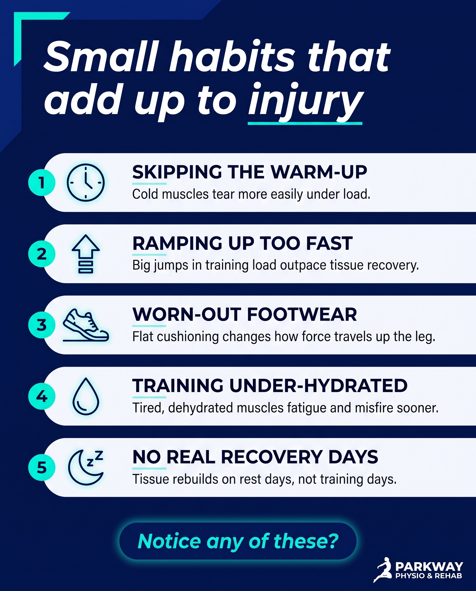
A typographic-led list-tips post for a physiotherapy clinic in Pickering, Ontario. Subject and intent: surface the small, easy-to-miss habits that quietly raise injury risk during sport and activity, the kind of patterns active people never question. Typographic-led design with five custom illustrated icons, one per habit, each icon simple and line-based relating to its tip (a clock for skipped warm-ups, a stacking arrow for jumping training load, a worn shoe for old footwear, a water drop for under-hydrating, a sleep crescent for poor recovery). Components: a header line introducing the list, five short item headings each with one short supporting line, and a soft closing CTA. Use only these brand colours: deep navy #011A77, bright aqua #02F7E0, soft off-white #F4F6FB, near-black #06081C, white #FFFFFF, mid navy tint #5060B5. Typography: Poppins for the header and item headings, Poppins for supporting lines, Poppins italic for the CTA. Text content to render: header "Small habits that add up to injury", item one "SKIPPING THE WARM-UP" with "Cold muscles tear more easily under load.", item two "RAMPING UP TOO FAST" with "Big jumps in training load outpace tissue recovery.", item three "WORN-OUT FOOTWEAR" with "Flat cushioning changes how force travels up the leg.", item four "TRAINING UNDER-HYDRATED" with "Tired, dehydrated muscles fatigue and misfire sooner.", item five "NO REAL RECOVERY DAYS" with "Tissue rebuilds on rest days, not training days.", CTA "Notice any of these?". Keep the design clean and intentional, accent the icons and key words in aqua against navy or off-white surfaces. Logo placement varies by composition and is finalised downstream. Show a polished, modern editorial layout with clear hierarchy and consistent icon treatment across all five items.
Text Overlay
Caption
Most sports injuries don't start with one bad moment. They build from small things you stop noticing. The warm-up you skip when you're short on time. The week you added an extra two runs because you felt good. Shoes you've had longer than you can remember. None of it feels risky on its own. Then a calf goes, or a knee starts complaining, and it seems to come out of nowhere. It rarely does. The body keeps score of the load you put through it, and recovery is part of training, not a break from it. If something has started to ache or feel tight, that's worth a look before it settles in.
📞 (905) 239-0101
🌐 https://parkwayphysiorehab.ca
✉️ info@parkwayphysiorehab.ca
Which one of these is you right now?
Hashtags
#SportsInjury #Physiotherapy #PickeringOntario #InjuryPrevention #ActiveLife
8.
T4S8A3
Rough Image Prompt
A stat-card communicating how common shoulder pain is and what real rehab involves. The single dominant element is the statistic, which anchors the composition. Below it sits one short context line and a brief explanation that names the actual approach: manual therapy with joint mobilizations plus targeted strengthening to restore range and rebuild strength. Style: typographic-led graphic design with a small supporting accent. Supporting accent element: a clean anatomical illustration of a shoulder joint (glenohumeral joint, rotator cuff structure) rendered in a translucent, glass-like clinical style, small and supporting, not full-frame. Use only these brand colours, drawn from as the design stage sees fit: #011A77 deep navy, #02F7E0 bright aqua, #F4F6FB soft off-white, #06081C near-black, #FFFFFF white, #5060B5 mid navy tint. Typography: Poppins for the statistic, Poppins for supporting text, Poppins italic for the CTA. Text to render: "70% of shoulder pain improves with the right rehab", "It is not always surgery or rest", "Manual therapy and joint mobilizations restore movement. Targeted exercise rebuilds the strength around the joint.", "Book a shoulder assessment". Logo placement varies by composition and is finalised downstream. Keep the statistic visually dominant and the anatomical accent clearly subordinate. Editorial, clean, intentional design with brand colour cues integrated naturally.
Text Overlay
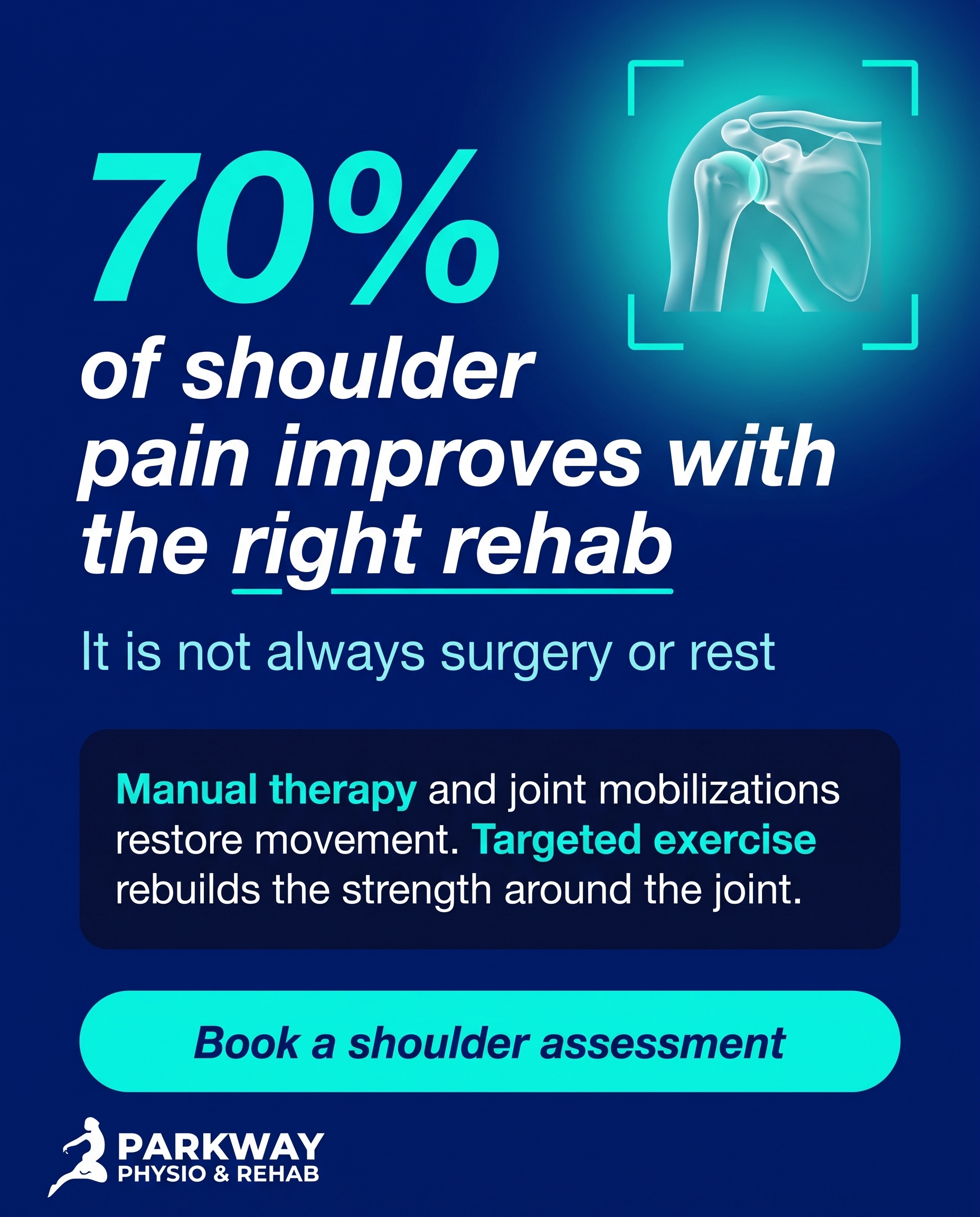
Caption
Shoulder pain rarely needs surgery to get better. Most cases respond well when the joint gets moving again and the muscles around it get stronger.
That is what shoulder rehab actually looks like. Manual therapy and joint mobilizations free up the stiff movement first. Then targeted exercise builds the rotator cuff and surrounding strength so the joint holds up under load. Reaching overhead, sleeping on that side, lifting without that catch, this is the work that gets you back there.
If your shoulder has been sore for weeks and you have been waiting it out, that is usually when it gets harder to shift. A proper assessment tells us what is actually limiting you.
📞 (905) 239-0101
🌐 https://parkwayphysiorehab.ca
✉️ info@parkwayphysiorehab.ca
Where does your shoulder feel it most?
Hashtags
#ShoulderPain #Physiotherapy #PickeringOntario #ShoulderRehab #ManualTherapy
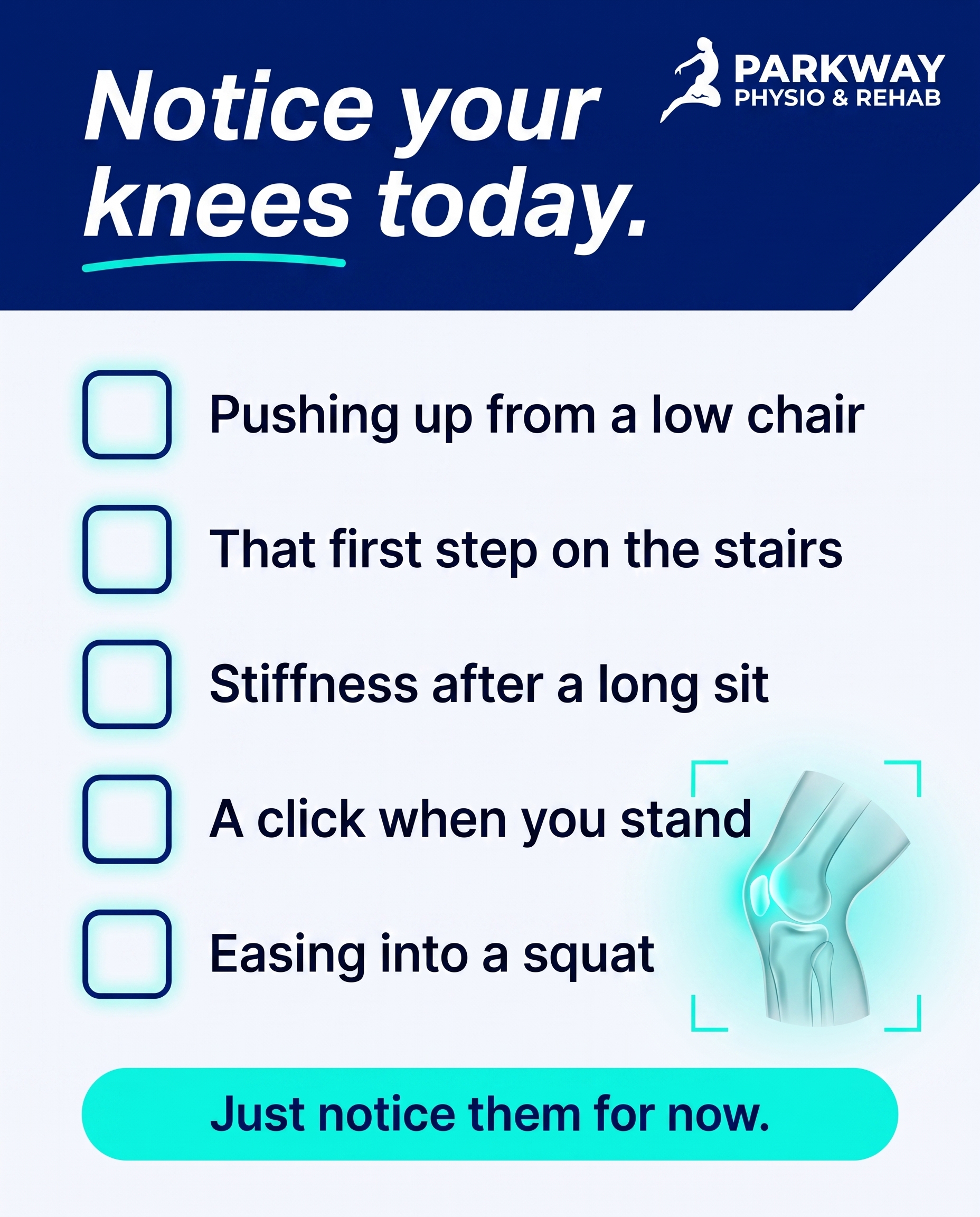
9.
T9S9A1
Rough Image Prompt
A checklist-style typographic post on the theme of everyday knee signals people tend to ignore. Visual register: typographic-led design with checkbox graphics and a small supporting anatomical accent. Components: a framing line at the top, four to five short checklist items each with a checkbox graphic, a soft closing CTA, and a small clean anatomical illustration of a knee joint (side or front view, translucent glass-like rendering with subtle aqua highlight to draw the eye) used as a supporting accent rather than a full-frame background. Keep the composition clean and considered, not cluttered. Brand colour palette to draw from: #011A77 deep navy, #02F7E0 bright aqua/cyan, #F4F6FB soft off-white, #06081C near-black, #FFFFFF white, #5060B5 mid navy tint. Typography: Poppins for the framing line and CTA, Poppins for the checklist item text. Text content to render: framing line 'Notice your knees today.' Checklist items: 'Pushing up from a low chair', 'That first step on the stairs', 'Stiffness after a long sit', 'A click when you stand', 'Easing into a squat'. CTA: 'Just notice them for now.' Checkbox graphics should be clean line or filled squares in brand colours. Logo may be included; placement is finalised downstream. Show only typographic elements, checkbox graphics, and the small knee illustration on a clean brand-coloured surface.
Text Overlay
Caption
Your knees do a lot of quiet work. Most of it you never think about. Standing up from the couch, the first stair in the morning, settling back down after a long sit at your desk. These moments come and go without any real thought. That's the point of this post, not to worry you, just to get you noticing. The knee carries your full body weight through every one of those movements. When something starts to feel slightly different, a small click, a bit of stiffness that loosens after a few steps, that's information. Notice it. You don't need to do anything else right now. Awareness comes first.
📞 (905) 239-0101
🌐 https://parkwayphysiorehab.ca
✉️ info@parkwayphysiorehab.ca
Which of these do you catch yourself doing?
Hashtags
#KneeHealth #Physiotherapy #PickeringOntario #MoveWell
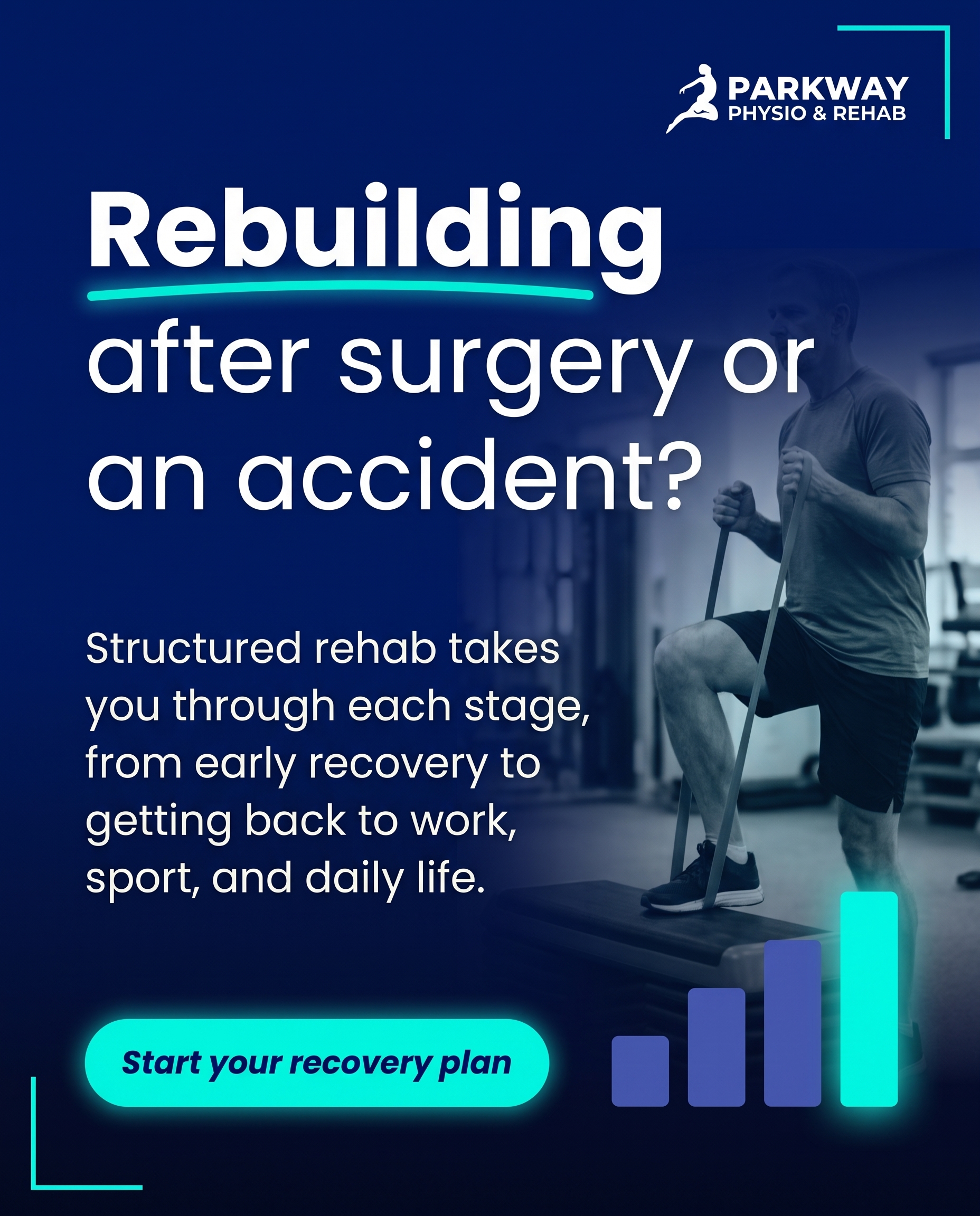
10.
C3S2
Rough Image Prompt
A typographic-led graphic-design post for a physiotherapy and rehab clinic, communicating that people recovering from surgery or a motor-vehicle / WSIB accident belong here, with structured rehab guiding each stage of returning to normal life. The piece should feel reassuring and grounded, signalling recognition and belonging rather than urgency. Typographic in character. Headline carries the emotional weight; supporting line states what structured rehab actually involves; a clear CTA. Use Poppins for the headline, Poppins for supporting text, and Poppins italic for the CTA. Render this text exactly: headline 'Rebuilding after surgery or an accident?', supporting text 'Structured rehab takes you through each stage, from early recovery to getting back to work, sport, and daily life.', CTA 'Start your recovery plan'. Accent elements may include a subtle stepped or staged motif (small abstract progress markers or ascending shapes) and a clean geometric accent, supporting and not full-frame. Brand colours to draw from: deep navy #011A77, bright aqua #02F7E0, soft off-white #F4F6FB, near-black #06081C, white #FFFFFF, mid navy tint #5060B5. Keep the treatment polished and editorial, no clinic interiors, no treatment tables, no people, no faces. Logo placement varies by composition and is finalised downstream.
Text Overlay
Caption
Recovering from surgery or a motor-vehicle accident is rarely a straight line. There are stages, and each one needs the right work at the right time.
Our pre and post-surgical rehab and MVA/WSIB recovery programs are built around exactly that. Early on, the focus is protecting the area and rebuilding basic movement. Later, it shifts to strength, load, and getting you back to the things that make up your day, whether that's lifting at work, training, or just moving without thinking about it.
If you're rebuilding after a major setback, this is a place that handles that journey. We work with post-surgical and post-accident patients in Pickering every week.
Not sure where to begin? Reach out and we'll map out a plan.
📞 (905) 239-0101
🌐 https://parkwayphysiorehab.ca
✉️ info@parkwayphysiorehab.ca
Hashtags
#PhysiotherapyPickering #PostSurgicalRehab #WSIBRecovery #AccidentRecovery #RehabJourney
4
Refined Image Prompts
10 prompts · 2026-06-29T09:56
10 prompts refined
▼
1.
L1S1A3
Refined Image Prompt
A real lived-in home-office workspace captured in elevated wellness photography, showing a person seated at a desk photographed from behind and cropped at the shoulders so no face is visible at all. The torso is angled slightly forward in the familiar slump of prolonged sitting, hands resting near a laptop keyboard as if pausing mid-task. The scene reads as honest daily life: a slightly cluttered desk with a notebook, a ceramic mug, a small stack of papers, and a soft fabric throw over the chair back. Natural daylight enters from a window on the left, casting a calm, considered, softly diffused glow across the workspace with gentle shadows. The mood is warm and authentic, not staged or clinical. Brand colour cues appear naturally and subtly: the mug in deep navy #011A77, a notebook cover with a thin bright aqua #02F7E0 band, and a soft off-white #F4F6FB wall tone behind. The overall register is bold high-contrast sports-physio energy softened into a real-world moment, with controlled aqua pops drawing the eye.
Composition uses the lower-left third of the workspace for the seated figure, leaving open negative space in the upper-right region of the frame for the text treatment. Place a navy text panel anchored along the right side, a sharp-cornered rectangular block in deep navy #011A77 with 0 to 2px corners, set at a slight diagonal lean for energy, overlapping the edge of the workspace. Inside this panel, set the headline "Desk ache has a fix beyond your chair." in Helvetica oblique, in white #FFFFFF, large and dominant, left-aligned across two to three lines. Underline the word "fix" with a thin bright aqua #02F7E0 keyword underline.
Below the headline, set the supporting text "Manual therapy releases the tissue that tightens from sitting, then targeted exercise rebuilds the endurance your posture lost." in Helvetica regular, in white #FFFFFF, smaller and left-aligned, with comfortable line spacing for readability.
Beneath the supporting text, place the CTA "Book an assessment." in Helvetica oblique, set inside a fully-rounded pill button filled with bright aqua #02F7E0, with the text in near-black #06081C, pill corners fully rounded. Add a soft aqua glow highlight around the pill to lift it off the navy panel.
Apply thin bright aqua #02F7E0 corner brackets framing the upper-right and lower-left outer corners of the navy text panel to add structure and brand energy.
Place the attached logo in the top-left corner of the composition over the lighter workspace area, sized small and unobtrusive at roughly one-eighth of the frame width. Preserve the logo exactly as supplied: do not redraw, recolour, restyle, distort, or regenerate it; keep its original proportions, colours, and lettering fully intact and legible.
Constraints: keep the scene focused on hands, torso, and the workspace only. Show no faces and no visible facial features. Keep the setting as a home office, not a clinic. Include no treatment equipment, no medical devices, and no exercise gear. Maintain natural daylight and a calm, authentic, lived-in feel throughout. Ensure all text is sharp, correctly spelled, and clearly legible against its background.
2.
T5S2A4
Refined Image Prompt
A typographic-led graphic design composition for a physiotherapy clinic, communicating that foot pain treatment begins with assessment rather than a default fix. No clinic interior, no treatment scene, no people. The layout is bold, high-contrast sports-physio in register, with energetic aqua pops drawing the eye through an otherwise disciplined navy and off-white structure.
Surface and background: a deep navy field in #011A77 covering the full canvas, with a subtle darker gradient toward the lower edge using #08123F so the composition feels grounded and weighted at the base. Across the upper third, the headline dominates as the hero element.
Headline: set in Helvetica oblique, heavy and confident, reversed in #FFFFFF, reading "Foot pain has more than one answer." Place it top-aligned with generous breathing room, occupying the upper third. Set the phrase "more than one" with an aqua keyword underline in #02F7E0, a thick clean stroke sitting tight beneath those words, drawing the eye to the core idea that there is no single fix.
Supporting text: set in Helvetica, regular and clean, in a soft off-white #F7F8FB at a calm readable size, sitting just below the headline with comfortable line spacing. Reading "The assessment decides the route. Gait analysis finds what's driving the pain, then orthotics or shockwave follow if they fit." Keep it to two or three tidy lines, left-aligned beneath the headline, never competing with it.
Three route blocks: arranged as a horizontal row of three equal cards across the middle band of the composition, each card a rounded rectangle with 10px corners, surfaced in #FFFFFF with a faint aqua glow halo of #02F7E0 around each card to lift them off the navy field. Inside each card, a single clean custom line-icon accent rendered in #011A77 sits centred in the upper portion, with its short label below.
Card one icon: a footprint with a flowing gait-path line motif, a single continuous line tracing a step path. Label below in Helvetica, all caps, #08123F, reading "GAIT ANALYSIS & RETRAINING".
Card two icon: a clean abstract insole shape, simple and isolated. Label below in Helvetica, all caps, #08123F, reading "CUSTOM ORTHOTICS".
Card three icon: an abstract concentric-wave pulse motif of three to four expanding arcs. Label below in Helvetica, all caps, #08123F, reading "SHOCKWAVE THERAPY".
Position the three cards as parallel equals to reinforce that the assessment decides which route fits, none preselected. Keep icons custom, minimal, and clean, supporting the typography rather than competing with it.
CTA: a fully-rounded pill button centred below the three cards, filled solid in #02F7E0, with the text set in Helvetica italic in #011A77 reading "Book a foot assessment". Give the pill a soft aqua glow to make it the brightest call-to-action moment in the lower composition.
Logo: place the provided logo file small and clean in the top-left corner over the navy field, reproduced in its white or reversed form so it reads clearly against #011A77. Preserve the logo exactly as supplied, do not redraw, recolour, distort, or reletter it, maintain its original proportions and spacing.
Optional accent: thin aqua corner brackets in #02F7E0 framing the outer corners of the canvas to add structured energy without clutter.
Composition: balanced vertical flow, headline as hero at top, supporting line beneath, three equal route cards across the middle, CTA anchored toward the lower third, logo top-left. Lighting is flat and graphic with the only luminosity coming from the aqua glow highlights.
Constraints: keep all treatment accents illustrative and isolated on the navy and off-white brand fields. No clinic interior, no treatment scene, no people, no photographic imagery. Keep typography crisp and legible at all sizes. Maintain consistent 10px rounded corners on all cards and fully-rounded pill on the CTA. Use only the specified hex colours.
3.
T12S3A4
Refined Image Prompt
A clean editorial clinical 3D anatomical render of the human jaw and temporomandibular joint as the central subject. Show the lower jawbone connecting to the skull at the TMJ hinge, with the surrounding masseter and temporalis muscle structure rendered in a translucent, glass-like material so the joint mechanics and soft tissue read as one connected, layered system. The bone surfaces carry a smooth matte clinical finish in soft off-white and pale navy tints, while the muscle structures are semi-transparent with subtle internal depth. No face, no skin, no full head likeness, only the isolated anatomical structure floating in the composition. Render with clinical polish, soft studio lighting from the upper left, gentle ambient shadows beneath the structure, and crisp anatomical accuracy.
Set the structure against a smooth vertical gradient background moving from #011A77 deep navy at the top to #08123F near-black at the lower edge, giving the composition a bold high-contrast sports-physio mood. Position the anatomical render in the upper-right two-thirds of the frame, angled slightly so the TMJ hinge is clearly visible and reads as the focal point.
Apply a focused aqua glow highlight in #02F7E0 radiating softly from the TMJ hinge area where the jaw meets the skull, drawing the eye directly to where the discomfort originates. Let the glow bloom outward gently with a soft falloff, with faint #7BEFE6 secondary diffusion at the edges of the glow. This is the energetic aqua pop anchoring the composition.
Add two thin aqua corner brackets in #02F7E0 framing the upper-left and lower-right of the anatomical structure as a secondary accent, set at sharp angles.
Text layout occupies the left side and lower portion of the frame, all reversed white for clarity against the navy.
Headline: render "Your jaw is a joint, too" in Helvetica oblique italic, large and heavy, in #FFFFFF, positioned in the upper-left area, stacked across two lines with "joint, too" on the lower line. Place a thin aqua keyword underline in #02F7E0 beneath the word "joint" to emphasise the core idea.
Supporting text: render "TMJ pain comes from the muscles and mechanics around the joint. We assess and treat it with manual therapy, soft-tissue release, and dry needling." in Helvetica regular, in #FFFFFF at a comfortable readable size, set in a tidy left-aligned block below the headline with generous line spacing.
CTA: render "Book a TMJ assessment" in Helvetica medium in #08123F, centred inside a fully-rounded pill button filled with #02F7E0, positioned in the lower-left of the frame. The pill has fully rounded ends with no sharp corners.
Place the attached practice logo in the top-left corner of the composition at a modest, balanced scale. Reproduce the logo exactly as supplied, preserving its original colours, proportions, lettering, and spacing without recolouring, distorting, or redrawing any part of it.
Maintain clean negative space around all text so the layout breathes. Keep all rectangular surfaces consistent with the mixed corner system: sharp angled brackets, fully-rounded pills for buttons. Ensure the anatomical render stays photoreal-clinical and accurate, with the aqua glow as the single brightest point in the frame.
Constraints: keep the structure anatomically correct, show no human face, no skin texture, no full head likeness. Avoid clutter, keep the colour palette limited to the brand hex values listed, and keep text crisp, legible, and correctly spelled.
4.
T6S4A4
Refined Image Prompt
A split-screen comparison card built on a vertical divide, the two halves given equal width and equal visual weight to dramatise the contrast between guesswork and dedicated care. The left half is a soft off-white surface in #F7F8FB, the right half is a deep navy surface in #011A77, creating an immediate light-versus-dark tension that reads instantly at thumbnail scale.
At the very top of the composition, spanning the full width across both halves, a centred headline reads "Pelvic pain needs targeted care" in Helvetica oblique, large and commanding. The word "targeted" carries a thin aqua underline in #02F7E0 to draw the eye to the core message. On the off-white left half the headline text sits in #08123F; where the headline crosses onto the navy right half the text reverses to #FFFFFF so it stays legible across the divide.
The left half is labelled with a fully-rounded pill near the upper-middle area, the pill filled in #5060B5-toned mid navy with the text "GENERAL APPROACH" inside it in Helvetica, set in #FFFFFF. Below the pill, the supporting line "Generic exercises, no clear sense of what is working" is set in Helvetica in #08123F, left-aligned within the half, generous line spacing, comfortable margins. A small, light, supporting line-icon of a single understated question mark inside a loose hand-drawn circle sits quietly above or beside the label area, rendered as a thin #5060B5 outline, kept small and unobtrusive, never filling the frame.
The right half is labelled with a matching fully-rounded pill in the same upper-middle vertical position, the pill filled in #02F7E0 with the text "PELVIC FLOOR PHYSIO" inside it in Helvetica, set in #011A77 for high contrast against the bright aqua. Below it, the supporting line "Assessment first, with biofeedback and electrical stimulation to guide it" is set in Helvetica in #FFFFFF, left-aligned within the half, matching the left side's line spacing and rhythm so the two columns balance. A clean line-icon of a smooth biofeedback signal wave sits quietly near the right label, drawn as a thin glowing #02F7E0 stroke with a soft aqua glow, small and supporting, suggesting measurement and guided care.
The vertical divider between the two halves is a crisp clean edge; a subtle aqua glow in #02F7E0 traces the seam to energise the split. Thin aqua corner brackets in #02F7E0 frame the outer corners of the overall composition to anchor the editorial layout.
Near the bottom, centred and spanning the divide, a fully-rounded CTA pill filled in #02F7E0 holds the text "Book a private assessment" in Helvetica italic, set in #011A77, with a soft aqua glow beneath it lifting it off the surface.
The supplied logo is placed centred at the very bottom of the composition, beneath the CTA, sized small and balanced. Render the logo exactly as supplied with no recolouring, no distortion, no added effects, preserving its original proportions and detail.
Apply corner treatment consistently: the label pills and the CTA are fully rounded, the corner brackets and the central divider are sharp and angular, reflecting the mixed navy-block and pill system. Overall register is bold, high-contrast and editorial with energetic aqua pops against the navy and off-white fields, clean intentional spacing throughout.
Constraints: keep both accent icons small and supporting, never full-frame; maintain equal width and equal visual weight between the two halves; keep all text legible with comfortable margins; render every text string exactly as written; keep the colour palette limited to #011A77, #02F7E0, #FFFFFF, #F7F8FB, #08123F and the #5060B5 mid navy tint.
5.
L4S5A2
Refined Image Prompt
A typographic question and answer card for a physiotherapy clinic, dark scheme, set against a deep navy surface in #011A77 with a subtle vertical gradient deepening toward #08123F at the lower edge. The composition is typographic-led, calm and confident, with a bold high-contrast sports-physio register and energetic aqua pops drawing the eye through the layout.
At the top left, a fully-rounded pill in #02F7E0 with the small word "QUESTION" set inside in Helvetica in #011A77, acting as a category tag. Directly below, the question headline reads "It comes and goes. Is that actually a problem?" set in Helvetica oblique italic in #FFFFFF, large and tightly leaded, occupying the upper third as the dominant typographic element, left aligned. The word "problem" carries a thin aqua keyword underline in #02F7E0 to anchor the question.
A clean horizontal divider sits below the question: a sharp-edged thin navy block in #5060B5 spanning roughly two thirds of the width, separating question from answer with editorial calm.
In the middle band, a small aqua signal-style checkmark icon in #02F7E0 enclosed in a soft circular glow sits to the left of the answer text. The answer reads "Pain that returns is your body flagging something early. It's far easier to settle now than once it's set in." set in Helvetica in #FFFFFF, medium size, left aligned, with comfortable line spacing for readability and clear contrast against the navy surface.
To the right of the answer band, a subtle editorial 3D illustration of a spine segment rendered in soft matte navy and off-white tones with restrained dimensional shading, kept small and supporting rather than full-frame. A single soft aqua glow marker in #02F7E0 pulses at one vertebra to suggest an early warning signal, the only luminous point on the joint.
At the lower left, a fully-rounded pill button filled in #02F7E0 with the CTA "Book an assessment" set inside in Helvetica italic in #011A77, drawing primary attention as the action element.
Aqua corner brackets in #02F7E0 frame the outer top-right and bottom-left corners of the composition as supporting accents, thin and minimal, reinforcing the structured sports-physio feel without crowding the type.
Corner treatment is mixed and applied consistently: the category tag and CTA are fully-rounded pills, the divider is a sharp-angled navy block, and any subtle background card layering uses moderate 10px rounded corners.
Place the provided logo file small in the bottom right corner, preserved exactly as supplied with no recolouring, redrawing, distortion, or alteration of its proportions, sized modestly so it reads as a clean brand sign-off.
Lighting is even and editorial with a soft ambient glow concentrated around the aqua signal marker and checkmark icon. Composition is balanced with generous negative space, intentional hierarchy flowing from question to answer to CTA, and crisp legibility throughout.
Constraints: keep all text exactly as written with correct spelling and punctuation; maintain clean contrast between question and answer; keep the anatomical illustration small and supporting, never full-frame; render only the colours specified; keep the overall feel calm, confident, and uncluttered.
6.
T1S6A4
Refined Image Prompt
A bold, high-contrast myth-buster graphic for a sports-physiotherapy and rehab clinic, typographic-led with energetic aqua pops on a split composition. The frame is divided into two vertical zones: the upper two-thirds is a deep navy field in #011A77 carrying the MYTH content, and the lower third is a clean off-white field in #F7F8FB carrying the TRUTH content, creating a strong visual break between false belief and clinical truth.
In the upper navy zone, a sharp-cornered solid block pill badge in #02F7E0 sits in the top-left, containing the word "MYTH" set in Poppins, in #08123F, compact and confident with a slight oblique lean. Beneath the badge, the myth statement "Rest is the best cure for back pain." is set large in Poppins, in #FFFFFF, left-aligned, occupying the dominant typographic weight of the composition. A thin keyword underline in #02F7E0 sits beneath the word "Rest" to draw the eye to the false premise. A subtle aqua glow halo radiates softly behind the headline block to add energy without reducing legibility.
In the lower off-white zone, a fully-rounded pill badge in #011A77 sits at the left edge of this band, containing the word "TRUTH" set in Poppins, in #02F7E0. Directly beside or beneath it, the truth statement "Most backs recover faster with structured movement, not stillness." is set in Poppins, in #08123F, left-aligned, clearly smaller than the myth headline but crisp and readable. The phrase "structured movement" carries a keyword underline in #02F7E0.
A supporting CTA pill, fully-rounded, in #02F7E0 with #08123F text, anchors the bottom edge of the composition containing the line "Active rehab beats waiting it out." set in Poppins italic.
The supporting accent element is a small, clean editorial-style anatomical illustration of the lower lumbar spine and surrounding muscle, rendered in a translucent glass-like material with soft refraction and subtle inner highlights. It is positioned in the lower-right area of the upper navy zone, bridging into the colour break, kept small so it never competes with the typography. A subtle aqua highlight in #02F7E0 traces along the lumbar region of the illustration, suggesting movement and recovery returning rather than pain. Corner brackets in #02F7E0 frame the anatomical accent loosely on two corners to mark it as a featured supporting detail.
Lighting is clean and even with a controlled aqua glow accentuating the headline and the spine highlight. Composition is balanced with generous negative space, intentional and modern, the navy mass weighted at top and the brighter resolution at the bottom mirroring the narrative shift from myth to truth.
The attached logo file is placed small in the bottom-right corner of the lower off-white band, sized modestly so it reads as a brand signature without competing with the CTA. Preserve the logo exactly as supplied: do not recolour, redraw, distort, crop, or regenerate it; render it faithfully at high fidelity with clear spacing around it.
Constraints: keep all rectangular surfaces consistent with the mixed corner treatment described, sharp on the navy MYTH badge and fully-rounded on the TRUTH and CTA pills; maintain strong contrast and clear legibility on all text; render every text string exactly as quoted with correct punctuation; keep the anatomical accent small and supporting so the typography carries the post; use only the specified hex colours; ensure the aqua glows remain subtle and never wash out adjacent text.
7.
T3S7A1
Refined Image Prompt
A polished, modern editorial typographic-led list post for a sports physiotherapy clinic, designed in a bold high-contrast sports-physio register with energetic aqua pops. The composition uses a deep navy #011A77 full-bleed background as the primary surface, creating a confident dark scheme that lets aqua accents glow against it.
Layout and hierarchy: The top zone holds a header band. Set the header text "Small habits that add up to injury" in Helvetica oblique italic, white #FFFFFF, left-aligned, large and dominant, with the key word "injury" underlined by a thin aqua #02F7E0 keyword underline running just beneath it for emphasis. Above the header, a sharp angled navy block sits as a small corner-bracket accent in aqua #02F7E0, framing the top-left corner of the layout.
Below the header, arrange five list items in a clean vertical stack with consistent spacing. Each item is a horizontal row: on the left, a fully-rounded pill container in soft off-white #F7F8FB holding a single simple line-based illustrated icon rendered in deep navy #011A77 line strokes with a subtle aqua #02F7E0 glow highlight. Icons one per item: item one a clock, item two an upward stacking arrow, item three a worn shoe, item four a water drop, item five a sleep crescent moon. Keep all five icons identical in stroke weight, size, and treatment for total consistency.
To the right of each icon, the item heading set in Helvetica, white #FFFFFF, in caps, followed directly below by one short supporting line in Helvetica, soft aqua tint #7BEFE6, smaller and lighter for clear hierarchy. Render exactly:
Item one heading "SKIPPING THE WARM-UP" with supporting line "Cold muscles tear more easily under load."
Item two heading "RAMPING UP TOO FAST" with supporting line "Big jumps in training load outpace tissue recovery."
Item three heading "WORN-OUT FOOTWEAR" with supporting line "Flat cushioning changes how force travels up the leg."
Item four heading "TRAINING UNDER-HYDRATED" with supporting line "Tired, dehydrated muscles fatigue and misfire sooner."
Item five heading "NO REAL RECOVERY DAYS" with supporting line "Tissue rebuilds on rest days, not training days."
Place a small fully-rounded aqua #02F7E0 numbered marker pill at the start of each row, holding the digits one through five in deep navy #011A77 Helvetica, sitting just left of or overlapping the icon pill.
At the bottom, a soft closing CTA: render "Notice any of these?" in Helvetica italic, aqua #02F7E0, centred, with a gentle aqua glow highlight behind the text. Set it inside a moderately rounded navy container subtly lifted from the background.
Corner treatment applied consistently: the icon pills and numbered markers are fully rounded, the CTA container uses moderate 8 to 12px rounded corners, and the top accent block is sharp and angled. Maintain generous margins and breathing room throughout for an intentional, uncluttered editorial feel.
Lighting and mood: clean, even, flat editorial lighting with crisp contrast between white text and navy surface, energetic aqua accents reading as the focal pops of colour and drawing the eye down the list. The overall feel is confident, modern, and sports-physio energetic.
Logo placement: position the attached logo file in the bottom corner of the layout, small and unobtrusive, with clear padding around it. Preserve the logo exactly as supplied, do not redraw, recolour, distort, or regenerate it, keep its original proportions and detail fully intact.
Constraints: use only these colours, deep navy #011A77, bright aqua #02F7E0, white #FFFFFF, soft off-white #F7F8FB, near-black #08123F, soft aqua tint #7BEFE6. Keep all five icons in matching line style and weight. Keep text crisp, legible, and correctly spelled exactly as quoted. Maintain clear visual hierarchy with the header dominant, item headings secondary, and supporting lines tertiary.
8.
T4S8A3
Refined Image Prompt
A typographic-led clinical stat-card composition built around one dominant statistic, designed in a bold high-contrast sports-physio register with energetic aqua pops.
Surface and background: full-bleed deep navy #011A77 surface. In the upper-right region, a small subtle aqua glow highlight in #02F7E0 radiates softly behind where the anatomical accent sits, fading naturally into the navy without harsh edges.
Dominant statistic: the number and phrase "70% of shoulder pain improves with the right rehab" set in Helvetica, oblique italic, in white #FFFFFF, positioned in the upper-left and centre-left, occupying the largest visual weight of the composition. The "70%" portion is rendered significantly larger than the rest of the line, in bright aqua #02F7E0, anchoring the eye as the primary focal point. The remaining words "of shoulder pain improves with the right rehab" wrap below in white #FFFFFF at a smaller scale, tightly leaded. A thin aqua #02F7E0 keyword underline sits beneath the words "the right rehab" to reinforce the message.
Context line: directly beneath the statistic block, the short line "It is not always surgery or rest" set in Helvetica, in soft tint #7BEFE6, at a modest supporting size, with comfortable spacing above and below.
Explanation block: below the context line, a rounded card with moderate 10px corners in a slightly lighter near-black surface #08123F sits as a contained callout. Inside it, the text "Manual therapy and joint mobilizations restore movement. Targeted exercise rebuilds the strength around the joint." set in Helvetica, in white #FFFFFF, at clean readable body size, two lines, well-leaded, with generous internal padding. The words "Manual therapy" and "Targeted exercise" are picked out in aqua #02F7E0 as keyword highlights within the white text.
Anatomical accent: a clean anatomical illustration of a shoulder joint showing the glenohumeral joint and rotator cuff structure, rendered in a translucent, glass-like clinical style with aqua #02F7E0 edge glow and subtle white #FFFFFF highlights, semitransparent over the navy surface. Positioned in the upper-right corner, small and clearly subordinate, not full-frame, sitting within the soft aqua glow. Aqua #02F7E0 corner brackets frame the illustration loosely on two opposing corners to mark it as a supporting accent.
CTA: in the lower portion of the composition, a fully-rounded pill button in bright aqua #02F7E0 with the text "Book a shoulder assessment" set in Helvetica italic, in deep navy #011A77, centred within the pill, comfortably padded.
Logo: place the supplied logo file in the bottom-left corner at a small, restrained scale with clear margin from the edges. Reproduce the logo exactly as supplied with no recolouring, redrawing, distortion or alteration of its proportions; preserve it precisely.
Composition and lighting: editorial, clean and intentional, with strong vertical hierarchy flowing from the dominant statistic at top, through the context line, into the explanation card, and resolving at the CTA pill. Generous negative space keeps the layout uncluttered. Even, clean lighting with a single soft aqua glow as the only atmospheric element. High contrast between white text and navy surface throughout.
Constraints: use only the brand colours #011A77, #02F7E0, #FFFFFF, #F7F8FB, #08123F and #7BEFE6. Keep the statistic visually dominant and the anatomical illustration clearly subordinate. Apply corners consistently: fully-rounded pills for the button, moderate 10px rounded corners for the card. Spell all rendered text exactly as quoted. Keep all text crisp, legible and correctly spelled.
9.
T9S9A1
Refined Image Prompt
A clean typographic checklist composition set on a flat near-white surface in hex #F7F8FB, designed in a bold high-contrast sports-physio register with energetic aqua pops. The layout is vertical and considered, generous breathing room, nothing cluttered.
At the top of the composition, a sharp-angled solid navy block in hex #011A77 spans the upper portion with crisp 0 to 2px corners. Reversed inside it, the framing headline reads "Notice your knees today." set in Helvetica oblique italic in white hex #FFFFFF, large and confident, left-aligned. A short thin underline accent in bright aqua hex #02F7E0 sits beneath the word "knees" to draw the eye.
Below the navy block, in the central area, a vertical stack of five checklist rows on the off-white surface. Each row pairs a clean checkbox graphic on the left with item text on the right, evenly spaced with comfortable vertical rhythm. The checkbox graphics are crisp squares with 3 to 6px slightly rounded corners, rendered as fine navy hex #011A77 line outlines, each filled with a subtle aqua glow highlight in hex #02F7E0 inside the box. The five item texts read, top to bottom, "Pushing up from a low chair", "That first step on the stairs", "Stiffness after a long sit", "A click when you stand", "Easing into a squat", each set in Helvetica in near-black hex #08123F, medium scale, left-aligned, clearly legible.
To the lower right of the checklist, as a small supporting accent rather than a background, a clean anatomical illustration of a knee joint shown in side view, rendered in a translucent glass-like style with soft edges, tinted in aqua hex #7BEFE6 with a subtle bright aqua hex #02F7E0 glow highlight catching the patella to draw the eye. The illustration is modest in scale, occupying roughly a quarter of the lower-right space, never overwhelming the type. Thin aqua corner brackets in hex #02F7E0 frame two corners of the illustration zone to anchor it.
At the bottom, the closing CTA sits inside a fully-rounded pill with soft pill corners, filled in bright aqua hex #02F7E0, containing the text "Just notice them for now." set in Helvetica in deep navy hex #011A77, centred, calm and unhurried in tone.
Soft even studio-flat lighting across the whole surface, no harsh shadows, a faint subtle aqua glow radiating gently behind the knee illustration to give energetic lift.
Place the attached logo in the top-right corner, small and clean, reversed to white hex #FFFFFF so it reads clearly against the navy header block. PRESERVE THE LOGO EXACTLY AS SUPPLIED: do not redraw, recolour beyond the specified white reversal, distort, rotate, or regenerate it; keep its proportions and detail fully intact.
Keep all text sharp, correctly spelled, and perfectly legible. Maintain wide margins and clean negative space. Use only the specified hex colours. Keep the knee illustration small and supporting, the typography leading the composition.
10.
C3S2
Refined Image Prompt
A typographic-led graphic design composition for a physiotherapy and rehabilitation clinic, communicating that people recovering from surgery or a motor-vehicle accident belong here, guided through structured rehab one stage at a time. The mood is reassuring, grounded and confident, with the bold high-contrast sports-physio register lifted by energetic aqua pops. No clinic interiors, no treatment tables, no people, no faces. Entirely typographic and abstract-geometric.
Surface uses the dark scheme: a deep navy background filled with solid #011A77, with a subtle near-black #06081C vignette settling into the lower corners for depth. The overall layout is editorial and spacious, weighted toward the upper-left where the headline anchors the composition.
The dominant element is the headline, set in Poppins, large and commanding, in white #FFFFFF, occupying the upper-left and middle band of the frame across three or four lines: "Rebuilding after surgery or an accident?" The word "Rebuilding" carries the most visual weight and sits on its own line. Apply a thin aqua #02F7E0 keyword underline beneath "Rebuilding" as the primary attention-drawer, a clean horizontal stroke with a soft aqua glow halo radiating gently from it.
Below the headline, with clear breathing space, the supporting text in Poppins, in soft off-white #F4F6FB, set smaller and in a comfortable measure across two or three lines: "Structured rehab takes you through each stage, from early recovery to getting back to work, sport, and daily life."
A staged progress motif sits along the lower-right region as a supporting accent, not full-frame: four small ascending vertical bars or stepped blocks rising left to right, the first three in mid navy tint #5060B5 with sharp 0px corners, and the tallest final bar in bright aqua #02F7E0 with a soft aqua glow, signalling forward progress toward full recovery.
The CTA sits at the lower-left in a fully-rounded pill button filled with bright aqua #02F7E0, the pill set against the navy surface with a faint surrounding aqua glow. CTA text inside the pill reads "Start your recovery plan" set in Poppins italic, in deep navy #011A77 for crisp contrast against the aqua fill.
Frame two opposing corners, top-right and bottom-left, with thin aqua #02F7E0 corner brackets as a secondary accent, framing the composition without enclosing it. All rectangular surfaces follow the mixed corner treatment: the angled progress bars stay sharp at 0px, while any soft callout or container element uses fully-rounded pill geometry to match the CTA.
Lighting is flat and clean with the only luminosity coming from the controlled aqua glow accents against the deep navy field, giving an energetic editorial polish.
The brand logo is placed in the top-right corner at a modest, balanced scale, reversed clean against the navy surface. Render the logo exactly as supplied without altering its proportions, colours, lettering or layout, and keep clear space around it.
Constraints: keep the composition typographic and abstract-geometric, no clinic interiors, no treatment tables, no medical equipment, no people, no faces, no hands. Render all text exactly as written with correct spelling. Maintain generous negative space and editorial balance throughout.
5
Rendered Images
10 rendered · 2026-06-29T10:36
10 rendered
▼
L1S1A3
1856×2304
T5S2A4
1856×2304
T12S3A4
v2
1856×2304
T6S4A4
1856×2304
L4S5A2
v2
1856×2304
T1S6A4
v4
1856×2304
T3S7A1
1856×2304
T4S8A3
1856×2304
T9S9A1
1856×2304
C3S2
v2
1856×2304
6
Samples Page
Ready to build
Part A — Practice Name
saved
Part B — Select 4 Images
(0/4 selected)
1
2
3
4
Part C — Build Page