Draw — 30 posts
1
Coordinates
30 coordinates
30 selected
▼
Hybrid draw — overflow posts present.
This draw requested 30 posts but the curated index only covers 18 unique subjects.
12 posts (marked OVERFLOW) were drawn from the master pool with subject re-use allowed.
These posts have no brand-fit curation guarantee — re-run Stage 4 to refine their image prompts before rendering.
| # | Code | Theme | Subject | Style | Awareness | Source |
|---|---|---|---|---|---|---|
| 1 | C3S1 | clinic | C3 — Older adults maintaining mobility and balance | photography | — | CURATED |
| 2 | C2S2 | clinic | C2 — Recreational and weekend athletes | graphic-design | — | CURATED |
| 3 | T4S3A4 | treatments | T4 — Headaches & Migraines | illustrative-3D | A4 — Product-aware | CURATED |
| 4 | T8S4A4 | treatments | T8 — Muscle Tension & Soreness | comparison-card | A4 — Product-aware | CURATED |
| 5 | T1S5A2 | treatments | T1 — Back Pain | qa-card | A2 — Problem-aware | CURATED |
| 6 | L1S6A4 | lifestyle | L1 — Prolonged desk and screen work (forward head / "tech neck" posture) | myth-buster | A4 — Product-aware | CURATED |
| 7 | L3S7A2 | lifestyle | L3 — Poor sleep positioning (stomach sleeping, unsupportive pillow/mattress) | list-tips | A2 — Problem-aware | CURATED |
| 8 | T3S8A3 | treatments | T3 — Sciatica | stat-card | A3 — Solution-aware | CURATED |
| 9 | T6S9A2 | treatments | T6 — Shoulder Pain | checklist | A2 — Problem-aware | CURATED |
| 10 | T2S1A3 | treatments | T2 — Neck Pain | photography | A3 — Solution-aware | CURATED |
| 11 | T7S5A2 | treatments | T7 — Joint Pain & Stiffness | qa-card | A2 — Problem-aware | CURATED |
| 12 | T12S8A2 | treatments | T12 — Foot & Gait-Related Pain | stat-card | A2 — Problem-aware | CURATED |
| 13 | T10S3A3 | treatments | T10 — Morning Stiffness | illustrative-3D | A3 — Solution-aware | CURATED |
| 14 | T11S9A2 | treatments | T11 — TMJ / Jaw Pain | checklist | A2 — Problem-aware | CURATED |
| 15 | T9S4A3 | treatments | T9 — Poor Posture | comparison-card | A3 — Solution-aware | CURATED |
| 16 | T5S6A3 | treatments | T5 — Cervicogenic (Neck-Related) Headaches | myth-buster | A3 — Solution-aware | CURATED |
| 17 | L5S2A1 | lifestyle | L5 — Ignoring early aches and pushing through discomfort instead of seeking care | graphic-design | A1 — Unaware | CURATED |
| 18 | L4S7A3 | lifestyle | L4 — Long commutes and prolonged driving | list-tips | A3 — Solution-aware | CURATED |
| 19 | L3S2A4 | lifestyle | L3 — Poor sleep positioning (stomach sleeping, unsupportive pillow/mattress) | graphic-design | A4 — Product-aware | OVERFLOW |
| 20 | T11S9A4 FORCED | treatments | T11 — TMJ / Jaw Pain | checklist | A4 — Product-aware | OVERFLOW |
| 21 | T4S5A2 | treatments | T4 — Headaches & Migraines | qa-card | A2 — Problem-aware | OVERFLOW |
| 22 | T5S7A2 | treatments | T5 — Cervicogenic (Neck-Related) Headaches | list-tips | A2 — Problem-aware | OVERFLOW |
| 23 | L3S3A2 | lifestyle | L3 — Poor sleep positioning (stomach sleeping, unsupportive pillow/mattress) | illustrative-3D | A2 — Problem-aware | OVERFLOW |
| 24 | T8S3A3 | treatments | T8 — Muscle Tension & Soreness | illustrative-3D | A3 — Solution-aware | OVERFLOW |
| 25 | T8S8A4 | treatments | T8 — Muscle Tension & Soreness | stat-card | A4 — Product-aware | OVERFLOW |
| 26 | T6S9A4 FORCED | treatments | T6 — Shoulder Pain | checklist | A4 — Product-aware | OVERFLOW |
| 27 | L3S1A4 | lifestyle | L3 — Poor sleep positioning (stomach sleeping, unsupportive pillow/mattress) | photography | A4 — Product-aware | OVERFLOW |
| 28 | T11S4A4 | treatments | T11 — TMJ / Jaw Pain | comparison-card | A4 — Product-aware | OVERFLOW |
| 29 | T10S8A3 | treatments | T10 — Morning Stiffness | stat-card | A3 — Solution-aware | OVERFLOW |
| 30 | C3S6 | clinic | C3 — Older adults maintaining mobility and balance | myth-buster | — | OVERFLOW |
2
Content Briefs
30 briefs · 2026-06-29T11:33
30 briefs generated
▼
1.
C3S1
photography
A warm photographic moment showing older adults moving with confidence — walking, reaching, staying steady — framing the clinic as a place where staying mobile and independent into later life is the shared goal. Communicates belonging: people who want to keep moving well come here.
Content: A warm photographic moment showing older adults moving with confidence — walking, reaching, staying steady — framing the clinic as a place where staying mobile and independent into later life is the shared goal. Communicates belonging: people who want to keep moving well come here.
Style: photography
2.
C2S2
graphic-design
A clean graphic celebrating the recreational and weekend-sport crowd — the runners, five-a-side players and weekend hikers — positioning the clinic as the natural home for active people who want to keep doing what they love without being sidelined by aches. Signals recognition: this is a place for people like you.
Content: A clean graphic celebrating the recreational and weekend-sport crowd — the runners, five-a-side players and weekend hikers — positioning the clinic as the natural home for active people who want to keep doing what they love without being sidelined by aches. Signals recognition: this is a place for people like you.
Style: graphic-design
3.
T4S3A4
illustrative-3D
Product-aware
A 3D-rendered view of the neck and upper spine showing how headaches can stem from there, paired with why this clinic is the right choice — combining manual assessment, sEMG scanning and a tailored plan rather than guesswork. Answers 'which option, and why you?' by showing the structured, assessment-led approach behind headache care here.
Content: A 3D-rendered view of the neck and upper spine showing how headaches can stem from there, paired with why this clinic is the right choice — combining manual assessment, sEMG scanning and a tailored plan rather than guesswork. Answers 'which option, and why you?' by showing the structured, assessment-led approach behind headache care here.
Style: illustrative-3D
4.
T8S4A4
comparison-card
Product-aware
A comparison card weighing self-managed muscle tension (heat, stretching, hoping it eases) against a professionally guided plan combining massage therapy and prescribed rehab exercises. Lands the 'why you' by showing the clinic's combined manual and rehab approach addresses the cause, not just the soreness.
Content: A comparison card weighing self-managed muscle tension (heat, stretching, hoping it eases) against a professionally guided plan combining massage therapy and prescribed rehab exercises. Lands the 'why you' by showing the clinic's combined manual and rehab approach addresses the cause, not just the soreness.
Style: comparison-card
5.
T1S5A2
qa-card
Problem-aware
A Q&A card answering the question readers quietly ask themselves: 'Is my back pain actually a problem, or will it just pass?' Helps them recognise the signs that an ache has crossed from everyday soreness into something worth taking seriously.
Content: A Q&A card answering the question readers quietly ask themselves: 'Is my back pain actually a problem, or will it just pass?' Helps them recognise the signs that an ache has crossed from everyday soreness into something worth taking seriously.
Style: qa-card
6.
L1S6A4
myth-buster
Product-aware
A myth-buster tackling the belief that 'good posture' alone fixes tech neck, then showing why a proper assessment matters when choosing care. Frames the clinic's posture and ergonomic advice plus targeted rehab as the reasoned choice over generic posture tips.
Content: A myth-buster tackling the belief that 'good posture' alone fixes tech neck, then showing why a proper assessment matters when choosing care. Frames the clinic's posture and ergonomic advice plus targeted rehab as the reasoned choice over generic posture tips.
Style: myth-buster
7.
L3S7A2
list-tips
Problem-aware
A list of tell-tale signs that your sleep position may be the hidden source of morning aches — stomach sleeping, an unsupportive pillow, waking stiff. Helps the reader recognise that what they've shrugged off may be a real, addressable problem.
Content: A list of tell-tale signs that your sleep position may be the hidden source of morning aches — stomach sleeping, an unsupportive pillow, waking stiff. Helps the reader recognise that what they've shrugged off may be a real, addressable problem.
Style: list-tips
8.
T3S8A3
stat-card
Solution-aware
A stat card highlighting how common sciatica is and how often it responds to conservative, hands-on care, framing structured treatment as the route to relief. Answers 'what fixes it?' by pointing toward manual therapy and rehab rather than waiting it out.
Content: A stat card highlighting how common sciatica is and how often it responds to conservative, hands-on care, framing structured treatment as the route to relief. Answers 'what fixes it?' by pointing toward manual therapy and rehab rather than waiting it out.
Style: stat-card
9.
T6S9A2
checklist
Problem-aware
A checklist of shoulder pain signs worth paying attention to — discomfort reaching overhead, aching at night, tightness that lingers. Helps the reader gauge whether their shoulder twinge is a genuine problem rather than something to keep ignoring.
Content: A checklist of shoulder pain signs worth paying attention to — discomfort reaching overhead, aching at night, tightness that lingers. Helps the reader gauge whether their shoulder twinge is a genuine problem rather than something to keep ignoring.
Style: checklist
10.
T2S1A3
photography
Solution-aware
A photographic look at hands-on neck assessment and treatment in the clinic, showing what care actually looks like. Answers 'what fixes it?' by demystifying manual adjustment and the unhurried, assessment-led process behind neck care.
Content: A photographic look at hands-on neck assessment and treatment in the clinic, showing what care actually looks like. Answers 'what fixes it?' by demystifying manual adjustment and the unhurried, assessment-led process behind neck care.
Style: photography
11.
T7S5A2
qa-card
Problem-aware
A Q&A card addressing the worry behind joint stiffness: 'Is this just age, or is it something I should act on?' Helps the reader see that persistent stiffness and reduced movement is a real, addressable problem worth understanding.
Content: A Q&A card addressing the worry behind joint stiffness: 'Is this just age, or is it something I should act on?' Helps the reader see that persistent stiffness and reduced movement is a real, addressable problem worth understanding.
Style: qa-card
12.
T12S8A2
stat-card
Problem-aware
A stat card on how often foot and gait issues quietly drive pain further up the body — into knees, hips and back. Helps the reader recognise that nagging foot discomfort may be a genuine problem with knock-on effects rather than something to dismiss.
Content: A stat card on how often foot and gait issues quietly drive pain further up the body — into knees, hips and back. Helps the reader recognise that nagging foot discomfort may be a genuine problem with knock-on effects rather than something to dismiss.
Style: stat-card
13.
T10S3A3
illustrative-3D
Solution-aware
A 3D illustration showing why joints and muscles seize overnight and how movement-based care eases them, answering 'what helps?' Points toward manual therapy and prescribed exercises as the practical route out of morning stiffness.
Content: A 3D illustration showing why joints and muscles seize overnight and how movement-based care eases them, answering 'what helps?' Points toward manual therapy and prescribed exercises as the practical route out of morning stiffness.
Style: illustrative-3D
14.
T11S9A2
checklist
Problem-aware
A checklist of signs that jaw discomfort is a real issue — clicking, tightness when chewing, aching that spreads to the temples or neck. Helps the reader recognise TMJ symptoms as a genuine problem rather than a passing annoyance.
Content: A checklist of signs that jaw discomfort is a real issue — clicking, tightness when chewing, aching that spreads to the temples or neck. Helps the reader recognise TMJ symptoms as a genuine problem rather than a passing annoyance.
Style: checklist
15.
T9S4A3
comparison-card
Solution-aware
A comparison card contrasting two routes to better posture — endless reminders to 'sit up straight' versus a structured plan combining assessment, manual care and rehab exercises. Answers 'what actually fixes it?' by showing why addressing the underlying mechanics works where willpower alone fails.
Content: A comparison card contrasting two routes to better posture — endless reminders to 'sit up straight' versus a structured plan combining assessment, manual care and rehab exercises. Answers 'what actually fixes it?' by showing why addressing the underlying mechanics works where willpower alone fails.
Style: comparison-card
16.
T5S6A3
myth-buster
Solution-aware
A myth-buster correcting the assumption that all headaches are the same and need painkillers, explaining that neck-related (cervicogenic) headaches have a structural source that responds to hands-on care. Answers 'what fixes it?' by pointing to manual treatment of the neck rather than masking symptoms.
Content: A myth-buster correcting the assumption that all headaches are the same and need painkillers, explaining that neck-related (cervicogenic) headaches have a structural source that responds to hands-on care. Answers 'what fixes it?' by pointing to manual treatment of the neck rather than masking symptoms.
Style: myth-buster
17.
L5S2A1
graphic-design
Unaware
A bold graphic that makes the reader pause on a habit they've never questioned: pushing through aches and assuming they'll sort themselves out. Plants the idea that 'toughing it out' is itself a choice with consequences — before any mention of treatment.
Content: A bold graphic that makes the reader pause on a habit they've never questioned: pushing through aches and assuming they'll sort themselves out. Plants the idea that 'toughing it out' is itself a choice with consequences — before any mention of treatment.
Style: graphic-design
18.
L4S7A3
list-tips
Solution-aware
A list of practical fixes for the stiffness and ache that build up over long drives and commutes — seat setup, micro-breaks, simple movements to reset. Answers 'what helps?' with actionable steps, with structured care as the next step if discomfort persists.
Content: A list of practical fixes for the stiffness and ache that build up over long drives and commutes — seat setup, micro-breaks, simple movements to reset. Answers 'what helps?' with actionable steps, with structured care as the next step if discomfort persists.
Style: list-tips
19.
L3S2A4
graphic-design
Product-aware
A graphic helping the reader weigh their options once they know poor sleep posture is the culprit — new pillow, trial and error, or a proper assessment that pinpoints the cause. Positions the clinic's posture advice and hands-on assessment as the route that addresses the body, not just the bedding.
Content: A graphic helping the reader weigh their options once they know poor sleep posture is the culprit — new pillow, trial and error, or a proper assessment that pinpoints the cause. Positions the clinic's posture advice and hands-on assessment as the route that addresses the body, not just the bedding.
Style: graphic-design
20.
T11S9A4
checklist
Product-aware
FORCED
Technique: checklist × product-aware: A symptom checklist points inward and is solution-aware, not product-aware. To be genuinely product-aware the post must do provider-selection work. Make the checklist items provider-selection criteria — things to check BEFORE booking anywhere (e.g. '5 things to look for in a physio') — criteria that this clinic happens to satisfy.
A checklist reframed as provider-selection criteria — what to look for before booking anywhere for jaw pain: proper assessment rather than a quick fix, a practitioner who looks at the neck and jaw together, a tailored plan, and clear explanation of your options. Criteria this clinic's assessment-led, whole-picture approach satisfies.
Content: A checklist reframed as provider-selection criteria — what to look for before booking anywhere for jaw pain: proper assessment rather than a quick fix, a practitioner who looks at the neck and jaw together, a tailored plan, and clear explanation of your options. Criteria this clinic's assessment-led, whole-picture approach satisfies.
Style: checklist
21.
T4S5A2
qa-card
Problem-aware
A Q&A card answering the question behind recurring headaches: 'Is this normal, or is something actually wrong?' Helps the reader recognise frequent or patterned headaches as a real problem worth investigating rather than simply enduring.
Content: A Q&A card answering the question behind recurring headaches: 'Is this normal, or is something actually wrong?' Helps the reader recognise frequent or patterned headaches as a real problem worth investigating rather than simply enduring.
Style: qa-card
22.
T5S7A2
list-tips
Problem-aware
A list of clues that a headache is coming from the neck rather than the head — pain that starts at the base of the skull, worsens with posture, sits on one side. Helps the reader recognise cervicogenic headaches as a distinct, real problem they may have been mislabelling.
Content: A list of clues that a headache is coming from the neck rather than the head — pain that starts at the base of the skull, worsens with posture, sits on one side. Helps the reader recognise cervicogenic headaches as a distinct, real problem they may have been mislabelling.
Style: list-tips
23.
L3S3A2
illustrative-3D
Problem-aware
A 3D illustration showing how stomach sleeping twists the neck and flattens the spine's natural curves through the night. Helps the reader see that their morning aches have a real, physical cause rooted in how they sleep.
Content: A 3D illustration showing how stomach sleeping twists the neck and flattens the spine's natural curves through the night. Helps the reader see that their morning aches have a real, physical cause rooted in how they sleep.
Style: illustrative-3D
24.
T8S3A3
illustrative-3D
Solution-aware
A 3D illustration showing how tight, knotted muscle tissue responds to hands-on release and stretch work, answering 'what actually eases it?' Points to massage therapy and trigger pointing as the practical route to lasting relief over temporary self-help.
Content: A 3D illustration showing how tight, knotted muscle tissue responds to hands-on release and stretch work, answering 'what actually eases it?' Points to massage therapy and trigger pointing as the practical route to lasting relief over temporary self-help.
Style: illustrative-3D
25.
T8S8A4
stat-card
Product-aware
A stat card on how often muscle tension is treated superficially and returns, making the case for assessment-led care that finds the driver. Answers 'why you?' by framing the clinic's combined sEMG scanning, massage and rehab approach as the option that addresses the root.
Content: A stat card on how often muscle tension is treated superficially and returns, making the case for assessment-led care that finds the driver. Answers 'why you?' by framing the clinic's combined sEMG scanning, massage and rehab approach as the option that addresses the root.
Style: stat-card
26.
T6S9A4
checklist
Product-aware
FORCED
Technique: checklist × product-aware: A symptom checklist points inward and is solution-aware, not product-aware. To be genuinely product-aware the post must do provider-selection work. Make the checklist items provider-selection criteria — things to check BEFORE booking anywhere (e.g. '5 things to look for in a physio') — criteria that this clinic happens to satisfy.
A checklist reframed as provider-selection criteria for shoulder pain — what to look for before booking: a thorough assessment of how the shoulder moves, a practitioner who considers the neck and posture too, a clear tailored plan, and hands-on plus rehab options. Criteria this clinic's assessment-led approach meets.
Content: A checklist reframed as provider-selection criteria for shoulder pain — what to look for before booking: a thorough assessment of how the shoulder moves, a practitioner who considers the neck and posture too, a clear tailored plan, and hands-on plus rehab options. Criteria this clinic's assessment-led approach meets.
Style: checklist
27.
L3S1A4
photography
Product-aware
A photographic post showing supportive sleep positioning and the human side of getting proper guidance, helping the reader weigh their options once they know their sleep setup is the problem. Positions the clinic's posture and ergonomic advice as the route that tackles the cause rather than guessing at pillows.
Content: A photographic post showing supportive sleep positioning and the human side of getting proper guidance, helping the reader weigh their options once they know their sleep setup is the problem. Positions the clinic's posture and ergonomic advice as the route that tackles the cause rather than guessing at pillows.
Style: photography
28.
T11S4A4
comparison-card
Product-aware
A comparison card weighing common routes for jaw pain — painkillers and waiting versus an assessment-led approach combining manual care and targeted exercises. Answers 'which option, and why you?' by showing the clinic addresses the muscles and joint mechanics behind TMJ rather than masking it.
Content: A comparison card weighing common routes for jaw pain — painkillers and waiting versus an assessment-led approach combining manual care and targeted exercises. Answers 'which option, and why you?' by showing the clinic addresses the muscles and joint mechanics behind TMJ rather than masking it.
Style: comparison-card
29.
T10S8A3
stat-card
Solution-aware
A stat card on how widely morning stiffness affects people and how reliably it eases with movement-based, hands-on care. Answers 'what helps?' by framing structured treatment and prescribed exercises as the practical route to easier mornings.
Content: A stat card on how widely morning stiffness affects people and how reliably it eases with movement-based, hands-on care. Answers 'what helps?' by framing structured treatment and prescribed exercises as the practical route to easier mornings.
Style: stat-card
30.
C3S6
myth-buster
A myth-buster gently challenging the belief that stiffness, aches and slowing down are simply an unavoidable part of getting older. Reframes the clinic as a place where older adults come to keep moving well — communicating belonging to those who refuse to write off their mobility.
Content: A myth-buster gently challenging the belief that stiffness, aches and slowing down are simply an unavoidable part of getting older. Reframes the clinic as a place where older adults come to keep moving well — communicating belonging to those who refuse to write off their mobility.
Style: myth-buster
3
Developed Posts
30 posts · 2026-06-29T11:41
30 developed
▼
1.
C3S1
Rough Image Prompt
Warm, elevated lifestyle photography communicating confident movement in later life. Depict an older adult mid-stride on a gentle outdoor walk, shown from behind or cropped at the neck, with attention on steady posture, a hand reaching to open a gate or steady against a railing, comfortable everyday clothing. The mood is independence, ease, and quiet confidence in staying mobile. Soft natural daylight, calm and reassuring atmosphere, generic outdoor setting such as a park path or garden, no identifiable location. No faces visible at all. Integrate brand colour cues naturally through clothing, foliage tones, or soft background fields. Text overlay rendered in Ahoura for the headline, Open Sans for supporting text, Open Sans italic for the CTA. Headline text: 'Keep moving, for life'. Supporting text: 'Strength, balance and joint mobility decline gradually with age, but regular movement and care slow that down'. CTA text: 'Stay steady with us'. Brand colours available: #2E7D32 green, #1A6B8A teal-blue, #F4F4F2 off-white, #16241A near-black, #FFFFFF white, #1F5A24 deep green. Logo should be included with placement varied by composition and finalised downstream. Show only a single person, body and movement focus, no faces, no clinic interiors, no equipment.
Text Overlay
Caption
Staying mobile in later life isn't about doing more, it's about keeping the joints, muscles and balance you rely on working well. Walking to the shops. Reaching the top shelf. Getting up from a chair without a second thought. These small things matter, and they're worth protecting.
A lot of the older adults we see in Pontypool come to us for exactly this. They want to keep doing the things they enjoy, and they'd rather stay ahead of stiffness than wait for it to slow them down. We use gentle, low-force options like Activator Methods alongside posture and mobility work to support that.
If staying independent and steady matters to you, you're in the right place.
📞 01495 757666
🌐 https://www.cymruchiropractic.co.uk
What keeps you moving each day?
Hashtags
#Chiropractic #Pontypool #StayingMobile #HealthyAgeing #GetWellStayWell
2.
C2S2
Rough Image Prompt
Graphic-design social post celebrating recreational and weekend-sport people: runners, five-a-side players, weekend hikers. The concept is recognition and belonging, an active person who wants to keep doing what they love without being sidelined by soreness. Typographic-led composition with supporting accent elements. Suitable accent imagery: small editorial object close-ups or stylised symbolic accents that signal recreational sport (a running shoe, a hiking boot, a football) shown as clean isolated objects on neutral or brand-colour background, or abstract motion-suggesting accent shapes. Any human reference must be body parts only, no faces. Use brand colours only, drawn from this palette: #2E7D32 green, #1A6B8A teal-blue, #F4F4F2 off-white, #16241A near-black, #FFFFFF white, #1F5A24 deep green. Typography: Ahoura for headline, Open Sans for supporting text, Open Sans italic for CTA. Text to render: headline 'For people who like to keep moving', supporting text 'Runners, five-a-side players, weekend hikers. We help active bodies stay active.', CTA 'Book your check-in'. Include the practice logo, placement to vary by composition and finalised downstream. Keep the visual character typographic and editorial, polished and intentional. Show clean composition, generous spacing, confident brand-colour fields.
Text Overlay
Caption
This one is for the weekend crowd. The Saturday parkrun, the five-a-side league, the hill walk that turned into a proper hike. You don't need to be an elite athlete to want your body working the way it should.
Most of the active people we see in Pontypool aren't injured. They've got a bit of tightness through the hips, a shoulder that grumbles after a long run, a back that stiffens up the morning after a game. Small things that, left alone, start to chip away at the stuff you actually enjoy.
We use GaitScan assessment, hands-on adjustment and rehab exercises to keep you doing what you love. If that sounds like you, we'd like to meet you.
📞 01495 757666
🌐 https://www.cymruchiropractic.co.uk
What's your weekend sport? Tell us below.
Hashtags
#ChiropracticCare #Pontypool #WeekendWarrior #StayActive #RunningRecovery
3.
T4S3A4
Rough Image Prompt
An anatomically accurate 3D illustration of the cervical spine and upper neck, viewed to show the vertebrae from the base of the skull down through the upper back. The render is translucent and glass-like with clinical polish, isolated on a clean brand-coloured background. A subtle red glow highlights the upper cervical region (the area around the top vertebrae and base of the skull) to indicate where neck-related headaches originate, with a soft teal-blue accent tracing the connection upward toward the head to suggest referred tension. The image communicates that headaches can stem from the neck and that this clinic identifies the source through structured assessment rather than guesswork. Components: the 3D cervical spine render as the central anatomical subject, the red highlight glow on the upper cervical area, a teal accent line indicating the neck-to-head pain pathway, and clean typographic overlay. Brand colour palette to draw from: #2E7D32 green, #1A6B8A teal-blue, #F4F4F2 off-white, #16241A near-black, #FFFFFF white, #1F5A24 deep green. Typography: Ahoura for the headline, Open Sans for supporting text, Open Sans italic for the CTA. Text to render: headline 'Your headache may start in your neck', supporting text 'We assess with hands-on testing and sEMG scanning, then build a plan around what we find', CTA 'Book a neck and headache assessment'. Logo placement varies by composition and is finalised downstream. Keep the anatomical detail credible, the lighting editorial and the background neutral so the render reads as a clear representation rather than a clinical photograph.
Text Overlay
Caption
Not every headache comes from the head. The joints and muscles at the top of the neck can refer pain upward, and that pattern often gets missed.
This is where the assessment matters. We use hands-on testing and MyoVision sEMG scanning to see how the muscles around your neck are actually behaving, then we look at posture and the way you move through your day. The plan comes from what we find, not from a script.
If desk work, driving or a poor pillow is feeding the problem, we want to know. That detail changes what the care looks like for you.
📞 01495 757666
🌐 https://www.cymruchiropractic.co.uk
Had headaches you suspect are coming from your neck? Tell us in the comments.
Hashtags
#chiropractic #Pontypool #headacherelief #neckpain #posturehealth
4.
T8S4A4
Rough Image Prompt
A comparison-card graphic for a chiropractic clinic weighing two approaches to ongoing muscle tension. Two distinct sides of equal visual weight, each clearly labelled. Left concept labelled 'HEAT AND HOPE' covering self-managed tension relief (a heat pack, a quick stretch, waiting for it to ease). Right concept labelled 'GUIDED PLAN' covering the clinic's combined approach of massage therapy plus prescribed rehab exercises that work on the cause. Typographic-led design with small supporting accent elements per side: a simple line-style icon of a heat pack or stretching figure for one side, and a small line-style icon pairing of hands-on massage and a rehab exercise movement for the other (icons only, no faces, no clinic interior, no treatment table, no practitioner-patient scene). Optional subtle anatomical accent of a relaxed muscle fibre motif as a small supporting graphic. Use only these brand colours: green #2E7D32, teal-blue #1A6B8A, off-white #F4F4F2, near-black #16241A, white #FFFFFF, deep green #1F5A24. Typography: Ahoura for the side labels and any headline, Open Sans for supporting text, Open Sans italic for the CTA. Text to render: side label 'HEAT AND HOPE', side label 'GUIDED PLAN', supporting line for the first side 'Eases the ache for a few hours, then it returns', supporting line for the second side 'Massage releases the tight tissue, rehab retrains it so it holds', and CTA 'Book an assessment'. Logo placement varies by composition and is finalised downstream. Clean, intentional editorial design with clear contrast between the two sides.
Text Overlay
Caption
Tight shoulders or a sore lower back, and the routine is usually the same. Heat pack on, a quick stretch, wait for it to settle. It works for an afternoon. Then the tension creeps back in.
The reason it keeps coming back is that heat and stretching ease the soreness without changing what caused it. The muscle is doing too much because something else has stopped pulling its weight.
That is where the combined approach earns its place. Massage therapy releases the tight, overworked tissue, and prescribed rehab exercises retrain the area so the load is shared properly again. One eases the symptom. The other deals with the cause.
If you have been heating the same spot for weeks, that is your sign to look deeper.
📞 01495 757666
🌐 https://www.cymruchiropractic.co.uk
What is the spot you keep reaching for the heat pack on?
Hashtags
#ChiropracticCare #Pontypool #MuscleTension #MassageTherapy #GetWellStayWell
5.
T1S5A2
Rough Image Prompt
A clean, typographic Q&A card for a chiropractic clinic answering whether back pain is worth taking seriously or will pass on its own. Subject and content character: clear question-and-answer hierarchy with a calm, reassuring, knowledgeable register. Components required: a question element, an answer element listing a few plain signs, and a CTA. Optional supporting accent: a small, simple anatomical illustration of the lower spine rendered in a clean translucent or glass-like style, used as a subtle accent rather than a full-frame background. Brand colours to draw from (exact hex): #2E7D32 green, #1A6B8A teal-blue, #F4F4F2 off-white, #16241A near-black, #FFFFFF white, #1F5A24 deep green. Typography: Ahoura for the question headline, Open Sans for the supporting answer text, Open Sans italic for the CTA. Text content to render: question 'Will my back pain just pass, or is it a problem?', answer line 'It's worth checking if it lasts beyond two weeks, wakes you at night, spreads into a leg, or keeps returning.', CTA 'Book an assessment'. Logo placement should vary by composition and is finalised downstream. Keep the composition typographic in character with the spine illustration as a small supporting accent. Show only clean typography and the isolated anatomical accent on a brand-colour surface, no faces, no clinic interior, no people.
Text Overlay
Caption
Most back pain settles within a couple of weeks. That's normal. The kind worth a closer look is the kind that doesn't follow that pattern.
Pain that wakes you at night, an ache that travels down into the leg, stiffness that keeps coming back after you thought it had gone. These are the signs that something other than everyday soreness might be going on.
If you're not sure which one you're dealing with, an assessment gives you a straight answer. We use sEMG scanning and muscle testing to see what's actually happening, not just where it hurts.
No guesswork, no pushing through it and hoping.
📞 01495 757666
🌐 https://www.cymruchiropractic.co.uk
Not sure if yours has crossed the line? Drop us a message.
Hashtags
#Chiropractic #BackPain #Pontypool #BackPainRelief #Torfaen
6.
L1S6A4
Rough Image Prompt
A myth-buster graphic for a chiropractic clinic tackling the belief that sitting up straight alone fixes tech neck. Typographic-led composition with bold contrast between a myth statement and a truth statement. Components: a 'MYTH' label, a 'TRUTH' label, the two opposing statements, and a small supporting accent of a translucent 3D anatomical illustration of the cervical spine with a forward-head tilt, one neck region softly highlighted to suggest strain. Anatomical accent should be small and supporting, not full-frame. Brand colours to draw from: #2E7D32 (green), #1A6B8A (teal-blue), #F4F4F2 (off-white), #16241A (near-black), #FFFFFF (white), #1F5A24 (deep green). Typography: Ahoura for the MYTH and TRUTH labels and statements, Open Sans for supporting text, Open Sans italic for the CTA. Text content to render: 'MYTH', 'Good posture alone fixes tech neck.', 'TRUTH', 'Posture habits help, but tight muscles and joint restriction need a proper assessment first.', and CTA 'Book a posture and movement check'. Logo placement varies by composition and is finalised downstream. Keep the anatomy clean and editorial, on a neutral or brand-colour field. Show body structure only, no faces, no clinic environment.
Text Overlay
Caption
Sitting up straight is good advice. It is rarely the whole answer for tech neck.
After hours at a screen, the muscles at the front of the neck shorten and the joints at the base of the skull stiffen. You can hold yourself upright all you like, but if those tissues are already tight and the joints are restricted, the strain comes straight back the moment you relax.
This is why we assess before we advise. A posture and ergonomic check tells us where movement is actually limited, and our sEMG scanning shows which muscles are working overtime. From there we set targeted rehab exercises rather than handing you a generic list of posture tips.
Generic advice treats everyone the same. Your neck is not everyone's neck.
📞 01495 757666
🌐 https://www.cymruchiropractic.co.uk
Spending most of your day at a desk? Tell us how your neck feels by Friday afternoon.
Hashtags
#TechNeck #ChiropractorPontypool #PostureHealth #NeckPain #Torfaen
7.
L3S7A2
Rough Image Prompt
A typographic-led list-tips post for a chiropractic clinic, communicating tell-tale signs that sleep position may be the source of morning aches. Clean editorial design built primarily from typography with custom illustrated icon accents, one small icon per list item (pillow, side-profile sleeping figure shown abstractly, sunrise/morning marker, neck/spine line motif). Components: a header line introducing the list, four short numbered items each with a small icon, a short title line and a one-line explanation, and a CTA. Draw from these exact brand colours only: #2E7D32 green, #1A6B8A teal-blue, #F4F4F2 off-white, #16241A near-black, #FFFFFF white, #1F5A24 deep green. Typography: Ahoura for the header, Open Sans for item titles and supporting lines, Open Sans italic for the CTA. Text to render: header "Is your sleep position the problem?", item one title "Stiff every morning" with line "Worst in the first hour, eases as you move", item two title "Stomach sleeping" with line "Turns the neck and flattens the lower back all night", item three title "Old or flat pillow" with line "Head drops out of line with the spine", item four title "Waking more than once" with line "Discomfort pulling you out of deep sleep", CTA "Worth getting looked at". Icons should feel custom and consistent in style, small and supporting, not full-frame imagery. Logo placement varies by composition and is finalised downstream. Keep the treatment typographic and uncluttered, with brand colour used across surface and accents.
Text Overlay
Caption
You spend roughly a third of your life asleep, so the way you lie down matters more than most people think. Stomach sleeping is a common culprit. It keeps the neck rotated to one side for hours and lets the lower back sag, which is why you wake up tight and sore before the day has even started. A pillow that has lost its shape does the same thing higher up, letting the head drop out of line with the spine.
If morning stiffness is something you've just learned to live with, it's worth checking whether your sleep set-up is feeding it. We see this pattern often, and a few simple adjustments to position and pillow support can make a real difference alongside hands-on care.
📞 01495 757666
🌐 https://www.cymruchiropractic.co.uk
Which sleep position do you wake up in most?
Hashtags
#Chiropractic #Pontypool #MorningStiffness #SleepPosture #BackHealth
8.
T3S8A3
Rough Image Prompt
A bold stat-card communicating how common sciatica is and that most cases respond well to conservative, hands-on care rather than waiting it out. The composition is typographic-led with the statistic as the dominant visual anchor. Include a small supporting accent element: a clean anatomical illustration of the lower spine and sciatic nerve pathway running from the lower back through the buttock and down the leg, with a subtle teal-blue or green highlight tracing the nerve line to signal the area of relief. The accent should support, not compete with, the typography. Brand colour palette to draw from: #2E7D32 green, #1A6B8A teal-blue, #F4F4F2 off-white, #16241A near-black, #FFFFFF white, #1F5A24 deep green. Typography: Ahoura for the statistic and headline, Open Sans for supporting text, Open Sans italic for the CTA. Render this text exactly: statistic '90%', context line 'of sciatica cases ease with conservative, hands-on care, no surgery needed', framing line 'You don't have to wait it out', and CTA 'Book a sciatica assessment'. Logo placement varies by composition and is finalised downstream. Keep the anatomical illustration accurate and editorial in style on a clean neutral or subtly gradient background, so it reads as a representation rather than a clinical photo.
Text Overlay
Caption
Sciatica feels like it will go on forever when you're in it. The good news is most cases settle without surgery. The pain comes from the sciatic nerve being irritated or compressed, often where the lower back meets the pelvis, and a structured plan tends to calm it down faster than waiting and hoping.
We start by working out what's actually driving it. That might mean manual adjustment, soft tissue work through the lower back and glutes, and rehab exercises you can do at home to take pressure off the nerve. Pushing through it rarely helps. A clear plan does.
If the ache is running down one leg and you're tired of putting up with it, come and get it assessed in Pontypool.
📞 01495 757666
🌐 https://www.cymruchiropractic.co.uk
How long have you been putting up with yours?
Hashtags
#Sciatica #Chiropractor #Pontypool #BackPainRelief #LiveWell
9.
T6S9A2
Rough Image Prompt
A typographic-led checklist graphic for a chiropractic clinic addressing shoulder pain signs worth paying attention to. Visual character is clean, clinical-trust design carried primarily by typography with checkbox graphics. Components: a framing line at the top, four to five checklist items each with a checkbox graphic and a short title line, and a soft CTA. Optional small supporting accent: a simple anatomical illustration of a shoulder joint (glass-like or translucent render of the ball-and-socket and surrounding muscle) kept small and supporting, not full-frame. Use a subtle gradient or flat field drawn from the brand palette behind the typography. Draw only from these exact brand colours: #2E7D32 (green), #1A6B8A (teal-blue), #F4F4F2 (off-white), #16241A (near-black), #FFFFFF (white), #1F5A24 (deep green). Typography: Ahoura for the headline and framing line, Open Sans for checklist item text and supporting copy, Open Sans italic for the CTA. Text to render: framing line 'Should you get that shoulder checked?', checklist items 'Reaching overhead aches or catches', 'A dull ache that wakes you at night', 'Tightness that lingers for weeks', 'Weakness lifting or carrying', and CTA 'Book an assessment in Pontypool'. Logo placement varies by composition and is finalised downstream. Keep the design typographic and intentional, with clean checkbox graphics and the small shoulder illustration as a quiet accent.
Text Overlay
Caption
Shoulder pain has a habit of getting quietly worse. You stop reaching for the top shelf with that arm. You sleep on the other side. Bit by bit the shoulder does less, and the surrounding muscles tighten to protect it.
The signs worth watching are the ordinary ones. An ache when you reach overhead. Discomfort that wakes you at night. Tightness that has hung around for weeks rather than days. Feeling weaker when you lift or carry.
We assess the shoulder properly here, including how the neck and upper back are moving, since they often play a part. Muscle testing and a look at posture usually tell us a lot in one visit.
If two or three of these sound like your shoulder, it is worth getting it looked at.
📞 01495 757666
🌐 https://www.cymruchiropractic.co.uk
Which one rings true for you?
Hashtags
#ShoulderPain #Chiropractic #Pontypool #PostureHealth
10.
T2S1A3
Rough Image Prompt
Elevated wellness photography communicating hands-on neck care as an unhurried, assessment-led process. Subject shown from behind or focused on the neck and upper shoulder area only, no face visible, no profile, no side-of-face. The concept centres on the moment of manual neck assessment: skilled hands engaging the back of the neck and upper shoulders, suggesting careful palpation and gentle manual technique rather than a depicted treatment-room scene. Practitioner presence is implied through hands and forearms only, partial and cropped, conveying guidance and careful touch. Neutral, calm setting with soft natural lighting, warm and reassuring atmosphere, editorial in character rather than documentary. Composition isolated on a clean neutral or softly graded background so it reads as a considered representation, not a clinic interior. Integrate brand colour cues naturally through tones and accent where it feels organic. Brand palette to draw from: #2E7D32 green, #1A6B8A teal-blue, #F4F4F2 off-white, #16241A near-black, #FFFFFF white, #1F5A24 deep green. Text overlay rendered in Ahoura for headline, Open Sans for supporting text, Open Sans italic for CTA. Headline text: 'What does ‘fixing it’ actually look like?'. Supporting text: 'Before any adjustment, we assess how your neck moves and where it’s restricted.'. CTA text: 'Book a neck assessment'. Logo placement varies by composition and is finalised downstream. Show only the neck, upper shoulders, and hands; keep the scene calm, clean, and credible.
Text Overlay
Caption
People often picture a quick crack and that's it. The real work happens before that. We check how your neck moves, where it's stiff, and which segments aren't doing their share. Sometimes that means muscle testing, sometimes a posture look, sometimes a scan. Only then does the adjustment make sense. The technique matters, but matching it to what your neck actually needs matters more. That's why we don't rush it. Whether it's tech neck from long hours at a desk or stiffness that's been building for months, the assessment tells us where to start. If your neck has been aching and you're not sure what would help, this is what the first step looks like.
📞 01495 757666
🌐 https://www.cymruchiropractic.co.uk
What's keeping your neck tight most days?
Hashtags
#Chiropractic #NeckPain #Pontypool #TechNeck #GetWellStayWell
11.
T7S5A2
Rough Image Prompt
A clean, typographic Q&A card for a chiropractic clinic addressing whether joint stiffness is just ageing or something worth acting on. The post reads as calm and reassuring, with a clear question-and-answer hierarchy. Components: a question element and an answer element as the typographic focus, with a small supporting anatomical accent illustration of a glass-like, translucent shoulder or knee joint showing subtle range-of-movement arcs, rendered editorially on a neutral or gradient field (not full-frame, supporting the typography rather than competing with it). Use a soft brand-coloured gradient or surface drawn from the palette. Brand colours available (use exact hex values): #2E7D32 green, #1A6B8A teal-blue, #F4F4F2 off-white, #16241A near-black, #FFFFFF white, #1F5A24 deep green. Typography: Ahoura for the question headline, Open Sans for the answer and supporting text, Open Sans italic for the CTA. Text content to render: question 'Is this just age, or something I should act on?', answer 'Stiffness that lingers and limits how you move is worth understanding, not waiting on.', supporting line 'Reduced range of movement responds to assessment and care at most ages.', CTA 'Book an assessment'. Include a small joint-movement icon or subtle arc accent to reinforce the mobility theme. Logo placement varies by composition and is finalised downstream. Keep the composition typographic and intentional, with the anatomical accent kept small and supporting.
Text Overlay
Caption
A lot of people tell themselves stiff joints are just part of getting older. Sometimes age plays a part. But persistent stiffness, the kind that limits how far you can turn, reach, or bend, is usually telling you something about how a joint is moving day to day.
We use MyoVision sEMG scanning and muscle testing to see where movement is restricted and what's driving it. From there it's manual adjustment, soft tissue work, or rehab exercises depending on what your body needs. Reduced range of movement responds to care at most ages, not just younger ones.
If you've been working around a stiff shoulder, neck, or hip for a while, it's worth getting it looked at properly.
📞 01495 757666
🌐 https://www.cymruchiropractic.co.uk
What have you been putting off getting checked?
Hashtags
#Chiropractic #Pontypool #JointStiffness #MobilityMatters #GetWellStayWell
12.
T12S8A2
Rough Image Prompt
A stat-card built around one dominant statistic about how foot and gait problems carry up the body into knees, hips and lower back. Typography-led composition with the statistic as the clear visual anchor. Supporting accent element: a small, clean anatomical illustration of a foot and lower leg in side profile with a subtle upward indicator (a soft glow or directional accent running up from the foot toward the knee and hip line) to suggest knock-on effect travelling upward. Keep the anatomical element supporting, not full-frame. Palette to draw from: #2E7D32 green, #1A6B8A teal-blue, #F4F4F2 off-white, #16241A near-black, #FFFFFF white, #1F5A24 deep green. Typography: Ahoura for the statistic and headline, Open Sans for supporting text, Open Sans italic for the CTA. Text to render: the large statistic "Your feet set the foundation for every step", supporting line "When your gait is off, the strain travels up, knees, hips and lower back compensate for what the feet can't.", and CTA "GaitScan assessment available in Pontypool". Logo placement should vary by composition and is finalised downstream. Clean, intentional editorial design that signals clinical trust. Show a credible anatomical foot render and a clear upward flow cue; keep the focus on the statistic.
Text Overlay
Caption
Foot pain rarely stays in the foot. The way you load and push off the ground sets the pattern for your knees, hips and lower back, so a small fault in your gait can show up as ache much further up the chain.
Most people ignore a sore foot and push through it. By the time the knee or back starts complaining, the foot is the last place they think to look.
A GaitScan assessment measures how your foot moves through each step and where the pressure goes. If custom orthotics make sense, we use them. If the issue is somewhere else, we find it.
📞 01495 757666
🌐 https://www.cymruchiropractic.co.uk
Noticed an ache that won't settle? Tell us where it shows up.
Hashtags
#Chiropractic #Pontypool #FootHealth #GaitAnalysis #GetWellStayWell
13.
T10S3A3
Rough Image Prompt
A 3D anatomical illustration communicating why joints and muscles seize overnight and how movement-based care eases them. Subject: a translucent, glass-like rendering of a spine and surrounding muscle structure, showing stiffness concentrated in the lower back and shoulders. Use a red glow to indicate the tight, seized areas and a green accent glow to indicate where movement and care restore ease. Components: the anatomical render as the visual anchor, text overlay, and a small icon or arrow accent suggesting movement loosening the affected area. Clinical polish, anatomically accurate, editorial illustration register on a clean neutral background (not a clinic environment). Brand colours available: #2E7D32 green, #1A6B8A teal-blue, #F4F4F2 off-white, #16241A near-black, #FFFFFF white, #1F5A24 deep green. Typography: Ahoura for headline, Open Sans for supporting text, Open Sans italic for CTA. Text to render: headline 'Why your joints seize overnight', supporting text 'Resting for hours lets fluid settle and muscles shorten. Movement pumps that fluid back through the joint.', CTA 'Ask us what helps'. Logo placement varies by composition and is finalised downstream. Show clean isolated anatomy with soft studio lighting that reads as a representation, not a photograph of a real procedure.
Text Overlay
Caption
Stiff first thing in the morning? There's a reason for it. While you sleep, you stop moving for hours, joint fluid settles and the muscles around your spine shorten and tighten. So the first few steps out of bed feel rusty. The good news is that morning stiffness usually responds well to the right kind of movement. Manual therapy helps free up the joints that have stiffened, and the rehab exercises we prescribe keep them moving between visits. The aim is simple. Get you moving easier, sooner. If your mornings always start sore, it's worth getting it looked at rather than waiting it out.
📞 01495 757666
🌐 https://www.cymruchiropractic.co.uk
What does your morning stiffness feel like? Tell us below.
Hashtags
#Chiropractic #Pontypool #MorningStiffness #BackPain #GetWellStayWell
14.
T11S9A2
Rough Image Prompt
A clean, typographic-led checklist graphic for a chiropractic clinic, helping readers recognise jaw discomfort (TMJ) symptoms as a genuine issue worth attention rather than a passing annoyance. Visual character: typography-driven with checkbox graphics, calm and clinical-trust feel. Components: a framing line, four short checklist items each with a checkbox graphic, and a soft CTA. Include a small supporting anatomical accent illustration of the jaw and TMJ joint area (side view of the lower face jaw structure, isolated, no facial features, editorial illustration style, translucent/clean rendering) positioned as a small supporting accent rather than full-frame. Brand colours to draw from: #2E7D32 (green), #1A6B8A (teal-blue), #F4F4F2 (off-white), #16241A (near-black), #FFFFFF (white), #1F5A24 (deep green). Typography: Ahoura for the framing line and headline, Open Sans for checklist item text, Open Sans italic for the CTA. Text content to render: framing line 'Do any of these sound familiar?', checklist items 'A click or pop when you open your mouth', 'Tightness or fatigue when chewing', 'Aching that spreads to the temples', 'Tension that creeps into the neck', and CTA 'Worth getting looked at'. Logo placement varies by composition and is finalised downstream. Keep the composition typographic and uncluttered, checkbox graphics consistent across all four items, anatomical accent small and supporting.
Text Overlay
Caption
Jaw pain rarely stays in the jaw. The joint sits just in front of the ear, and the muscles that move it connect into the temples and down the neck. So a click when you open your mouth, or a tired ache after chewing, often shows up as a headache or neck tightness by the afternoon. People tend to put up with it for months before they mention it. If any of these sound familiar, it's worth a proper look. We use muscle testing and posture assessment to work out what's driving the tension, then treat the area directly rather than just the symptom. Recognise more than one of these? Have a read and see if it fits.
📞 01495 757666
🌐 https://www.cymruchiropractic.co.uk
Hashtags
#TMJ #JawPain #Chiropractic #Pontypool #NeckPain
15.
T9S4A3
Rough Image Prompt
A comparison-card graphic for a chiropractic clinic contrasting two routes to better posture. Two distinct sides of equal visual weight, each clearly labelled. One side labelled 'WILLPOWER ALONE', the other labelled 'STRUCTURED PLAN'. The 'WILLPOWER ALONE' side conveys the cycle of reminding yourself to sit up straight and slumping again within minutes; the 'STRUCTURED PLAN' side conveys assessment, manual care and rehab exercises working together to change the underlying mechanics. Typographic-led design with small supporting accent elements per side: a simple symbolic icon for each (e.g. a looping arrow or repeated reminder mark for the willpower side, a small clean upright-spine anatomical illustration or layered-step icon for the structured side). Keep the spine illustration small and supporting, not full-frame. Use brand colours only, drawn from this palette: #2E7D32 (green), #1A6B8A (teal-blue), #F4F4F2 (off-white), #16241A (near-black), #FFFFFF (white), #1F5A24 (deep green). Typography: Ahoura for the headline and side labels, Open Sans for supporting text, Open Sans italic for the CTA. Text to render: headline 'What actually fixes posture?', side label 'WILLPOWER ALONE' with supporting line 'Reminders fade. The slump returns within minutes.', side label 'STRUCTURED PLAN' with supporting line 'Assessment, manual care and rehab exercises retrain the mechanics.', and CTA 'Book a posture assessment'. Logo placement varies by composition and is finalised downstream. Clean editorial graphic-design character, intentional and considered, no clinic interiors, no faces, no practitioner-patient scenes.
Text Overlay
Caption
Telling yourself to sit up straight works for about ninety seconds. Then you're back on a deadline and the shoulders roll forward again. The slump isn't a willpower problem. It's the muscles and joints settling into the pattern they've held all day at the desk.
That's where a plan beats a reminder. We start with an assessment to see how you actually move and where things have tightened up. Manual care frees the joints that have stopped moving well. Rehab exercises then retrain the muscles so the upright position holds without you having to think about it.
Muscle testing and sEMG scanning help us see what's really going on rather than guessing. The aim is posture that looks after itself.
📞 01495 757666
🌐 https://www.cymruchiropractic.co.uk
Still catching yourself slouching by mid-morning? Tell us where you feel it most.
Hashtags
#Chiropractic #Pontypool #PostureCorrection #TechNeck #BackHealth
16.
T5S6A3
Rough Image Prompt
A myth-buster graphic post for a chiropractic clinic correcting the assumption that all headaches are the same and reach for painkillers. Typographic-led design carrying a clear contrast between a wrong belief and the corrective fact. Components required: a 'MYTH' label, the myth statement, a 'TRUTH' label, the truth statement, and a CTA. Include a small supporting anatomical illustration as an accent element only (not full-frame): a clean, editorial 3D render of the upper cervical spine and base of the skull, translucent glass-like style, with a subtle warm highlight glow at the top neck joints to indicate the structural source of the pain. The illustration stays small and supporting so the typography leads. Brand colours to draw from (exact hex): #2E7D32 green, #1A6B8A teal-blue, #F4F4F2 off-white, #16241A near-black, #FFFFFF white, #1F5A24 deep green. Typography: Ahoura for the labels and headline statements, Open Sans for supporting text, Open Sans italic for the CTA. Text content to render: 'MYTH', 'All headaches are the same, just take a painkiller.', 'TRUTH', 'Neck-related headaches start in the upper neck joints. Treating the neck eases the headache.', and CTA 'Book a neck assessment'. Logo placement varies by composition and is finalised downstream. Keep the composition clean and intentional, anatomically accurate render, brand-coloured typographic surface, accent illustration only. No faces, no clinic interior, no treatment room, no people.
Text Overlay
Caption
Not every headache comes from your head. Some start at the top of the neck, where the upper joints sit close to the nerves that refer pain up into the skull. We call these cervicogenic headaches, and they're easy to mistake for a standard tension headache. A painkiller might take the edge off for a few hours, but it does nothing about the joint that set the pain off in the first place. That's where hands-on care comes in. We assess how the upper neck is moving, then use gentle adjustment and soft tissue work to settle the structures actually causing the pain. If your headaches keep coming back in the same spot, the neck is worth checking. Send us a message or give the clinic a call and we'll talk it through.
📞 01495 757666
🌐 https://www.cymruchiropractic.co.uk
Hashtags
#Chiropractic #Pontypool #CervicogenicHeadache #NeckPain #HeadacheRelief
17.
L5S2A1
Rough Image Prompt
A bold typographic graphic-design post built to make someone stop on a habit they've never questioned: ignoring an ache and assuming it will sort itself out. The visual character is confident, editorial, typography-led, with the headline carrying the weight. Use a richly-coloured brand surface with a supporting accent element: a subtle abstract upward-trending line or quiet escalation motif (a small mark that grows or repeats with increasing intensity) suggesting that discomfort left alone tends to build rather than fade. Keep it symbolic and clean, not literal anatomy. Brand colours available to draw from: #2E7D32 green, #1A6B8A teal-blue, #F4F4F2 off-white, #16241A near-black, #FFFFFF white, #1F5A24 deep green. Typography: Ahoura for the headline, Open Sans for supporting text, Open Sans italic for the CTA. Text to render: headline "Toughing it out is still a choice.", supporting line "An ache you ignore today is information your body keeps repeating until something makes you listen.", CTA "Listen sooner.". Logo placement varies by composition and is finalised downstream. Keep the composition typographic and intentional, with strong contrast between headline and surface, and the accent motif supporting rather than competing with the words.
Text Overlay
Caption
Most people don't decide to ignore an ache. It just becomes the default. You push through, the morning stiffness fades by lunch, and the thought never finishes forming.
But waiting is a choice too, even when it doesn't feel like one. The body tends to compensate around discomfort. A stiff lower back changes how you move, and the muscles around it pick up work they weren't built for. That's how something small starts repeating.
We see this pattern a lot in desk workers and weekend athletes around Pontypool. The aches that get sorted early are usually the ones people stopped explaining away.
If an ache keeps coming back, that's worth a closer look.
📞 01495 757666
🌐 https://www.cymruchiropractic.co.uk
What's the ache you keep telling yourself will go on its own?
Hashtags
#chiropractic #Pontypool #backpain #posture #Torfaen
18.
L4S7A3
Rough Image Prompt
A clean, typographic list-tips post for a chiropractic clinic giving practical fixes for stiffness and ache that build up over long drives and commutes. Typographic-led composition with custom illustrated icons for each tip, no photography background. Header introduces the list, followed by four short numbered tips each with a small line icon: a car seat icon, a clock or pause icon for breaks, a stretching figure icon (limbs only, no face), and a steering wheel or shoulder-roll icon. Components required: header text, four tip headings each with one short supporting line, an icon per tip, and a CTA. Brand colours available to draw from: #2E7D32 (green), #1A6B8A (teal-blue), #F4F4F2 (off-white), #16241A (near-black), #FFFFFF (white), #1F5A24 (deep green). Typography: Ahoura for the header and tip headings, Open Sans for supporting lines, Open Sans italic for the CTA. Text content to render: header 'Stiff after a long drive?', tip 1 'Set the seat upright' / 'Hips level with or just above your knees.', tip 2 'Break every 90 minutes' / 'Step out, walk 2 minutes, reset.', tip 3 'Roll the shoulders back' / 'Ten slow rolls clears the forward slump.', tip 4 'Tuck the chin gently' / 'Eases the load on a tired neck.', CTA 'Ache that lingers? Book an assessment.'. Custom illustrated icons should feel cohesive and on-brand, line-style in brand colours. Logo placement should vary by composition and is finalised downstream. Keep the composition typographic and uncluttered with clear separation between the four tips.
Text Overlay
Caption
Long drives load the lower back and pull the head forward, and most of us only notice once we climb out of the car. A few small habits keep it in check. Sit upright with your hips level with your knees, not sunk into the seat. Get out every 90 minutes and walk for a couple of minutes. Roll the shoulders back, tuck the chin in, let the neck come off duty for a moment. If the ache hangs around after the commute is over, that's worth a proper look. We use GaitScan and posture assessment to find what's driving it rather than chasing the symptom. Worth a check if it keeps showing up.
📞 01495 757666
🌐 https://www.cymruchiropractic.co.uk
Hashtags
#Chiropractic #Pontypool #CommuterPain #PostureTips #BackHealth
19.
L3S2A4
Rough Image Prompt
A typographic-led graphic-design post for a chiropractic clinic, helping someone who has realised their sleep posture is causing morning neck stiffness weigh up their next move. Concept: three routes laid out plainly, with the considered route being a proper assessment that looks at how the body is loading, not just the pillow. The visual character is clean, editorial, and confident, primarily typography with optional small supporting accent. Suitable accent options: a simple line illustration of a pillow and a subtle anatomical neck/cervical spine icon, kept small and supporting rather than full-frame. No clinic interior, no treatment table, no people. Use only these brand colours, drawing from the palette as the design stage sees fit: #2E7D32 green, #1A6B8A teal-blue, #F4F4F2 off-white, #16241A near-black, #FFFFFF white, #1F5A24 deep green. Typography: Ahoura for the headline, Open Sans for supporting text, Open Sans italic for the CTA. Text to render, exact words: headline 'New pillow? Or new approach?'; supporting line 'A pillow changes what your neck rests on. An assessment finds why it stiffens overnight.'; CTA 'Book a posture assessment in Pontypool'. Include three short option labels as supporting elements: 'Buy a new pillow', 'Trial and error', 'Get assessed'. Logo placement varies by composition and is finalised downstream. Keep the composition typographic, intentional, and easy to read at a glance.
Text Overlay
Caption
You've worked out the pillow is part of the problem. So what now? Most people start swapping pillows, then try a firmer mattress, then sleep on a different side, and a few weeks later the morning stiffness is still there. The bedding isn't the whole story. How your neck sits through the night depends on what your spine has been doing all day, the desk hours, the driving, the side you always lean on. A new pillow can help. It can't tell you why one side of your neck locks up by morning. We use posture assessment and hands-on checks to find where the movement is actually restricted, then sort the sleep set-up around that. Fix the body, not just the bedding.
Waking up stiff most mornings? Tell us which side it tends to be.
📞 01495 757666
🌐 https://www.cymruchiropractic.co.uk
Hashtags
#Chiropractic #Pontypool #SleepPosture #NeckPain #MorningStiffness
20.
T11S9A4
Rough Image Prompt
A checklist-style social post for a chiropractic clinic on the topic of choosing where to go for jaw pain (TMJ). Typographic-led design with checkbox graphics. Components required: a framing line that introduces the checklist, four checklist items each with a checkbox graphic and a short title line, and a soft CTA. Optional small supporting accent: a clean anatomical illustration of the jaw joint and upper neck region (TMJ and cervical area shown together) rendered in a subtle, supporting way that reinforces the neck-and-jaw connection, not full-frame. Brand colours to draw from: #2E7D32 green, #1A6B8A teal-blue, #F4F4F2 off-white, #16241A near-black, #FFFFFF white, #1F5A24 deep green. Typography: Ahoura for the headline and framing line, Open Sans for checklist item text, Open Sans italic for the CTA. Text content to render: framing line 'Before you book anywhere for jaw pain, check for these:'; checklist items 'A proper assessment, not a quick fix', 'Someone who looks at your neck and jaw together', 'A plan built around you', 'Your options explained clearly'; CTA 'Ask before you book'. Logo placement varies by composition and is finalised downstream. Keep the design clean and confident with clear checkbox graphics and strong typographic hierarchy. Show body-part-only or symbolic anatomical accents on neutral or brand-colour backgrounds.
Text Overlay
Caption
Jaw pain rarely starts and ends at the jaw. The joint sits right below the neck, and the muscles that move it share a lot with the ones holding your head up all day. So when someone only looks at the jaw, they can miss what's actually driving it.
Before you book anywhere, it's worth knowing what a thorough look should include. A real assessment first. A practitioner who checks the neck and the jaw together. A plan that fits your situation rather than a standard one. And a clear explanation of what your options are.
That whole-picture approach is how we work in Pontypool. We assess before we adjust, and we tell you what we find.
📞 01495 757666
🌐 https://www.cymruchiropractic.co.uk
What questions would you ask before booking?
Hashtags
#JawPain #TMJ #Chiropractic #Pontypool #NeckPain
21.
T4S5A2
Rough Image Prompt
A clean, typographic Q&A card for a chiropractic clinic answering whether recurring headaches are normal or a sign something needs investigating. The visual register is typographic-led with a small supporting anatomical accent. Components: a clearly framed question element, an answer element, and a soft CTA. Supporting accent element: a small, editorial-style anatomical illustration of the head, neck, and upper cervical spine, rendered with clinical polish and a subtle translucent or glass-like quality, with a faint glow indicator at the base of the skull and upper neck to suggest the cervical origin of certain headaches. The accent supports the typography rather than competing with it. Draw from these exact brand colours only: #2E7D32 green, #1A6B8A teal-blue, #F4F4F2 off-white, #16241A near-black, #FFFFFF white, #1F5A24 deep green. Typography: Ahoura for the question and answer headline, Open Sans for supporting text, Open Sans italic for the CTA. Render this exact text: question 'Is this normal, or is something actually wrong?', answer headline 'Headaches that keep coming back are worth looking into', supporting line 'Frequent or patterned headaches often trace back to tension and joint restriction in the upper neck.', CTA 'Book an assessment'. Logo placement varies by composition and is finalised downstream. Keep the composition intentional and editorial, with the anatomical accent on a neutral or subtly graded brand-colour field.
Text Overlay
Caption
If you get the same headache in the same place, week after week, that pattern is telling you something. A one-off headache after a bad night's sleep is one thing. Headaches that keep returning are another. Some of them start in the upper neck, where tight muscles and restricted joints refer pain up into the head. These are called cervicogenic headaches, and they often get put down to stress or screens and quietly endured for years. We use sEMG scanning and a hands-on assessment to work out where yours is actually coming from before deciding what helps. You don't have to wait until it's unbearable to ask the question.
📞 01495 757666
🌐 https://www.cymruchiropractic.co.uk
How often is too often for you? Tell us in the comments.
Hashtags
#Chiropractic #Pontypool #HeadacheRelief #NeckPain #CervicogenicHeadache
22.
T5S7A2
Rough Image Prompt
A clean, typographic-led list-tips graphic for a chiropractic clinic, explaining how to recognise a headache that comes from the neck rather than the head (cervicogenic headache). Typographic in character with custom illustrated icon accents, not photography-led. Components: a header introducing the list, then 4 numbered list items, each with a small custom-illustrated icon, a short title line, and one short supporting line. A small, subtle anatomical accent illustration of the upper neck and base of the skull (cervical spine meeting the cranium, editorial 3D style, translucent/glass-like rendering) may sit as a supporting accent element, not full-frame. Icons should feel custom to the content: base-of-skull marker, a posture/desk silhouette icon, a one-sided head marker, a clock/duration icon. Brand colour palette to draw from: #2E7D32 green, #1A6B8A teal-blue, #F4F4F2 off-white, #16241A near-black, #FFFFFF white, #1F5A24 deep green. Typography: Ahoura for the header and item titles, Open Sans for supporting lines, Open Sans italic for the CTA. Text to render exactly: header 'Is your headache actually coming from your neck?'; item 1 title 'Starts at the base of the skull' with supporting line 'Pain begins where the neck meets the head'; item 2 title 'Worse with posture' with supporting line 'Builds after long stints at a desk or screen'; item 3 title 'Usually one-sided' with supporting line 'Tends to stay on the same side each time'; item 4 title 'Linked to neck movement or stiffness' with supporting line 'Turning the head can trigger or worsen it'; CTA 'Sound familiar? Let's check your neck.' Logo placement should vary by composition and is finalised downstream. Keep the design intentional, clinically trustworthy, and calm.
Text Overlay
Caption
Not every headache starts in your head. Some start in your neck and get mislabelled for years.
A cervicogenic headache comes from the joints and muscles at the top of the neck. The pain often begins at the base of the skull and spreads upward or behind one eye, usually staying on the same side. It tends to flare after a long day at the desk, and turning your head can set it off.
This matters because the treatment is different. If the source is the neck, painkillers only ever cover it. We use muscle testing and posture assessment to work out where it's actually coming from, then treat the neck directly.
If this sounds like the headache you keep getting, it's worth having your neck looked at.
📞 01495 757666
🌐 https://www.cymruchiropractic.co.uk
Which of these four feels most like yours?
Hashtags
#Chiropractic #Pontypool #CervicogenicHeadache #NeckPain #HeadacheRelief
23.
L3S3A2
Rough Image Prompt
An anatomically accurate 3D medical illustration communicating how stomach sleeping twists the neck and flattens the spine's natural curves over a full night of sleep. Depict a translucent, glass-like rendering of the spine and cervical (neck) vertebrae shown in a position that conveys the head rotated sharply to one side and the lower back losing its natural inward curve, pressed into an unnatural flat line. Use a soft red glow on the cervical region and lower back to indicate strain and irritation points where the twisting and flattening occur. The overall feel is clinical, clean, and editorial, not documentary. Components: the 3D anatomical spine subject as the visual anchor, red strain-glow indicators on the neck and lumbar region, and text overlay. Brand colour palette to draw from: #2E7D32 green, #1A6B8A teal-blue, #F4F4F2 off-white, #16241A near-black, #FFFFFF white, #1F5A24 deep green. Typography: Ahoura for the headline, Open Sans for supporting text, Open Sans italic for the CTA. Render this text: headline 'Stomach sleeping twists your neck all night', supporting text 'Turning your head to one side for hours rotates the cervical spine and flattens the natural curve in your lower back. Hours of that strain shows up as morning stiffness.', CTA 'Book a posture and spine check'. Show the anatomy isolated on a clean neutral or subtle gradient background so it reads as an illustrative representation. Logo placement varies by composition and is finalised downstream.
Text Overlay
Caption
If you wake up with a stiff neck or an aching lower back, the way you sleep might be the cause. Stomach sleeping forces your head to turn to one side for hours at a time. That rotation holds the cervical spine in a twisted position all night, and the lower back loses its natural curve as it presses flat into the mattress. Your body stays in that position for six, seven, eight hours without a break. Then you wake up and wonder why you feel worse than when you went to bed. The fix isn't always dramatic. Sometimes it's a different pillow, a change in sleep position, or finding out where the strain has already built up. A posture check and a spine assessment can show you exactly what's going on.
📞 01495 757666
🌐 https://www.cymruchiropractic.co.uk
Which way do you sleep? Let us know below.
Hashtags
#Chiropractic #Pontypool #MorningStiffness #SleepPosture #SpineHealth
24.
T8S3A3
Rough Image Prompt
An anatomically accurate 3D illustration of a section of skeletal muscle tissue, showing tight, knotted muscle fibres with a clear contracted band or trigger point, transitioning to looser, relaxed, healthier fibres alongside it to communicate the effect of hands-on release and stretch work. Translucent, glass-like rendering style with clinical polish, showing the difference between bunched, congested fibres and smoothed, lengthened ones. Use a soft red glow highlight on the knotted contracted area to indicate tension and discomfort, and a green accent glow on the released area to indicate relief and focus. Draw colours from this brand palette: #2E7D32 green, #1A6B8A teal-blue, #F4F4F2 off-white, #16241A near-black, #FFFFFF white, #1F5A24 deep green. Typography: Ahoura for the headline and question, Open Sans for supporting text, Open Sans italic for the CTA. Text content to render: "What actually eases muscle tension?", "Hands-on release and stretch work change the tissue itself, not just how it feels for an hour", "Book a massage session". Include a small custom icon or accent suggesting hands-on pressure where it supports the illustration. Logo should be included with placement varying by composition, finalised downstream. Keep the illustration clean and editorial against a neutral or subtly graded background so it reads as a clear representation of muscle tissue.
Text Overlay
Caption
Foam rolling and a hot bath can take the edge off. But the tightness usually comes back by the afternoon. A knotted muscle has a contracted band of fibres that stays shortened, and you can't always reach it or hold enough pressure on your own. That's where remedial massage and trigger pointing do something different. The therapist works directly into the tight band, eases the contracted fibres, and follows with stretch work so the muscle lengthens properly. The relief lasts because the tissue itself has changed. If your shoulders or back feel tight most days, a session is worth booking before it settles in further.
📞 01495 757666
🌐 https://www.cymruchiropractic.co.uk
Where do you hold your tension most, neck or shoulders?
Hashtags
#MassageTherapy #Pontypool #MuscleTension #TriggerPoint #CymruChiropractic
25.
T8S8A4
Rough Image Prompt
A stat-card concept communicating that muscle tension often comes back when it's treated only at the surface, and that finding the driver matters more than chasing the symptom. The composition is typography-led, with one large statistic as the visual anchor and a short supporting line beneath it. Include a small supporting accent element: a simple anatomical illustration of a muscle group (such as the upper back / trapezius region) with a subtle highlight indicating tension, rendered as a clean editorial illustration, small and supporting, not full-frame. Use brand colours drawn from this palette: #2E7D32 green, #1A6B8A teal-blue, #F4F4F2 off-white, #16241A near-black, #FFFFFF white, #1F5A24 deep green. Typography: Ahoura for the statistic and headline, Open Sans for supporting text, Open Sans italic for the CTA. Text to render: the large stat 'Most muscle tension treated only at the surface comes back', the supporting line 'Tension is often a symptom of how the body is loading. sEMG scanning shows where, so the massage and rehab actually target the driver.', and the CTA 'Book an assessment'. Logo placement should vary by composition and is finalised downstream. Keep the design clean, intentional, and clinical-trust in feel, with the statistic dominating and the anatomical accent supporting rather than competing.
Text Overlay
Caption
Rub a tight shoulder, it feels better for a day, then it's back. Sound familiar? Tension that keeps returning usually isn't the whole problem, it's pointing at something else, often how you're sitting, loading, or holding posture through the day.
That's why we scan before we treat. Our MyoVision sEMG scan reads the muscle activity along your spine and shows where things are working overtime. From there the massage and rehab exercises target the driver, not just the sore spot.
Deep tissue and trigger point work has its place. It works far better when it's aimed at the right thing.
If the same ache keeps coming back, an assessment is a good place to start.
📞 01495 757666
🌐 https://www.cymruchiropractic.co.uk
Hashtags
#Chiropractic #Pontypool #MuscleTension #BackHealth #Torfaen
26.
T6S9A4
Rough Image Prompt
A typographic-led checklist graphic for a chiropractic clinic, themed around choosing the right provider for shoulder pain. The visual is built primarily from typography with checkbox graphics, supported by a small editorial-style anatomical accent of a shoulder joint (translucent, clinical-polish render showing the ball-and-socket and surrounding muscle attachment) used as a quiet supporting element, not full-frame. Components: a framing line, five short checklist items each paired with a checkbox graphic, and a soft CTA. Use only these brand colours, drawing from the palette as suits the composition: #2E7D32 green, #1A6B8A teal-blue, #F4F4F2 off-white, #16241A near-black, #FFFFFF white, #1F5A24 deep green. Typography: Ahoura for the framing line and headline, Open Sans for checklist items and supporting lines, Open Sans italic for the CTA. Text to render exactly: framing line 'Before you book shoulder pain treatment, look for:'; checklist items 'Assessment of how the shoulder actually moves', 'A look at your neck and posture too', 'A plan built around your shoulder, not a template', 'Hands-on and rehab options together', 'Time to ask questions before anything starts'; CTA 'Our assessment covers all five.' Keep checkbox graphics clean and consistent. Logo placement varies by composition and is finalised downstream. The design should read as confident, clear, and trustworthy, with the anatomical shoulder accent isolated on a clean field rather than in any environment.
Text Overlay
Caption
Shoulder pain rarely starts and ends at the shoulder. The neck, the upper back, and how you hold your posture all feed into it, so an assessment that only looks at the sore spot can miss what's actually driving it.
That's why we check how the shoulder moves, then look wider. Where it helps, we use sEMG scanning and muscle testing to see what's working and what isn't. From there you get a plan that fits your shoulder, not a script. Hands-on work where it's needed, rehab exercises to hold the change.
If you're weighing up where to go, these are fair things to ask before you commit.
📞 01495 757666
🌐 https://www.cymruchiropractic.co.uk
Which of these would you want most before booking?
Hashtags
#ShoulderPain #ChiropracticCare #Pontypool #PostureHealth
27.
L3S1A4
Rough Image Prompt
Elevated wellness photography concept communicating supportive sleep positioning and the value of proper guidance over guesswork. Depict the human side of resting well: a person shown from behind or from the shoulders down, settled on their side in bed with a supportive pillow under the head and a pillow tucked between the knees, hands relaxed near the pillow, body curled in a comfortable side-lying posture. No face visible at all. Generic home bedroom feel suggested only through soft bedding and natural texture, not specific decor. Soft natural morning light, calm and restful mood, considered editorial composition. Integrate brand colour cues naturally through bedding tones, soft shadow, and a subtle accent so the image reads on-brand without looking staged. Brand colours available to draw from: #2E7D32 green, #1A6B8A teal-blue, #F4F4F2 off-white, #16241A near-black, #FFFFFF white, #1F5A24 deep green. Typography: Ahoura for the headline, Open Sans for supporting text, Open Sans italic for the CTA. Text content to render: headline 'Guessing at pillows won't fix it', supporting line 'Side sleeping with support under your head and between your knees keeps your spine neutral overnight', CTA 'Get your sleep set-up assessed'. Logo placement varies by composition and is finalised downstream. Show clean, restful styling and a calm human warmth; keep the image free of faces, clinic rooms, treatment tables, and equipment.
Text Overlay
Caption
Most people change the pillow before they change the position. A side-lying setup with the head supported and a pillow between the knees stops the lower back from twisting through the night. That twist is often what you wake up with as morning stiffness. Buying a new pillow online is a fair guess, but it's still a guess. Posture and ergonomic advice is part of what we do here, so the changes you make actually match how your spine moves while you sleep. If your mornings start stiff and you've worked through a drawer of pillows already, it's worth getting the set-up looked at properly.
📞 01495 757666
🌐 https://www.cymruchiropractic.co.uk
What does your sleep position look like right now?
Hashtags
#Chiropractic #Pontypool #SleepPosture #MorningStiffness #BackHealth
28.
T11S4A4
Rough Image Prompt
A comparison-card graphic for a chiropractic clinic weighing two routes for jaw pain (TMJ). The post communicates the difference between masking jaw pain with painkillers and waiting, versus an assessment-led approach that addresses the muscles and joint mechanics behind TMJ. Two distinct sides of equal visual weight. One side labelled 'PAINKILLERS & WAITING' covering the temporary mask approach; the other labelled 'ASSESSMENT-LED CARE' covering manual care and targeted jaw and neck exercises. Typographic-led design with a small supporting anatomical accent: a clean illustration of the jaw joint (temporomandibular joint) and surrounding muscle, rendered in a translucent editorial style, used small as an accent rather than full-frame. Use brand colours drawn from this palette: #2E7D32 (green), #1A6B8A (teal-blue), #F4F4F2 (off-white), #16241A (near-black), #FFFFFF (white), #1F5A24 (deep green). Typography: Ahoura for the labels and headline, Open Sans for supporting text, Open Sans italic for the CTA. Text to render: headline 'Two ways to handle jaw pain', label one 'PAINKILLERS & WAITING' with supporting line 'Eases the ache, leaves the cause', label two 'ASSESSMENT-LED CARE' with supporting line 'We check the jaw joint, muscles and neck driving it', CTA 'Book a jaw assessment'. Logo placement varies by composition and is finalised downstream. Keep the design clean, intentional, and on-brand, with the anatomical accent supporting rather than competing with the typography.
Text Overlay
Caption
Jaw pain has a habit of being ignored until it starts clicking, locking, or aching every morning. Painkillers can take the edge off, but they don't touch what's actually causing it. TMJ trouble often comes down to how the jaw joint moves and how tight the muscles around it have become, and the neck plays a bigger part than most people expect. That's why we assess before we treat. Muscle testing, a look at how the joint and surrounding muscles are working, then hands-on care and a few targeted exercises to settle things down. The aim is to fix the mechanics, not mask the ache.
If your jaw has been bothering you and you're not sure why, it's worth getting it looked at properly.
📞 01495 757666
🌐 https://www.cymruchiropractic.co.uk
Hashtags
#JawPain #TMJ #Chiropractic #Pontypool #GetWellStayWell
29.
T10S8A3
Rough Image Prompt
A stat-card concept communicating how common morning stiffness is and that it tends to ease with regular movement and structured care. The statistic is the visual anchor and dominates the composition. Supporting accent element: a small, clean illustrative motif suggesting easing movement, such as a simplified line-art figure mid-stretch shown from behind or a subtle stylised joint-mobility icon, kept supporting and not full-frame. The visual treatment is typographic in character on a brand-colour surface. Brand palette to draw from: #2E7D32 green, #1A6B8A teal-blue, #F4F4F2 off-white, #16241A near-black, #FFFFFF white, #1F5A24 deep green. Typography: Ahoura for the statistic and headline, Open Sans for supporting text, Open Sans italic for the CTA. Text to render: "Most adults feel it" as the framing line, "Morning stiffness" as the subject, and the supporting line "It usually loosens within 30 minutes of moving. When it lingers, hands-on care plus prescribed exercises gets joints moving sooner." CTA reads "Book a movement assessment". Logo should be included and its placement varies by composition, finalised downstream. Show clean typographic hierarchy with the stat leading, on a brand-coloured surface with the supporting illustrative motif integrated tastefully. No faces, no clinic interiors, no treatment-table scenes.
Text Overlay
Caption
Stiff first thing in the morning? You're far from alone. Joints and muscles settle overnight, so the first hour after waking can feel slow and tight before things ease off.
For most people it loosens within half an hour of moving about. When it hangs around longer, or every morning feels like a fight, that's usually a sign something underneath needs looking at.
This is bread and butter for us. We assess how you're moving, work on the stiff areas hands-on, and give you a few prescribed exercises to do at home so mornings stop being the worst part of your day.
Get well, stay well, be well.
📞 01495 757666
🌐 https://www.cymruchiropractic.co.uk
Does your morning start with a stretch and a groan? Tell us below.
Hashtags
#Chiropractic #Pontypool #MorningStiffness #JointHealth #GetWellStayWell
30.
C3S6
Rough Image Prompt
A bold typographic myth-buster post for a chiropractic clinic, gently challenging the belief that stiffness and slowing down are an inevitable part of ageing. Subject and content character: a confident, reassuring typographic design built around a clear MYTH versus TRUTH contrast, communicating that mobility can be maintained and improved with care, not surrendered to age. Components required: a MYTH label, a single myth statement, a TRUTH label, a single truth statement, a supporting line, and a CTA. Optional small supporting accent element: a simple anatomical line illustration of a healthy, mobile spine or joint, rendered in a clean translucent or glass-like editorial style on a neutral or gradient field, kept small and supporting so the typography leads. Brand colours available to draw from (exact hex): #2E7D32 green, #1A6B8A teal-blue, #F4F4F2 off-white, #16241A near-black, #FFFFFF white, #1F5A24 deep green. Typography: Ahoura for the myth and truth statements and labels, Open Sans for supporting text, Open Sans italic for the CTA. Text content to render: MYTH label reads "MYTH"; myth statement reads "Aches and stiffness are just part of getting older."; TRUTH label reads "TRUTH"; truth statement reads "Joints stiffen when they stop moving well, not simply because of age."; supporting line reads "Regular movement and good joint care keep older adults active and steady."; CTA reads "Keep moving well". Logo: include the clinic logo, placement to vary by composition and finalised downstream. Constraints framed positively: keep the design typographic and editorial, use only the listed brand colours, keep any anatomical accent clean and illustrative on a neutral background, and ensure clear visual contrast between the myth and truth sections.
Text Overlay
Caption
A lot of people tell us they have started to accept the stiffness. The slower mornings, the knees that protest on the stairs, the shoulder that does not turn the way it used to. They put it down to age and leave it there.
Age plays a part. But stiffness builds when joints stop moving through their full range, and that is something we can work on. We use gentle, low-force options like Activator Methods for those who prefer it, alongside mobility and rehab exercises tailored to where you are now.
Plenty of our older patients come in to stay moving, not just to fix something. Walking the dog without aching after. Getting up from a chair without thinking about it.
What is the one movement you wish felt easier?
📞 01495 757666
🌐 https://www.cymruchiropractic.co.uk
Hashtags
#Chiropractic #Pontypool #StayingMobile #HealthyAgeing #GetWellStayWell
4
Refined Image Prompts
30 prompts · 2026-06-29T11:49
30 prompts refined
▼
1.
C3S1
Refined Image Prompt
Warm, elevated lifestyle photograph occupying the full canvas, depicting an older adult captured mid-stride on a gentle outdoor walk, shown from behind and cropped at the neck so no face is ever visible. The figure stands tall with steady, confident posture, one hand reaching forward to push open a simple wooden garden gate, wearing comfortable everyday clothing in soft neutral tones with a subtle olive-green knit or scarf that introduces the brand accent naturally. The setting is a generic, unidentifiable park path edged with greenery, soft foliage and a gentle field of background bokeh, no signage or recognisable landmarks. Soft natural daylight falls from the side, warm and reassuring, with gentle shadows and an airy, calm atmosphere that conveys independence, ease and quiet confidence in staying mobile. The overall register is clean approachable wellness-clinical with natural organic warmth, white-dominant in its overlay treatment with sparing olive-green accents.
Composition uses the lower-left third for a clean overlay zone. Place a generously rounded card with approximately 24px corners in soft off-white #F4F4F2 at around eighty-five percent opacity, sitting over the lower-left of the image so the photograph remains the hero. Inside this card, set the headline "Keep moving, for life" in Optima, coloured dark grey #5B5B5B, large and confident at the top of the card. Beneath it, set the supporting text "Strength, balance and joint mobility decline gradually with age, but regular movement and care slow that down" in Open Sans, coloured near-black #2B2B2B for comfortable readable contrast, in a smaller measured size with relaxed line spacing.
Below the supporting text, place a fully-rounded CTA pill in olive-green #A3C64E containing the text "Stay steady with us" in Open Sans italic, coloured white #FFFFFF, centred within the pill. To draw the eye, add a small olive-green #A3C64E arrow or circular dot marker just before or beside the pill as a supporting accent. In the opposite upper-right corner of the image, introduce a single soft organic green blob motif in #A3C64E at low opacity, bleeding gently off the edge, as the only other green element so the accent stays sparing.
Place the attached logo in the top-left corner of the composition over the open daylight area of the photograph, sized small and balanced. Render the logo exactly as supplied, preserving its original colours, proportions, spacing and lettering without recolouring, redrawing, distorting or regenerating any part of it.
Constraints: keep the canvas predominantly light and airy with green used only as a sparing accent, never as a large fill. Show only a single person with full focus on body and movement. Keep all faces fully hidden. Keep the setting outdoors and generic with no clinic interiors, no equipment, no recognisable location, and no additional text beyond the three specified strings.
2.
C2S2
Refined Image Prompt
A typographic-led editorial social post for a chiropractic wellness clinic, white-dominant and clean with an approachable wellness-clinical mood, natural organic warmth, generous breathing space throughout. The composition is built on a predominantly white background of #FFFFFF, calm and uncluttered, with confident negative space anchoring the layout.
Layout: a vertically oriented composition divided into clear typographic zones. The upper two-thirds is reserved for headline typography set against the white field, with the lower third hosting a soft alternate-surface panel in #F4F4F2 with generously rounded corners of approximately 24px, holding the supporting text and CTA. Maintain wide margins and airy spacing so the design feels intentional and editorial.
Headline: the words "For people who like to keep moving" set in Optima, in dark grey #5B5B5B with the single word "moving" emphasised in olive-green #A3C64E. Position the headline in the upper-left to centre region, large and confident, broken across three lines for rhythm, left-aligned, with comfortable line spacing.
Supporting text: "Runners, five-a-side players, weekend hikers. We help active bodies stay active." set in Open Sans, in neutral near-black #2B2B2B, left-aligned, sitting inside the soft #F4F4F2 panel in the lower third, sized smaller than the headline with relaxed legible spacing.
CTA: a fully-rounded pill button in olive-green #A3C64E positioned at the lower-left of the panel, containing the text "Book your check-in" set in Open Sans italic in white #FFFFFF, with comfortable internal padding.
Accent imagery: a single clean editorial object close-up of a running shoe, isolated and photographed crisply on a soft neutral background, placed within a generously rounded card of approximately 24px corners on the right side of the composition to balance the typography. Optionally support this with one small abstract motion-suggesting accent shape, a thin sweeping olive-green #A3C64E curved line near the shoe to signal movement, used sparingly. A small circular icon badge in olive-green #A3C64E may sit beside the supporting text as a marker. One soft organic green corner blob in #A3C64E anchors a single corner of the canvas, subtle and used sparingly, never dominating the white field.
Accent treatment: draw attention through the soft green CTA pill as the primary attention-drawer, supported by circle icon badges, thin green arrows or motion lines, and the single organic corner blob. Keep all green usage sparing on white, never as a full background or large solid panel.
Embellishments applied consistently: every rectangular surface, the supporting-text panel, the accent image card, any badge or callout, uses generously rounded corners of approximately 20 to 28px. The CTA is a fully-rounded pill. The overall register stays clean, approachable, wellness-clinical, polished and intentional.
Lighting and style: bright, even, natural lighting with soft shadows, a polished editorial finish, high clarity, gentle organic warmth. Any human reference is body parts only such as legs or feet mid-stride, never faces.
Logo placement: place the practice logo in the top-right corner of the composition at a modest, balanced scale with clear surrounding space. Reproduce the supplied logo file EXACTLY as provided, preserving its precise colours, proportions, lettering and layout without any alteration, recolouring, distortion, or redrawing.
Constraints: use only the brand colours specified, the whites #FFFFFF and #F4F4F2, dark grey #5B5B5B, near-black #2B2B2B, and olive-green #A3C64E as the sparing accent. Keep the canvas predominantly white. Keep green as an accent only. Show clean composition, generous spacing, confident brand-colour fields, faces omitted, all text spelled exactly as written.
3.
T4S3A4
Refined Image Prompt
An anatomically accurate 3D illustration of the cervical spine and upper neck, viewed from a three-quarter angle to show the vertebrae from the base of the skull down through the upper back. The render is translucent and glass-like with clinical polish and editorial lighting, positioned on the right half of the composition as the central anatomical subject. A subtle red glow highlights the upper cervical region around the top vertebrae and base of the skull to indicate where neck-related headaches originate, with a soft teal-blue accent line tracing the connection upward toward the head to suggest referred tension travelling along the neck-to-head pathway. The render reads as a clear translucent representation rather than a clinical photograph, with credible anatomical detail and soft natural shadows beneath.
The background is a clean white surface in #FFFFFF, with a soft off-white #F4F4F2 panel occupying the lower portion to ground the composition. The overall register is clean approachable wellness-clinical, white-dominant with sparing olive-green accents and natural organic warmth.
In the upper left, set the headline "Your headache may start in your neck" in Optima, coloured #2B2B2B, left-aligned across two or three lines with generous line spacing. Directly beneath it, the supporting text "We assess with hands-on testing and sEMG scanning, then build a plan around what we find" in Open Sans, coloured #5B5B5B, left-aligned in a comfortable measure.
Below the supporting text, place a fully-rounded CTA pill filled with #A3C64E olive-green, containing the text "Book a neck and headache assessment" in Open Sans italic, coloured #2B2B2B, with a small green arrow inside the pill pointing right. The pill has soft fully-rounded ends.
Add one small organic green blob in #A3C64E softly anchored in the lower left corner as a subtle accent motif, and a small circle icon badge in #A3C64E near the top of the headline block. Keep all green usage sparing and intentional on the dominant white canvas.
Any card or container surfaces use generous rounded corners around 20 to 28px. Maintain clear breathing space between the text column on the left and the anatomical render on the right.
Render the attached logo file exactly as supplied, preserving its proportions, colours and lettering without redrawing or altering it, placed small in the lower right corner with clear margin around it.
Constraints: keep the green as a sparing accent only and never as a full background or large solid panel; keep the background neutral and clean; keep the anatomical render translucent and credible rather than photographic; maintain a white-dominant editorial composition with soft natural warmth; render all text exactly as quoted with correct spelling.
4.
T8S4A4
Refined Image Prompt
A clean editorial comparison-card graphic for a chiropractic wellness clinic, split into two vertical halves of equal visual weight that present two approaches to ongoing muscle tension. The overall register is clean approachable wellness-clinical, white-dominant with sparing olive-green accents and natural organic warmth, balanced and intentional with calm breathing space throughout.
The canvas surface is white #FFFFFF. The left half sits on a soft off-white #F4F4F2 rounded card with generously rounded corners of approximately 24px, inset from the edges with comfortable margin. The right half sits on a matching rounded card of the same 24px corner radius, also off-white #F4F4F2, but distinguished by a slim olive-green #A3C64E outline frame and a small organic green blob accent in its top corner to signal it as the recommended approach. A slim vertical divider of dark grey #5B5B5B at very low weight separates the two cards down the centre, with a small fully-rounded olive-green #A3C64E pill badge centred on the divider carrying a tiny "vs" in white, set in Optima.
LEFT SIDE — top area holds a small line-style icon, drawn in a single thin stroke of dark grey #5B5B5B, depicting a heat pack with gentle wavy heat lines rising from it, paired with a simple stretching-figure pose silhouette in outline only (icons only, no faces, no clinic interior, no treatment table, no practitioner-patient scene). Below the icon, the side label "HEAT AND HOPE" set in Optima in dark grey #5B5B5B, sized as a clear sub-headline. Beneath it, the supporting line "Eases the ache for a few hours, then it returns" set in Open Sans in dark grey #5B5B5B at a calm readable size.
RIGHT SIDE — top area holds a small line-style icon pairing drawn in a single thin stroke of deep olive #6E8B2E, showing a pair of hands-on massage motion alongside a simple rehab exercise movement figure in outline only (icons only, no faces). Below the icon, the side label "GUIDED PLAN" set in Optima in near-black #2B2B2B, matched in size to the opposing label. Beneath it, the supporting line "Massage releases the tight tissue, rehab retrains it so it holds" set in Open Sans in near-black #2B2B2B. A subtle small anatomical motif of a relaxed muscle fibre, drawn as a delicate thin-line graphic in olive-green #A3C64E at low opacity, sits as a quiet supporting accent in the lower corner of the right card.
Across the very top, spanning both cards as a unifying header, a short headline "Two ways to handle muscle tension" set in Optima in dark grey #5B5B5B, centred, kept understated so the two side labels remain the primary focus.
At the bottom centre, a fully-rounded olive-green #A3C64E CTA pill containing "Book an assessment" set in Open Sans italic in white #FFFFFF, with a small green arrow accent integrated to the right of the text. The pill is the single brightest green element in the composition, drawing the eye to the action.
The attached logo file is placed small and centred just above the CTA pill, on the white area below the cards. Preserve the logo exactly as supplied: do not recolour, redraw, restretch, crop, or alter its proportions, lettering, or spacing in any way. Render it crisp and clear at modest size with clean clearance around it.
Lighting and finish are flat, even, and editorial with no harsh shadows, giving a soft clinical-wellness cleanliness. Composition is symmetrical, balanced, and uncluttered with generous negative space framing every element.
Constraints: use only the brand colours white #FFFFFF, soft off-white #F4F4F2, olive-green #A3C64E, dark grey #5B5B5B, near-black #2B2B2B, and deep olive #6E8B2E. Keep olive-green sparing and accent-only, never as a full background or large solid panel. All icons are line-style outlines only with no faces, no clinic interior, no treatment table, and no practitioner-patient scene. Keep all rectangular surfaces consistently rounded at approximately 24px and all CTA pills fully rounded. Render all rendered text exactly as quoted with correct spelling and clean kerning.
5.
T1S5A2
Refined Image Prompt
A clean, typographic question-and-answer card for a chiropractic clinic, designed in a calm, reassuring, knowledgeable register with natural organic warmth. The composition is white-dominant and predominantly typographic, with a single small anatomical accent.
Surface and layout: a full white background in #FFFFFF. Set the content within a single large rounded card in soft off-white #F4F4F2, with generously rounded corners of approximately 24px, occupying the central portion of the canvas with comfortable breathing room on all sides. In the top-left corner of the card place a soft organic blob shape in olive-green #A3C64E, rounded and irregular like a gentle leaf form, used as a sparing decorative accent. Echo a smaller, lighter version of the same organic blob faintly in the bottom-right for subtle balance.
Headline: the question "Will my back pain just pass, or is it a problem?" set in Optima, in dark grey #5B5B5B, positioned in the upper third of the card, left-aligned, generous in size and the clear focal hierarchy. Allow the line to break naturally across two or three lines with calm spacing.
Question marker: place a small fully-rounded circle icon badge in olive-green #A3C64E directly above or beside the headline, containing a clean question-mark glyph in white #FFFFFF, as a soft attention-drawer.
Answer: the supporting text "It's worth checking if it lasts beyond two weeks, wakes you at night, spreads into a leg, or keeps returning." set in Open Sans, in near-black #2B2B2B for stronger body contrast, positioned in the middle of the card, left-aligned, smaller than the headline, with relaxed line height and a comfortable measure for easy reading.
CTA: the text "Book an assessment" set in Open Sans italic, in white #FFFFFF, placed inside a fully-rounded pill in olive-green #A3C64E, positioned in the lower-left of the card. Add a small green arrow glyph in white inside or beside the pill pointing right to reinforce the call to action.
Anatomical accent: a small, simple, isolated illustration of the lower spine and pelvis, rendered in a clean translucent glass-like style with a faint olive-green #A3C64E tint and subtle highlights, floating in the lower-right area of the card as a subtle supporting accent at modest scale. It should feel light and unobtrusive, never a full-frame background, with soft natural light catching its edges.
Lighting and mood: bright, clean, even daylight quality across the white and off-white surfaces, conveying clean approachable wellness-clinical calm with natural organic warmth. Soft, minimal shadowing under the card to lift it gently off the white background.
Logo: place the supplied logo file in the top-right corner of the card at a small, restrained scale with clear surrounding space. Render the logo exactly as supplied, preserving its original colours, proportions, lettering, and spacing without recolouring, distorting, redrawing, or altering it in any way.
Constraints: keep the composition typographic in character with the spine illustration as a small supporting accent only. Use olive-green sparingly across pills, badges, arrows, and organic corner blobs, never as a full background or large solid panel. Render all text strings exactly as written. Show only clean typography and the isolated anatomical accent on a brand-colour surface. No faces, no people, no clinic interior, no photographic backgrounds.
6.
L1S6A4
Refined Image Prompt
A clean editorial myth-buster graphic for a chiropractic wellness clinic, typographic-led with a calm clinical register. The canvas is predominantly white #FFFFFF, with natural organic warmth and sparing olive-green accents.
The composition is split into two stacked horizontal zones with a subtle visual divide. The upper zone sits on a soft off-white surface #F4F4F2 occupying roughly the top 45 percent of the canvas. In the top-left of this zone, a small fully-rounded pill in olive-green #A3C64E with the word "MYTH" in dark grey #5B5B5B set in Optima, the pill sitting like a soft tab. Below the pill, the myth statement "Good posture alone fixes tech neck." in Optima, coloured dark grey #5B5B5B, set in two lines, left-aligned, generous letter spacing, occupying the left two thirds of the upper zone.
The lower zone sits on pure white #FFFFFF and is the brighter, affirmative half. In its top-left, a small fully-rounded pill in olive-green #A3C64E containing the word "TRUTH" in near-black #2B2B2B set in Optima. Below it, the truth statement "Posture habits help, but tight muscles and joint restriction need a proper assessment first." in Optima, coloured near-black #2B2B2B for stronger contrast, left-aligned across three lines, occupying the left two thirds of the lower zone.
In the right portion of the canvas, spanning subtly across the divide between the two zones, place a small supporting translucent 3D anatomical illustration of the cervical spine shown in profile with a gentle forward-head tilt to suggest tech neck. The vertebrae are rendered in soft translucent grey and pale olive tones, clean and editorial, with one mid-cervical region softly highlighted in a warm olive-green #6E8B2E glow to suggest muscular and joint strain. The anatomy is small and supporting, occupying no more than the right third, floating on the white field with a soft natural shadow beneath it. Show body structure only.
A thin olive-green #A3C64E underline accent sits beneath the highlighted spine region as a subtle marker, echoing the strain point.
Near the bottom-left of the canvas, a fully-rounded CTA pill in olive-green #A3C64E containing the text "Book a posture and movement check" in white #FFFFFF set in Open Sans italic, with a small white right-pointing arrow at the end of the pill.
In the bottom-right corner, place the attached logo at a small, balanced scale on the white field. Reproduce the logo exactly as supplied, preserving its original colours, proportions, lettering, and spacing without any alteration, recolouring, or distortion.
Small organic green corner blob accent in #A3C64E softly anchoring the top-right corner of the canvas, subtle and partially bleeding off-edge, used sparingly.
All rectangular surfaces, callout zones, and dividing panels use generously rounded corners of approximately 20 to 28px. All pills are fully rounded. Soft, even, natural lighting across the whole composition. Calm, approachable wellness-clinical mood, white-dominant with breathing room and balanced negative space.
Constraints: keep green used sparingly as accents only, never as a full background or large solid panel. No faces, no people, no clinic environment, no medical equipment. Keep the anatomy small, clean, and editorial. Maintain high legibility with generous spacing. Use only the specified hex colours.
7.
L3S7A2
Refined Image Prompt
A clean editorial typographic-led list-tips post for a chiropractic wellness clinic, communicating tell-tale signs that sleep position may be the source of morning aches. The composition is white-dominant and uncluttered, built primarily from typography with small custom illustrated icon accents supporting each list item.
Surface and layout: the full canvas is a clean white background using hex #FFFFFF, with a generous soft off-white panel in hex #F4F4F2 occupying the central content zone as a subtly raised card with generously rounded corners at 24px, leaving comfortable white margins all around. Ample breathing space and balanced vertical rhythm. The overall register is clean approachable wellness-clinical with natural organic warmth.
Header zone at the top: the headline "Is your sleep position the problem?" set in Optima, in dark grey hex #5B5B5B, large and confident, left-aligned within the card with a comfortable top margin. Directly beneath the headline, a slim fully-rounded soft green pill in olive-lime hex #A3C64E sits as a short underline-style accent marker, narrow and unobtrusive, drawing the eye to the question.
Below the header, four numbered list items arranged in a clean vertical stack with even spacing. Each item begins with a small circular icon badge, a soft filled circle in olive-lime green hex #A3C64E approximately 44px diameter with generously rounded form, containing a simple custom-drawn line icon in white hex #FFFFFF. The four icons are consistent in style, minimal single-weight line work, small and supporting, never full-frame: item one a simple stiff-figure or morning stretch motif, item two an abstract side-profile sleeping figure lying on the stomach, item three a flat pillow shape, item four a crescent moon with a small disturbance mark suggesting interrupted sleep. To the right of each icon badge sits the numbered title and explanation.
Item one: a small "1" numeral in olive-lime green hex #A3C64E, the title "Stiff every morning" set in Open Sans in near-black hex #2B2B2B, with the supporting line "Worst in the first hour, eases as you move" set in Open Sans in dark grey hex #5B5B5B directly beneath in smaller size.
Item two: "2" in olive-lime green hex #A3C64E, title "Stomach sleeping" in Open Sans hex #2B2B2B, supporting line "Turns the neck and flattens the lower back all night" in Open Sans hex #5B5B5B beneath.
Item three: "3" in olive-lime green hex #A3C64E, title "Old or flat pillow" in Open Sans hex #2B2B2B, supporting line "Head drops out of line with the spine" in Open Sans hex #5B5B5B beneath.
Item four: "4" in olive-lime green hex #A3C64E, title "Waking more than once" in Open Sans hex #2B2B2B, supporting line "Discomfort pulling you out of deep sleep" in Open Sans hex #5B5B5B beneath.
CTA zone at the bottom of the card: a fully-rounded CTA pill filled with olive-lime green hex #A3C64E, sized to its text with comfortable horizontal padding, centred or left-aligned to match the list. The CTA text "Worth getting looked at" set in Open Sans italic in white hex #FFFFFF.
Organic warmth detail: a single soft organic green blob in olive-lime hex #A3C64E placed quietly in one outer corner of the white canvas, low opacity and partially cropped off-edge, adding natural warmth without clutter. Green is used sparingly throughout, only on the pill, icon badges, numerals, the accent underline and the corner blob, never as a full background or large solid panel.
Lighting and finish: soft, even, bright and airy with gentle natural softness, no harsh shadows, a calm clinical-yet-warm tone. Subtle soft shadow beneath the off-white card to lift it gently from the white canvas.
Logo placement: position the attached logo file small and unobtrusive in the bottom corner of the canvas, sitting within the clean white margin outside the content card. Preserve the logo exactly as supplied, do not redraw, recolour, distort, or alter its proportions or lettering in any way.
Constraints: keep the treatment typographic and uncluttered with generous whitespace. Use only the specified hex colours. Maintain consistent generously rounded corners across the card, pills and badges. Keep all icons small, consistent and supporting. Render all text exactly as quoted with correct fonts. Keep green strictly as a sparing accent on a white-dominant layout.
8.
T3S8A3
Refined Image Prompt
A clean, typographic-led wellness stat-card with a predominantly white background using #FFFFFF as the dominant surface, with a very subtle warm off-white gradient drifting toward #F4F4F2 in the lower right corner for gentle depth. The mood is calm, approachable, wellness-clinical with natural organic warmth.
The dominant visual anchor is the large statistic "90%" set in Optima, rendered in deep olive #6E8B2E, positioned in the upper-left third of the composition, oversized so it commands the layout. Directly beneath it, the context line "of sciatica cases ease with conservative, hands-on care, no surgery needed" set in Open Sans in dark grey #5B5B5B, sized as a clear readable sub-line spanning a comfortable measure across the left and centre of the canvas.
Above the statistic, a short framing line "You don't have to wait it out" set in Open Sans in near-black #2B2B2B, smaller, acting as a quiet introductory line with a thin soft green underline accent in olive #A3C64E beneath it.
On the right side of the composition, a supporting anatomical illustration of the lower spine and sciatic nerve pathway, editorial and clean in style, showing the lumbar spine, the nerve running from the lower back through the buttock and down the back of the leg. The nerve line is traced with a subtle soft green highlight in #A3C64E to signal the area of relief, glowing gently. The illustration is rendered in soft greys and muted line-work so it reads as a representation rather than a clinical photo, and it supports rather than competes with the typography. Keep the anatomy anatomically accurate and restrained.
At the lower portion of the canvas, a fully-rounded CTA pill with soft 28px corners, filled in olive green #A3C64E, containing the text "Book a sciatica assessment" set in Open Sans italic in white #FFFFFF, centred within the pill. To the right of the text inside or just beside the pill, a small clean green arrow accent.
In one upper corner, a small organic green blob shape in olive #A3C64E used sparingly as a corner motif. Any rectangular containers or callout blocks use generously rounded corners of approximately 24px. Circle icon badges, if any small supporting marker is used, are filled in soft olive green #A3C64E.
Lighting is bright, even and soft, evoking a clean clinical-wellness atmosphere with natural warmth and plenty of breathing room around all elements. Generous white space surrounds the typography to keep the composition uncluttered.
Place the supplied logo file in the lower-left corner at a modest, balanced size, preserving its exact original colours, proportions, lettering and spacing without recolouring, redrawing, distorting or altering it in any way.
Constraints: keep green as a sparing accent only, never a full background or large solid panel; keep the canvas white-dominant; render all specified text exactly as written; keep the anatomical illustration editorial and illustrative, not a photographic clinical image; maintain clean spacing and uncluttered balance throughout.
9.
T6S9A2
Refined Image Prompt
A clean, typographic-led checklist graphic for a chiropractic wellness clinic, addressing shoulder pain signs worth paying attention to. The composition is white-dominant with sparing olive-green accents, embodying a clean approachable wellness-clinical register with natural organic warmth. Vertical portrait layout.
Background is a soft field of white #FFFFFF transitioning very subtly into off-white #F4F4F2 toward the lower third, kept gentle and flat with no heavy gradient. The overall feeling is calm, breathable, and uncluttered, with generous negative space framing the content.
At the top, a framing line headline set in Optima reads "Should you get that shoulder checked?" in dark grey #5B5B5B, sitting on two lines, left-aligned with comfortable margins. Directly beneath the headline place a short fully-rounded soft pill in olive-green #A3C64E, narrow and underline-like, acting as the primary accent that anchors the headline. Keep the green sparing and clean.
Below the headline, arrange four checklist items stacked vertically with even spacing, each occupying its own row. Each row begins on the left with a clean circle icon badge approximately the same height as the text, rendered as a thin outlined circle in olive-green #A3C64E containing a simple green checkmark. To the right of each badge, the checklist title is set in Open Sans in near-black #2B2B2B for strong readable contrast. The four items read, top to bottom: "Reaching overhead aches or catches", "A dull ache that wakes you at night", "Tightness that lingers for weeks", "Weakness lifting or carrying". Keep each item on a single line, left-aligned, with consistent vertical rhythm.
Optionally place a small, quiet supporting accent in the lower-right region: a simple translucent, glass-like anatomical illustration of a shoulder ball-and-socket joint with faint surrounding muscle, rendered small and subtle in soft tones of olive-green #A3C64E and dark grey #5B5B5B, kept supporting and never dominating the frame. Allow plenty of white space around it.
Toward the bottom, the CTA sits inside a fully-rounded soft pill in olive-green #A3C64E with the text "Book an assessment in Pontypool" set in Open Sans italic in white #FFFFFF, centred within the pill. Place a small green arrow or keep the pill clean and self-contained. The CTA is the secondary attention-drawer, balanced against the headline pill.
Apply generous corner treatment throughout: any card surfaces or callout containers use rounded corners around 20 to 28px, and all CTA and accent pills are fully rounded. Add one small organic green blob motif tucked into a corner of the canvas, soft-edged and understated, reinforcing the natural organic warmth without crowding the layout.
Place the attached logo small and intact in the top-left or bottom-left corner with clear surrounding space. Render the logo exactly as supplied, preserving its proportions, colours, and lettering without alteration, recolouring, or distortion.
Lighting and finish are bright, even, and soft, with a fresh clinical clarity. Typography is intentional, precise, and well-spaced. Composition is balanced and airy.
Constraints: keep olive-green as a sparing accent only, never as a full background or large solid panel. Maintain a white-dominant surface throughout. Keep the shoulder illustration small and supporting, not full-frame. Ensure all text is crisp, legible, and correctly spelled. Preserve generous negative space and a calm, uncluttered feel.
10.
T2S1A3
Refined Image Prompt
Elevated editorial wellness photograph centred on the moment of manual neck assessment, shown from behind the client so that only the back of the neck, the upper shoulders, and the practitioner's hands and forearms are visible. No face, no profile, no side of the face. The practitioner's hands engage the back of the neck and the top of the shoulders with a careful, unhurried palpation gesture that reads as skilled assessment rather than active manipulation. Forearms enter the frame partially and cropped, conveying guidance and gentle, credible touch. The client's skin and upper back are softly lit, calm posture, no clinical equipment or treatment-room furniture in view.
Soft natural lighting, warm and reassuring, gentle directional key light from upper left with soft fill so shadows stay open and the mood stays approachable. Editorial in character, considered and composed, not documentary. The subject is isolated on a clean, softly graded background in off-white #F4F4F2 transitioning to pure white #FFFFFF, so the image reads as a thoughtful representation rather than a clinic interior. Introduce the brand olive-green #A3C64E only as a faint, organic environmental tint in the background gradient or a barely-there warm-cool play, kept subtle and natural, never a solid block.
Overall register is clean, approachable wellness-clinical, white-dominant with sparing olive-green accents and natural organic warmth.
Layout composition: the photograph occupies the right two thirds of the canvas, the hands and neck positioned in the right portion of the frame. A clean white #FFFFFF text zone occupies the left third, separated by a soft organic feathered edge rather than a hard line, so the photograph blends naturally into the white surface.
In the upper area of the white text zone, place the headline in Optima, colour dark grey #5B5B5B, set across two or three lines, generous line spacing: "What does 'fixing it' actually look like?" with the words 'fixing it' carrying gentle emphasis. Below a comfortable gap, place the supporting text in Open Sans, colour dark grey #5B5B5B, smaller scale, comfortable reading width: "Before any adjustment, we assess how your neck moves and where it's restricted."
Below the supporting text, place a fully-rounded soft pill in olive-green #A3C64E, generous rounded corners, with the CTA text inside the pill in Open Sans italic, colour white #FFFFFF: "Book a neck assessment". To the right of the pill text place a small green arrow motif in white inside the pill, or a simple chevron.
Add one small organic green blob accent in #A3C64E softly placed in a corner of the white zone, low opacity, used very sparingly as a gentle corner motif. Any rounded surfaces, pills, and badges use generous rounding in the range of 20 to 28 pixels; the CTA pill is fully rounded.
Place the attached logo file in the lower left of the white text zone, small and unobtrusive, with clear breathing space around it. Preserve the logo exactly as supplied: do not redraw, recolour, distort, rotate, or regenerate it; reproduce it precisely as provided, only scaling proportionally.
Constraints: keep the scene calm, clean, and credible; show only the neck, upper shoulders, hands, and forearms; keep all skin tones natural and warm; keep green strictly as a sparing accent on a white-dominant canvas; render all overlay text crisp, correctly spelled, and legible; keep the background free of clinic furniture, equipment, and any depiction of a treatment room.
11.
T7S5A2
Refined Image Prompt
A clean, editorial typographic Q&A card for a chiropractic clinic, calm and reassuring in tone, embodying a clean approachable wellness-clinical register with white-dominant surfaces, sparing olive-green accents, and natural organic warmth.
Background: a predominantly white #FFFFFF canvas with a very soft, subtle gradient blending into #F4F4F2 toward the lower right corner, keeping the field bright, airy, and uncluttered. In the upper left and lower right corners, place small organic green corner blobs in #A3C64E, softly rounded and asymmetric like natural shapes, used sparingly as quiet accents rather than dominant elements.
Composition is typography-led with a clear question-and-answer hierarchy stacked in the upper and central left two-thirds of the layout, generous breathing room around all elements.
Top element: a small fully-rounded pill in soft #A3C64E green, approximately 28px corner radius, containing the short label text "QUESTION" in Open Sans, in #FFFFFF white, letter-spaced and small. Positioned upper left.
Directly below the pill, the question headline in Optima, in #2B2B2B near-black, set large as the dominant typographic focus across two or three lines: "Is this just age, or something I should act on?"
Below the headline, separated by comfortable vertical space, a smaller circle icon badge in #A3C64E green, roughly the size of a coin, containing a simple minimal white joint-movement icon with a subtle curved range-of-movement arc inside it, reinforcing the mobility theme.
To the right of or just beneath the badge, the answer text in Open Sans, in #5B5B5B dark grey, set at a comfortable readable size: "Stiffness that lingers and limits how you move is worth understanding, not waiting on."
Below that, the supporting line in Open Sans, slightly smaller, in #5B5B5B dark grey: "Reduced range of movement responds to assessment and care at most ages."
CTA element near the lower left: a fully-rounded pill button in solid #A3C64E green, approximately 28px corner radius, containing the text "Book an assessment" in Open Sans italic, in #FFFFFF white, with a small green-to-white arrow motif rendered subtly to its right suggesting forward movement.
Supporting anatomical accent: in the lower right region, kept small and clearly secondary to the typography, an editorial illustration of a glass-like translucent shoulder or knee joint, rendered in soft frosted glass tones with faint #A3C64E green edge light, showing subtle thin range-of-movement arcs curving around it in light #6E8B2E deep olive. The illustration sits gently on the soft #F4F4F2 gradient field, supporting rather than competing with the text, occupying no more than the lower right quarter of the canvas.
All rectangular surfaces and cards use generous rounded corners of approximately 20 to 28px. CTA and label pills are fully rounded. Accents are drawn only with soft green pills, the circle icon badge, the green arrow, and the organic corner blobs, with green used sparingly on white.
Lighting is bright, soft, and even, with natural organic warmth, clean editorial daylight quality, gentle soft shadows beneath the floating elements for subtle depth.
Logo: place the attached logo file small and unobtrusive, centred along the bottom edge of the composition with comfortable margin. Reproduce the logo exactly as supplied, preserving its colours, proportions, lettering, and spacing without recolouring, distorting, redrawing, or altering it in any way.
Constraints: keep the composition typographic, intentional, and uncluttered. Keep the anatomical accent small and supporting. Use green only as a sparing accent, never as a full background or large solid panel. Maintain a white-dominant surface throughout. Render all text exactly as written with correct spelling. Keep all hex colours precise to the values specified.
12.
T12S8A2
Refined Image Prompt
A typography-led editorial stat-card composition on a clean wellness-clinical canvas, white-dominant with sparing olive-green accents and natural organic warmth. The background is a soft off-white surface in #F4F4F2 occupying the full frame, giving an airy, premium clinical feel.
The composition is anchored by a large headline statement positioned in the upper-left to centre region. The headline reads "Your feet set the foundation for every step" rendered in Optima, in dark grey #5B5B5B with the word "foundation" emphasised in olive-green #A3C64E. The headline is large, confident, and the clear visual anchor of the layout, set across two or three lines with generous line spacing.
Below the headline, a supporting line reads "When your gait is off, the strain travels up, knees, hips and lower back compensate for what the feet can't." rendered in Open Sans in neutral near-black #2B2B2B, at a comfortably smaller scale, left-aligned and set in a clean readable measure.
On the right side of the composition, place a small, credible anatomical illustration of a foot and lower leg shown in side profile. Render it as a clean, minimal medical-style line illustration in #5B5B5B with subtle organic warmth. Running upward from the foot toward the knee and hip line, add a soft directional accent: a gentle gradient glow and a slim upward-pointing arrow in olive-green #A3C64E, suggesting the knock-on effect travelling up the body. Keep the anatomical element supporting and refined, not full-frame, occupying roughly the right third of the canvas with breathing space around it.
Toward the lower area of the composition, place the CTA inside a fully-rounded soft green pill in #A3C64E. The CTA text reads "GaitScan assessment available in Pontypool" rendered in Open Sans italic in white #FFFFFF, centred within the pill. The pill has fully-rounded ends and sits with clear surrounding white space.
Add subtle embellishments consistent with the brand: a single small organic green corner blob in #A3C64E softly anchored to one corner of the canvas, and a small circular icon badge in #A3C64E near the foot illustration acting as a quiet accent marker. Any rectangular surfaces such as subtle callout containers use generously rounded corners at approximately 24px. Use the green sparingly across the whole composition so white and off-white remain dominant.
The brand logo (provided as an attached image file) is placed in the bottom-left corner at a small, tasteful scale with clear padding around it. Preserve the logo exactly as supplied: do not redraw, recolour, distort, reposition the elements within it, or alter its proportions. Render it crisp and unmodified.
Lighting is soft, even, and bright, with a natural clinical clarity and gentle warmth. The overall mood is clean, intentional, trustworthy and approachable, signalling clinical credibility through restraint and editorial spacing.
Constraints: keep green as a sparing accent only, never as a full background or large solid panel. Maintain a white and off-white dominant surface. Keep the statistic as the clear focal point with the anatomical illustration supporting it. Ensure all text is legible with strong contrast. Keep the anatomical foot render anatomically credible and clean. Maintain generous negative space and balanced editorial composition.
13.
T10S3A3
Refined Image Prompt
A clean editorial 3D anatomical illustration set on a calm studio background, presented as a clear medical representation rather than a photograph of a real procedure. The visual anchor is a translucent, glass-like rendering of a human spine with the surrounding lower-back and shoulder musculature, rendered with refined clinical polish and accurate anatomy. The glass material catches soft, diffuse studio light from the upper left, creating gentle highlights and subtle internal refractions that make the structure read as a designed representation. Stiffness is concentrated in the lower back and the shoulder region, indicated by a soft, contained warm red-orange internal glow pooling in those seized areas. A clean olive-green glow at hex #A3C64E radiates from the mid-spine and the surrounding joints to indicate where movement and care restore ease, the two glows balanced so the green clearly signals relief flowing back through the joints.
The anatomy sits in the centre-right of the composition, floating with a soft contact shadow beneath it. The background is a smooth gradient of white #FFFFFF blending into soft off-white #F4F4F2 toward the lower corners, keeping the canvas predominantly light and airy with natural organic warmth.
In the upper-left negative space, place the headline in Optima reading "Why your joints seize overnight" in dark grey #5B5B5B, set in two or three calm lines with generous spacing. Directly below the headline, set the supporting text in Open Sans in near-black #2B2B2B reading "Resting for hours lets fluid settle and muscles shorten. Movement pumps that fluid back through the joint." sized noticeably smaller than the headline and kept to a comfortable narrow column.
Near the green glow region, include a small circular icon badge filled with olive-green #A3C64E containing a clean white curved motion arrow, suggesting movement loosening the affected area. Pair it with a slim green arrow at hex #A3C64E pointing from the red seized zone toward the green eased zone, used sparingly so the green stays an accent against the white.
In the lower-left area, place the CTA inside a fully-rounded pill with a solid olive-green fill #A3C64E, the text in Open Sans italic in white #FFFFFF reading "Ask us what helps". The pill has fully rounded ends consistent with the brand's generous corner treatment.
Apply generous rounded corners of roughly 20 to 28px to any card, callout block, or container surface in the layout. Keep all rectangular surfaces uniformly soft-cornered. Maintain a clean, approachable wellness-clinical register throughout: white-dominant, with sparing olive-green accents, soft studio lighting, and natural organic warmth.
Place the attached logo small in the top-right corner with clear breathing space around it. Render the logo exactly as supplied without altering its colours, proportions, lettering, or layout, preserving it faithfully.
Constraints: keep the background a neutral studio gradient, not a clinic environment. Keep the anatomy translucent and clearly representational, not a photograph of a real body or procedure. Keep olive-green strictly an accent on white surfaces, never a full background or large solid panel. Keep the red glow soft and contained to the seized zones only. Maintain abundant white space and a calm, uncluttered layout.
14.
T11S9A2
Refined Image Prompt
A clean, typographic-led checklist graphic for a chiropractic clinic, designed to help readers recognise jaw discomfort and TMJ symptoms as a genuine issue worth attention. The composition is white-dominant, calm, clinical, and uncluttered, embodying an approachable wellness-clinical register with natural organic warmth and sparing olive-green accents.
Surface and background: a full white background in #FFFFFF, with a single soft off-white panel in #F4F4F2 anchoring the checklist area for gentle separation. The panel has generously rounded corners at approximately 24px. Keep the overall layout airy with generous breathing space around all elements.
Layout and composition: vertical centred arrangement. At the top, the framing line headline reads "Do any of these sound familiar?" set in Optima, in dark grey #5B5B5B, large and confident, centred near the top third with comfortable margins above. Directly beneath the headline, a short soft green underline accent in #A3C64E, thin and fully rounded at the ends, drawing focus to the headline without dominating.
Below the headline sits the soft off-white checklist panel in #F4F4F2 with rounded corners at approximately 24px. Inside the panel, four checklist items stacked vertically with even spacing. Each item begins on the left with a consistent checkbox graphic: a small square outline with rounded corners at approximately 6px, drawn in olive-green #A3C64E, each containing a soft green check mark in #A3C64E. All four checkboxes are identical in size, style, and alignment. To the right of each checkbox, the item text set in Open Sans, in near-black #2B2B2B for strong readability, left-aligned and consistently baseline-aligned with its checkbox. The four items read, top to bottom:
"A click or pop when you open your mouth"
"Tightness or fatigue when chewing"
"Aching that spreads to the temples"
"Tension that creeps into the neck"
Anatomical accent illustration: a small, supporting editorial illustration of the lower face and jaw structure shown in side profile, focused on the TMJ joint area, isolated with no facial features, rendered in a clean translucent line-and-fill style using deep olive #6E8B2E and dark grey #5B5B5B with subtle light olive #A3C64E highlighting at the jaw joint. Position this small illustration in the lower-right area as a gentle supporting accent, never larger than the checklist panel, sitting comfortably within the white space rather than overlapping the text.
CTA: near the bottom centre, a fully-rounded soft green pill in olive-green #A3C64E. Inside the pill, the text "Worth getting looked at" set in Open Sans italic, in white #FFFFFF, centred. The pill is compact and gentle, the only solid green block in the composition.
Embellishments: one small organic green corner blob in #A3C64E placed softly in the top-left corner as a subtle brand motif, kept minimal and translucent. All rectangular surfaces use generously rounded corners. Green is used sparingly across the underline, checkboxes, corner blob, and CTA pill only, never as a large fill.
Logo placement: place the provided logo file small and centred at the very bottom of the composition, beneath the CTA, with clear white space around it. Preserve the logo exactly as supplied, do not redraw, recolour, distort, or alter its proportions, lettering, or spacing in any way.
Lighting and finish: soft, even, natural editorial lighting with a clean flat finish. Calm, trustworthy, and clinical mood.
Constraints: keep the composition typographic and uncluttered with abundant white space. Keep all four checkbox graphics identical and consistently aligned. Keep the anatomical illustration small and supporting, never full-frame. Use green only as a sparing accent on a white-dominant canvas. Render all text exactly as written with correct spelling.
15.
T9S4A3
Refined Image Prompt
A clean editorial comparison-card graphic for a chiropractic clinic, split into two equal-weight vertical halves divided down the centre. The overall canvas is white #FFFFFF with an intentional, considered, clean approachable wellness-clinical character carrying natural organic warmth. The composition is typographic-led with generous breathing room.
At the top centre, spanning both halves, the headline reads "What actually fixes posture?" in Optima, in dark grey #5B5B5B, large and confident, centred, with comfortable margins above and below.
Below the headline the canvas divides into two columns of equal width separated by a thin subtle vertical line in soft off-white #F4F4F2.
LEFT COLUMN labelled "WILLPOWER ALONE": the surface is a soft off-white panel #F4F4F2 set as a rounded card with 24px rounded corners. Near the top of the card sits a small circular icon badge, a clean circle outline in dark grey #5B5B5B containing a simple looping arrow symbol suggesting a repeating cycle. Below the icon, the side label "WILLPOWER ALONE" in Optima in dark grey #5B5B5B, centred. Beneath it the supporting line "Reminders fade. The slump returns within minutes." in Open Sans in #5B5B5B, centred, smaller, with relaxed line spacing.
RIGHT COLUMN labelled "STRUCTURED PLAN": the surface is a clean white rounded card #FFFFFF with a subtle 1px olive-green outline #A3C64E and 24px rounded corners, giving it quiet prominence. Near the top sits a small circular icon badge filled with olive-green #A3C64E containing a simple clean layered-step icon in white. Just beside or below the badge, a small supporting upright-spine anatomical line illustration rendered minimally in deep olive #6E8B2E, kept small and supporting, never full-frame. Below this the side label "STRUCTURED PLAN" in Optima in near-black #2B2B2B, centred. Beneath it the supporting line "Assessment, manual care and rehab exercises retrain the mechanics." in Open Sans in #2B2B2B, centred, smaller, with relaxed line spacing.
Centred at the bottom of the canvas spanning both columns, a fully-rounded CTA pill filled with olive-green #A3C64E containing the text "Book a posture assessment" in Open Sans italic in white #FFFFFF. To the right of the text inside or just after the pill, a small green arrow accent. Place one soft organic green corner blob in #A3C64E in the bottom-left corner of the canvas, very subtle and small, adding natural warmth without dominating.
Apply rounded corners consistently across all cards and the icon badges, with the CTA fully rounded into a pill. Green appears only on accents: the right card outline, the green icon badge, the CTA pill, the arrow, and the corner blob, never as a large fill or background.
Place the provided logo file, attached separately, centred at the very top of the canvas above the headline, scaled small and clear. Preserve the logo exactly as supplied with no recolouring, distortion, cropping, or regeneration of its lettering or marks.
Lighting is flat, even, and editorial with crisp clean edges. Constraints: keep the spine illustration small and supporting, use only the specified hex colours, include no clinic interiors, no faces, no practitioner-patient scenes, no photographic backgrounds, and keep all type sharp and legible.
16.
T5S6A3
Refined Image Prompt
A clean, white-dominant myth-buster graphic for a chiropractic wellness clinic, typographic-led with a clear vertical contrast between a false belief at the top and the corrective fact below, embodying a clean approachable wellness-clinical register with natural organic warmth.
Surface and layout: a predominantly white background using #FFFFFF, with the lower truth zone seated on a softly rounded card of soft off-white #F4F4F2 with generously rounded corners of about 24px. The composition splits into two stacked zones. The upper zone holds the MYTH content, the lower rounded card holds the TRUTH content, creating an immediate visual descent from question to answer. Leave breathing room and generous margins so the layout feels uncluttered and intentional.
Upper MYTH zone: a small soft fully-rounded pill badge in olive green #A3C64E sits at the top left containing the word "MYTH" in Optima, in white #FFFFFF, letter-spaced and compact. Directly beneath, the myth statement "All headaches are the same, just take a painkiller." rendered in Optima in dark grey #5B5B5B, set large as the dominant headline of the upper zone, with a thin understated dark grey strike-through line drawn cleanly through the statement to signal it is incorrect. Keep this zone airy and white.
Lower TRUTH card: on the soft off-white #F4F4F2 rounded card, a soft fully-rounded pill badge in olive green #A3C64E containing the word "TRUTH" in Optima in white #FFFFFF, positioned at the top left of the card. Beneath it, the truth statement "Neck-related headaches start in the upper neck joints. Treating the neck eases the headache." rendered in Optima in near-black #2B2B2B for strong contrast, set slightly smaller than the myth headline but confident and clear.
Accent illustration: a small, supporting editorial 3D render of the upper cervical spine and base of the skull, translucent glass-like style, anatomically accurate, positioned to the right side of the composition spanning the join between the two zones. A subtle warm olive-green #A3C64E highlight glow gently illuminates the top neck joints to indicate the structural source of the pain. The illustration remains small and secondary so the typography leads. Allow soft natural lighting and a clean editorial render with gentle shadows.
CTA: a fully-rounded pill button in olive green #A3C64E placed at the lower portion of the card, containing the text "Book a neck assessment" in Open Sans italic in white #FFFFFF, with a small green arrow accent. Beneath or beside the CTA, in smaller Open Sans in dark grey #5B5B5B, the contact line "01495 757666 cymruchiropractic.co.uk".
Embellishments: apply generous rounding consistently to all rectangular surfaces, cards, pills and the CTA button. Use olive green #A3C64E sparingly only on the pills, the badge, the arrow and the subtle illustration glow, never as a full background or large solid panel. Add one small organic green corner blob in olive green #A3C64E at a single corner of the layout as a gentle warm accent.
Logo: place the attached logo file in the bottom corner at a small, tasteful scale, preserving it EXACTLY as supplied with no recolouring, no distortion, no regeneration and no alteration of its proportions or letterforms.
Lighting and mood: bright, soft, clean studio lighting with a calm clinical-wellness warmth, white-dominant and uncluttered.
Constraints: keep all typography crisp and legible. No faces, no people, no clinic interior, no treatment rooms. Keep the anatomical render small and supporting, never full-frame. Maintain abundant white space and an intentional, clean composition.
17.
L5S2A1
Refined Image Prompt
A confident, editorial, typography-led graphic-design post built around a single arresting headline. The composition is white-dominant and clean with a clinical-wellness register, carrying natural organic warmth through sparing olive-green accents.
Surface and layout: a full off-white canvas in #F4F4F2 occupying the entire frame, giving a quiet, premium gallery feel. The composition is vertical and intentional, with the headline anchored in the upper-middle third as the dominant element. Generous breathing space surrounds all type. Maintain strong contrast between dark type and the pale surface so the words command attention immediately.
Headline: rendered in Optima, in deep olive #6E8B2E for the primary phrase and dark grey #5B5B5B for emphasis variation, set in two or three stacked lines reading "Toughing it out is still a choice." Position it left-aligned in the upper-middle portion of the canvas, large and assured, treating the headline as the visual hero. Let the type size dominate the layout.
Supporting text: rendered in Open Sans in dark grey #5B5B5B, placed directly beneath the headline with comfortable spacing, left-aligned, set at a calm readable size in a single tidy block reading "An ache you ignore today is information your body keeps repeating until something makes you listen." Keep the line measure narrow enough to feel editorial, not crowded.
Accent motif: a quiet escalation motif positioned in the lower portion or right margin of the canvas, supporting rather than competing with the words. Render a small abstract sequence of three to five short vertical marks or dots in olive #A3C64E that grow progressively taller from left to right, forming a subtle upward-trending rhythm that suggests discomfort building rather than fading. Keep it symbolic, minimal, and clean, with no anatomical reference. The marks should read as a soft visual whisper, drawn sparingly in green on white.
CTA: rendered in Open Sans italic in white #FFFFFF, set inside a fully-rounded soft pill filled with olive green #A3C64E, positioned in the lower-left area of the canvas reading "Listen sooner." The pill should have fully rounded ends and sit confidently but modestly, never overpowering the headline.
Embellishments: all rectangular surfaces and containers use generously rounded corners between 20 and 28px. Attention is drawn through the soft green pill and the green escalation marks as supporting accents. An optional organic green corner blob in #A3C64E may sit quietly in one corner of the canvas, soft-edged and understated, reinforcing the natural organic warmth without crowding the type.
Colour discipline: keep the canvas predominantly off-white #F4F4F2 with text in #5B5B5B and #6E8B2E, and olive green #A3C64E reserved strictly for the CTA pill, the accent marks, and the optional corner blob. Never fill large areas with green.
Logo placement: place the supplied logo file small and unobtrusive in the bottom-right corner, sized modestly against the white space. Reproduce the logo exactly as supplied with no recolouring, redrawing, distortion, or alteration of its proportions, preserving its original form precisely.
Constraints: keep the composition typographic, spacious, and intentional. Maintain a calm, premium, approachable wellness-clinical feel. Keep all text legible with clear contrast. Use only the specified hex colours. Render every text string exactly as quoted with standard punctuation and no dashes.
18.
L4S7A3
Refined Image Prompt
A clean, typographic list-tips composition for a chiropractic wellness clinic, no photography, purely illustrated and type-led. The canvas is a predominantly white surface in #FFFFFF with a calm, uncluttered, approachable wellness-clinical mood, conveying natural organic warmth through sparing olive-green accents.
At the top, a header zone sits on a soft off-white block in #F4F4F2 with generously rounded corners around 24px, spanning most of the width with comfortable margins. Inside it, the header text reads "Stiff after a long drive?" in Optima, in dark grey #5B5B5B, large and confident, left-aligned with breathing room. To the left of or above the header, a small organic green corner blob in #A3C64E adds a soft natural accent without dominating.
Below the header, four numbered tips are arranged as a clean vertical stack with clear visual separation between each, generous white space dividing them. Each tip occupies its own subtle row, optionally seated on a very light #F4F4F2 card with rounded corners around 22px to keep separation crisp.
For each tip, on the left sits a circular icon badge, a soft filled circle in pale olive-green #A3C64E at low presence, containing a clean line-style custom icon drawn in deep olive #6E8B2E. Beside each badge sits a small numbered marker, the figures 1 to 4 rendered in Optima in olive-green #A3C64E.
Tip one icon: a simple line-drawn upright car seat. Heading "Set the seat upright" in Optima in near-black #2B2B2B, with the supporting line beneath in Open Sans in dark grey #5B5B5B reading "Hips level with or just above your knees."
Tip two icon: a clean line-drawn clock with a small pause motif. Heading "Break every 90 minutes" in Optima in #2B2B2B, supporting line in Open Sans in #5B5B5B reading "Step out, walk 2 minutes, reset."
Tip three icon: a line-drawn stretching figure showing limbs and torso only, no face, mid shoulder-roll posture. Heading "Roll the shoulders back" in Optima in #2B2B2B, supporting line in Open Sans in #5B5B5B reading "Ten slow rolls clears the forward slump."
Tip four icon: a line-drawn head-and-neck profile with a gentle chin-tuck arrow, or a simple steering wheel paired with a neck motif, drawn minimally. Heading "Tuck the chin gently" in Optima in #2B2B2B, supporting line in Open Sans in #5B5B5B reading "Eases the load on a tired neck."
All four icons share a single cohesive line-style weight, consistent stroke, rounded line ends, and the same olive-green palette so they read as one custom icon family.
At the bottom, a fully-rounded CTA pill in olive-green #A3C64E sits centred or left-aligned with comfortable padding, containing the text "Ache that lingers? Book an assessment." in Open Sans italic in white #FFFFFF. A small green arrow in #A3C64E may sit just outside the pill to draw the eye forward.
The brand logo is placed cleanly in a bottom corner or the top-right of the header zone, small and unobtrusive against the white surface, given clear surrounding space. Preserve the logo exactly as supplied in the attached file, keeping its original colours, proportions, lettering, and layout fully intact with no recolouring, redrawing, distortion, or alteration of any kind.
Lighting is bright, even, and flat as befits a clean vector composition. Overall accent restraint: green appears only in the icon badges, numbers, the CTA pill, the arrow, and the single corner blob, never as a large solid panel or full background.
Constraints: keep the composition typographic and uncluttered with clear separation between the four tips, white-dominant throughout, green used sparingly as accent only, all rendered text spelled exactly as quoted, all rectangular surfaces sharing the same generous rounded-corner treatment, illustrated figures showing limbs and posture only with no faces.
19.
L3S2A4
Refined Image Prompt
A typographic-led editorial graphic design post for a chiropractic clinic, clean and confident, primarily driven by type with small supporting accents. No clinic interior, no treatment table, no people, no photographic elements.
Surface and palette. Use the brand light scheme. The full canvas is a soft off-white background in #F4F4F2 with a clean white #FFFFFF central content card floating with generous breathing room around it. The card has generously rounded corners at approximately 24px and a very soft, diffuse shadow to lift it gently off the background. All colour is restrained: white-dominant with sparing olive-green accents and natural organic warmth.
Composition and layout. Vertical editorial structure, content centred and balanced for easy reading at a glance. Comfortable margins on all sides.
At the top of the card, a small circular icon badge approximately 64px wide, filled in soft olive green #A3C64E, containing a clean thin-line white anatomical cervical spine and neck icon, simple and minimal. Keep this icon small and supporting, never full-frame.
Below the badge, the headline in Optima, in two lines, set in near-black #2B2B2B for strong contrast: "New pillow? Or new approach?" Large, generous letter spacing, the dominant focal element.
Beneath the headline, the supporting line in Open Sans, dark grey #5B5B5B, comfortable line length, two lines: "A pillow changes what your neck rests on. An assessment finds why it stiffens overnight."
Below the supporting text, three short option labels laid out as three stacked horizontal rows representing three routes, evenly spaced. The first two rows are quiet and de-emphasised: each is a thin outlined pill with fully rounded ends, a 1.5px border in light grey #5B5B5B at reduced presence, transparent fill, with the label text inside in Open Sans, grey #5B5B5B. First row reads "Buy a new pillow". Second row reads "Trial and error". The third row is the considered, emphasised route: a fully-rounded soft pill filled in olive green #A3C64E, with the label "Get assessed" inside in Open Sans, near-black #16241A for legibility, and a small clean line illustration of a pillow rendered subtly to the side as a quiet supporting accent. A small green arrow in #6E8B2E points toward this third row to signal the recommended path. The visual hierarchy makes clear the third option is the intended choice.
Near the bottom of the card, the CTA in Open Sans italic, set inside a fully-rounded pill button filled in olive green #A3C64E, with the CTA text in near-black #16241A: "Book a posture assessment in Pontypool". Centred.
In one of the lower corners of the off-white background, an organic soft blob shape in olive green #A3C64E at low opacity as a subtle corner motif, small and unobtrusive, adding natural warmth without dominating.
Logo. Place the provided logo file small and centred in the top margin of the card, above the icon badge, or alternatively bottom-centre beneath the CTA, whichever keeps the composition balanced. Render the logo exactly as supplied, preserving its original colours, proportions, lettering, and spacing without recolouring, redrawing, distorting, or regenerating any part of it.
Lighting and mood. Even, bright, clean studio-flat lighting with no harsh shadows. The overall register is approachable wellness-clinical: calm, intentional, trustworthy, white-dominant with restrained green accents and gentle organic warmth.
Constraints. Keep all green usage sparing and accent-only, never as a full background or large solid panel. Maintain all rounded corners consistently at approximately 24px for cards and fully rounded for every pill and button. Keep the icon and pillow illustration small and supporting. Keep typography crisp, legible, and well-spaced. Render every text string exactly as quoted with correct spelling. Keep the composition purely typographic and graphic with no people, no interior scenes, no furniture, no photographic textures.
20.
T11S9A4
Refined Image Prompt
A clean, white-dominant typographic checklist composition for a chiropractic wellness clinic, built for a calm, confident, approachable wellness-clinical feel with sparing olive-green accents and natural organic warmth.
Background: a full #FFFFFF white canvas. In the lower-right corner, a soft organic blob shape in #A3C64E olive green sits low and partially off-canvas, rounded and irregular like a gentle leaf form, used as a subtle corner motif occupying roughly the bottom-right eighth of the composition. A second much smaller and very faint #F4F4F2 off-white rounded blob anchors the top-left corner for quiet balance.
Top section: the framing headline reads "Before you book anywhere for jaw pain, check for these:" set in Optima, in #2B2B2B near-black, left-aligned, positioned in the upper portion of the canvas with comfortable margins. The phrase "jaw pain" within the headline is rendered in #6E8B2E deep olive for emphasis. Below the headline sits a short thin underline accent bar in #A3C64E olive green, about a quarter of the canvas width, with fully rounded ends, drawing the eye down toward the list.
Centre section: a vertical stack of four checklist items, evenly spaced, each item left-aligned and sitting on its own softly rounded card with 24px corners in #F4F4F2 soft off-white, generous internal padding, the cards stacked with consistent gaps between them. Each card has a checkbox graphic on its left: a rounded-square checkbox with 8px corners, outlined in #A3C64E olive green with a clean #A3C64E green checkmark inside. To the right of each checkbox, the item text in Open Sans, #5B5B5B dark grey, single line where possible:
Item one: "A proper assessment, not a quick fix"
Item two: "Someone who looks at your neck and jaw together"
Item three: "A plan built around you"
Item four: "Your options explained clearly"
Supporting anatomical accent: a clean, minimal line illustration of the temporomandibular joint and upper cervical spine shown together, rendered in subtle #5B5B5B dark grey thin linework with a single soft #A3C64E olive green highlight ring marking the jaw joint where it meets the neck. This sits small and quiet in the lower-right area, partially overlapping the green corner blob, scaled modestly so it supports rather than dominates the composition, reinforcing the neck-and-jaw connection.
CTA: positioned near the bottom-left, above the corner blob, a fully-rounded pill button in #A3C64E olive green containing the text "Ask before you book" in Open Sans italic, #FFFFFF white, centred within the pill. A small #FFFFFF white arrow points right at the trailing edge of the pill.
Logo: place the supplied logo file in the top-right corner at a modest, balanced scale with clear margin from the edges. Render the logo exactly as supplied, preserving its original colours, proportions, lettering, and spacing without recolouring, distorting, cropping, or redrawing any part of it.
Composition and lighting: airy and uncluttered with generous white space, strong typographic hierarchy flowing top to bottom, even soft lighting, flat clean design with crisp edges. All rectangular surfaces use generous rounded corners and all pills are fully rounded.
Constraints: keep the olive green sparing and used only on the pill, checkbox outlines and checkmarks, underline accent, corner blob and anatomical highlight, never as a full background or large solid panel. Keep all four checklist cards uniform in style and spacing. Keep the anatomical illustration small, symbolic and supporting, never full-frame. Maintain a predominantly white canvas throughout. Render all specified text exactly as written.
21.
T4S5A2
Refined Image Prompt
A clean, editorial typographic Q&A card for a chiropractic clinic, white-dominant with sparing olive-green accents and a calm wellness-clinical mood. The composition uses the light scheme: a predominantly white background of #FFFFFF, with a large rounded card panel in soft off-white #F4F4F2 occupying the central composition, corners rounded at approximately 24px. The overall register is clean, approachable, and softly clinical with natural organic warmth.
Layout from top to bottom. In the upper area of the off-white card, a small fully-rounded question pill sits left-aligned, filled with solid olive-green #A3C64E, containing short label text in white #FFFFFF reading "QUESTION" in Open Sans, set small and spaced. Directly beneath the pill, the question headline in Optima, dark grey #5B5B5B, reading "Is this normal, or is something actually wrong?", set as the dominant typographic statement across two lines, generously sized and left-aligned with comfortable line spacing.
Below the question, a thin horizontal divider rendered as a short soft green underline accent in #A3C64E, fully rounded ends, drawing the eye to the answer.
The answer headline follows in Optima, near-black #2B2B2B for stronger contrast, reading "Headaches that keep coming back are worth looking into", left-aligned across two to three lines, slightly smaller than the question headline.
Beneath the answer headline, supporting text in Open Sans, dark grey #5B5B5B, reading "Frequent or patterned headaches often trace back to tension and joint restriction in the upper neck.", set at a calm readable body size, left-aligned, with relaxed leading.
In the lower portion of the card, a CTA element: a fully-rounded pill filled with solid olive-green #A3C64E containing the text "Book an assessment" in Open Sans italic, white #FFFFFF, with a small green-to-white circle icon badge or a simple white arrow inside the pill suggesting forward motion. The pill is left-aligned, compact, and clearly tappable in feel.
Supporting visual accent positioned on the right side of the composition, balancing the left-aligned typography: a small, editorial-style anatomical illustration of the head, neck, and upper cervical spine, rendered with clinical polish and a subtle translucent, glass-like quality. The illustration sits within a softly graded field transitioning gently from white #FFFFFF to off-white #F4F4F2. A faint olive-green glow #A3C64E rests at the base of the skull and upper neck to indicate the cervical origin of certain headaches. The anatomical accent is refined and restrained, smaller in visual weight than the typography, supporting rather than competing with the text.
Organic corner accents: a soft, irregular green blob in #A3C64E placed at one outer corner of the card, low opacity and gently rounded, adding natural warmth without dominating. All rectangular surfaces, cards, pills, and badges carry generous rounding, fully-rounded pills and approximately 20 to 28px rounded cards, applied uniformly.
Lighting is bright, soft, and even, evoking a clean clinical wellness environment with natural light quality. The glass-like anatomical accent catches subtle highlights and soft translucency without harsh reflection.
Place the provided logo file in the top-left corner of the composition, sitting on the white background above the off-white card, at a small, balanced scale with clear margin around it. Reproduce the logo exactly as supplied, preserving its precise colours, proportions, lettering, and spacing without recolouring, redrawing, distorting, or altering it in any way.
Constraints: keep green strictly as a sparing accent on pills, badges, arrows, the underline, the glow, and the corner blob, never as a full background or large solid panel. Keep the canvas white-dominant. Keep all text exactly as written with correct spelling. Maintain Optima for both the question and answer headlines, Open Sans for supporting text, and Open Sans italic for the CTA. Keep the composition intentional, editorial, uncluttered, and calm, with ample white space.
22.
T5S7A2
Refined Image Prompt
A clean, typographic-led list-tips graphic for a chiropractic clinic, white-dominant with sparing olive-green accents and natural organic warmth, designed in a calm, clinically trustworthy, approachable wellness-clinical register. The composition is portrait-oriented and built on a generous white background of #FFFFFF, with a soft off-white panel of #F4F4F2 anchoring the list area for gentle separation.
At the top, a header block sits with comfortable breathing room. The header text reads "Is your headache actually coming from your neck?" set in Optima, in dark grey #5B5B5B with the word "neck" carried in olive green #A3C64E for emphasis. A small soft green pill in #A3C64E with white text reading "Cervicogenic headache" sits just above the header as a category marker, fully rounded.
Below the header, four numbered list items stack vertically, each housed in its own rounded card with corners at approximately 24px, surfaced in #F4F4F2 with a thin subtle edge. Each card contains, on the left, a circular icon badge approximately 56px in diameter filled with a soft tint of olive green and a custom line illustration inside rendered in deep olive #6E8B2E. The four icons are: item one a base-of-skull marker showing the cranium meeting the cervical spine; item two a posture and desk silhouette of a person seated at a screen; item three a one-sided head marker showing a head with emphasis on a single side; item four a clock and duration icon paired with a subtle rotation arrow. To the right of each icon badge sits a large numeral, 1 through 4, in Optima in olive green #A3C64E.
Each item title is set in Optima in near-black #2B2B2B, with the supporting line beneath it in Open Sans in dark grey #5B5B5B.
Item one title "Starts at the base of the skull" with supporting line "Pain begins where the neck meets the head". Item two title "Worse with posture" with supporting line "Builds after long stints at a desk or screen". Item three title "Usually one-sided" with supporting line "Tends to stay on the same side each time". Item four title "Linked to neck movement or stiffness" with supporting line "Turning the head can trigger or worsen it".
In the upper right negative space near the header, a small subtle anatomical accent illustration of the upper neck and base of the skull, where the cervical spine meets the cranium, rendered in an editorial 3D style with a translucent, glass-like quality, tinted faintly olive-green and white, sitting as a soft supporting accent that does not dominate the frame. An organic green corner blob in #A3C64E sits softly behind it, low opacity, adding natural warmth.
At the bottom, a fully-rounded CTA pill spanning a comfortable width, filled in olive green #A3C64E, with the text "Sound familiar? Let's check your neck." set in Open Sans italic in white #FFFFFF, centred within the pill. A small white arrow sits at the right end of the pill.
The attached logo file should be placed cleanly in the bottom left corner outside the CTA pill, at modest scale with clear surrounding white space. Preserve the logo exactly as supplied: do not recolour, redraw, distort, crop, or regenerate it, and keep its proportions and detail fully intact.
Lighting is soft, even, and natural, giving the off-white cards a gentle dimensional lift. Composition is balanced and uncluttered with generous margins and consistent vertical rhythm between cards.
Constraints: keep olive green used sparingly as an accent only, never as a full background or large solid panel. Keep all rectangular surfaces consistently rounded at the same radius. Maintain ample white space throughout. Render all text exactly as written with correct spelling. Keep the overall feel calm, intentional, and clinically trustworthy.
23.
L3S3A2
Refined Image Prompt
An anatomically accurate 3D medical illustration presented in a clean editorial style, set on a soft vertical gradient background flowing from pure white #FFFFFF at the top into a gentle off-white #F4F4F2 toward the lower third, giving the composition airy clinical breathing room.
The visual anchor is a translucent, glass-like rendering of a human spine and cervical vertebrae, positioned slightly right of centre and occupying roughly the central two thirds of the frame vertically. The spine is shown in a posture that clearly conveys stomach sleeping strain: the head and cervical vertebrae rotated sharply to one side, the neck twisted out of neutral alignment, and the lumbar region losing its natural inward curve, pressed into an unnatural flattened line. The glass material catches subtle soft studio light, reading as a refined illustrative representation rather than a documentary scan. A soft diffuse red glow radiates from the cervical region where the head twists and from the lower lumbar region where the curve flattens, marking these as strain and irritation points. The glow is subtle and luminous, not harsh, integrated cleanly into the editorial mood.
The overall register is clean approachable wellness-clinical, white-dominant with natural organic warmth, calm and considered rather than alarming.
Text layout, top-aligned across the upper portion of the frame, left-anchored within a comfortable margin:
Headline in Optima, in near-black #2B2B2B, set in two lines for impact: "Stomach sleeping twists your neck all night"
Supporting text directly below the headline, in Open Sans, in dark grey #5B5B5B, set in a tidy left-aligned block at comfortable reading width: "Turning your head to one side for hours rotates the cervical spine and flattens the natural curve in your lower back. Hours of that strain shows up as morning stiffness."
CTA positioned in the lower portion of the frame, set inside a fully-rounded soft pill button filled with olive-lime green #A3C64E, the pill with generous rounded ends. The CTA text inside the pill is Open Sans italic, in white #FFFFFF: "Book a posture and spine check"
Apply the embellishments consistently: any rectangular surfaces use generously rounded corners around 20 to 28px; the CTA uses a fully-rounded pill. Use green sparingly as the single attention accent. Place one small organic green blob shape #A3C64E softly in a corner of the composition as a subtle brand motif, kept gentle and uncluttered. A slim olive-green circle badge or small marker may sit beside the strain-glow region of the neck to draw the eye to the affected area.
Place the attached logo in the lower left corner at a modest, balanced size with clear margin around it. Render the logo exactly as supplied, preserving its proportions, colours, lettering, and spacing without altering, recolouring, redrawing, or distorting it in any way.
Constraints: keep the background clean and white-dominant; use olive-green only as a sparing accent and never as a full background or large solid panel; keep ample negative space; ensure all text is crisp, legible, and correctly spelled; keep the red strain-glow soft and luminous rather than harsh; maintain a calm, clean, approachable clinical mood throughout.
24.
T8S3A3
Refined Image Prompt
An anatomically accurate 3D illustration of a section of skeletal muscle tissue rendered in a translucent, glass-like style with clinical polish, positioned in the upper two-thirds of the composition. The illustration shows a clear contrast: on one side, tight, knotted muscle fibres with a visible contracted band or trigger point, bunched and congested; transitioning across to looser, relaxed, smoothed and lengthened healthier fibres on the other side. A soft red glow highlight sits on the knotted contracted area to indicate tension and discomfort, while a soft olive-green glow at #A3C64E sits on the released area to indicate relief and focus. A small, subtle custom icon suggesting hands-on pressure (gentle thumb or fingertip pressure marks) sits where the tight fibres begin to release, supporting the illustration without crowding it.
The background is a predominantly white #FFFFFF canvas with a very subtle soft grade toward #F4F4F2 at the lower edge, keeping the illustration clean and editorial. An organic green corner blob at #A3C64E with soft translucency anchors the top-left corner, used sparingly as a brand accent.
Layout is clean and white-dominant with generous breathing space. The headline sits in the lower-left area in Optima, colour #2B2B2B, reading "What actually eases muscle tension?" set across two lines. Directly beneath it, the supporting text in Open Sans, colour #5B5B5B, reads "Hands-on release and stretch work change the tissue itself, not just how it feels for an hour" in a comfortable measure no wider than two-thirds of the canvas width.
Below the supporting text, a fully-rounded CTA pill filled with #A3C64E contains the text "Book a massage session" in Open Sans italic, colour #FFFFFF, with a small green arrow detail. The pill has soft fully-rounded ends.
All rectangular surfaces, any callout blocks or framing elements, use generously rounded corners around 20 to 28px. Accent treatment is restrained: soft green pills, the circle accent, the corner blob and the glow highlight, with olive-green used sparingly against the white field. The overall register is clean, approachable wellness-clinical with natural organic warmth and a quiet editorial calm.
Lighting on the muscle tissue illustration is soft and even with gentle clinical highlights that emphasise the translucent glass-like material, creating depth between the congested and released fibre groups without harsh shadows.
Place the attached logo in the top-right corner at a modest, balanced scale with clear surrounding space. Render the logo exactly as supplied, preserving its original colours, proportions, lettering and layout without recolouring, distorting, redrawing or altering it in any way.
Constraints: keep the green accent sparing and never as a large solid panel or full background; keep the canvas white-dominant; maintain clear separation and legibility between all text elements; render the muscle tissue as a clear, accurate representation; keep all text exactly as quoted with correct spelling.
25.
T8S8A4
Refined Image Prompt
A typography-led stat card on a clean white surface, designed in a clean approachable wellness-clinical register with natural organic warmth and white-dominant space.
Surface and layout: the full canvas background is solid white #FFFFFF with generous breathing room. The composition is anchored by one large editorial statement that dominates the upper-centre of the layout. Below it sits a short supporting line, then a CTA pill near the lower area. A small anatomical illustration provides a supporting accent in a lower corner, sized to support and never compete with the typography. An organic green blob motif sits softly in one corner as a brand accent.
Headline (the dominant visual anchor): set in Optima, in dark grey #5B5B5B with key emphasis words in olive-lime green #A3C64E. The text reads "Treat the surface, the tension comes back" positioned in the upper-centre, set across three or four lines, large and commanding, taking up the most visual weight on the canvas. Let the line "the tension comes back" carry the heaviest scale and apply the green #A3C64E to the word "back" as the primary attention-drawer.
Supporting text: set in Open Sans in near-black #2B2B2B for strong body contrast, positioned centred beneath the headline with clear vertical spacing. The text reads "Tension is often a symptom of how the body is loading. sEMG scanning shows where, so the massage and rehab actually target the driver." Keep it to two or three comfortable lines, smaller than the headline, calm and readable.
CTA: a fully-rounded soft green pill filled with olive-lime green #A3C64E, positioned centred below the supporting text. Inside the pill the text reads "Book an assessment" set in Open Sans italic in white #FFFFFF. Beside or within the pill, include a small green arrow as a secondary accent cue.
Anatomical accent: a clean editorial line illustration of the upper back and trapezius muscle region, small and supporting, placed in the lower-right corner area. Rendered in soft dark grey #5B5B5B linework with a subtle warm highlight glow in olive-lime green #A3C64E over the tension zone of the upper trapezius, indicating localised muscle tension. Keep it minimal and clinical, occupying a small footprint, not full-frame.
Embellishments: all rectangular surfaces and any subtle callout containers use generously rounded corners around 20 to 28px. The CTA is a fully-rounded pill. An organic green corner blob in olive-lime green #A3C64E at low opacity softens one corner of the composition for natural warmth. Green is used sparingly throughout on the white-dominant canvas, reserved for the accent word, the pill, the arrow, the corner blob, and the anatomical highlight.
Lighting and mood: even, bright, soft editorial lighting with a clean, intentional, clinical-trust feel. Plenty of white space conveying calm professionalism and approachable wellness.
Logo: place the attached logo file small and unobtrusive at the top-centre of the canvas with clear surrounding white space. Reproduce the logo exactly as supplied, preserving its proportions, colours, and lettering without recolouring, redrawing, or distorting it.
Constraints: keep the statistic dominant and the anatomical illustration small and supporting. Keep green sparing and never used as a full background or large solid panel. Maintain a predominantly white canvas. Keep all text crisp, correctly spelled, and legible. Use only the specified hex colours.
26.
T6S9A4
Refined Image Prompt
A typographic-led checklist graphic for a chiropractic clinic, themed around choosing the right provider for shoulder pain. The composition is white-dominant and clean, built primarily from typography with consistent checkbox graphics, supported by a small editorial anatomical accent of a shoulder joint used as a quiet element rather than a full-frame subject.
Surface and layout: a predominantly white #FFFFFF canvas with a subtle soft off-white #F4F4F2 panel occupying the central vertical band where the checklist sits, giving gentle separation. The panel is a rounded card with generously rounded corners at approximately 24px. Composition is vertically structured: framing line near the top, the five checklist items stacked in the middle with comfortable spacing, the CTA pill toward the lower third, and the anatomical accent placed quietly in the upper right corner area, partially overlapping the white margin.
Anatomical accent: a translucent, clinically polished render of a human shoulder joint showing the ball-and-socket and surrounding muscle attachments, isolated on a clean white field with no environment or background scene. Render it small and editorial, tinted in soft neutral greys #5B5B5B with faint olive #A3C64E highlight edges, sitting in the upper right at a modest scale so it never competes with the typography. Soft, even studio lighting with a gentle natural warmth and no harsh shadows.
Typography: the framing line and any headline emphasis set in Optima, in dark grey #5B5B5B, reading "Before you book shoulder pain treatment, look for:" positioned across the top with calm authority. The five checklist items set in Open Sans in near-black #2B2B2B for strong body contrast, each item left-aligned and paired with a clean, consistent checkbox graphic to its left. The checkbox graphics are small rounded squares with approximately 6px corners, outlined in olive green #A3C64E with a soft green check mark inside, identical in style and size across all five. Checklist items read exactly: "Assessment of how the shoulder actually moves", "A look at your neck and posture too", "A plan built around your shoulder, not a template", "Hands-on and rehab options together", "Time to ask questions before anything starts". Each item on its own line with even vertical rhythm.
CTA: the line "Our assessment covers all five." set in Open Sans italic in white #FFFFFF, placed inside a fully-rounded soft pill filled with olive green #A3C64E, centred in the lower third. The pill is the single strongest green moment in the composition, drawing the eye as the primary accent.
Accents: green used sparingly throughout. Olive green #A3C64E appears only in the checkbox outlines and check marks, the CTA pill, and one small organic corner blob in the lower left corner echoing the brand's natural warmth. Deep olive #6E8B2E may be used for a single fine detail line if needed, never as a fill. The overall register is clean approachable wellness-clinical, white-dominant with sparing olive-green accents and natural organic warmth, reading as confident, clear, and trustworthy.
Logo placement: position the attached logo file small in the bottom centre, below the CTA pill, at a modest scale with clear white space around it. Preserve the logo exactly as supplied, do not alter its colours, proportions, lettering, or layout, and do not recreate or redraw it.
Constraints: keep the canvas predominantly white with generous breathing room. Keep all checkbox graphics identical in style and size. Keep green restrained and limited to accents only, never as a large solid panel or full background. Keep the anatomical shoulder small, isolated, and supporting rather than dominant. Maintain crisp, legible typography with even spacing. Render all text exactly as quoted with correct spelling and no additional words.
27.
L3S1A4
Refined Image Prompt
Elevated wellness lifestyle photograph communicating supportive side-sleeping posture, shot in a clean approachable editorial style with natural organic warmth. A person rests on their side in bed, shown from the shoulders down or from behind so NO face is visible at all, body curled into a comfortable side-lying posture, head settled on a soft supportive pillow, a second pillow tucked between the relaxed knees, hands resting gently near the head pillow. Generic, calming home bedroom feel suggested purely through soft layered bedding, natural cotton and linen textures, and gentle folds, with no specific decor, furniture detail, or personal objects. Soft natural morning light enters from one side, casting calm diffused shadows across the bedding for a restful, serene mood.
The bedding palette stays light and white-dominant, drawing on the brand surface tones of #FFFFFF and #F4F4F2 for the sheets and pillows, with soft #5B5B5B grey in the shadow depths. A single subtle accent of olive-green #A3C64E appears naturally and sparingly, as a fine piping line or thin folded blanket edge resting across the bed, so the image reads on-brand without looking staged. Considered editorial composition, generous negative space on one side of the frame to hold the text, photographic realism throughout.
Over the open negative space, render a clean text block. Headline reads "Guessing at pillows won't fix it" in Optima, in dark grey #5B5B5B, set large and calm at the top of the text area. Below it, supporting text reads "Side sleeping with support under your head and between your knees keeps your spine neutral overnight" in Open Sans, in #2B2B2B near-black for comfortable contrast, set smaller in two or three relaxed lines. Beneath the supporting line, place a fully-rounded CTA pill filled with olive-green #A3C64E, its corners completely rounded into a soft capsule shape, containing the text "Get your sleep set-up assessed" in Open Sans italic, in white #FFFFFF, centred within the pill.
Add one soft organic green blob in a single corner of the composition as a gentle accent shape in #A3C64E at low opacity, kept small and unobtrusive, echoing the natural wellness register. Any framing or callout surfaces use generously rounded corners of roughly 20 to 28px.
Place the supplied logo from the attached reference image in an uncluttered corner of the layout, kept small and clearly legible against the light bedding or text area. Reproduce the logo EXACTLY as supplied, preserving its original colours, proportions, lettering, and spacing without recolouring, redrawing, distorting, or altering it in any way.
Constraints: keep all faces entirely out of frame; show only soft bedding and natural texture for the bedroom feel; keep the composition free of clinic rooms, treatment tables, and any equipment; keep green strictly as a sparing accent on a white-dominant canvas, never as a full background or large solid panel; maintain a clean, restful, calm human warmth throughout.
28.
T11S4A4
Refined Image Prompt
A clean, white-dominant comparison-card graphic for a chiropractic wellness clinic, presented in a calm editorial style that feels approachable and clinical at once. The overall register is wellness-clinical with natural organic warmth, white-dominant with sparing olive-green accents.
Background and surface: the full canvas is white #FFFFFF, with the central comparison structure resting on a subtly defined area. Set the two comparison panels side by side, each of equal visual weight, separated by a slim vertical divider down the centre. The left panel sits on a soft off-white #F4F4F2 surface as a rounded card with generously rounded corners of approximately 24px. The right panel sits on a clean white #FFFFFF rounded card with the same 24px corner radius, given quiet emphasis through a thin olive-green #A3C64E outline frame to signal it as the preferred route. Maintain generous breathing space and margins around all elements.
Headline: at the top, centred above both panels, the text "Two ways to handle jaw pain" set in Optima, coloured dark grey #5B5B5B. Allow it clear space and let it lead the composition.
Anatomical accent: a small, clean illustration of the temporomandibular jaw joint and surrounding muscle, rendered in a translucent editorial line style in olive-green #A3C64E and soft dark grey #5B5B5B tones. Place it small, positioned near the top centre just beneath the headline or tucked discreetly between the two panels as a supporting accent. It must remain understated and never compete with the typography.
Left panel content: a small soft green pill label at the top of the panel containing the text "PAINKILLERS & WAITING" set in Optima, with the pill in muted olive-green #A3C64E and the label text in white #FFFFFF, or alternatively the label in dark grey #5B5B5B on a soft #F4F4F2 surface for a quieter, less-favoured feel. Beneath it, the supporting line "Eases the ache, leaves the cause" set in Open Sans, coloured dark grey #5B5B5B.
Right panel content: a soft fully-rounded green pill label at the top containing the text "ASSESSMENT-LED CARE" set in Optima, with the pill filled olive-green #A3C64E and the label text in white #FFFFFF. Beneath it, the supporting line "We check the jaw joint, muscles and neck driving it" set in Open Sans, coloured near-black #2B2B2B for stronger contrast and emphasis. Add a small green arrow or circle icon badge in olive-green #A3C64E beside this panel to draw subtle attention to the favoured route.
CTA: near the bottom centre, a fully-rounded pill button filled olive-green #A3C64E containing the text "Book a jaw assessment" set in Open Sans italic, coloured white #FFFFFF. Keep it generously rounded and balanced.
Logo: place the supplied logo file small and unobtrusive, positioned in the bottom centre beneath the CTA, or in the top-left corner clear of the headline. Reproduce the attached logo EXACTLY as provided, preserving its original colours, proportions, lettering and spacing without recolouring, redrawing, distorting or regenerating any part of it.
Embellishment details: apply rounded corners of approximately 20 to 28px to all cards and frames, and fully-rounded ends to all pills and the CTA button. Use accents sparingly through soft green pills, a circle icon badge, a green arrow, and an optional small organic green corner blob in one corner of the composition for warmth. Green must appear only as light accent against the dominant white, never as a full background or large solid panel.
Lighting and finish: even, soft, natural light with a clean flat editorial finish. Composition balanced, symmetrical between the two panels, intentional and uncluttered.
Constraints: keep green as a sparing accent only on a white-dominant canvas. Keep the anatomical illustration small and supporting, never full-frame. Maintain clear margins and generous spacing. Use only the specified hex colours. Render all text exactly as quoted in the specified fonts. Preserve the supplied logo precisely as provided.
29.
T10S8A3
Refined Image Prompt
A typographic stat-card composition on a clean white surface (#FFFFFF), white-dominant with sparing olive-green accents and natural organic warmth, conveying a calm, approachable wellness-clinical mood. Portrait orientation with a clear vertical hierarchy and generous breathing space around all elements.
The dominant visual anchor is a large framing statement set in the upper-third area. In Optima, in dark grey (#5B5B5B), the small framing line "Most adults feel it" sits at the top, sized as a modest lead-in. Directly beneath it, the subject "Morning stiffness" renders very large in Optima in neutral near-black (#2B2B2B), commanding the composition as the visual centrepiece, occupying the most space of any text element.
Beneath the headline, a soft off-white callout block (#F4F4F2) with generously rounded corners (~24px) holds the supporting text in Open Sans, dark grey (#5B5B5B): "It usually loosens within 30 minutes of moving. When it lingers, hands-on care plus prescribed exercises gets joints moving sooner." The text is comfortably padded inside the block with clean line spacing for easy reading.
In the lower-mid region, integrate a small, clean line-art illustrative motif suggesting easing movement: a simplified single-line figure shown mid-stretch from behind, or a subtle stylised joint-mobility icon drawn in thin strokes of deep olive (#6E8B2E). Keep this motif supporting and modest in scale, positioned to the side so it complements rather than competes with the typography. A soft organic green blob in olive/lime (#A3C64E) sits behind or partially under the motif as a gentle accent shape, used sparingly.
Near the bottom, a fully-rounded CTA pill in olive/lime green (#A3C64E) contains the text "Book a movement assessment" in Open Sans italic, in white (#FFFFFF), with a small green arrow detail. The pill is centred or left-aligned to suit the flow and has comfortable padding.
Add a single small organic green corner blob in olive/lime (#A3C64E) in one corner of the canvas as a brand accent motif, kept subtle and not overpowering the white space.
Place the attached logo cleanly in a lower corner or top corner where it does not overlap text, scaled modestly with clear margin around it. PRESERVE THE LOGO EXACTLY AS SUPPLIED: do not redraw, recolour, restyle, or alter its proportions, lettering, or layout in any way.
Lighting and finish are flat, even, and clean with a bright airy quality befitting a wellness clinic. All rectangular surfaces, cards, and callout blocks use generous rounded corners (~20-28px); all CTA elements are fully-rounded pills.
Constraints: keep the surface white-dominant with green used only as sparing accents, never as a full background or large solid panel. No faces. No clinic interiors. No treatment-table scenes. Keep the statistic and headline as the clear visual lead with the supporting motif tastefully integrated and subordinate.
30.
C3S6
Refined Image Prompt
A clean editorial myth-buster composition for a chiropractic wellness clinic, built around a clear vertical MYTH versus TRUTH contrast where confident typography leads and a small anatomical accent supports. White-dominant approachable wellness-clinical register with sparing olive-green accents and natural organic warmth.
Layout and composition: a predominantly white background using #FFFFFF as the dominant canvas surface. The composition divides into two stacked sections with generous breathing space. Upper section is the MYTH block, lower section is the TRUTH block, separated by a comfortable gap so the contrast reads instantly. The TRUTH section sits on a soft off-white card surface of #F4F4F2 with generously rounded corners around 24px to give it visual weight and distinguish it as the affirming answer, while the MYTH section sits openly on the white canvas with a lighter, more muted treatment to signal it as the belief being gently corrected.
MYTH block, upper third: a small soft fully-rounded pill badge in olive-green #A3C64E containing the word "MYTH" in Optima, text colour #FFFFFF, placed top-left of the block. Directly beneath, the myth statement "Aches and stiffness are just part of getting older." set in Optima in dark grey #5B5B5B, large and clear, left-aligned, with comfortable line spacing. Render this statement in a slightly softer, lighter grey tone to feel like the idea being questioned.
TRUTH block, centre to lower area on the #F4F4F2 rounded card: a small soft fully-rounded pill badge in deep olive #6E8B2E containing the word "TRUTH" in Optima, text colour #FFFFFF, placed at the top-left of the card. Beneath it, the truth statement "Joints stiffen when they stop moving well, not simply because of age." set in Optima in high-contrast neutral near-black #2B2B2B, the largest and most prominent text in the composition, left-aligned, confident and reassuring. A thin olive-green #A3C64E underline accent sits beneath the most important phrase to draw the eye. Below the truth statement, the supporting line "Regular movement and good joint care keep older adults active and steady." set in Open Sans in dark grey #5B5B5B, smaller, calm and readable.
CTA: a fully-rounded pill button in olive-green #A3C64E positioned at the lower-left beneath the supporting line, containing "Keep moving well" in Open Sans italic, text colour #FFFFFF. A small green arrow detail in #A3C64E may accompany the pill to suggest forward movement.
Anatomical accent: a small, clean line illustration of a healthy, mobile spine rendered in a translucent glass-like editorial style, placed subtly in the right-hand margin or lower-right corner where it supports without competing, drawn in thin olive-green #6E8B2E and soft grey #5B5B5B linework on the neutral surface, kept small so typography clearly leads. A soft organic green blob accent in #A3C64E may anchor a single corner for natural warmth.
Lighting and finish: bright, even, airy editorial lighting consistent with a clean wellness-clinical aesthetic, soft natural warmth, no harsh shadows, generous white space throughout.
Logo: place the supplied clinic logo in the top-right corner at a modest, balanced scale. Reproduce the logo exactly as supplied, preserving its original colours, proportions, lettering and spacing without recolouring, redrawing, distorting or altering it in any way.
Constraints: use only the listed brand hex colours #FFFFFF, #F4F4F2, #A3C64E, #5B5B5B, #2B2B2B and #6E8B2E. Keep green as a sparing accent only on pills, badges, arrows, underline and corner motif, never as a full background or large solid panel. Keep the design typographic and editorial. Keep the anatomical accent clean, illustrative and small on a neutral background. Maintain clear visual contrast between the MYTH and TRUTH sections. Apply generously rounded corners to all cards and fully-rounded pills to all badges and buttons consistently. Keep all spelling exactly as written in the quoted text.
5
Rendered Images
30 rendered · 2026-07-01T10:17
30 rendered
▼
C3S1
v2
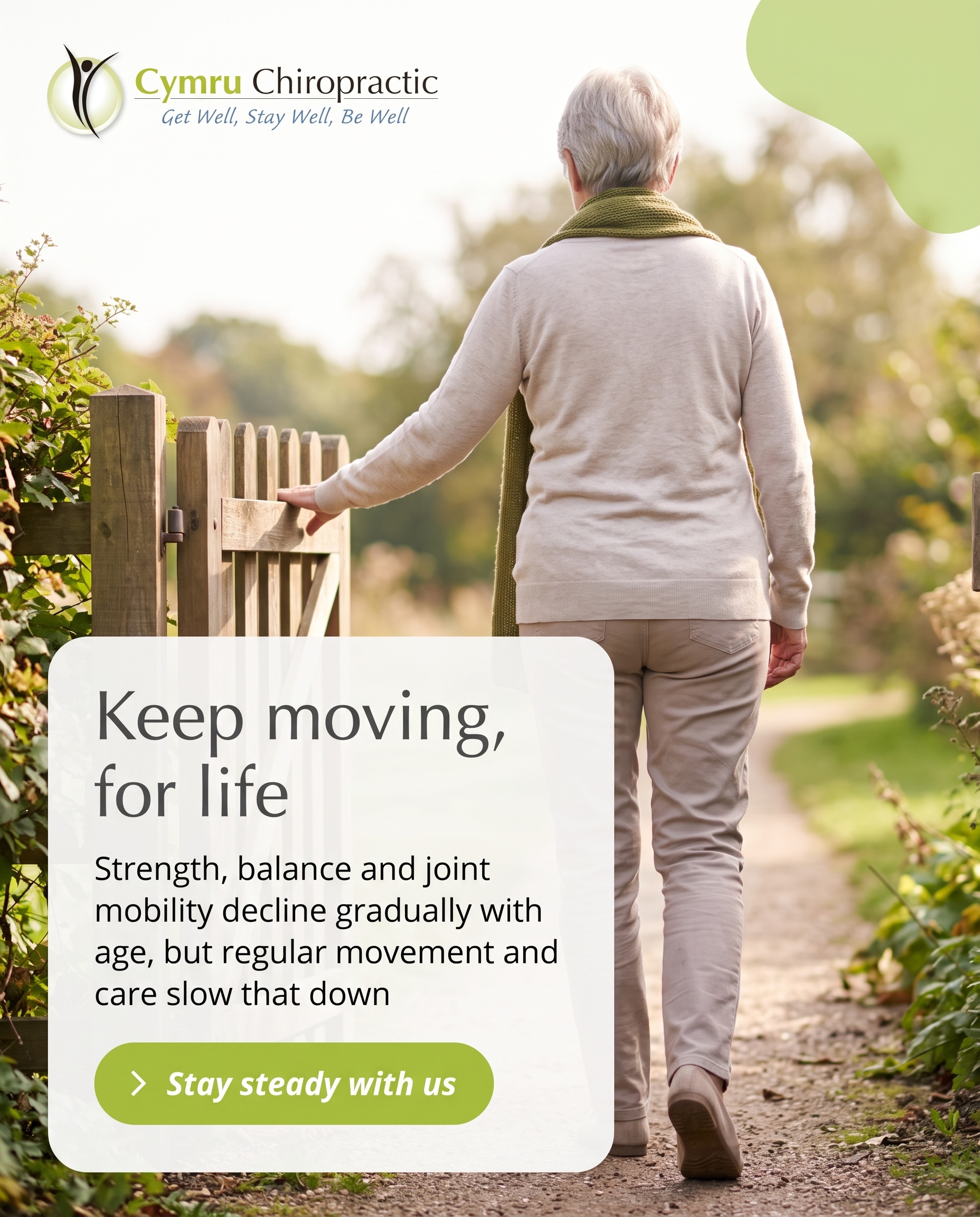
1856×2304
C2S2
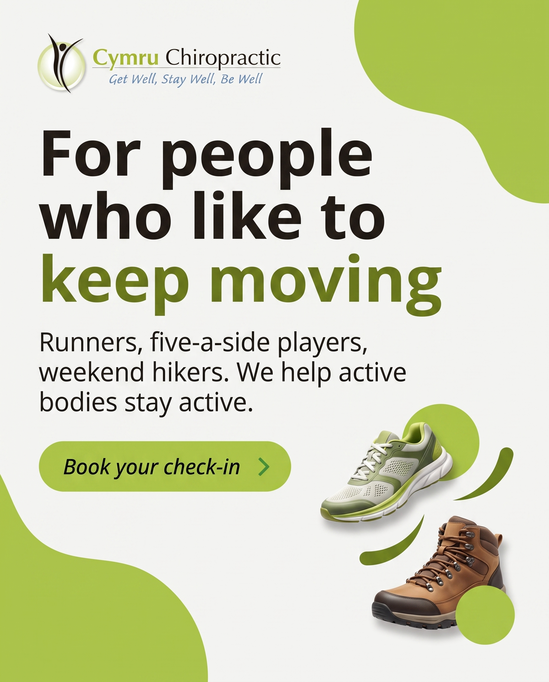
1856×2304
T4S3A4
v2
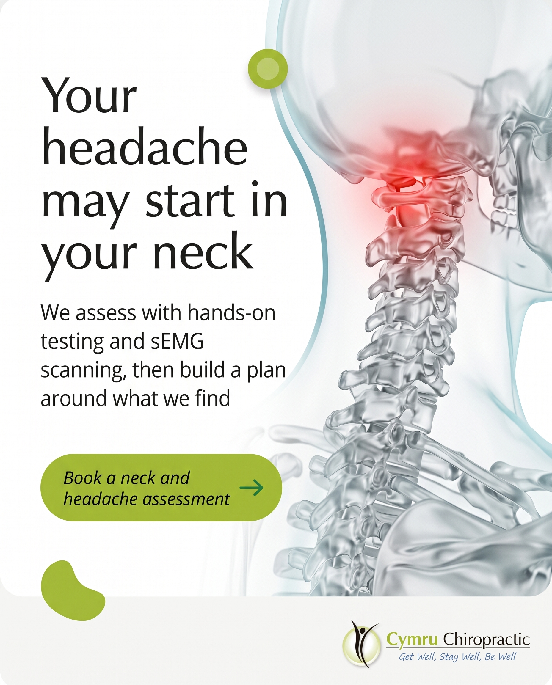
1856×2304
T8S4A4
v2
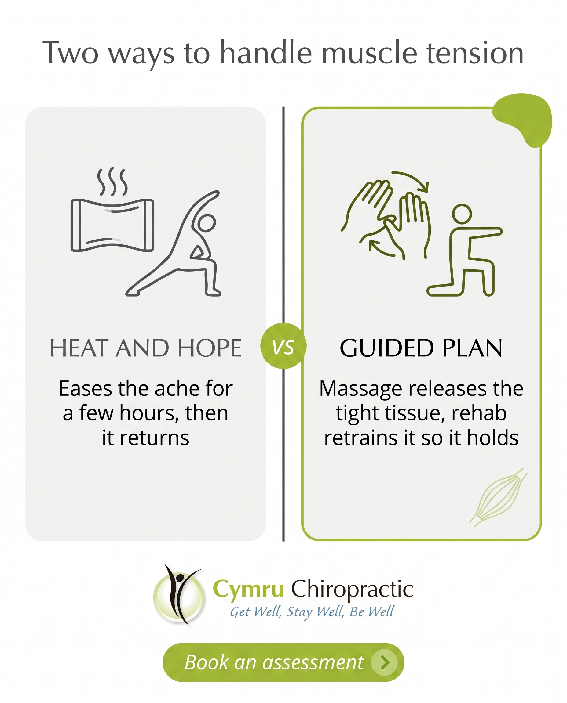
1856×2304
T1S5A2
v2
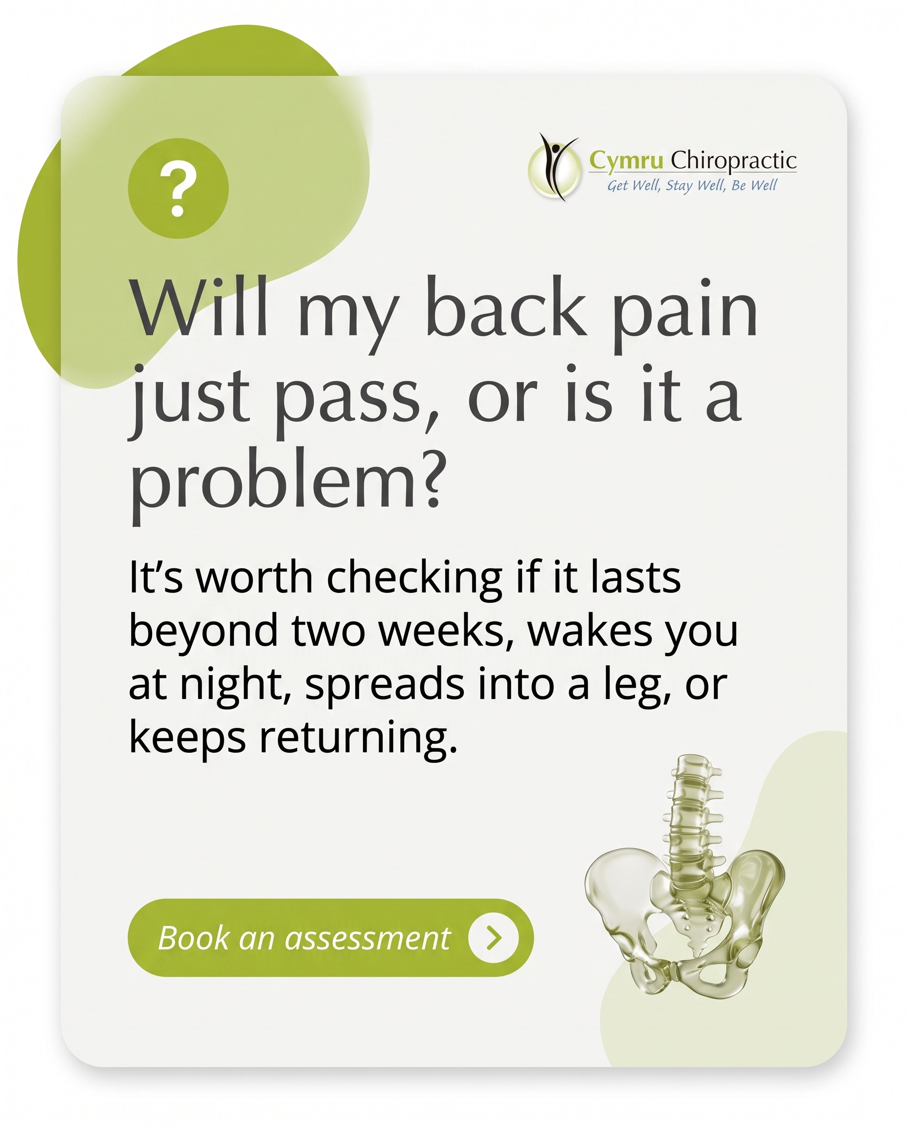
1856×2304
L1S6A4
v4
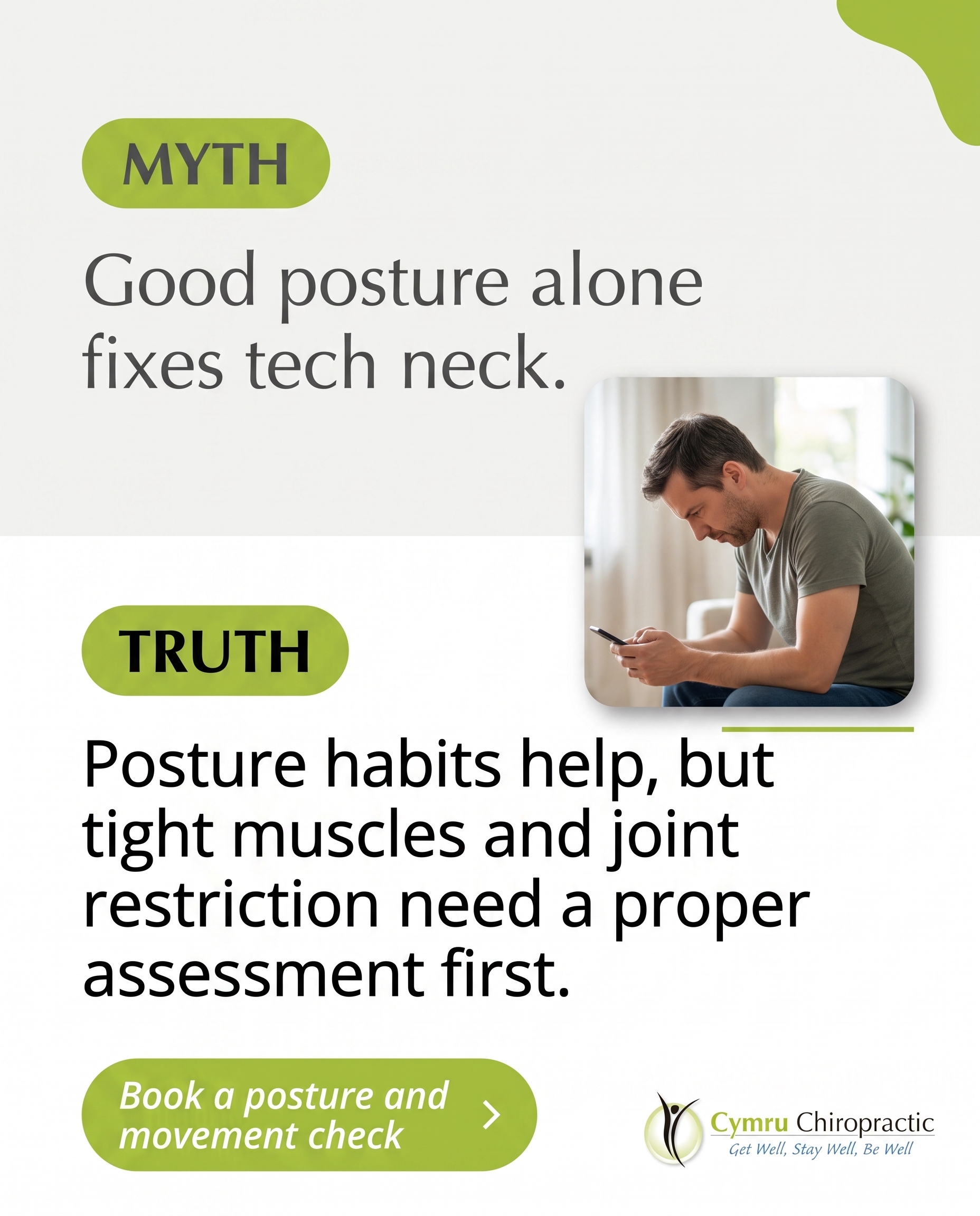
1856×2304
L3S7A2
v2
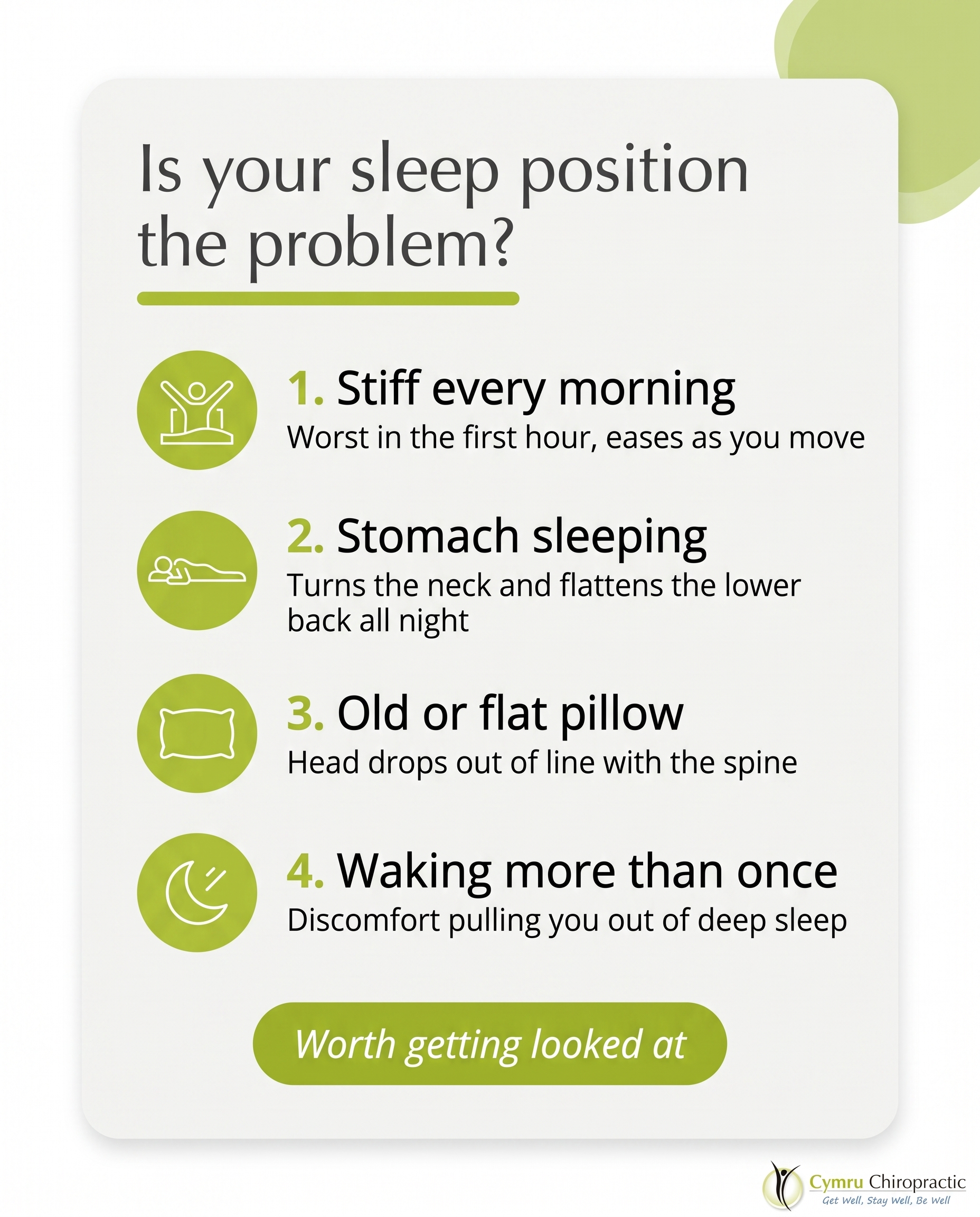
1856×2304
T3S8A3
v2
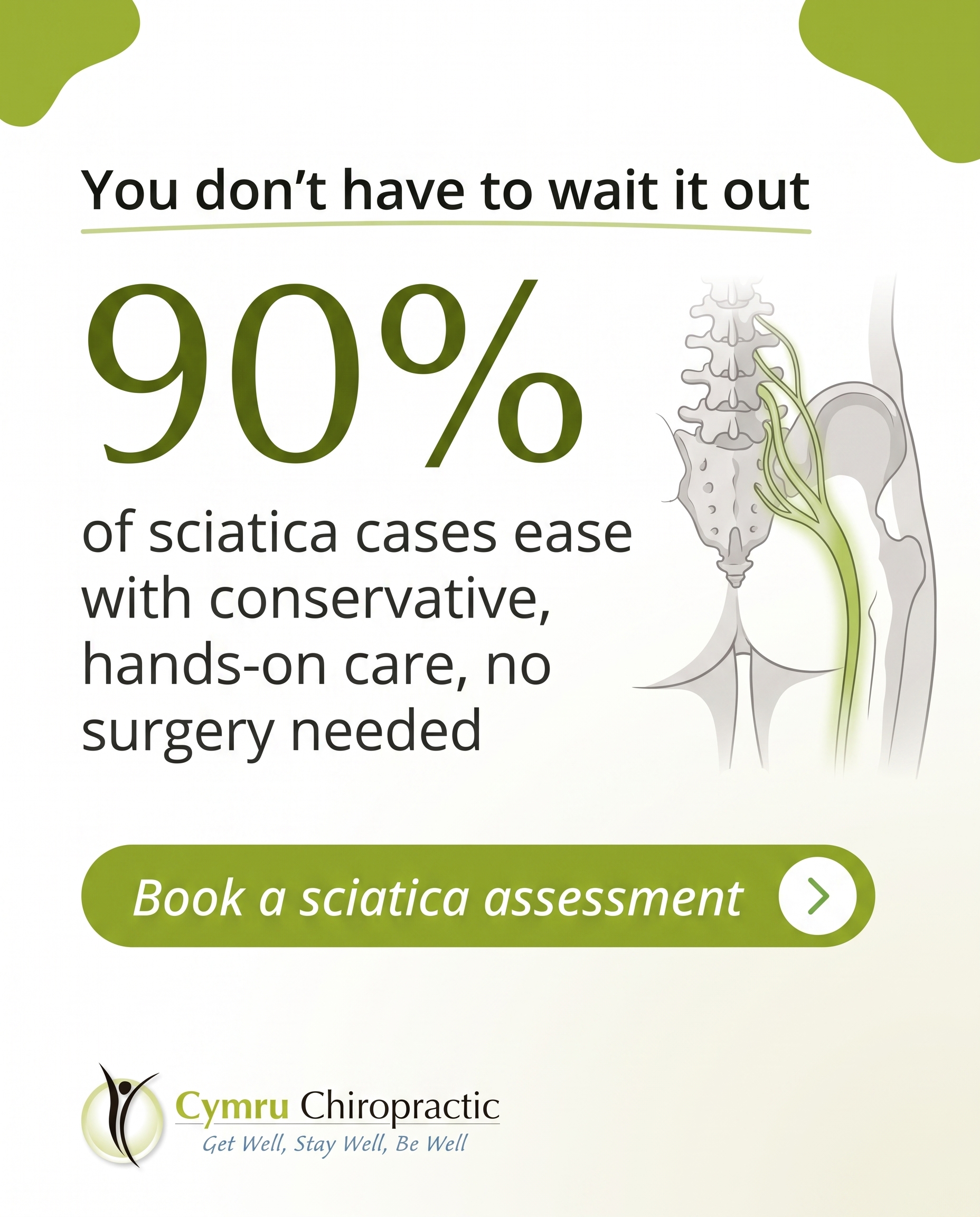
1856×2304
T6S9A2
v2
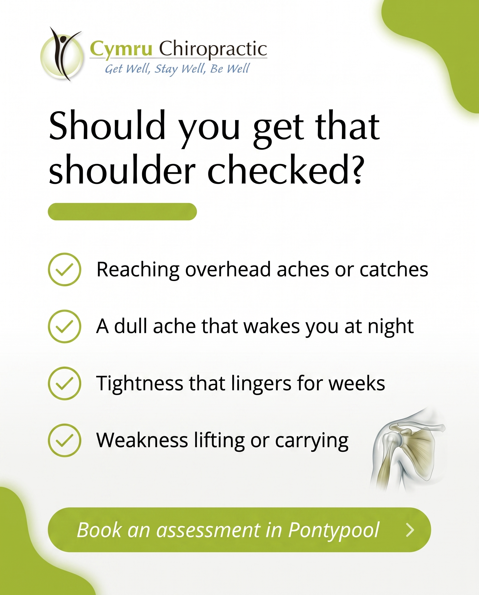
1856×2304
T2S1A3
v3
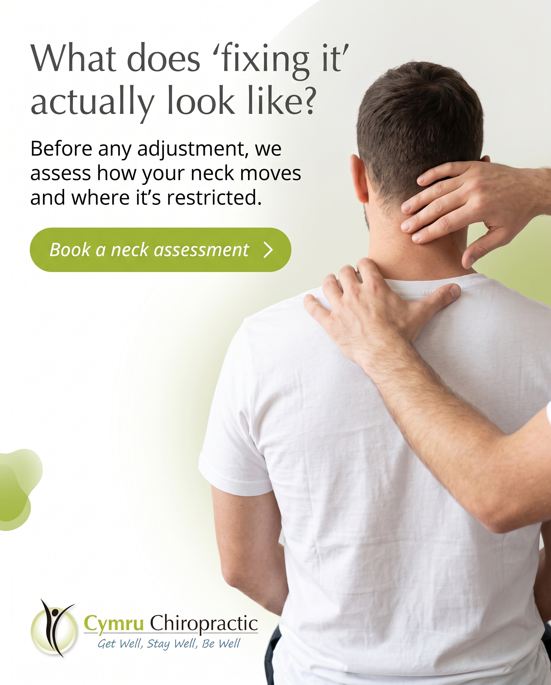
1856×2304
T7S5A2
v2
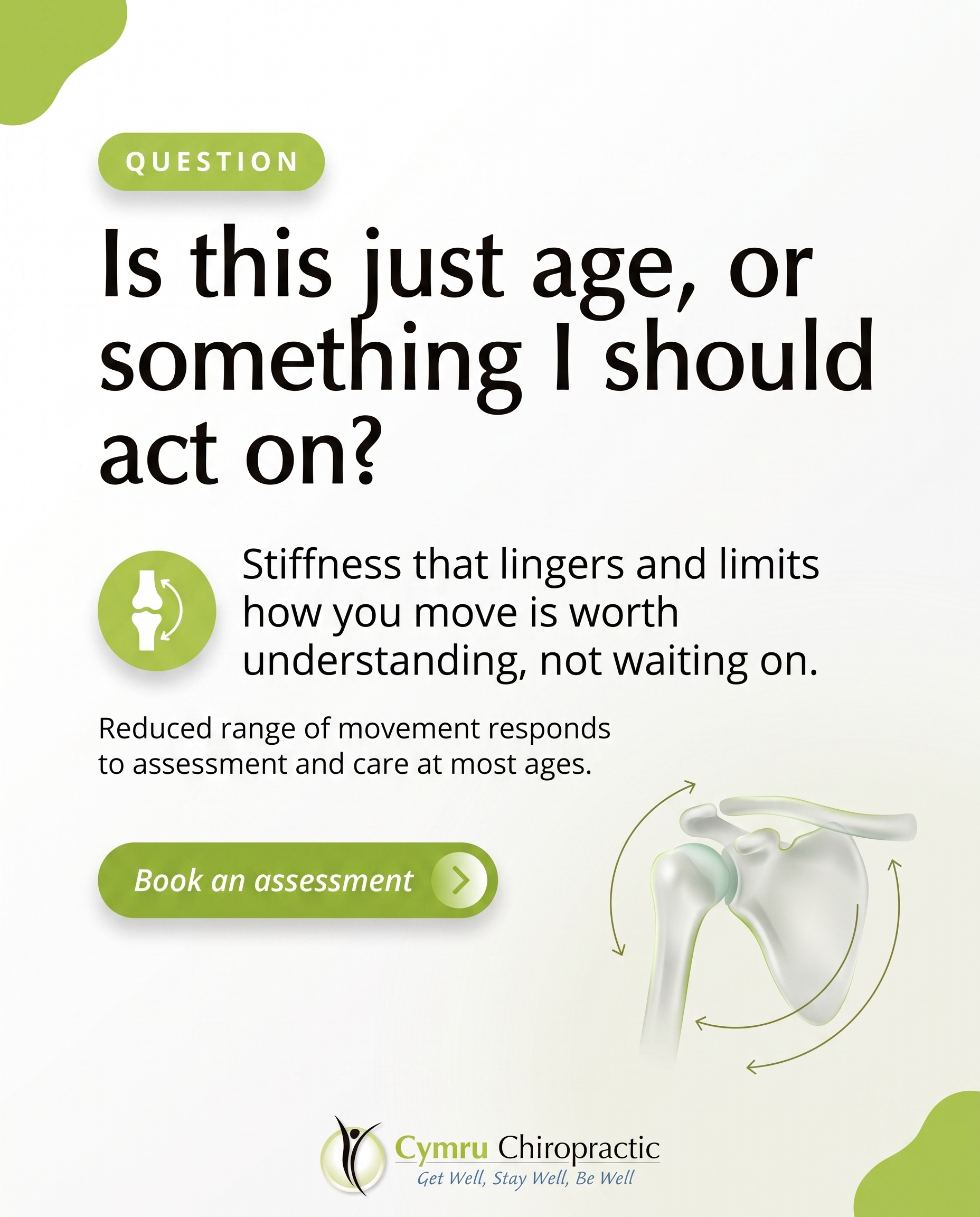
1856×2304
T12S8A2
v4
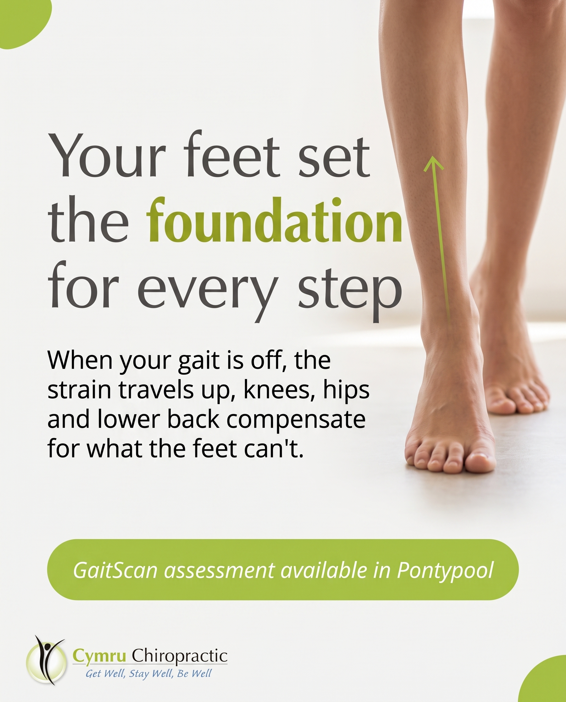
1856×2304
T10S3A3
v2
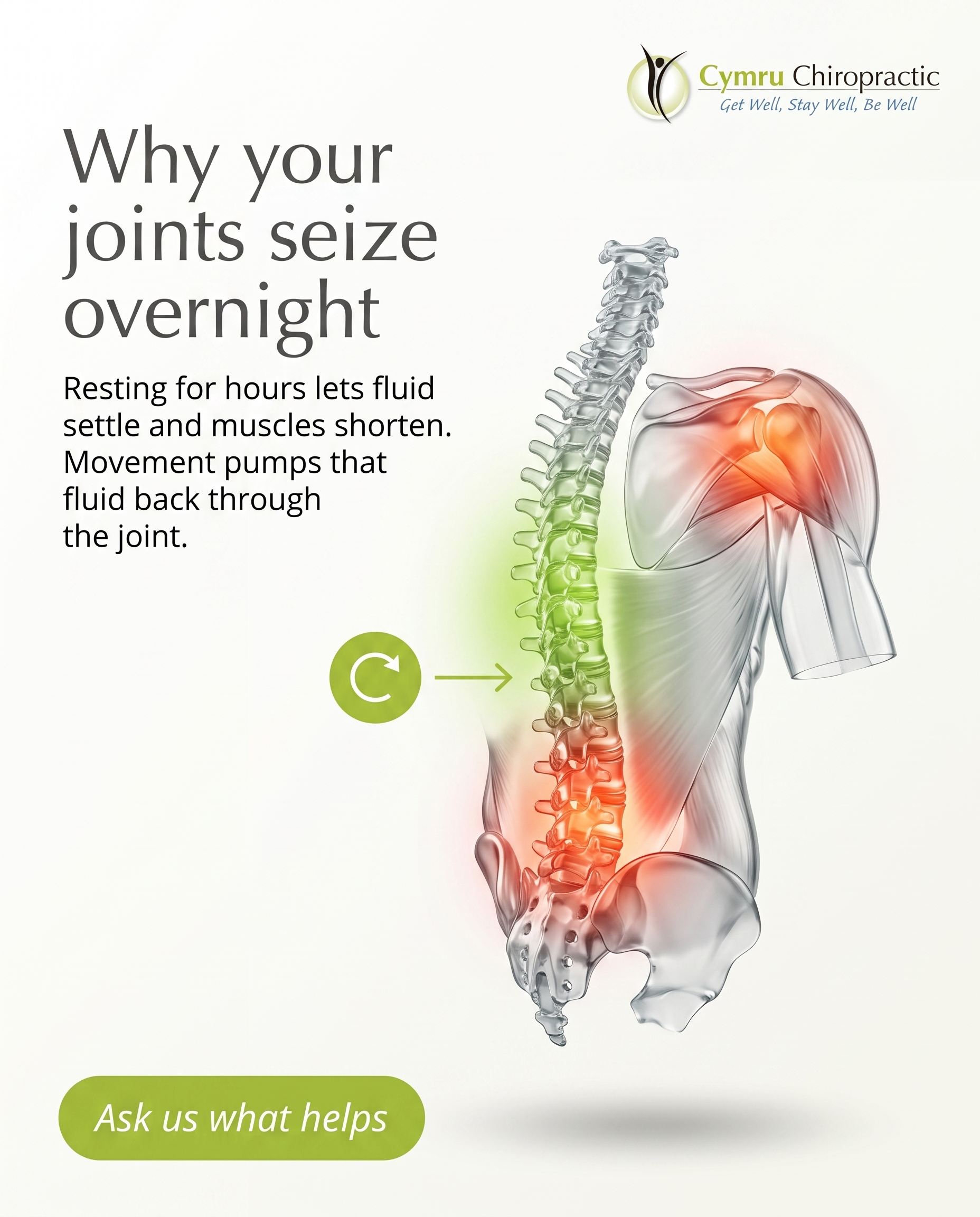
1856×2304
T11S9A2
v2
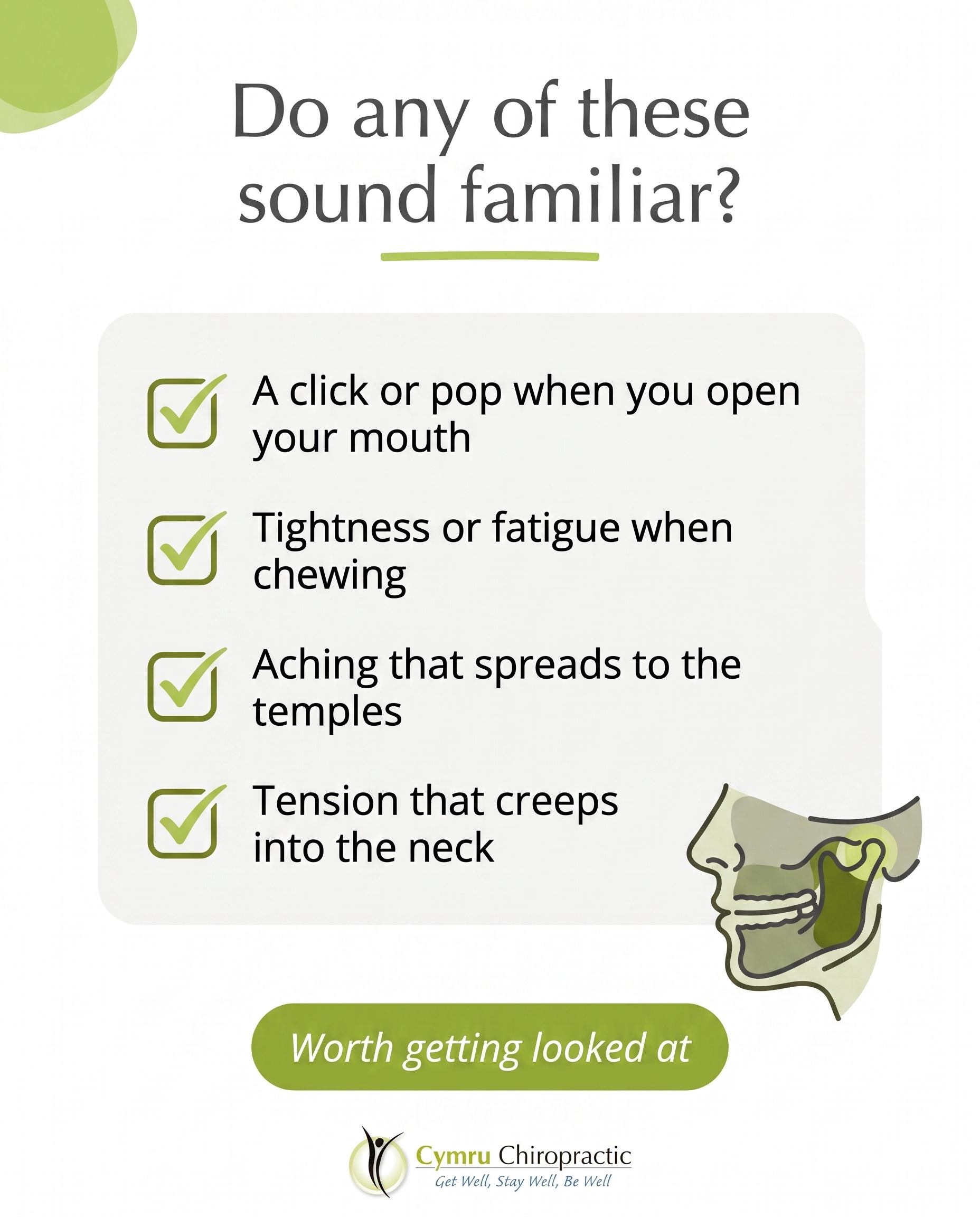
1856×2304
T9S4A3
v2
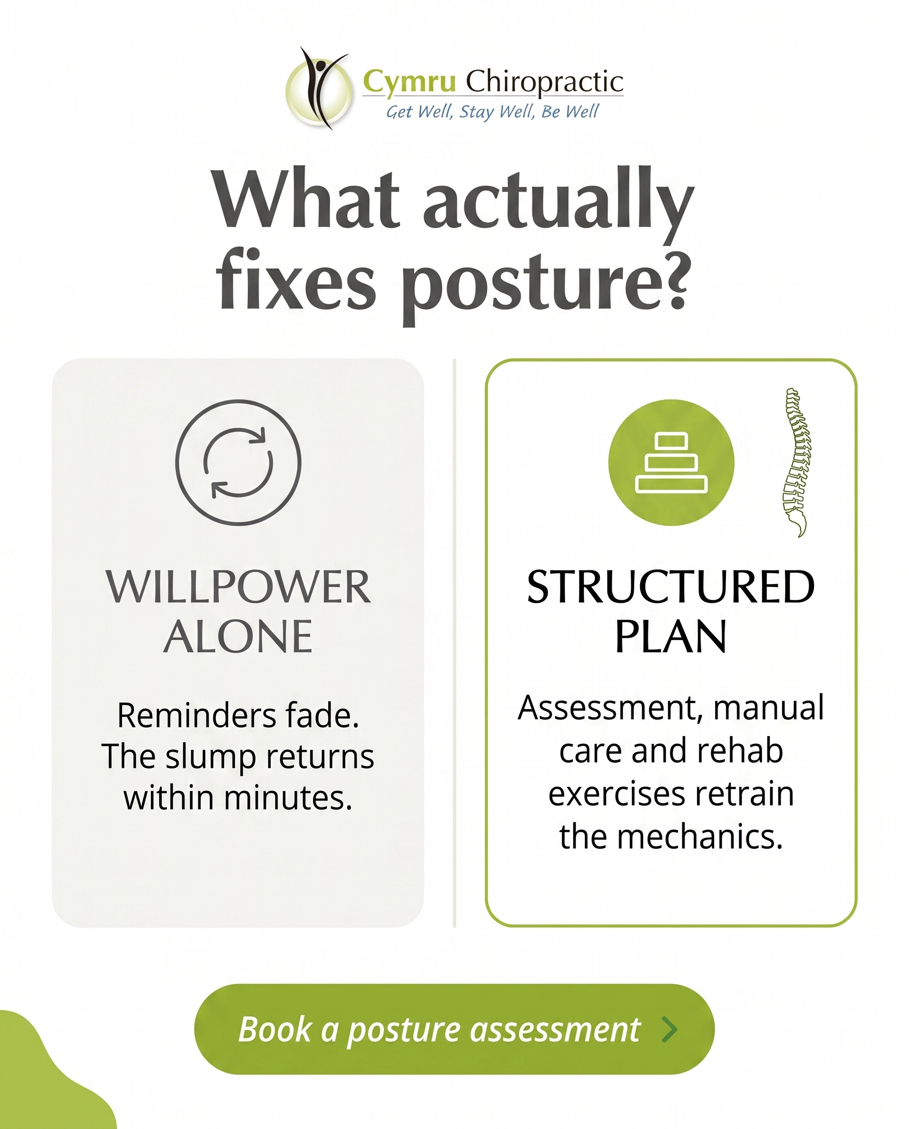
1856×2304
T5S6A3
v5
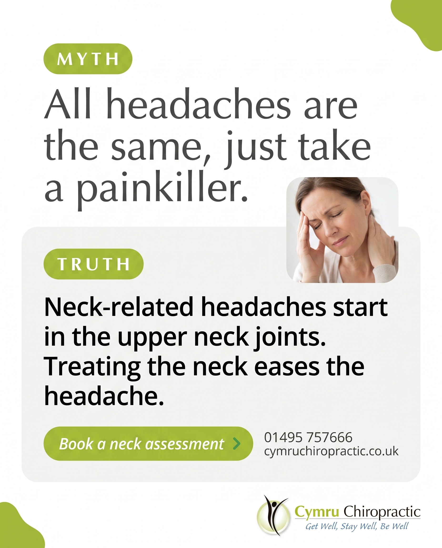
1856×2304
L5S2A1
v3
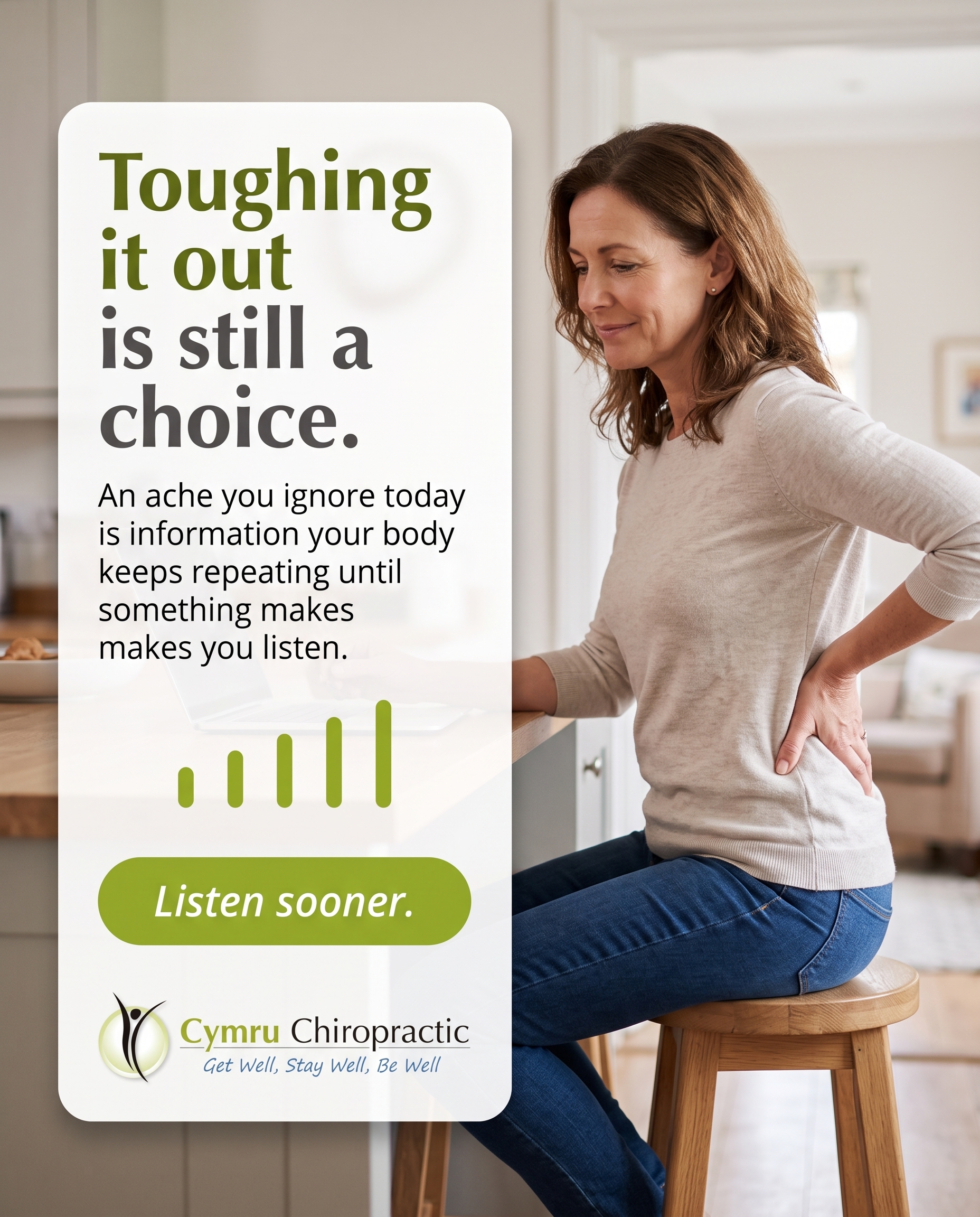
1856×2304
L4S7A3
v2
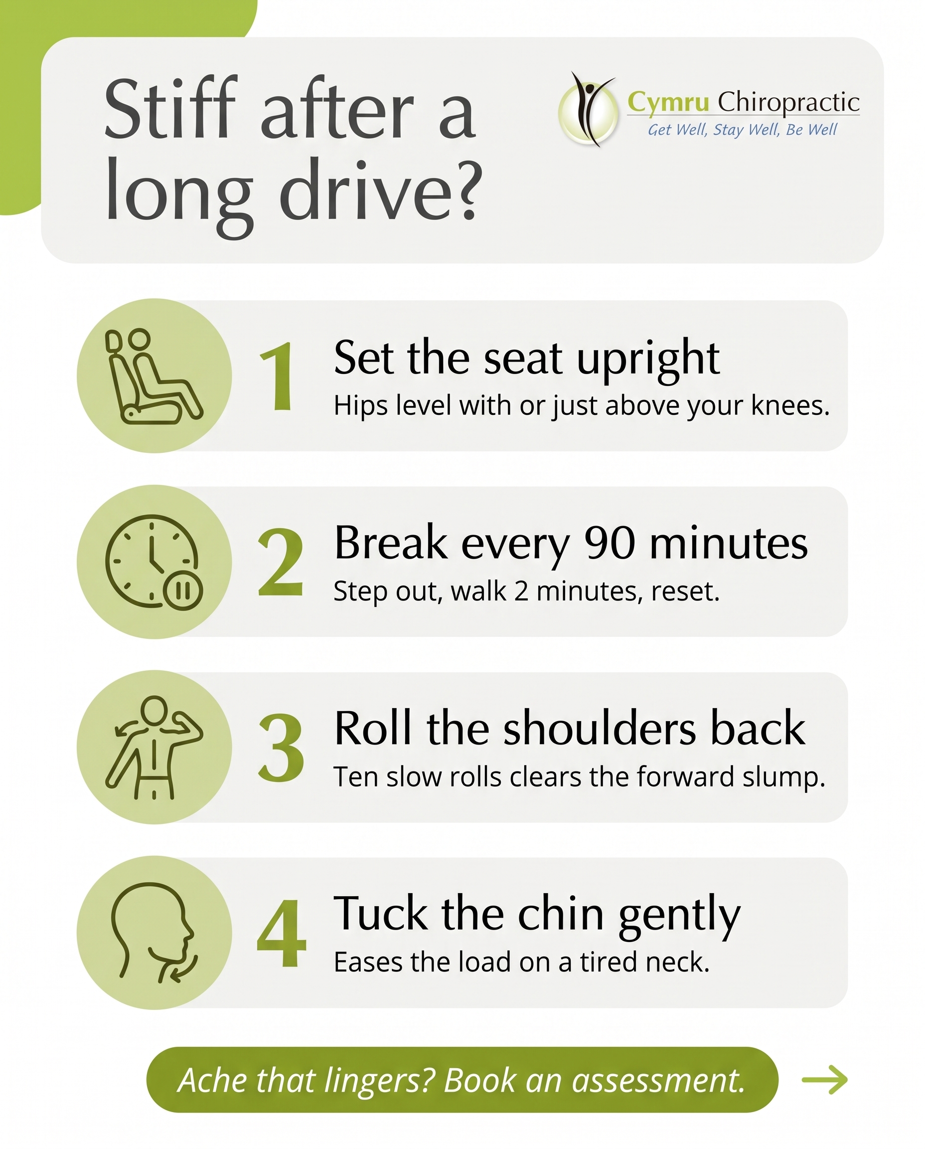
1856×2304
L3S2A4
v2
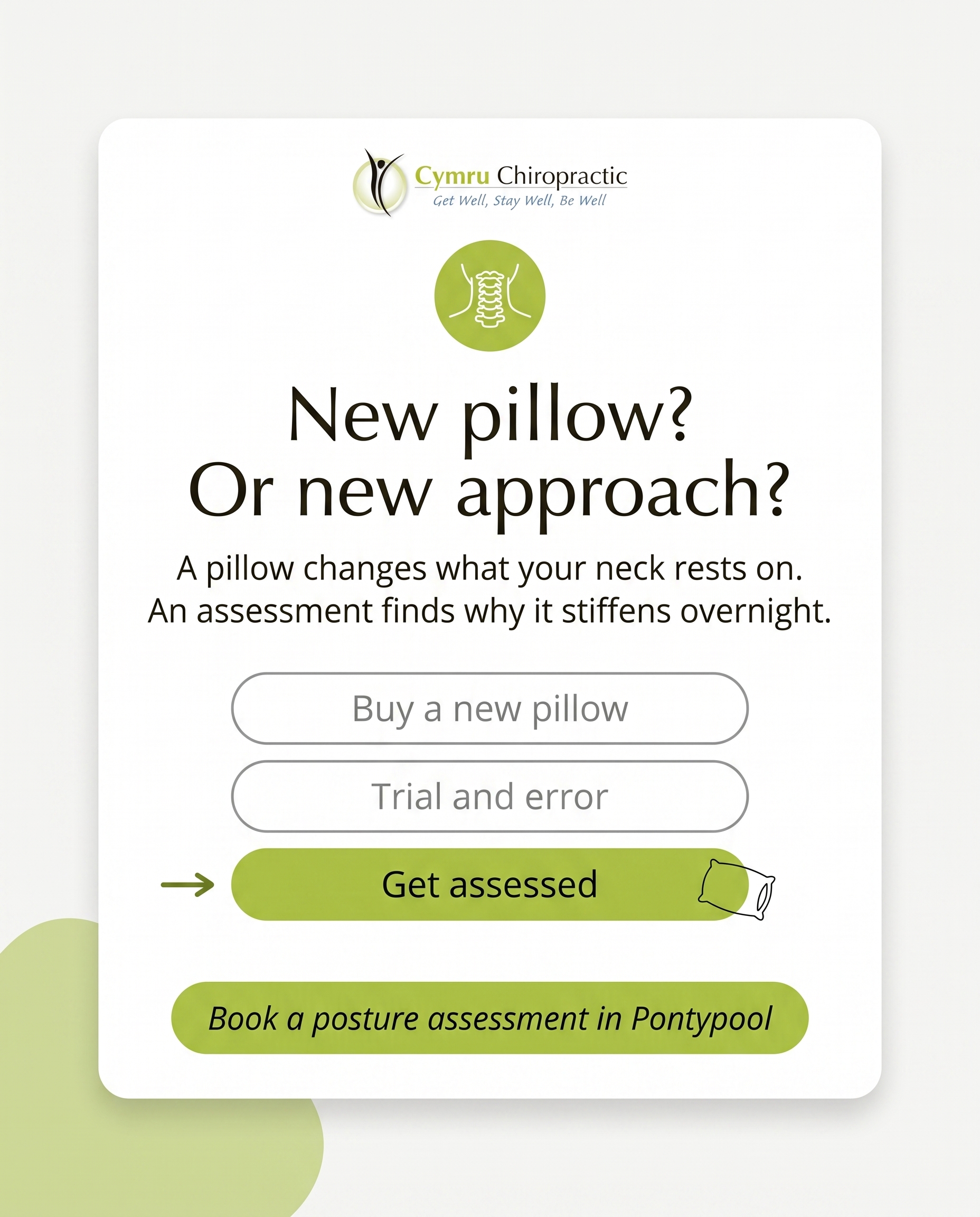
1856×2304
T11S9A4
v2
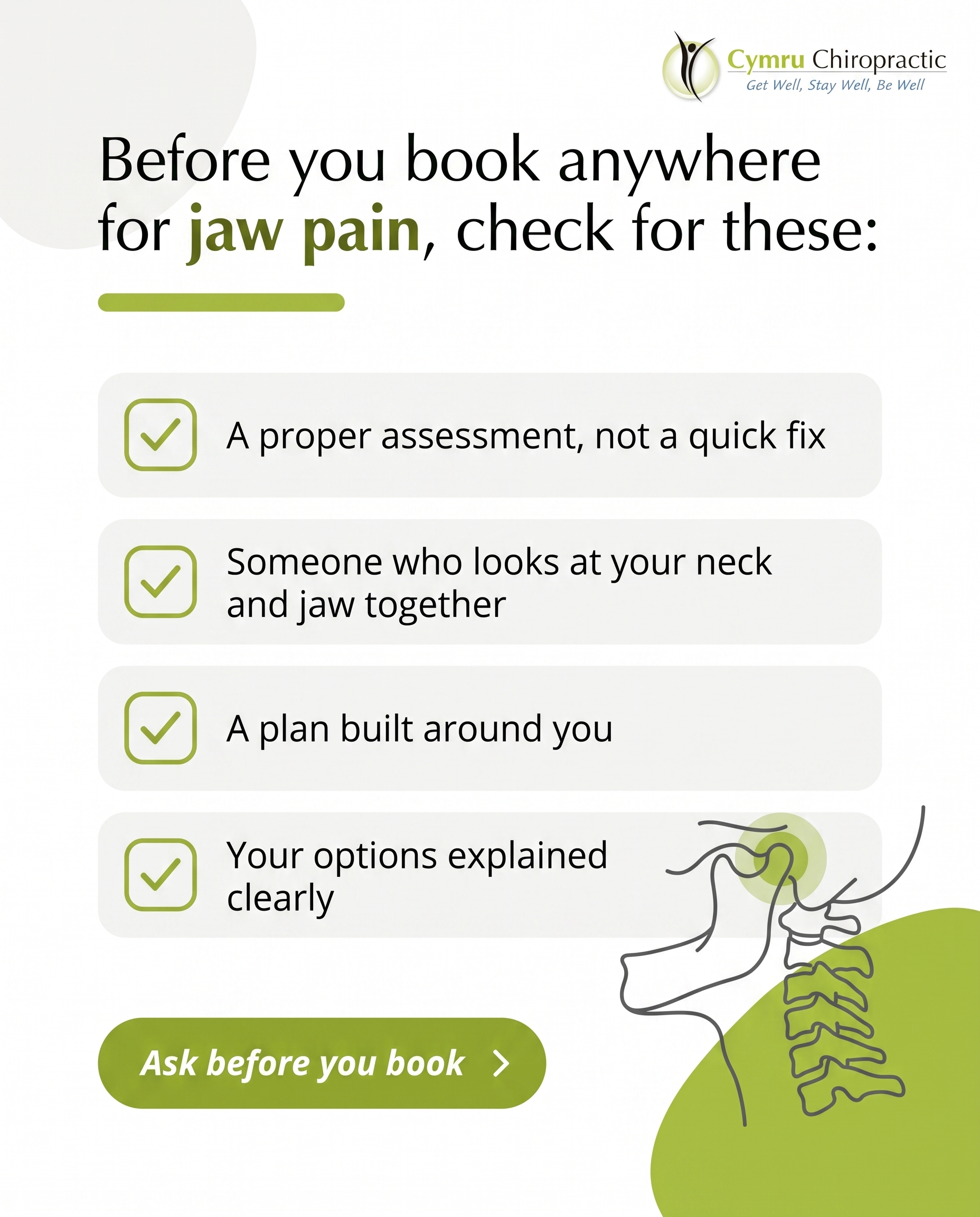
1856×2304
T4S5A2
v2
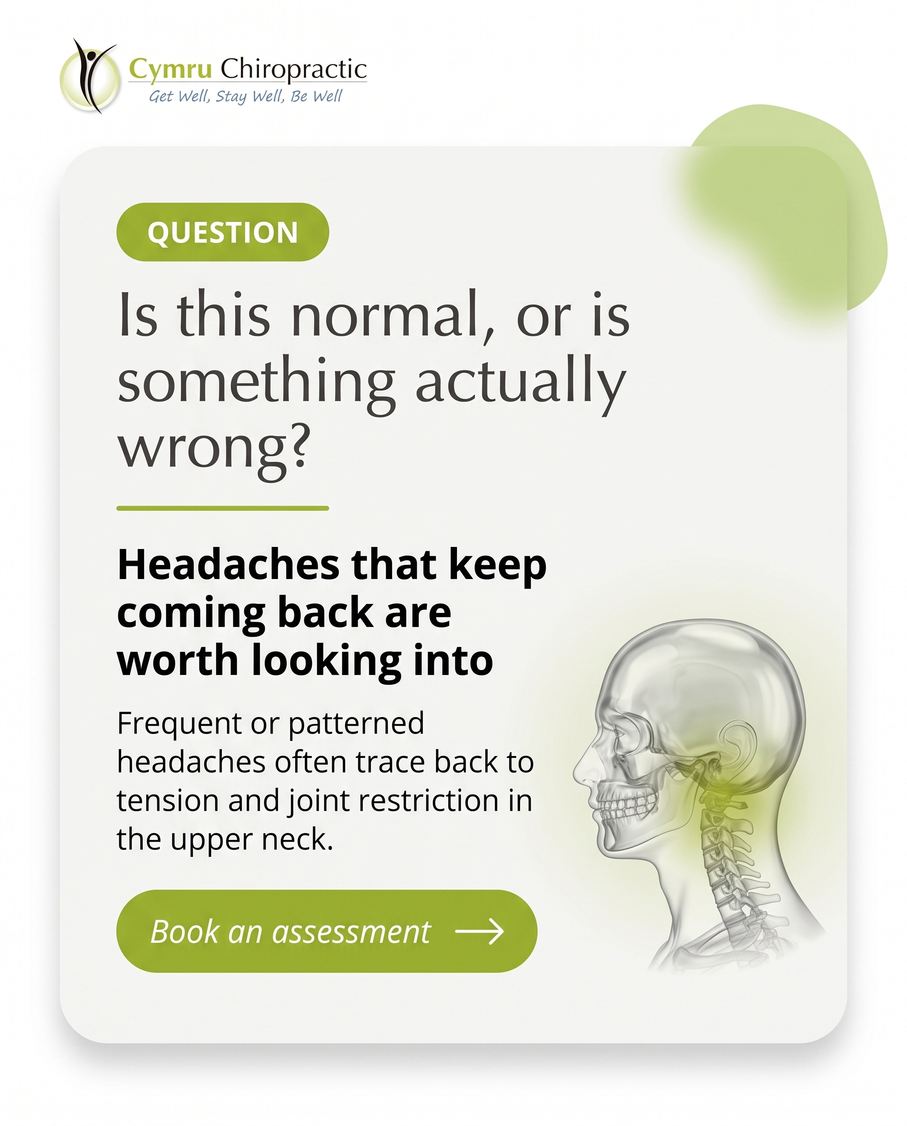
1856×2304
T5S7A2
v2
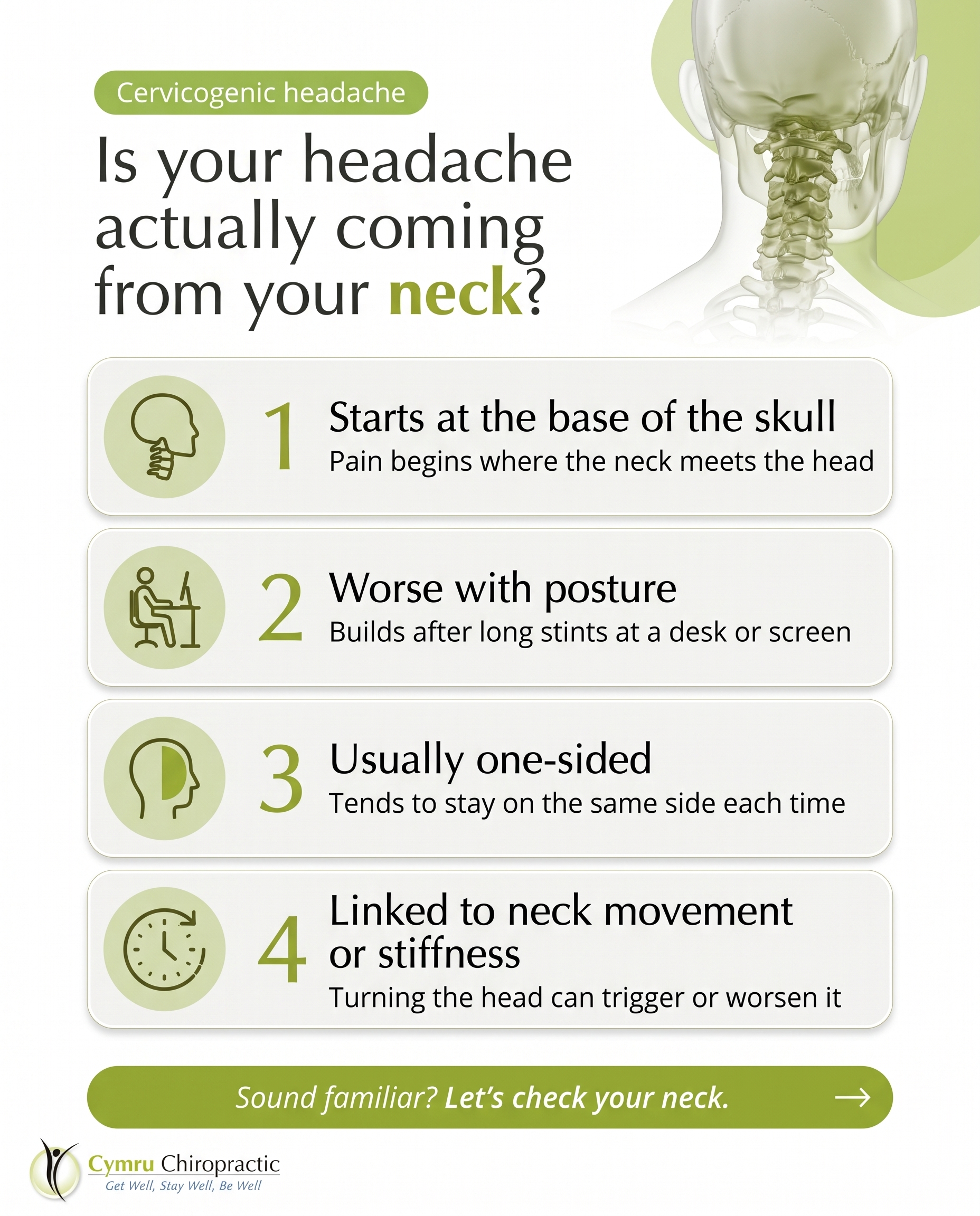
1856×2304
L3S3A2
v2
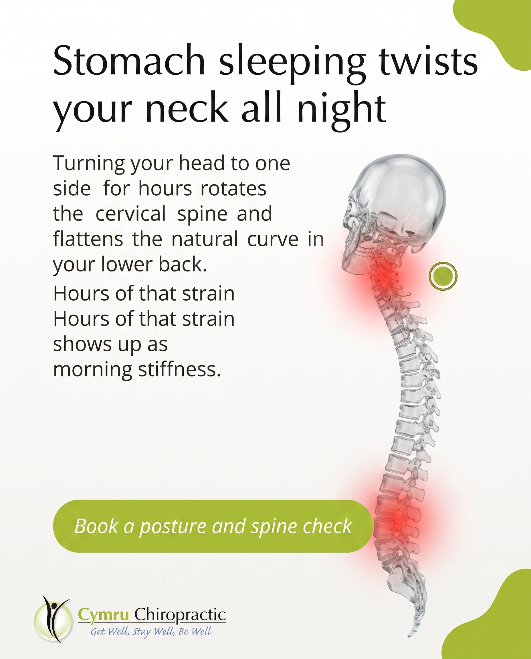
1856×2304
T8S3A3
v2
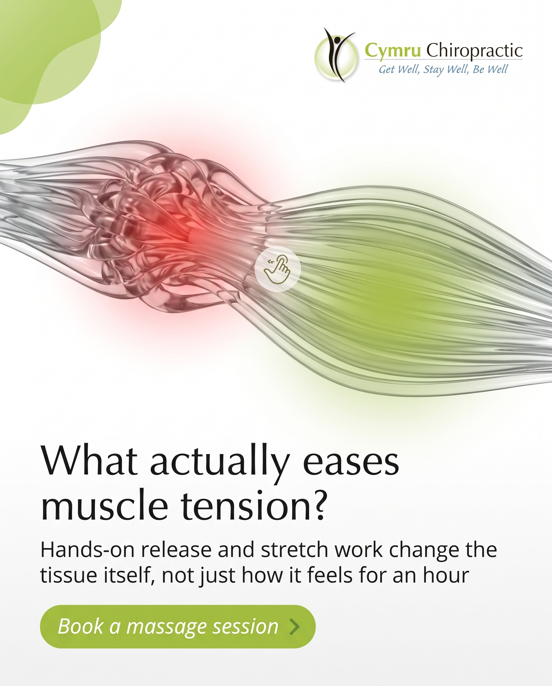
1856×2304
T8S8A4
v2
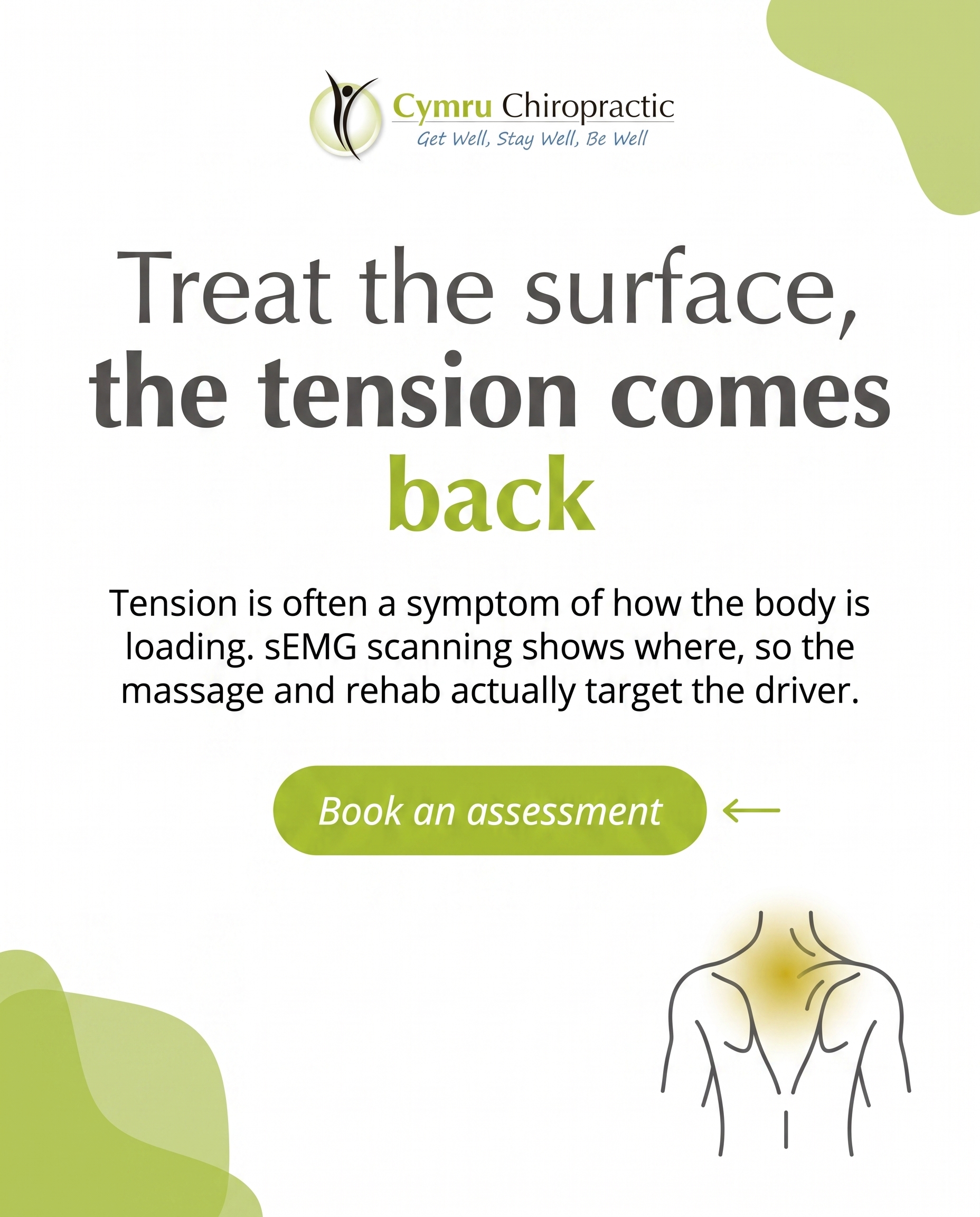
1856×2304
T6S9A4
v2
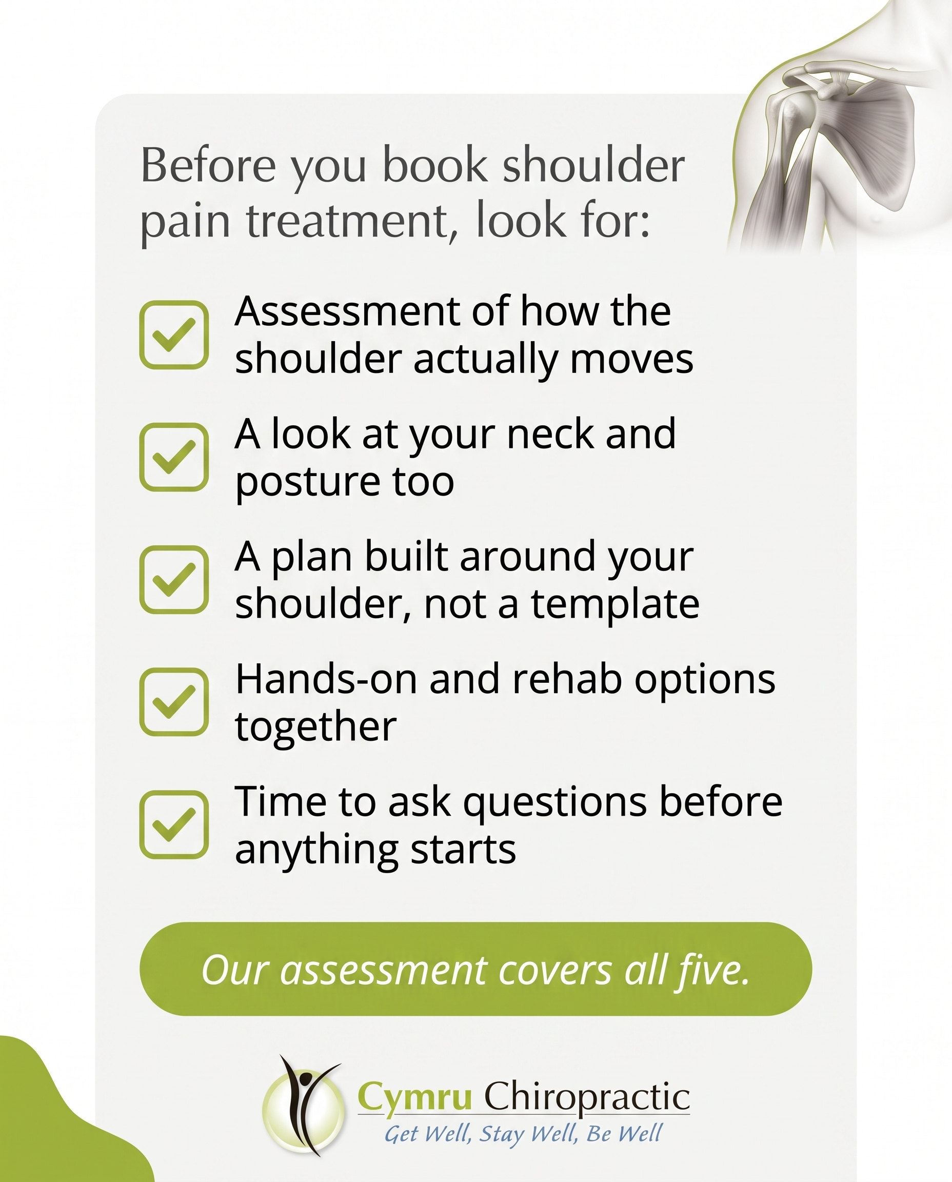
1856×2304
L3S1A4
v2
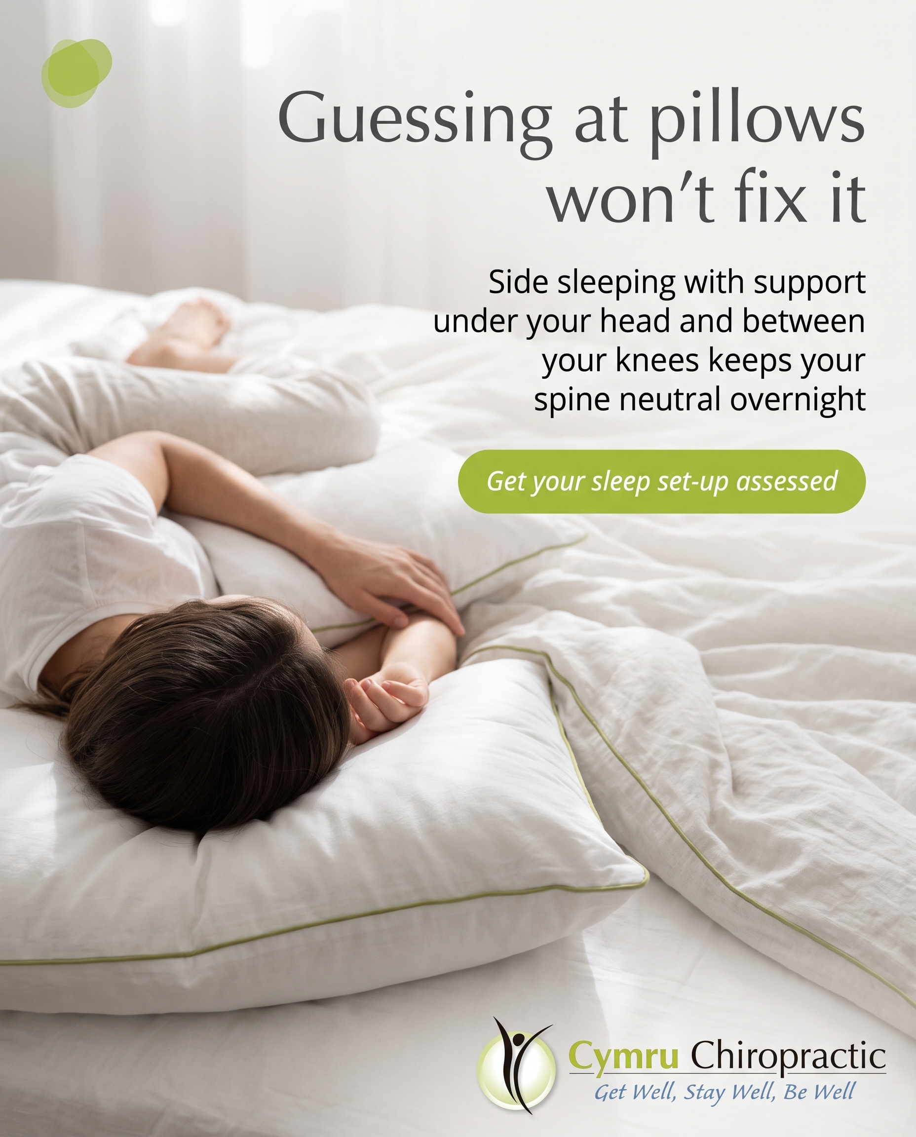
1856×2304
T11S4A4
v2
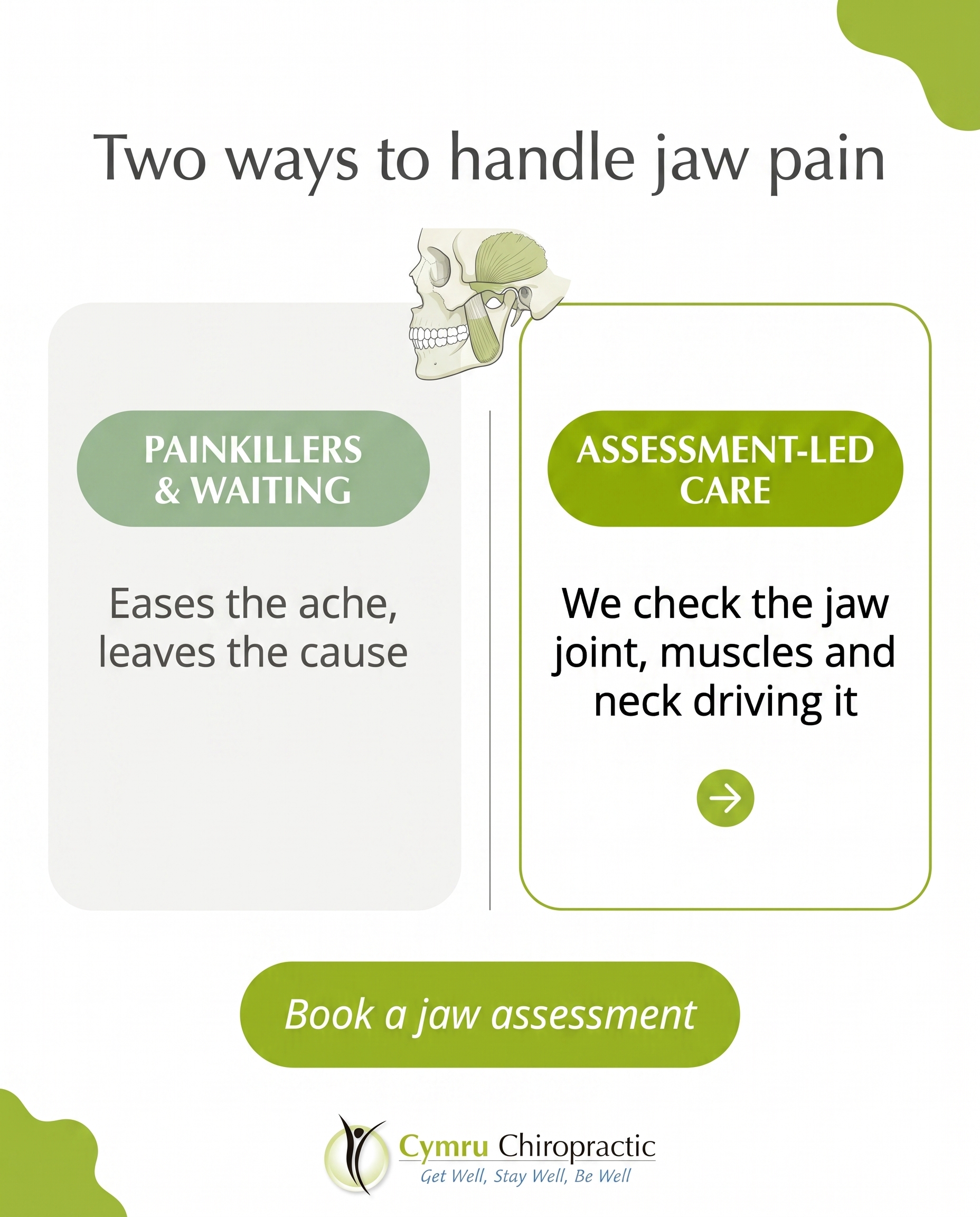
1856×2304
T10S8A3
v2
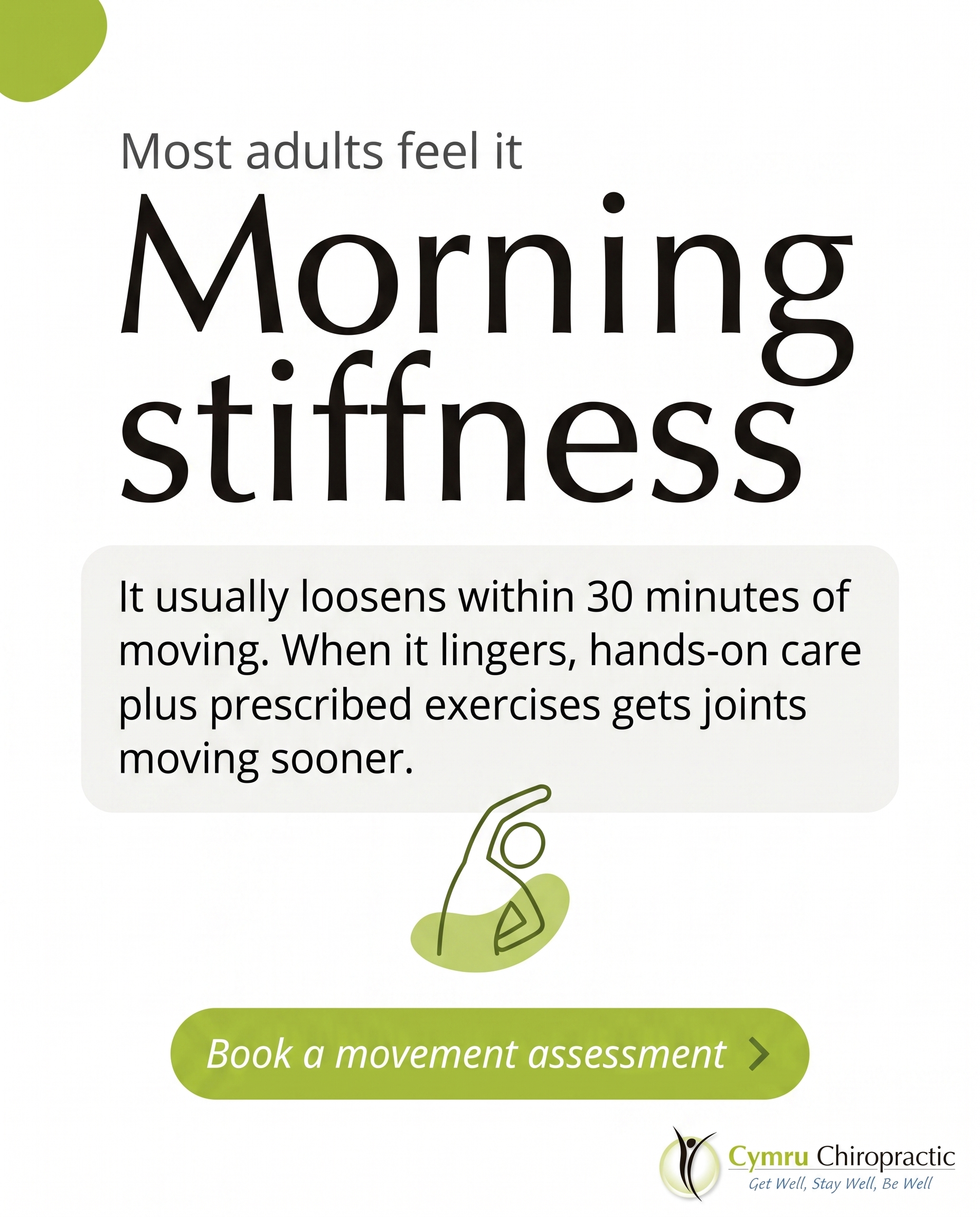
1856×2304
C3S6
v2
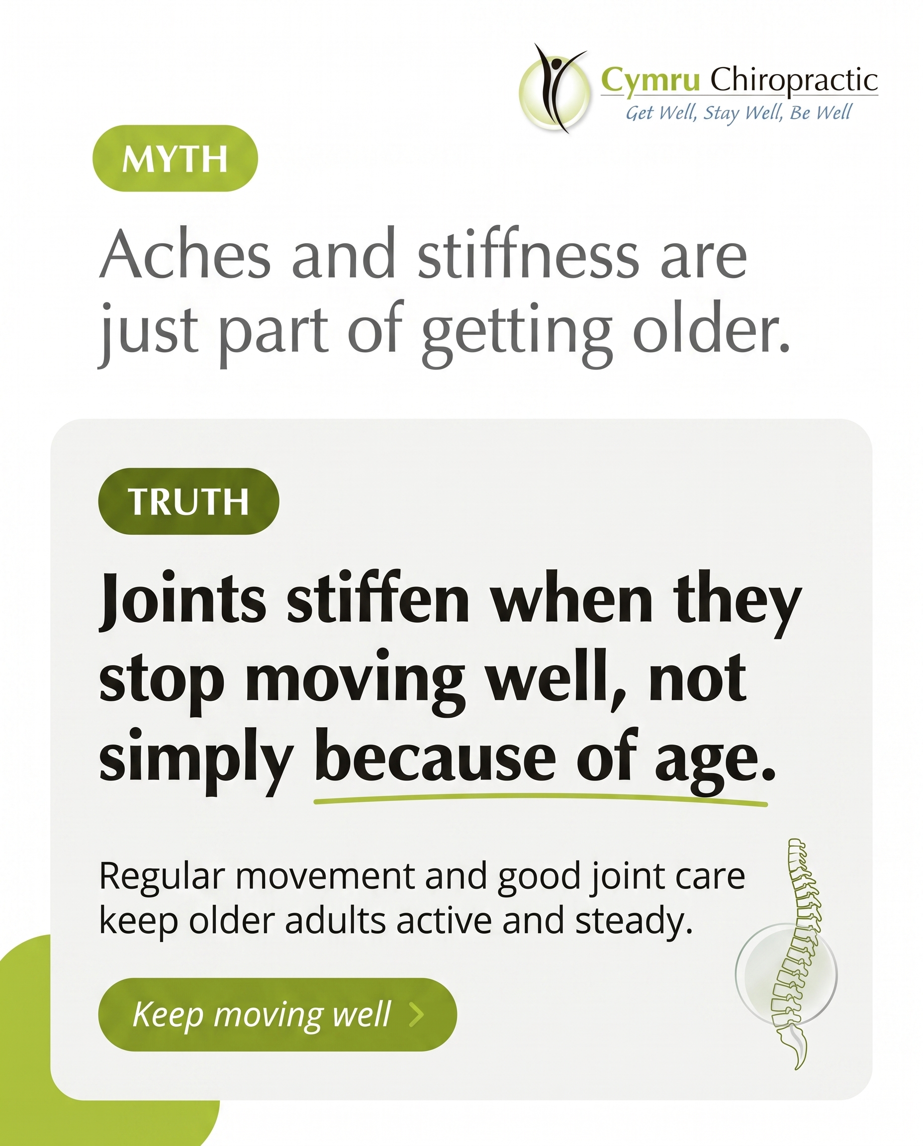
1856×2304
6
Samples Page
Built · 2026-07-01T16:45
Page built
▼
Part A — Practice Name
saved
Part B — Select 4 Images
(4/4 selected)
1
2
3
4
2
1
3
4