Draw — 10 posts
1
Coordinates
10 coordinates
10 selected
▼
| # | Code | Theme | Subject | Style | Awareness | Source |
|---|---|---|---|---|---|---|
| 1 | T8S1A1 | treatments | T8 — Muscle Tension & Soreness | photography | A1 — Unaware | CURATED |
| 2 | T11S2A3 | treatments | T11 — TMJ / Jaw Pain | graphic-design | A3 — Solution-aware | CURATED |
| 3 | T12S3A2 | treatments | T12 — Foot & Gait-Related Pain | illustrative-3D | A2 — Problem-aware | CURATED |
| 4 | T7S4A3 | treatments | T7 — Joint Pain & Stiffness | comparison-card | A3 — Solution-aware | CURATED |
| 5 | L3S5A2 | lifestyle | L3 — Poor sleep positioning (stomach sleeping, unsupportive pillow/mattress) | qa-card | A2 — Problem-aware | CURATED |
| 6 | T3S6A4 | treatments | T3 — Sciatica | myth-buster | A4 — Product-aware | CURATED |
| 7 | C3S7 | clinic | C3 — Older adults maintaining mobility and balance | list-tips | — | CURATED |
| 8 | T10S8A2 | treatments | T10 — Morning Stiffness | stat-card | A2 — Problem-aware | CURATED |
| 9 | T9S9A3 | treatments | T9 — Poor Posture | checklist | A3 — Solution-aware | CURATED |
| 10 | L1S6A3 | lifestyle | L1 — Prolonged desk and screen work (forward head / "tech neck" posture) | myth-buster | A3 — Solution-aware | CURATED |
2
Content Briefs
10 briefs · 2026-06-25T14:12
10 briefs generated
▼
1.
T8S1A1
photography
Unaware
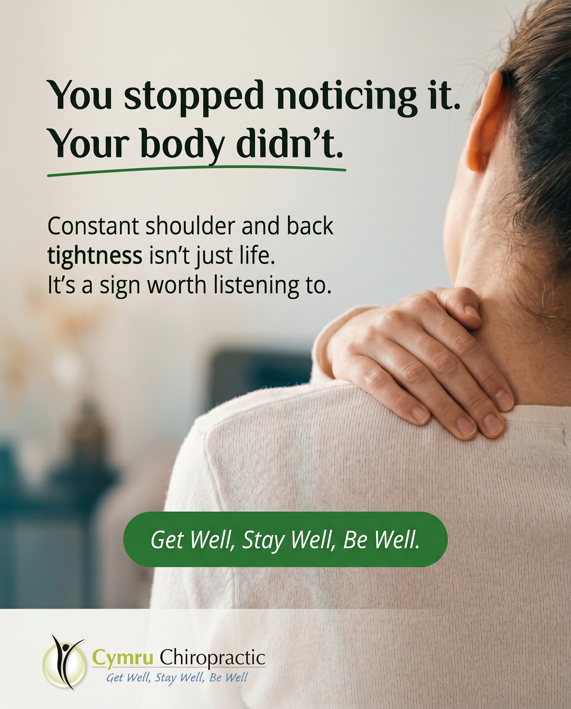
A quiet, relatable photo-led moment showing how everyday muscle tension and soreness slowly become 'normal' background discomfort that people stop noticing. The angle plants a gentle seed: that constant tightness in your shoulders or back isn't just life — it's something worth paying attention to, framed around the clinic's Get Well, Stay Well, Be Well ethos.
Content: A quiet, relatable photo-led moment showing how everyday muscle tension and soreness slowly become 'normal' background discomfort that people stop noticing. The angle plants a gentle seed: that constant tightness in your shoulders or back isn't just life — it's something worth paying attention to, framed around the clinic's Get Well, Stay Well, Be Well ethos.
Style: photography
2.
T11S2A3
graphic-design
Solution-aware
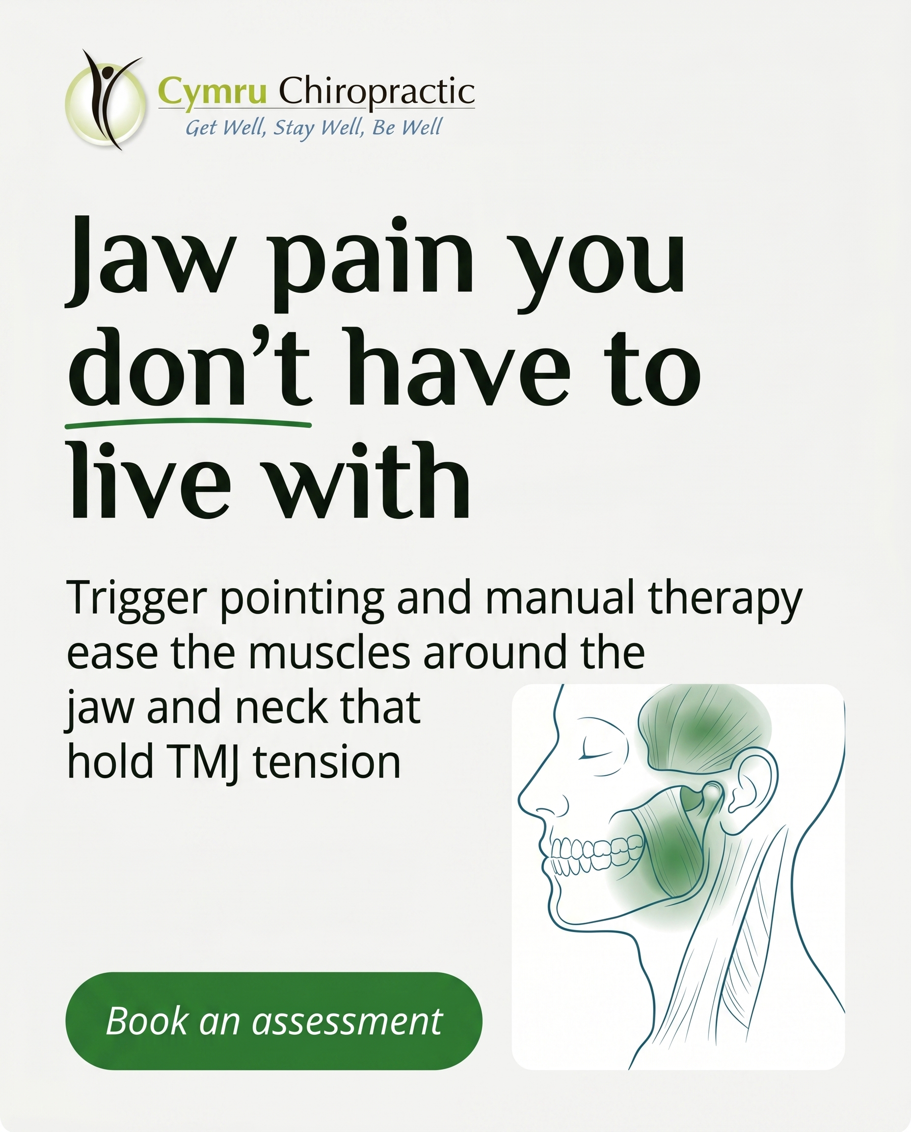
Explain what actually helps jaw pain and tension once you know it's a problem, walking through how manual therapy and trigger pointing around the jaw and neck muscles can ease TMJ discomfort. The message: this is a treatable thing with hands-on options, not something you have to live with.
Content: Explain what actually helps jaw pain and tension once you know it's a problem, walking through how manual therapy and trigger pointing around the jaw and neck muscles can ease TMJ discomfort. The message: this is a treatable thing with hands-on options, not something you have to live with.
Style: graphic-design
3.
T12S3A2
illustrative-3D
Problem-aware
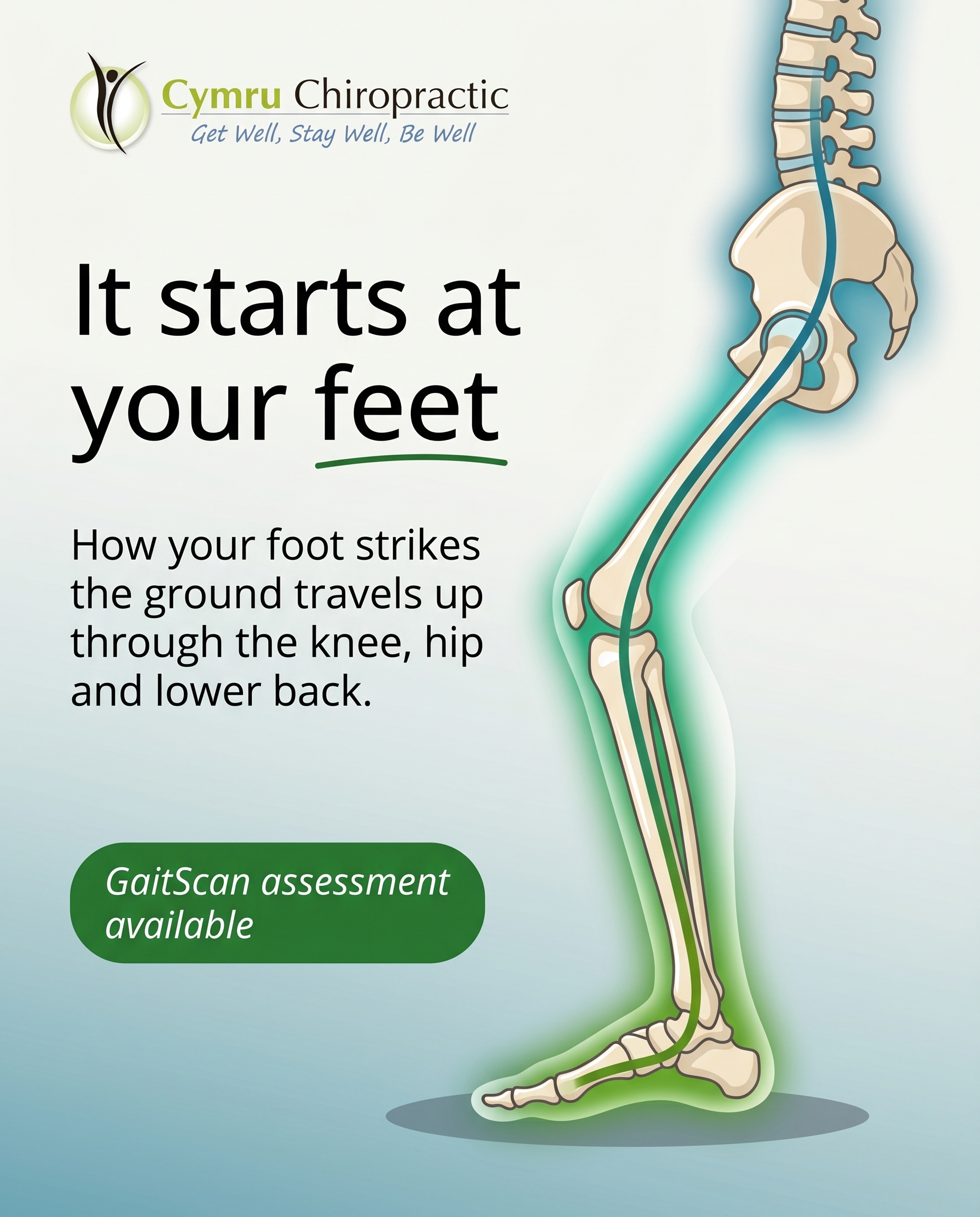
A clean 3D illustration showing how foot mechanics and gait ripple upward into knees, hips and lower back, helping the reader recognise that their nagging foot or leg discomfort may be a genuine structural issue. The angle validates the problem and hints that how you walk is measurable and assessable.
Content: A clean 3D illustration showing how foot mechanics and gait ripple upward into knees, hips and lower back, helping the reader recognise that their nagging foot or leg discomfort may be a genuine structural issue. The angle validates the problem and hints that how you walk is measurable and assessable.
Style: illustrative-3D
4.
T7S4A3
comparison-card
Solution-aware
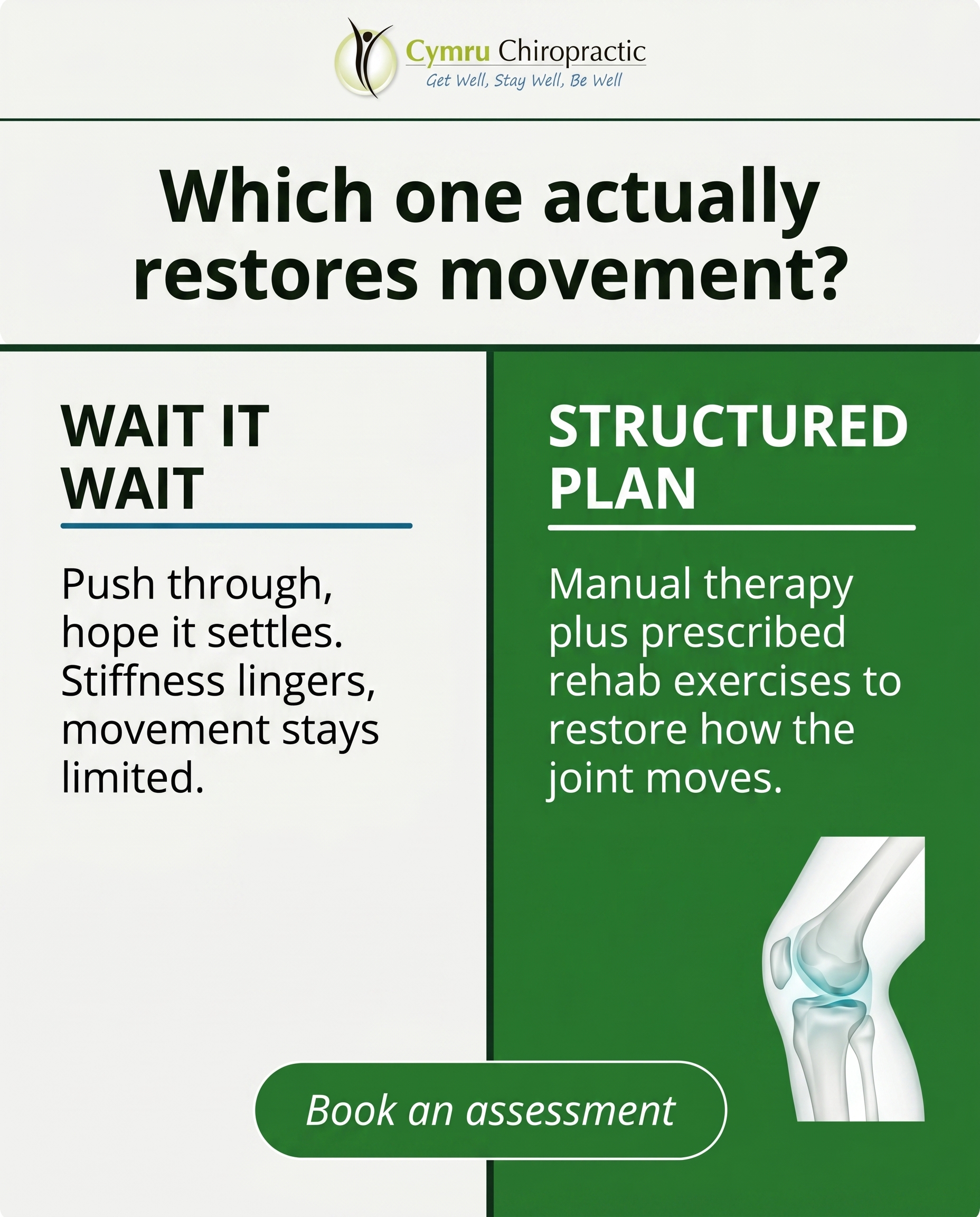
A comparison card contrasting two routes for stiff, achy joints — pushing through and waiting it out versus a structured plan of manual therapy and prescribed rehab exercises. The message lands on which approach actually restores movement, answering the reader who already knows their joints need help and wants to know what fixes it.
Content: A comparison card contrasting two routes for stiff, achy joints — pushing through and waiting it out versus a structured plan of manual therapy and prescribed rehab exercises. The message lands on which approach actually restores movement, answering the reader who already knows their joints need help and wants to know what fixes it.
Style: comparison-card
5.
L3S5A2
qa-card
Problem-aware
A Q&A card answering 'Could the way I sleep be causing my morning aches?' — addressing stomach sleeping and unsupportive pillows. The angle confirms that yes, sleep positioning is a real and common contributor to neck and back discomfort, making the reader feel seen rather than blamed.
Content: A Q&A card answering 'Could the way I sleep be causing my morning aches?' — addressing stomach sleeping and unsupportive pillows. The angle confirms that yes, sleep positioning is a real and common contributor to neck and back discomfort, making the reader feel seen rather than blamed.
Style: qa-card
6.
T3S6A4
myth-buster
Product-aware
A myth-buster tackling the belief that sciatica means surgery or endless painkillers are your only options, positioning the clinic's structured, hands-on approach — manual and low-force adjustment plus rehab exercises — as a considered alternative. The angle is 'why choose us': careful assessment, with X-ray or MRI referral when genuinely indicated, rather than a one-size-fits-all fix.
Content: A myth-buster tackling the belief that sciatica means surgery or endless painkillers are your only options, positioning the clinic's structured, hands-on approach — manual and low-force adjustment plus rehab exercises — as a considered alternative. The angle is 'why choose us': careful assessment, with X-ray or MRI referral when genuinely indicated, rather than a one-size-fits-all fix.
Style: myth-buster
7.
C3S7
list-tips
A list of practical, encouraging tips for older adults wanting to stay mobile, steady and independent, framed so this audience sees themselves as exactly the kind of people who belong here. The tone signals that maintaining balance and movement is something the clinic genuinely supports, reinforcing belonging over a hard sell.
Content: A list of practical, encouraging tips for older adults wanting to stay mobile, steady and independent, framed so this audience sees themselves as exactly the kind of people who belong here. The tone signals that maintaining balance and movement is something the clinic genuinely supports, reinforcing belonging over a hard sell.
Style: list-tips
8.
T10S8A2
stat-card
Problem-aware
A stat card using a striking number on how common persistent morning stiffness is, helping the reader realise that needing to 'loosen up' every morning isn't just ageing — it can signal a real underlying issue. The angle validates the experience and nudges them to take it seriously.
Content: A stat card using a striking number on how common persistent morning stiffness is, helping the reader realise that needing to 'loosen up' every morning isn't just ageing — it can signal a real underlying issue. The angle validates the experience and nudges them to take it seriously.
Style: stat-card
9.
T9S9A3
checklist
Solution-aware
A checklist of what actually addresses poor posture once you've decided to fix it — combining posture and ergonomic adjustments, prescribed strengthening exercises, and hands-on treatment. The message reassures that posture is changeable through a structured plan, not willpower and 'sit up straight' alone.
Content: A checklist of what actually addresses poor posture once you've decided to fix it — combining posture and ergonomic adjustments, prescribed strengthening exercises, and hands-on treatment. The message reassures that posture is changeable through a structured plan, not willpower and 'sit up straight' alone.
Style: checklist
10.
L1S6A3
myth-buster
Solution-aware
A myth-buster dismantling the idea that 'tech neck' from desk work is fixed by simply buying a fancier chair or standing desk. The angle redirects to what genuinely helps — ergonomic and posture advice paired with targeted rehab exercises and manual therapy — for the reader ready to address it properly.
Content: A myth-buster dismantling the idea that 'tech neck' from desk work is fixed by simply buying a fancier chair or standing desk. The angle redirects to what genuinely helps — ergonomic and posture advice paired with targeted rehab exercises and manual therapy — for the reader ready to address it properly.
Style: myth-buster
3
Developed Posts
10 posts · 2026-06-25T14:16
10 developed
▼
1.
T8S1A1
Rough Image Prompt
Elevated health and wellness photography for a chiropractic clinic. Subject: a person at the end of a long day, shown from behind or cropped at the neck, one hand reaching up to press into the back of their own shoulder/neck where tension sits, a quiet self-soothing gesture that reads as so habitual the person barely notices they are doing it. Body parts only, no face visible at all, no profile, no side of face. Generic everyday setting, soft and calm, suggesting the ordinary end of a working day rather than any clinical environment. Mood: quiet, relatable, a little weary, considered composition. Soft natural lighting, gentle and warm. Integrate brand colour cues naturally where they fit (clothing, surface tones, ambient light) drawing from the palette below, without it feeling staged. Text overlay required, rendered cleanly in the brand fonts. Headline: "You stopped noticing it. Your body didn't." Supporting line: "Constant shoulder and back tightness isn't just life. It's a sign worth listening to." CTA: "Get Well, Stay Well, Be Well." Brand colours available (use exact hex, draw from these, placement decided downstream): #2E7D32 green, #1A6B8A teal-blue, #F4F4F2 off-white, #16241A near-black, #FFFFFF white, #1F5A24 deep green. Typography: Ahoura for headline, Open Sans for supporting text, Open Sans italic for the CTA. Logo placement varies by composition and is finalised downstream. Keep the image photographic in register, single human subject, hands and torso focus, intentional and credible.
Text Overlay
Caption
At some point the tightness across your shoulders just became normal. You roll them out, you reach up and press the same spot, you carry on. It fades into the background until you barely register it's there at all.
Muscle tension and soreness that sticks around usually has a reason behind it. Long hours at a desk, a forward head posture, the same driving position day after day. The body adapts and stops complaining loudly, but the underlying pattern is still doing its work.
That's the bit worth paying attention to. Not the ache itself, but how long you've quietly put up with it. A check-in can pick up what you've learned to ignore, whether that's through hands-on work, soft tissue release, or a look at how you're sitting and moving day to day.
📞 01495 757666
🌐 https://www.cymruchiropractic.co.uk
Where does your tension always seem to settle? Tell us below.
Hashtags
#Chiropractic #Pontypool #ShoulderTension #PostureHealth #GetWellStayWell
2.
T11S2A3
Rough Image Prompt
A graphic-design social post communicating that jaw pain and TMJ tension is treatable with hands-on care, not something to live with. Typographic-led composition with a supporting anatomical accent: a small, clean illustration of the jaw and surrounding muscles where the jaw joint and the masseter/temporalis area near the neck are highlighted to indicate where tension builds, rendered in an editorial illustrative style on a neutral or brand-colour field. Components: headline, supporting explanatory line, and a CTA. Use brand colours drawn from this palette: #2E7D32 green, #1A6B8A teal-blue, #F4F4F2 off-white, #16241A near-black, #FFFFFF white, #1F5A24 deep green. Typography: Ahoura for the headline, Open Sans for the supporting text, Open Sans italic for the CTA. Text to render: headline 'Jaw pain you don't have to live with', supporting line 'Trigger pointing and manual therapy ease the muscles around the jaw and neck that hold TMJ tension', CTA 'Book an assessment'. Logo placement should vary by composition and is finalised downstream. Keep the anatomical accent small and supporting so the typography leads. Show a calm, clinical-trust feel using the brand greens and teal-blue.
Text Overlay
Caption
Jaw pain often shows up as a tight, aching feeling near the joint, sometimes with clicking, sometimes a dull headache that creeps up the side of the head. A lot of it comes down to the muscles around the jaw and upper neck staying clenched, whether that's from stress, grinding at night, or hours at a desk with your head pushed forward.
The good news is this responds well to hands-on work. Trigger pointing releases the tight bands in the jaw and neck muscles, and manual therapy helps the joint move more freely again. We'll also look at how you're sitting and sleeping, because those habits keep feeding the tension.
You don't have to push through it.
📞 01495 757666
🌐 https://www.cymruchiropractic.co.uk
Been living with jaw tension for a while? Send us a message.
Hashtags
#TMJrelief #JawPain #ChiropractorPontypool #CymruChiropractic #NeckTension
3.
T12S3A2
Rough Image Prompt
An anatomically accurate 3D illustration showing the kinetic chain from the foot upward through the knee, hip, and lower back, communicating that how the foot strikes the ground and how a person walks affects structures higher up the body. Render a single lower limb and pelvis-to-spine segment in a clean, translucent, glass-like clinical style, with the foot and arch detailed at the base and the connection travelling up through the knee, hip, and into the lower spine. Use a soft directional highlight or coloured glow along the kinetic chain to show how mechanics transfer upward, with a subtle accent at the foot/arch as the origin point. Style is polished, editorial, and intentional, not photographic or documentary. Components: the 3D anatomical render of the lower limb and lower back as one connected structure, a flow indicator (glow or directional accent) running up the chain, and text overlay. Brand colours available (use exact hex values): #2E7D32 green, #1A6B8A teal-blue, #F4F4F2 off-white, #16241A near-black, #FFFFFF white, #1F5A24 deep green. Typography: Ahoura for headline, Open Sans for supporting text, Open Sans italic for CTA. Text to render: headline 'It starts at your feet', supporting text 'How your foot strikes the ground travels up through the knee, hip and lower back.', CTA 'GaitScan assessment available'. Logo placement varies by composition and is finalised downstream. Show the limb isolated on a clean neutral or gradient brand-colour background with no clinic environment, no people, no faces.
Text Overlay
Caption
That ache you keep blaming on your knee or your lower back might actually begin lower down. The way your foot hits the ground sets the pattern for everything above it. If your arch collapses or your gait is off, the knee, hip and spine all compensate, and over time that compensation shows up as discomfort you can't quite explain.
The useful part is that gait is measurable. Our GaitScan assessment maps how you load each foot through a full step, and from there we can look at whether custom orthotics or a change in how you move would help take the pressure off the joints higher up.
If you've been pushing through foot or leg soreness and hoping it settles on its own, it's worth getting it looked at properly.
📞 01495 757666
🌐 https://www.cymruchiropractic.co.uk
Had foot or leg discomfort that won't quite shift? Tell us where it shows up.
Hashtags
#ChiropractorPontypool #GaitScan #FootPain #KineticChain #Torfaen
4.
T7S4A3
Rough Image Prompt
A comparison-card graphic for a chiropractic clinic contrasting two routes for stiff, achy joints. Two distinct sides of equal visual weight, each clearly labelled. One side represents the 'wait it out' route: pushing through discomfort and hoping joint stiffness settles on its own. The other side represents the 'structured plan' route: hands-on manual therapy combined with prescribed rehabilitation exercises. Typographic-led design with small supporting accent elements only. An optional small anatomical illustration accent of a joint (such as a shoulder or knee joint) rendered in a clean translucent clinical style may support the structured side, kept small and not full-frame. Use only these brand colours: green #2E7D32, deep green #1F5A24, teal-blue #1A6B8A, off-white #F4F4F2, near-black #16241A, white #FFFFFF. Typography: Ahoura for the labels and headline, Open Sans for supporting text, Open Sans italic for the CTA. Text to render: side labels 'WAIT IT OUT' and 'STRUCTURED PLAN'; under the first label 'Push through, hope it settles. Stiffness lingers, movement stays limited.'; under the second label 'Manual therapy plus prescribed rehab exercises to restore how the joint moves.'; headline 'Which one actually restores movement?'; CTA 'Book an assessment'. Logo placement varies by composition and is finalised downstream. Keep the design clean, intentional, and credibly clinical with strong contrast between the two sides.
Text Overlay
Caption
Stiff, achy joints rarely sort themselves out by waiting. When a joint moves poorly, the muscles around it tighten to protect it, and that stiffness becomes the new normal. Pushing through doesn't change the mechanics. A structured plan does. We use manual therapy to free up how the joint moves, then prescribe specific rehab exercises so it holds that movement between sessions. Diversified adjustments, Activator Methods for lower-force work, and remedial massage all have a place depending on what the assessment shows. The exercises are what carry the progress forward. If your joints already feel limited, the question isn't whether to act. It's having a plan that restores movement rather than masking it.
📞 01495 757666
🌐 https://www.cymruchiropractic.co.uk
Which joint is giving you the most trouble right now?
Hashtags
#Chiropractic #JointPain #Pontypool #MobilityMatters #GetWellStayWell
5.
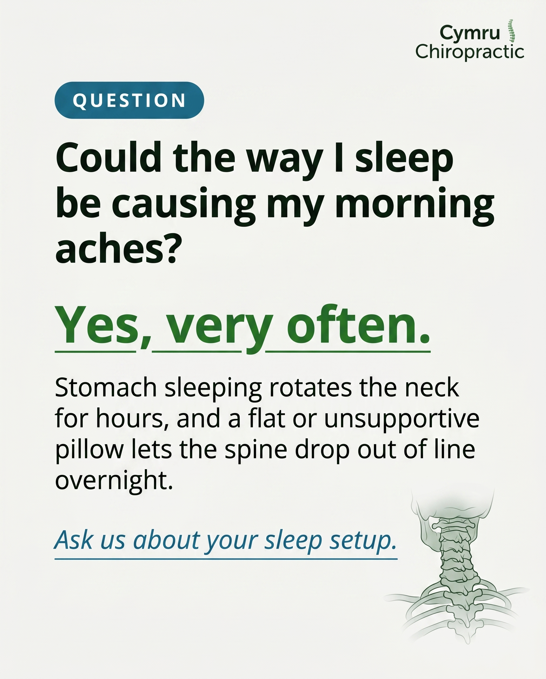
L3S5A2
Rough Image Prompt
A clean, typographic Q&A card for a chiropractic clinic answering whether sleep position causes morning aches. Components required: a question text element, an answer text element, a short supporting explanation, and a soft CTA. Visual register is typographic-led with a small supporting accent only: a simple anatomical illustration of the cervical spine and upper back vertebrae rendered in a clear, translucent, clinical-polish style, or a minimal line-icon of a pillow and head silhouette from behind (no face). Keep the accent small and supporting so the typography leads. Brand colour palette to draw from: #2E7D32 green, #1A6B8A teal-blue, #F4F4F2 off-white, #16241A near-black, #FFFFFF white, #1F5A24 deep green. Typography: Ahoura for the question and answer headline elements, Open Sans for supporting text, Open Sans italic for the CTA. Text content to render: question 'Could the way I sleep be causing my morning aches?', answer 'Yes, very often.', supporting line 'Stomach sleeping rotates the neck for hours, and a flat or unsupportive pillow lets the spine drop out of line overnight.', CTA 'Ask us about your sleep setup.' Logo placement should vary by composition and is finalised downstream. Show clear contrast between the question and the confirming answer, with a calm, trustworthy, reassuring tone. Neutral surface, no clinic interior, no faces, no people shown in full.
Text Overlay
Caption
If you wake up stiffer than when you went to bed, your pillow and your sleep position are worth a proper look. Stomach sleeping keeps the neck turned to one side for hours at a time. A pillow that is too flat or too high lets the spine sit out of its natural line all night. None of this means you are doing something wrong. It is one of the most common patterns we see, and it is one of the easier ones to start changing. Side sleeping with a pillow that fills the gap between your shoulder and ear takes a lot of strain off the neck and lower back. We can check how you move, scan your posture, and talk through what your set-up needs.
📞 01495 757666
🌐 https://www.cymruchiropractic.co.uk
How do you sleep, on your back, side, or front?
Hashtags
#Chiropractic #Pontypool #MorningStiffness #SleepPosture #NeckPain
6.
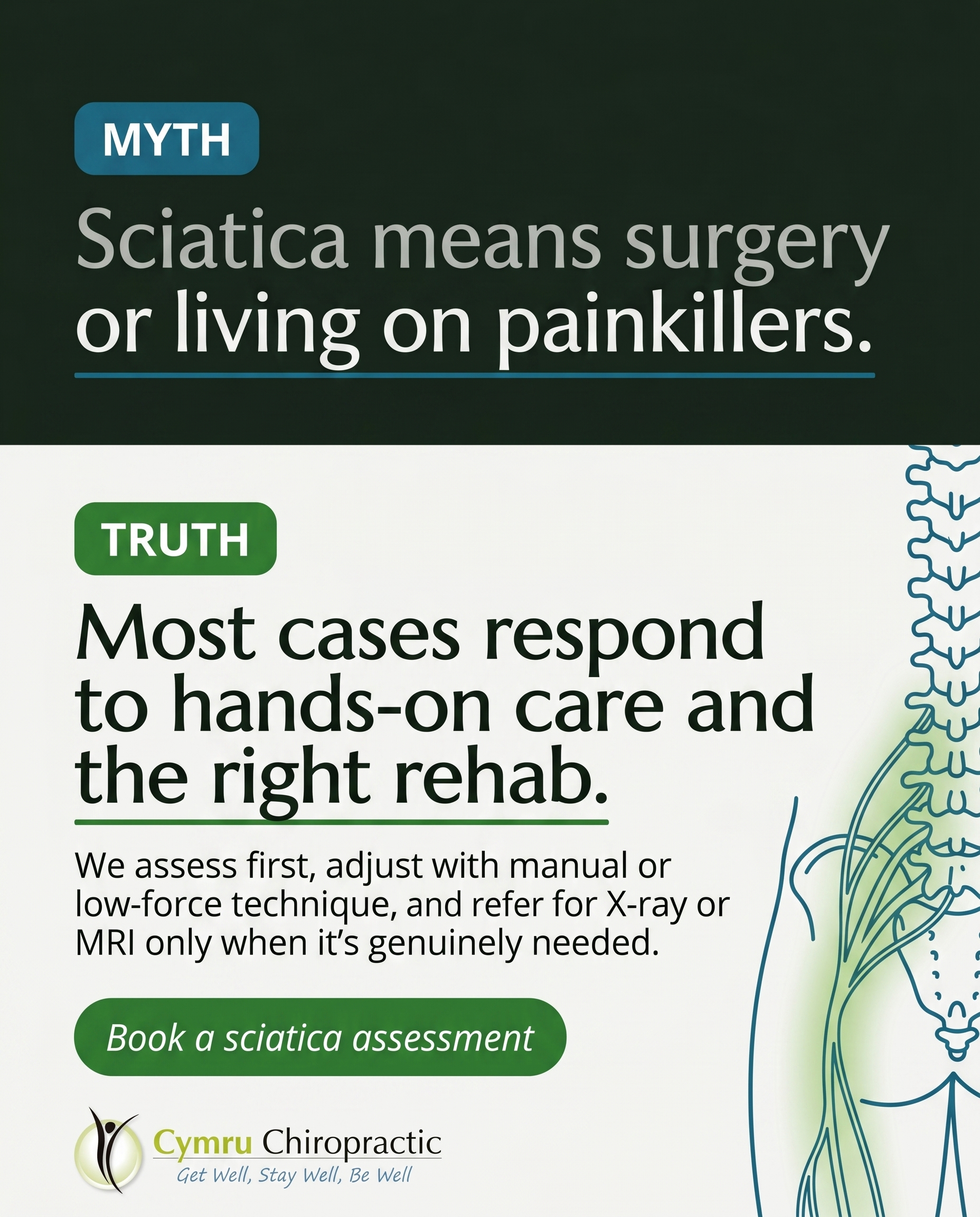
T3S6A4
Rough Image Prompt
A myth-buster style typographic post tackling the belief that sciatica means surgery or painkillers are the only path. Typography-led composition using Ahoura for headline and label text, Open Sans for supporting text, Open Sans italic for the CTA. Two clearly contrasted text blocks: a MYTH label with its statement, and a TRUTH label with its statement, set with bold typographic impact and clear visual separation between the two. Include a small supporting anatomical illustration accent of the lower spine and sciatic nerve pathway down through the lower back and leg, rendered clean and editorial with a soft highlight along the nerve path, not full-frame, sitting as a supporting element rather than competing with the type. Draw from this exact brand palette: #2E7D32 green, #1A6B8A teal-blue, #F4F4F2 off-white, #16241A near-black, #FFFFFF white, #1F5A24 deep green. Text content to render: MYTH label reads 'MYTH', myth statement reads 'Sciatica means surgery or living on painkillers.', TRUTH label reads 'TRUTH', truth statement reads 'Most cases respond to hands-on care and the right rehab.', CTA reads 'Book a sciatica assessment'. Logo placement varies by composition and is finalised downstream. Keep the composition clean, confident, and clinical-trust in feel, with all text sharp and legible.
Text Overlay
Caption
If you've been told sciatica leaves you with two choices, surgery or a long course of painkillers, it's worth a second look.
Sciatica is a symptom, not a diagnosis on its own. The pain travels down the leg, but the source is usually higher up, where the nerve is being irritated. So the first thing we do is assess properly and find out what's actually driving it.
From there the care is structured. Manual adjustment or low-force Activator technique to settle the irritated area, plus rehab exercises you do between visits to hold the change. If something points to a deeper structural issue, we refer for X-ray or MRI. No guesswork.
Most people don't need the operating table. They need the right assessment and a plan that fits them.
📞 01495 757666
🌐 https://www.cymruchiropractic.co.uk
Dealing with leg pain that won't ease? Send us a message.
Hashtags
#Sciatica #Chiropractic #Pontypool #BackPainRelief #Torfaen
7.
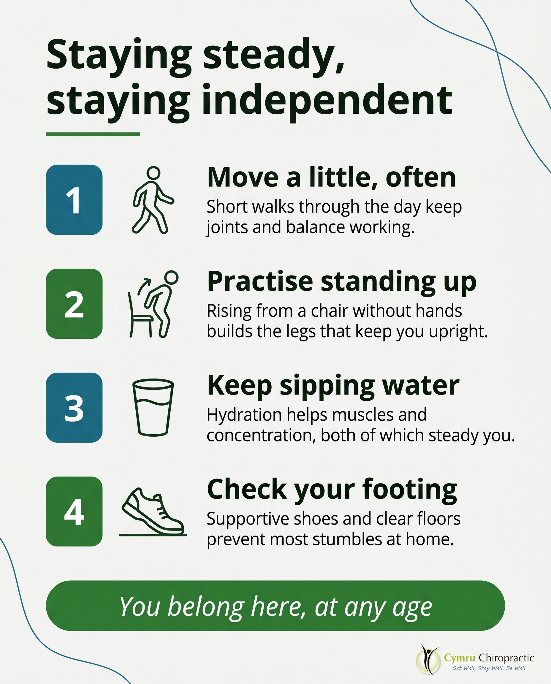
C3S7
Rough Image Prompt
A typographic-led list-tips graphic for a chiropractic clinic, sharing practical tips for older adults staying mobile, steady and independent. The post should feel warm, encouraging and grounded, signalling that this audience belongs at the clinic. Components: a header introducing the list, four numbered tips each with a short title and one supporting line, and a soft closing CTA. Use small custom illustrated icons next to each tip that feel hand-considered and relate to each tip's subject (a walking figure or steady footing, a glass of water, a chair-to-stand motion, a gentle stretch). Optional subtle anatomical or movement-line accent kept small and supporting, not full-frame. Typographic in character: typography carries the post, icons and accents support it. Brand colour palette to draw from: #2E7D32 green, #1A6B8A teal-blue, #F4F4F2 off-white, #16241A near-black, #FFFFFF white, #1F5A24 deep green. Typography: Ahoura for the header and tip titles, Open Sans for supporting lines, Open Sans italic for the CTA. Text content to render: header 'Staying steady, staying independent', tip one title 'Move a little, often', tip one line 'Short walks through the day keep joints and balance working.', tip two title 'Practise standing up', tip two line 'Rising from a chair without hands builds the legs that keep you upright.', tip three title 'Keep sipping water', tip three line 'Hydration helps muscles and concentration, both of which steady you.', tip four title 'Check your footing', tip four line 'Supportive shoes and clear floors prevent most stumbles at home.', CTA 'You belong here, at any age'. Logo placement varies by composition and is finalised downstream. Clean editorial composition, generous spacing, no faces, no clinic interior, no treatment scenes.
Text Overlay
Caption
Staying mobile in your later years isn't about big changes. It's the small, steady habits that keep you doing the things you love.
A short walk after lunch. Standing up from your chair without using your hands. A supportive pair of shoes. These add up, and they make a real difference to balance and confidence over time.
We see plenty of older adults at the clinic who simply want to keep moving well and stay independent. That's exactly the kind of goal we're here to support, whether through gentle adjustments, GaitScan assessment, or a few tailored exercises to do at home.
You're never too old to look after your movement. We'd be glad to help you keep going.
📞 01495 757666
🌐 https://www.cymruchiropractic.co.uk
Which of these tips already feels like part of your routine?
Hashtags
#Chiropractic #Pontypool #StayingMobile #HealthyAgeing #Torfaen
8.
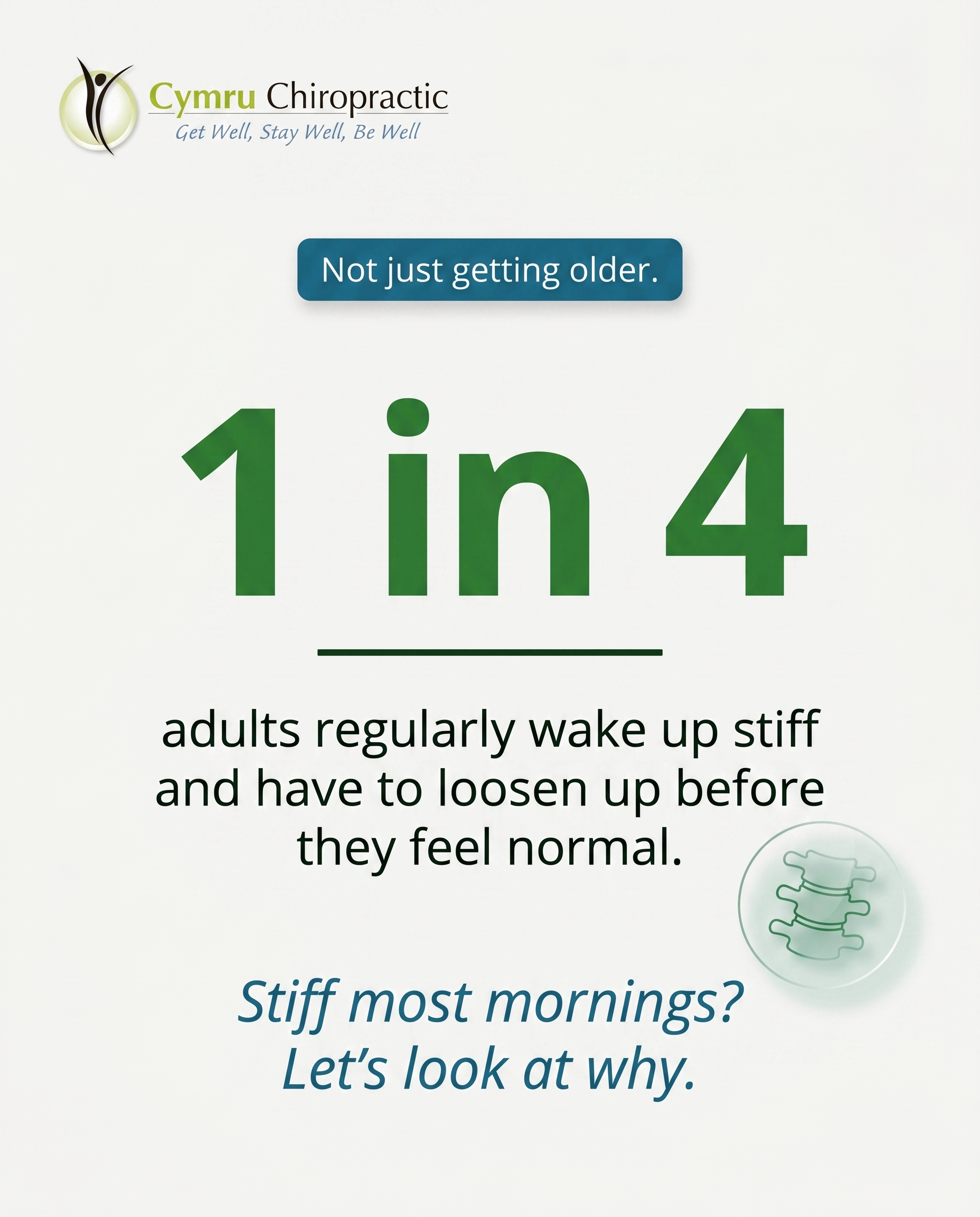
T10S8A2
Rough Image Prompt
A stat-card concept built around one striking number, communicating that morning stiffness is common and worth taking seriously rather than dismissing as ageing. Typographic-led composition where the statistic is the visual anchor. The statistic to render large and dominant: "1 in 4". Supporting context line beneath it: "adults regularly wake up stiff and have to loosen up before they feel normal." A short framing tag: "Not just getting older." CTA in italic: "Stiff most mornings? Let's look at why." Optional small supporting accent: a simple anatomical illustration of a spine or a lower-back joint rendered in a clean translucent glass-like style, used small and supporting, never full-frame. Brand colours to draw from: #2E7D32 green, #1A6B8A teal-blue, #F4F4F2 off-white, #16241A near-black, #FFFFFF white, #1F5A24 deep green. Typography: Ahoura for the statistic and headline, Open Sans for supporting text, Open Sans italic for the CTA. Keep the composition clean and confident so the number reads instantly. Logo placement varies by composition and is finalised downstream.
Text Overlay
Caption
Do you wake up stiff and need a good ten minutes to move properly before the day starts? A lot of people put that down to age and leave it there. Morning stiffness happens because the joints and surrounding muscles settle overnight, and when something underneath isn't moving the way it should, that settling takes longer to shake off. If it's happening most mornings, it's worth a proper look rather than just stretching it out and hoping. At the clinic we use MyoVision sEMG scanning and muscle testing to find where the restriction actually sits, then build a plan around it. Stiffness that's there every single morning is a signal, not a sentence.
📞 01495 757666
🌐 https://www.cymruchiropractic.co.uk
How long does it take you to feel loose in the mornings? Let us know below.
Hashtags
#Chiropractic #Pontypool #MorningStiffness #BackHealth #Torfaen
9.
T9S9A3
Rough Image Prompt
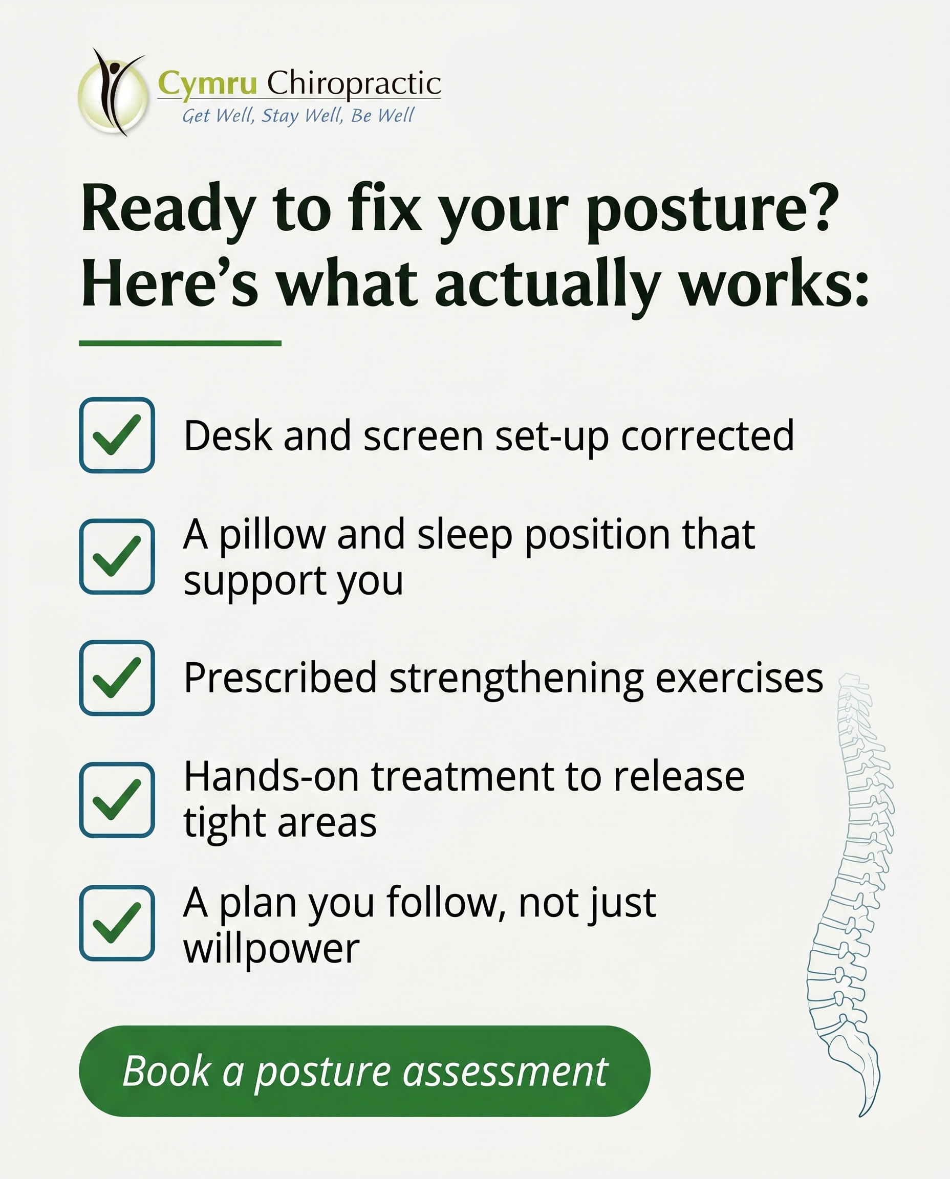
A checklist-style graphic post for a chiropractic clinic communicating that poor posture is changeable through a structured plan, not willpower alone. Typographic-led design with checkbox graphics. Components: a framing line, five short checklist items each with a checkbox graphic, and a soft CTA. Include a small supporting anatomical accent of a side-view spine showing healthy upright alignment, illustrated in a clean editorial style, kept subtle and supporting so the typography leads. Brand colour palette to draw from: #2E7D32 green, #1A6B8A teal-blue, #F4F4F2 off-white, #16241A near-black, #FFFFFF white, #1F5A24 deep green. Typography: Ahoura for the framing line and headline, Open Sans for the checklist item text, Open Sans italic for the CTA. Text content to render: framing line 'Ready to fix your posture? Here's what actually works:'. Checklist items: 'Desk and screen set-up corrected', 'A pillow and sleep position that support you', 'Prescribed strengthening exercises', 'Hands-on treatment to release tight areas', 'A plan you follow, not just willpower'. CTA: 'Book a posture assessment'. Show clean checkbox graphics beside each item. Logo placement should vary by composition and is finalised downstream. Keep the look intentional, calm, and clinical-trust in character, with the typography as the primary focus and the spine illustration as a quiet supporting element.
Text Overlay
Caption
Telling yourself to sit up straight lasts about ten minutes. Then you're back to the forward head and rounded shoulders, because the muscles holding you there are tired and the desk in front of you hasn't changed.
Posture shifts when you change the things around it. We look at how your desk and screen are set up, how you sleep, and which muscles have switched off from sitting all day. From there you get prescribed exercises to rebuild the strength that holds you upright, and hands-on work to release the areas that have tightened over months of the same position.
It's a plan, and it's one you can actually keep to. Forward head from desk work is one of the most common patterns we see in Pontypool.
📞 01495 757666
🌐 https://www.cymruchiropractic.co.uk
What's the first thing you'd change about your desk set-up?
Hashtags
#PostureCorrection #Chiropractic #Pontypool #TechNeck #DeskHealth
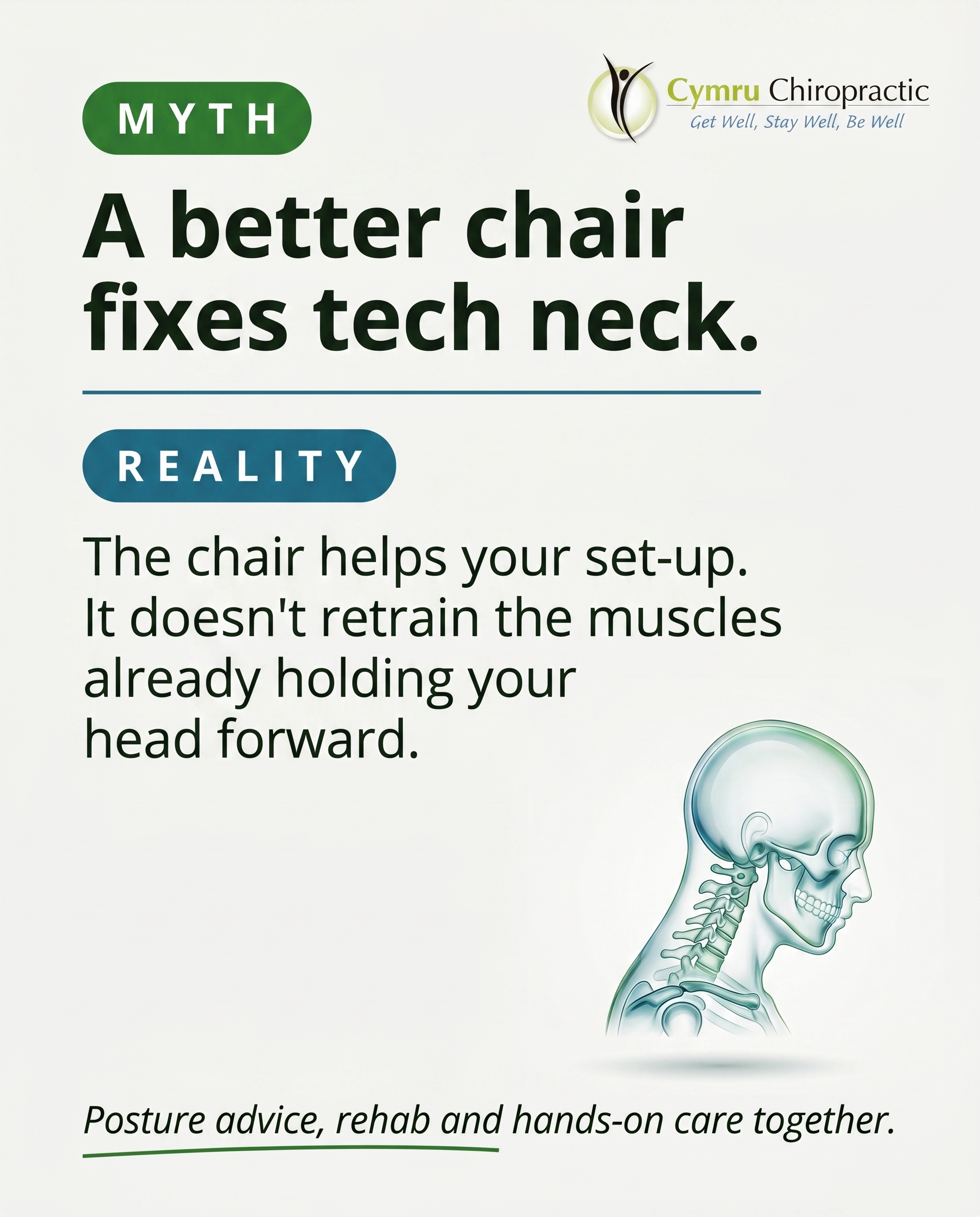
10.
L1S6A3
Rough Image Prompt
A myth-buster graphic post for a chiropractic clinic dismantling the belief that 'tech neck' is solved by buying a fancier chair or a standing desk. Typographic-led design with a clear contrast between a myth statement and the corrective reality. Include a 'MYTH' label and a 'REALITY' label as distinct typographic markers. Supporting accent element: a small, clean anatomical illustration of the cervical spine and head in a forward-head posture, rendered in a translucent, glass-like clinical style, used as a supporting accent rather than a full-frame background. Brand colour palette to draw from: #2E7D32 green, #1A6B8A teal-blue, #F4F4F2 off-white, #16241A near-black, #FFFFFF white, #1F5A24 deep green. Typography: Ahoura for the headline and MYTH/REALITY labels, Open Sans for supporting text, Open Sans italic for the CTA. Text to render: 'MYTH', 'A better chair fixes tech neck.', 'REALITY', 'The chair helps your set-up. It doesn't retrain the muscles already holding your head forward.', 'Posture advice, rehab exercises and manual therapy together.' Keep the cervical spine illustration anatomically accurate and on neutral ground so it reads as a representation, not a clinical photo. Logo placement should vary by composition and is finalised downstream. No faces, no clinic interior, no treatment scene, no chair or desk product photography.
Text Overlay
Caption
A new chair sounds like the fix. It rarely is.
When you spend hours at a screen, the head drifts forward and the muscles at the back of the neck end up working overtime to hold it there. A standing desk or an expensive chair can improve how you sit, but it doesn't undo the pattern your body has already learned.
That's where the actual work happens. We pair ergonomic and posture advice with targeted rehab exercises to rebuild the support, and manual therapy to ease the tightness that's already set in. The chair is one piece. The retraining is the rest.
If your neck aches by the afternoon most days, it's worth looking at properly.
📞 01495 757666
🌐 https://www.cymruchiropractic.co.uk
What does your desk set-up look like right now?
Hashtags
#TechNeck #ChiropracticCare #Pontypool #PostureMatters #NeckPain
4
Refined Image Prompts
10 prompts · 2026-06-25T14:19
10 prompts refined
▼
1.
T8S1A1
Refined Image Prompt
Elevated health and wellness photography for a chiropractic clinic, photographic in register, intentional and credible, embodying a clean approachable wellness-clinical mood that feels quiet and human rather than staged.
Subject: a single person at the end of a long day, framed from behind or cropped at the neck and shoulders so that no face is visible at all, no profile, no side of the face, no eyes. One hand reaches up across the body to press into the back of their own shoulder and neck, fingers digging gently into the muscle where tension sits, a quiet self-soothing gesture that reads as so habitual the person barely registers they are doing it. Focus stays on hands, neck, and upper torso. Soft knit clothing in a muted off-white #F4F4F2 tone with a faint warmth to it.
Setting: a generic, calm, everyday interior suggesting the ordinary end of a working day, not a clinic. Soft out-of-focus background, gentle warm ambient light spilling from one side, low contrast and unhurried. Natural daylight quality, soft and warm, wrapping the figure with no harsh shadows. A subtle teal-blue #1A6B8A ambient cool tone sits in the background shadows to balance the warmth and quietly carry the brand palette without feeling deliberate.
Composition: the figure positioned slightly off-centre toward the right, leaving open negative space on the upper left of the frame for text. Considered, balanced, breathing room around the subject. The mood is weary, relatable, and tender.
Text overlay, rendered cleanly and integrated into the upper-left negative space:
Headline in Ahoura, in near-black #16241A, set in two short stacked lines reading "You stopped noticing it." on the first line and "Your body didn't." on the second line, the second line carrying a thin underline accent in green #2E7D32 sitting beneath "Your body didn't." to draw the eye.
Supporting line directly below the headline in Open Sans, in near-black #16241A at a calm readable size, reading "Constant shoulder and back tightness isn't just life. It's a sign worth listening to."
CTA placed lower in the composition inside a soft pill shape with slightly rounded 4px corners, filled with green #2E7D32, the text in Open Sans italic in white #FFFFFF reading "Get Well, Stay Well, Be Well."
All rectangular surfaces, pills, and containers use slight 3 to 6px rounded corners consistently. Attention is drawn only through the thin green underline beneath the headline and the soft green CTA pill, keeping the rest of the design quiet and uncluttered.
Place the provided logo file in the bottom-left corner at a modest, unobtrusive size with clear spacing around it. Render the logo exactly as supplied, preserving its original colours, proportions, lettering, and layout without recolouring, redrawing, distorting, or altering it in any way.
Constraints: keep the image photographic and credible throughout, a single human subject only, hands and torso focus, no face or facial features visible from any angle, no clinical or medical environment, no clutter, soft and warm natural lighting only, text remaining fully legible against the soft background, exact hex colours as specified, fonts exactly as specified with Ahoura for the headline, Open Sans for the supporting line, and Open Sans italic for the CTA.
2.
T11S2A3
Refined Image Prompt
A typographic-led social media post with a calm, clean approachable wellness-clinical register. The composition uses a light scheme: a full off-white #F4F4F2 surface as the background, giving a spacious, breathable clinical-trust feel. Generous margins frame the content, with the typography clearly leading and a small anatomical illustration providing supporting visual interest.
Layout: the headline occupies the upper-left two-thirds of the composition, set in Ahoura in near-black #16241A, reading "Jaw pain you don't have to live with" across two or three lines with comfortable line spacing. The word "don't" is emphasised with a thin underline accent in green #2E7D32 sitting directly beneath it. Below the headline, separated by clear breathing space, the supporting line is set in Open Sans in near-black #16241A at a noticeably smaller size, reading "Trigger pointing and manual therapy ease the muscles around the jaw and neck that hold TMJ tension", set to a comfortable measure so it does not run edge to edge.
In the lower-right quadrant, a small, clean editorial illustration of the human jaw and surrounding muscles, shown in profile. The illustration depicts the jaw joint and the masseter and temporalis muscle region near the neck, drawn in fine confident linework with a limited palette using teal-blue #1A6B8A line strokes. The jaw joint area and the muscle tension zones are subtly highlighted with soft fills of green #2E7D32 at reduced opacity to indicate where tension builds. The illustration is kept small and supporting, roughly a quarter of the composition, never competing with the typography. It sits within a soft rounded container with slight 4px corners filled in a faint tint, or rests cleanly on the off-white field with no harsh border.
The CTA sits in the lower-left, presented as a soft pill button with slight 5px rounded corners filled in green #2E7D32, containing the text "Book an assessment" set in Open Sans italic in white #FFFFFF, centred within the pill with balanced padding.
All rectangular surfaces, any container, the CTA pill, and the illustration frame use slight 3 to 6px rounded corners applied uniformly. Accents are limited to the thin green underline beneath "don't" and the soft pill CTA, keeping attention focused and uncluttered.
Lighting and mood: even, soft, flat editorial lighting with no dramatic shadows, conveying calm, clinical trust and approachable wellness. The overall feel is spacious, modern, and reassuring.
Place the provided logo file in the top-left corner at a modest, balanced scale with clear surrounding padding. Reproduce the logo exactly as supplied, preserving its original colours, proportions, lettering, and detail with no recolouring, distortion, cropping, or redrawing.
Constraints: render all text exactly as written with correct spelling and apostrophes. Use only the specified hex colours. Keep the anatomical illustration small, clean, and supporting so the typography leads. Maintain generous negative space and a balanced, uncluttered layout. Ensure all text is crisp, legible, and correctly aligned.
3.
T12S3A2
Refined Image Prompt
An anatomically accurate 3D illustration showing the kinetic chain rising from the foot upward through the knee, hip, and into the lower spine, rendered as a single connected lower limb and pelvis-to-spine segment in a clean, translucent, glass-like clinical style. The foot and arch are detailed at the base as the origin point, with the structure travelling smoothly up through the knee, hip, and into the lower lumbar vertebrae. The anatomy carries a refined frosted-glass translucency with soft internal light, polished and editorial rather than photographic or documentary.
Composition: vertical emphasis with the anatomical render positioned to occupy roughly the right two thirds of the frame, the foot anchored toward the lower right and the spine segment reaching toward the upper right, leaving clean negative space on the left for text. Background is a soft vertical gradient flowing from off-white #F4F4F2 at the top into a gentle pale tint of teal-blue #1A6B8A toward the lower edge, calm and uncluttered with no clinic environment, no people, no faces.
Flow indicator: a soft directional glow runs continuously up the kinetic chain from the foot to the lower back, beginning as a warm saturated green #2E7D32 accent concentrated at the foot and arch as the origin point, transitioning into teal-blue #1A6B8A as it travels upward through the knee and hip, communicating how mechanics transfer up the body. The glow is smooth and luminous, hugging the contours of the limb.
Lighting: soft directional studio light from the upper left, casting gentle highlights across the translucent surfaces and a faint diffuse shadow beneath the foot to ground the form.
Text overlay on the left negative space, all text in near-black #16241A except where noted:
Headline in Ahoura, large and prominent in the upper left: "It starts at your feet" with a thin underline accent in green #2E7D32 beneath the word "feet".
Supporting text in Open Sans, set in a comfortable readable size below the headline: "How your foot strikes the ground travels up through the knee, hip and lower back."
CTA in Open Sans italic, placed inside a soft pill shape with slightly rounded 4px corners filled with green #2E7D32, the text rendered in white #FFFFFF reading "GaitScan assessment available", positioned in the lower left.
All rectangular and pill surfaces use slight 4px rounded corners consistently. The overall register is clean, approachable, wellness-clinical: composed, trustworthy, and uncluttered.
Place the provided logo at the top left corner at a modest scale with clear spacing around it. Preserve the logo exactly as supplied without altering its colours, proportions, lettering, or layout.
Constraints: keep the background clean and free of any clinic setting, equipment, people, or faces. Maintain anatomical accuracy in the foot, knee, hip, and lumbar spine. Keep all text crisp, correctly spelled, and legible against its background. Use only the specified hex colours.
4.
T7S4A3
Refined Image Prompt
A clean, credibly clinical comparison-card graphic for a chiropractic clinic, built as a balanced split-screen composition divided down the centre into two vertical panels of exactly equal width and visual weight, contrasting two routes for stiff, achy joints.
Left panel uses the light scheme: an off-white #F4F4F2 surface with near-black #16241A text. At the top of the left panel, a label "WAIT IT OUT" set in Ahoura, in near-black #16241A, underlined with a thin teal-blue #1A6B8A horizontal underline sitting just beneath the label. Below it, supporting text "Push through, hope it settles. Stiffness lingers, movement stays limited." set in Open Sans in near-black #16241A, sized comfortably for reading, left-aligned within the panel with generous margins. This side feels static and muted, with no illustrative accent.
Right panel uses the dark scheme: a saturated green #2E7D32 surface with white #FFFFFF text, giving strong contrast against the left side. At the top of the right panel, a label "STRUCTURED PLAN" set in Ahoura, in white #FFFFFF, underlined with a thin white #FFFFFF underline just beneath it. Below it, supporting text "Manual therapy plus prescribed rehab exercises to restore how the joint moves." set in Open Sans in white #FFFFFF, left-aligned with generous margins. Toward the lower area of this right panel, place a small clean translucent clinical anatomical illustration of a knee joint, rendered in subtle tonal whites and faint teal-blue #1A6B8A highlights with a translucent glass-like quality, kept small and tucked into the lower corner so it supports rather than dominates, never full-frame.
A thin vertical divider line in deep green #1F5A24 runs down the exact centre where the two panels meet, clean and crisp.
Across the top of the full composition, spanning both panels, a headline band: the headline "Which one actually restores movement?" set in Ahoura, centred, sitting on its own clear strip above the two panels. Render this headline in near-black #16241A on a slim off-white #F4F4F2 header strip so it reads clearly across both sides.
At the bottom centre of the composition, spanning the seam between the two panels, a soft pill-shaped button with slightly rounded 4px corners filled with green #2E7D32, containing the CTA "Book an assessment" set in Open Sans italic in white #FFFFFF, centred within the pill. The pill sits cleanly over the divider as a unifying call-to-action.
All rectangular elements, including the header strip, panels and any text containers, use slight 3 to 5px rounded corners applied uniformly. The pill button uses fully soft rounded ends. Overall register is clean, approachable and wellness-clinical: balanced spacing, calm confident typographic hierarchy, plenty of breathing room, no clutter.
Lighting and finish are flat and even with a modern editorial design feel, strong clear contrast between the dim left side and the vibrant green right side to make the comparison instantly legible.
Place the provided logo in the top corner of the header strip, sized small and legible, positioned so it does not overlap the headline. Preserve the logo exactly as supplied: do not redraw, recolour, distort, or regenerate it, keep its original proportions, colours and detail fully intact.
Use only these brand colours and no others: green #2E7D32, deep green #1F5A24, teal-blue #1A6B8A, off-white #F4F4F2, near-black #16241A, white #FFFFFF. Keep all text exactly as written. Maintain crisp text edges, accurate spelling, and clear separation between the two panels. Keep the anatomical accent small, clean and supportive. Keep the whole design intentional, uncluttered and credibly clinical.
5.
L3S5A2
Refined Image Prompt
A clean, typographic Q&A card for a chiropractic wellness clinic, designed in a calm, approachable, clinical-polish register where typography leads and a single small anatomical accent supports.
Surface and layout: a full off-white background in #F4F4F2 filling the entire frame, giving an open, breathable, reassuring feel. The composition is vertically structured with generous margins and clear negative space. A soft pill-shaped label sits at the top, a small rounded rectangle with 5px corners filled in #1A6B8A teal-blue, containing the word "QUESTION" in Open Sans, white #FFFFFF, in small spaced capitals.
Directly below the label, the question headline sits as the dominant element in the upper-middle of the frame, set in Ahoura, near-black #16241A, large and confident, reading "Could the way I sleep be causing my morning aches?" across two or three lines, left-aligned within the margins.
Beneath the question, the confirming answer creates strong contrast: the words "Yes, very often." set in Ahoura, in green #2E7D32, noticeably larger and bolder in presence than the supporting text, with a thin underline accent in #2E7D32 sitting just below it, drawing the eye. This is the clear emotional pivot of the card.
Below the answer, a short supporting explanation in Open Sans, near-black #16241A at a comfortable readable size, left-aligned, reading "Stomach sleeping rotates the neck for hours, and a flat or unsupportive pillow lets the spine drop out of line overnight."
Toward the lower third of the card, set the CTA in Open Sans italic, teal-blue #1A6B8A, reading "Ask us about your sleep setup." A thin underline accent in #1A6B8A sits beneath the CTA line to mark it as the soft call to action.
Supporting accent: in the lower-right corner area, a small, minimal, translucent anatomical illustration of the cervical spine and upper-back vertebrae rendered in clear, clinical-polish line style, tinted softly in #1F5A24 deep green at low opacity so it reads as a delicate background-supporting element. Keep it small, refined, and secondary so it never competes with the typography. No faces, no people, no clinic interior.
Embellishments applied consistently: all rectangular surfaces, the pill label, and any container edges use slight 5px rounded corners. Attention is drawn using thin underlines beneath the answer and the CTA, and one soft pill for the top label, matching the clean approachable wellness-clinical register throughout.
Lighting and mood: flat, even, soft daylight tone across the surface, no harsh shadows, calm and trustworthy, with a sense of clarity and reassurance.
Logo placement: position the attached logo small in the top-right corner, sized modestly so it sits in balance with the top label without crowding it. Render the logo exactly as supplied in the attached file, preserving its precise colours, proportions, lettering, and details without alteration, recolouring, redrawing, or distortion.
Constraints: keep the typography clearly leading and the anatomical accent small and supporting. Maintain strong visual contrast between the question and the confirming answer. Use only the specified hex colours. Show no faces, no people in full, no clinic interior, no photographic backgrounds. Keep all text legible with generous spacing and clean alignment.
6.
T3S6A4
Refined Image Prompt
A myth-buster typographic social post for a chiropractic wellness clinic, split into two clearly contrasted vertical zones with a clean editorial register that feels approachable yet clinically trustworthy.
The upper zone uses a near-black surface in #16241A occupying roughly the top 45 percent of the composition. In the top left of this zone, a soft pill badge with slightly rounded 4px corners filled in #1A6B8A teal-blue contains the word "MYTH" set in Ahoura in #FFFFFF white, compact and confident. Directly below the badge, the myth statement reads "Sciatica means surgery or living on painkillers." set in Ahoura in #FFFFFF white, large and prominent, given a faint reduced opacity treatment to feel like the discredited idea. A thin underline accent in #1A6B8A sits beneath the myth statement, drawing a subtle line under the false claim.
The lower zone uses an off-white surface in #F4F4F2 occupying the bottom 55 percent. In the top left of this zone, a soft pill badge with slightly rounded 4px corners filled in #2E7D32 green contains the word "TRUTH" set in Ahoura in #FFFFFF white. Below it, the truth statement reads "Most cases respond to hands-on care and the right rehab." set in Ahoura in #16241A near-black, large and assured, rendered crisp and full strength to feel definitive. A thin underline accent in #2E7D32 green sits beneath the truth statement. Beneath the truth statement, smaller supporting body text reads "We assess first, adjust with manual or low-force technique, and refer for X-ray or MRI only when it's genuinely needed." set in Open Sans in #16241A near-black, comfortably spaced and highly legible.
A small supporting anatomical illustration of the lower spine and sciatic nerve pathway runs down through the lower back and leg, rendered clean and editorial in line-art style using #1A6B8A teal-blue with a soft highlight glow in #2E7D32 green tracing along the nerve path. This illustration sits to the right side as a supporting accent, partially bleeding off the right edge, scaled modestly so it never competes with the typography and reads as a quiet anatomical cue.
Near the bottom of the lower zone, a soft pill button with slightly rounded 5px corners filled in #2E7D32 green contains the CTA "Book a sciatica assessment" set in Open Sans italic in #FFFFFF white, centred within the pill.
Place the provided logo in the bottom left corner of the lower off-white zone at a modest, balanced scale with clear surrounding space. Preserve the logo exactly as supplied with no recolouring, redrawing, distortion, or alteration of its proportions, lettering, or marks.
Lighting is even, bright, and editorial with no harsh shadows. Composition is clean, confident, and well balanced with generous breathing room between elements. All text must be rendered sharp, crisp, and perfectly legible with accurate spelling. Apply slight 3 to 6px rounded corners uniformly to every rectangular and pill element. Keep the overall feel calm, professional, and reassuring with the wellness-clinical register intact.
7.
C3S7
Refined Image Prompt
A clean editorial typographic list-tips graphic for a chiropractic and wellness clinic, sharing four practical tips that help older adults stay mobile, steady and independent. The overall register is clean, approachable and wellness-clinical: warm, encouraging and grounded, with generous spacing and a calm sense of order.
Layout and composition. Use a light scheme. Set the full background as off-white #F4F4F2 surface. The composition is vertical and structured, with a comfortable outer margin of breathing space on all sides. Organise the layout into three zones from top to bottom: a header zone, a stacked list of four numbered tips occupying the central majority of the frame, and a closing CTA band at the base. Keep alignment left-anchored within a clear central column so the typography reads as a calm, considered editorial sequence.
Header zone. Render the header in Ahoura in near-black #16241A, set as two lines reading "Staying steady, staying independent". Beneath the header place a thin underline accent in green #2E7D32, short and left-aligned, roughly the width of the first word, drawing the eye down into the list. Keep the header large and confident but unhurried, with soft generous spacing below it.
The four tips. Stack four tips vertically with even, generous spacing between each. Each tip is built from three parts arranged in a consistent row pattern: a small soft pill containing the number on the left, a small custom illustrated icon beside it, then the tip title and supporting line to the right.
For each number, use a soft pill with slight rounded corners of 4px, filled with teal-blue #1A6B8A, the numeral inside set in Ahoura in white #FFFFFF, alternating optionally with green #2E7D32 pills to keep the rhythm gentle. Numbers run 1 through 4.
Next to each pill, render a small, hand-considered line illustrated icon, simple and friendly, drawn in deep green #1F5A24 with thin clean strokes, each relating to its tip: tip one a walking figure mid-stride suggesting steady footing, tip two a chair-to-stand motion of a figure rising from a chair, tip three a glass of water, tip four a supportive shoe on a clear floor. Keep icons small, consistent in stroke weight, and supporting rather than dominant.
Tip titles in Ahoura in near-black #16241A, tip supporting lines in Open Sans in a softer near-black #16241A at smaller size directly beneath each title. Render the tips as follows.
Tip one title "Move a little, often" with supporting line "Short walks through the day keep joints and balance working."
Tip two title "Practise standing up" with supporting line "Rising from a chair without hands builds the legs that keep you upright."
Tip three title "Keep sipping water" with supporting line "Hydration helps muscles and concentration, both of which steady you."
Tip four title "Check your footing" with supporting line "Supportive shoes and clear floors prevent most stumbles at home."
Closing CTA. At the base, place a soft pill band with slight rounded corners of 5px, filled with green #2E7D32, containing the CTA "You belong here, at any age" set in Open Sans italic in white #FFFFFF, centred within the pill. Keep this warm and inviting, a gentle resolution to the list.
Optional accent. Allow one very subtle movement-line accent, a thin flowing curved line in teal-blue #1A6B8A at low opacity, kept small and supporting in a corner or trailing edge near the header or footer, never full-frame and never competing with the typography.
Logo. Place the attached logo small in the top-left or bottom corner, sized modestly and given clear surrounding space. Preserve the logo exactly as supplied: do not redraw, recolour, distort, crop, or regenerate it. Reproduce its existing colours, proportions and lettering faithfully.
Lighting and finish. Flat, even, bright editorial lighting with no harsh shadows. Crisp clean rendering, soft and approachable yet clinically trustworthy.
Constraints. Typography carries the composition; icons and accents stay small and supporting. Keep all rectangular surfaces and pills to slight rounded corners of 3 to 6px consistently. Maintain generous spacing throughout. Show no human faces, no clinic interior, no treatment scenes. Keep the palette strictly to off-white #F4F4F2, near-black #16241A, green #2E7D32, teal-blue #1A6B8A, deep green #1F5A24 and white #FFFFFF.
8.
T10S8A2
Refined Image Prompt
A clean, typographic-led stat card composition with the statistic as the dominant visual anchor. The background is a soft off-white surface in #F4F4F2, giving the design an airy, approachable wellness-clinical mood that feels calm and confident.
The composition is centred and vertically balanced. In the upper third, a small soft pill badge with slightly rounded corners (4px radius) filled in #1A6B8A teal-blue holds the framing tag text "Not just getting older." in Open Sans, coloured #FFFFFF white, set small and tracked comfortably.
The central focal point is the statistic "1 in 4" rendered very large and dominant in Ahoura, coloured #2E7D32 green, occupying the visual centre of the layout so it reads instantly. Beneath the statistic sits a thin horizontal underline accent in #1F5A24 deep green, short and centred, drawing the eye down to the supporting line.
Directly below the underline, the supporting context line "adults regularly wake up stiff and have to loosen up before they feel normal." appears in Open Sans, coloured #16241A near-black, set at a comfortable readable size, centred, with relaxed line spacing across two lines so it stays easy to scan.
In the lower portion of the composition, the CTA "Stiff most mornings? Let's look at why." is rendered in Open Sans italic, coloured #1A6B8A teal-blue, centred and given breathing room above and below.
To the lower right of the statistic, used small and supporting, place a simple anatomical illustration of a lower-back spinal segment rendered in a clean translucent glass-like style with soft refractive edges and a faint green-teal tint drawn from #2E7D32 and #1A6B8A. It sits as a quiet supporting accent, never full-frame, never competing with the number.
Lighting is soft and even, like diffused daylight, keeping the surface bright and the type crisp with gentle, barely-there shadows beneath the pill badge and glass element to give subtle depth.
Place the attached logo in the top left corner at a modest, balanced size with clear surrounding space. Preserve the logo exactly as supplied, with no recolouring, no distortion, no redrawing, and no alteration of its proportions or lettering.
All rectangular surfaces, badges and containers use slight rounded corners of 4px. Maintain generous margins and clean negative space throughout so the layout feels uncluttered and trustworthy.
Constraints: keep the statistic the single clear focal point. Keep the anatomical illustration small and supporting. Keep all text legible and correctly spelled exactly as quoted. Use only the specified hex colours. Maintain a clean, approachable, wellness-clinical register throughout.
9.
T9S9A3
Refined Image Prompt
A clean, editorial typographic checklist composition for a chiropractic wellness clinic, calm and clinical-trust in character with typography leading and an anatomical accent kept quiet and supporting. The overall register is clean, approachable, wellness-clinical.
Background surface is a flat off-white field in #F4F4F2 filling the entire frame, giving an airy, uncluttered feel. A generous margin of negative space surrounds all content so the layout breathes.
In the upper portion, a framing line and headline set in Ahoura, in near-black #16241A, reading "Ready to fix your posture? Here's what actually works:" arranged across two or three lines, left-aligned, sized as the dominant element on the canvas. Beneath the headline place a single thin underline accent in green #2E7D32, short and tidy, drawing the eye to the opening statement.
Below the headline, a vertical stack of five checklist rows, evenly spaced and left-aligned. Each row begins with a clean square checkbox graphic with slightly rounded corners at 4px, drawn as a thin outline stroke in teal-blue #1A6B8A, each containing a tidy green #2E7D32 checkmark. To the right of each checkbox, the item text set in Open Sans in near-black #16241A. The five items in order:
"Desk and screen set-up corrected"
"A pillow and sleep position that support you"
"Prescribed strengthening exercises"
"Hands-on treatment to release tight areas"
"A plan you follow, not just willpower"
Keep consistent vertical rhythm between rows and align all text on a shared baseline grid so the list reads cleanly.
At the lower portion of the composition, a soft pill-shaped call to action button with slightly rounded corners at 5px, filled with green #2E7D32, containing the text "Book a posture assessment" set in Open Sans italic in white #FFFFFF, centred within the pill.
On the right side of the composition, occupying roughly the lower-right quadrant beside or behind the checklist area, a subtle side-view anatomical illustration of a healthy, upright spine showing natural alignment and gentle curves, rendered in a clean minimal editorial line style using thin strokes in teal-blue #1A6B8A at reduced opacity so it sits quietly in the background and never competes with the typography. Keep it light, supporting, and uncluttered.
All rectangular surfaces, checkboxes, the CTA pill, and any subtle callout edges carry consistent slightly rounded corners between 3 and 6px. Attention is drawn only through thin underlines and soft pills, with no heavy blocks or boxes around the text.
Lighting is flat, even, and bright, like clean studio diffusion with no harsh shadows, keeping the surface crisp and clinical.
Place the provided logo file in the top-left corner at a modest, balanced scale, with clear surrounding space. Render the logo exactly as supplied with its original colours, proportions, and lettering fully preserved and unaltered. Do not redraw, restyle, recolour, or distort the logo in any way.
Constraints: keep the typography as the primary focus and the spine illustration as a quiet secondary element; maintain generous negative space and an uncluttered layout; use only the specified hex colours; keep all checkboxes and corner treatments uniform; ensure all rendered text is spelled exactly as written, sharp, and legible; keep the spine illustration anatomically simple and subtle.
10.
L1S6A3
Refined Image Prompt
A clean, typographic-led myth-buster graphic for a chiropractic wellness clinic, built on a vertically split editorial composition with a calm, clinical-but-approachable register. The upper two-thirds carries the myth-versus-reality typographic contrast, while a translucent anatomical accent anchors the lower right.
Surface and layout: the background is a solid off-white field in #F4F4F2 filling the entire canvas. Across the upper portion, a soft pill-shaped label sits top left, rendered as a filled rounded rectangle in #2E7D32 green with 4px corners, containing the word "MYTH" in Ahoura, in #FFFFFF white, letter-spaced and uppercase, sized small as a marker. Directly beneath it, the myth headline "A better chair fixes tech neck." is set in Ahoura in #16241A near-black, large and prominent, left-aligned, occupying the dominant visual weight of the top third.
Below the myth statement, a thin horizontal underline rule in #1A6B8A teal-blue, roughly one-third the width of the canvas, separates myth from reality. Beneath it, a second soft pill label in #1A6B8A teal-blue with 4px corners holds the word "REALITY" in Ahoura, in #FFFFFF white, uppercase and letter-spaced, mirroring the MYTH marker. Following the REALITY label, the corrective supporting line "The chair helps your set-up. It doesn't retrain the muscles already holding your head forward." is set in Open Sans in #16241A near-black, medium size, left-aligned, with comfortable line spacing for readability.
Supporting accent illustration: in the lower right area of the composition, a small, clean anatomical illustration of the cervical spine and head shown in forward-head posture, rendered in a translucent, glass-like clinical style with subtle teal-blue #1A6B8A and green #2E7D32 refractions and soft edge highlights. It rests on neutral off-white ground with a faint soft shadow so it reads clearly as an anatomical representation rather than a clinical photograph. Keep it anatomically accurate, restrained in scale, and positioned as a supporting accent that does not crowd the type.
CTA: along the lower band of the composition, a thin underline accent in #2E7D32 green sits beneath the closing line "Posture advice, rehab and hands-on care together." set in Open Sans italic in #1F5A24 deep green, left-aligned, medium-small size, signalling the resolution and brand action tone.
Lighting and finish: even, soft, diffuse studio lighting with no harsh shadows, giving a fresh, airy, wellness-clinical mood. Generous white space throughout, balanced negative space around each text block, and a sense of calm editorial order.
Logo: place the supplied logo file in the top right corner at a modest, legible scale with clear margin. Reproduce the logo exactly as supplied, preserving its original colours, proportions, lettering and spacing without recolouring, redrawing, distorting or adding effects.
All rectangular elements, pills and frames use slight 4px rounded corners consistently. Attention is drawn using thin underlines as the primary accent and soft pills as the supporting accent, applied uniformly.
Constraints: include no human faces, no clinic interior, no treatment scene, no chairs, no desks, and no product photography. Keep the anatomical illustration on neutral ground as a representation only. Maintain clean spelling and accurate rendering of all quoted text exactly as written.
5
Rendered Images
10 rendered · 2026-06-25T14:47
10 rendered
▼
T8S1A1
v4
1856×2304
T11S2A3
v5
1856×2304
T12S3A2
v6
1856×2304
T7S4A3
v4
1856×2304
L3S5A2
v4
1856×2304
T3S6A4
v4
1856×2304
C3S7
v4
1856×2304
T10S8A2
v4
1856×2304
T9S9A3
v4
1856×2304
L1S6A3
v4
1856×2304
6
Samples Page
Ready to build
Part A — Practice Name
saved
Part B — Select 4 Images
(0/4 selected)
1
2
3
4
Part C — Build Page