Draw — 15 posts
1
Coordinates
15 coordinates
15 selected
▼
| # | Code | Theme | Subject | Style | Awareness | Source |
|---|---|---|---|---|---|---|
| 1 | T2S1A3 | treatments | T2 — Neck Pain | photography | A3 — Solution-aware | CURATED |
| 2 | T8S2A2 | treatments | T8 — Knee Pain | graphic-design | A2 — Problem-aware | CURATED |
| 3 | C1S3 | clinic | C1 — Local families across multiple generations (Fluvanna/Lake Monticello area residents) | illustrative-3D | — | CURATED |
| 4 | L5S4A4 | lifestyle | L5 — Ignoring early symptoms until pain becomes chronic | comparison-card | A4 — Product-aware | CURATED |
| 5 | T3S5A2 | treatments | T3 — Sciatica | qa-card | A2 — Problem-aware | CURATED |
| 6 | T5S6A3 | treatments | T5 — Herniated / Bulging Discs | myth-buster | A3 — Solution-aware | CURATED |
| 7 | T11S7A2 | treatments | T11 — Peripheral Neuropathy | list-tips | A2 — Problem-aware | CURATED |
| 8 | L2S8A2 | lifestyle | L2 — Sedentary desk work and inactive lifestyle | stat-card | A2 — Problem-aware | CURATED |
| 9 | T6S9A3 | treatments | T6 — Whiplash & Auto Accident Injuries | checklist | A3 — Solution-aware | CURATED |
| 10 | T1S8A3 | treatments | T1 — Lower Back Pain | stat-card | A3 — Solution-aware | CURATED |
| 11 | T4S1A3 | treatments | T4 — Headaches & Migraines | photography | A3 — Solution-aware | CURATED |
| 12 | T7S4A2 | treatments | T7 — Shoulder Pain | comparison-card | A2 — Problem-aware | CURATED |
| 13 | T12S7A1 | treatments | T12 — Sports Injuries | list-tips | A1 — Unaware | CURATED |
| 14 | L3S9A1 | lifestyle | L3 — Poor sleep positioning | checklist | A1 — Unaware | CURATED |
| 15 | C2S2 | clinic | C2 — Recreational and competitive athletes | graphic-design | — | CURATED |
2
Content Briefs
15 briefs · 2026-06-22T10:06
15 briefs generated
▼
1.
T2S1A3
photography
Solution-aware
A clinical photography post showing hands-on manual neck assessment and adjustment, framing chiropractic care plus supporting modalities as the practical fix for stiff, aching necks. The angle answers 'what actually treats this?' by walking through what a neck-focused treatment visit looks like, from evaluation to targeted adjusting and muscle work.
Content: A clinical photography post showing hands-on manual neck assessment and adjustment, framing chiropractic care plus supporting modalities as the practical fix for stiff, aching necks. The angle answers 'what actually treats this?' by walking through what a neck-focused treatment visit looks like, from evaluation to targeted adjusting and muscle work.
Style: photography
2.
T8S2A2
graphic-design
Problem-aware
A graphic-design post helping readers gauge whether their knee discomfort is a real issue worth addressing rather than something to wait out. It contrasts the soreness people brush off with the early signs — swelling, instability, pain on stairs — that signal the knee needs a proper look.
Content: A graphic-design post helping readers gauge whether their knee discomfort is a real issue worth addressing rather than something to wait out. It contrasts the soreness people brush off with the early signs — swelling, instability, pain on stairs — that signal the knee needs a proper look.
Style: graphic-design
3.
C1S3
illustrative-3D
An illustrative-3D post celebrating that this is a place generations of local families return to, reflecting a 75-year family tradition and 35 years serving the Fluvanna and Lake Monticello community. The message is belonging — the same trusted door for grandparents, parents, and adult children alike.
Content: An illustrative-3D post celebrating that this is a place generations of local families return to, reflecting a 75-year family tradition and 35 years serving the Fluvanna and Lake Monticello community. The message is belonging — the same trusted door for grandparents, parents, and adult children alike.
Style: illustrative-3D
4.
L5S4A4
comparison-card
Product-aware
A comparison-card weighing the two paths someone faces when they keep ignoring early aches: let it become chronic on its own, or get it assessed and addressed now. The 'why us' answer leans on multiple services under one roof, six-days-a-week availability with same-day appointments, and 35 years of experience — so acting early is genuinely easy here.
Content: A comparison-card weighing the two paths someone faces when they keep ignoring early aches: let it become chronic on its own, or get it assessed and addressed now. The 'why us' answer leans on multiple services under one roof, six-days-a-week availability with same-day appointments, and 35 years of experience — so acting early is genuinely easy here.
Style: comparison-card
5.
T3S5A2
qa-card
Problem-aware
A Q&A-card answering the question many readers quietly ask: 'is this shooting leg pain actually sciatica, or just a sore back?' It validates the radiating, tingling, down-the-leg pattern as a real nerve problem worth taking seriously rather than dismissing.
Content: A Q&A-card answering the question many readers quietly ask: 'is this shooting leg pain actually sciatica, or just a sore back?' It validates the radiating, tingling, down-the-leg pattern as a real nerve problem worth taking seriously rather than dismissing.
Style: qa-card
6.
T5S6A3
myth-buster
Solution-aware
A myth-buster correcting the belief that a herniated or bulging disc always means surgery. It reframes the fix around conservative, non-surgical care — adjusting, laser therapy, muscle stimulation, and corrective exercise — as a real first-line route to relief.
Content: A myth-buster correcting the belief that a herniated or bulging disc always means surgery. It reframes the fix around conservative, non-surgical care — adjusting, laser therapy, muscle stimulation, and corrective exercise — as a real first-line route to relief.
Style: myth-buster
7.
T11S7A2
list-tips
Problem-aware
A list-tips post helping readers recognise whether their numbness, tingling, or burning in the hands and feet is a real problem rather than something to ignore. It lists the everyday signs that peripheral neuropathy may be at play and worth getting evaluated.
Content: A list-tips post helping readers recognise whether their numbness, tingling, or burning in the hands and feet is a real problem rather than something to ignore. It lists the everyday signs that peripheral neuropathy may be at play and worth getting evaluated.
Style: list-tips
8.
L2S8A2
stat-card
Problem-aware
A stat-card using a striking figure about sedentary desk time to help readers see their daily sitting as a genuine contributor to back, neck, and hip trouble. The angle turns an abstract habit into a concrete, this-is-happening-to-me realisation.
Content: A stat-card using a striking figure about sedentary desk time to help readers see their daily sitting as a genuine contributor to back, neck, and hip trouble. The angle turns an abstract habit into a concrete, this-is-happening-to-me realisation.
Style: stat-card
9.
T6S9A3
checklist
Solution-aware
A checklist laying out what proper whiplash and auto-injury care actually involves, from early assessment through adjusting, muscle stimulation, and rehab. It answers 'what fixes this?' by showing the structured steps to recovery after a collision and the value of being seen promptly.
Content: A checklist laying out what proper whiplash and auto-injury care actually involves, from early assessment through adjusting, muscle stimulation, and rehab. It answers 'what fixes this?' by showing the structured steps to recovery after a collision and the value of being seen promptly.
Style: checklist
10.
T1S8A3
stat-card
Solution-aware
A stat-card pairing a meaningful figure about chiropractic outcomes for low back pain with the message that hands-on, non-drug care is an effective route to relief. The angle answers 'what treats this?' by positioning structured chiropractic and rehab as a proven option.
Content: A stat-card pairing a meaningful figure about chiropractic outcomes for low back pain with the message that hands-on, non-drug care is an effective route to relief. The angle answers 'what treats this?' by positioning structured chiropractic and rehab as a proven option.
Style: stat-card
11.
T4S1A3
photography
Solution-aware
A photography post connecting tension and cervicogenic headaches to neck and posture issues, showing the hands-on care that addresses the source rather than masking the pain. It answers 'what fixes this?' by pointing to adjusting and muscle therapy as treatment for headache-driving tension.
Content: A photography post connecting tension and cervicogenic headaches to neck and posture issues, showing the hands-on care that addresses the source rather than masking the pain. It answers 'what fixes this?' by pointing to adjusting and muscle therapy as treatment for headache-driving tension.
Style: photography
12.
T7S4A2
comparison-card
Problem-aware
A comparison-card contrasting ordinary shoulder soreness that eases with the kind of restricted, persistent shoulder pain that signals a real problem. It helps readers decide whether what they're feeling warrants getting checked.
Content: A comparison-card contrasting ordinary shoulder soreness that eases with the kind of restricted, persistent shoulder pain that signals a real problem. It helps readers decide whether what they're feeling warrants getting checked.
Style: comparison-card
13.
T12S7A1
list-tips
Unaware
A list-tips post for active people who don't yet think of minor strains as worth attention, surfacing why nagging sports aches matter before they sideline you. The angle plants the 'should I even care?' seed by showing how small overuse issues quietly compound.
Content: A list-tips post for active people who don't yet think of minor strains as worth attention, surfacing why nagging sports aches matter before they sideline you. The angle plants the 'should I even care?' seed by showing how small overuse issues quietly compound.
Style: list-tips
14.
L3S9A1
checklist
Unaware
A checklist gently introducing the idea that how you sleep may be feeding morning stiffness and neck or back ache people assume is just 'normal.' For readers not yet aware it matters, it frames sleep position as a hidden factor worth noticing.
Content: A checklist gently introducing the idea that how you sleep may be feeding morning stiffness and neck or back ache people assume is just 'normal.' For readers not yet aware it matters, it frames sleep position as a hidden factor worth noticing.
Style: checklist
15.
C2S2
graphic-design
A graphic-design post signalling that recreational and competitive athletes belong here, recognising the bodies that train hard and push limits. The message is that this is a place that understands active people and keeps them moving — no named staff, just shared identity.
Content: A graphic-design post signalling that recreational and competitive athletes belong here, recognising the bodies that train hard and push limits. The message is that this is a place that understands active people and keeps them moving — no named staff, just shared identity.
Style: graphic-design
3
Developed Posts
15 posts · 2026-06-22T10:26
15 developed
▼
1.
T2S1A3
Rough Image Prompt
Elevated health and wellness photography depicting the moment of focused neck care for a stiff, aching neck. Show the person from behind or cropped at the neck and upper shoulders only, no face visible at all, with the visual emphasis on the neck and upper trapezius area where tension sits. Convey hands-on manual technique through a pair of hands resting at the base of the neck or along the upper shoulder, suggesting the relationship of careful assessment and targeted manual work rather than a full treatment scene. Composition should read as editorial and illustrative, not documentary, on a neutral or softly lit background with no clinic interior, no treatment table, and no identifiable equipment. Soft natural lighting, calm and reassuring mood. Integrate brand colour cues naturally through styling and background tone. Brand palette to draw from: #2C7A3F green, #1B4D8F blue, #F4F1EA warm off-white, #1A2A1E near-black, #FFFFFF white, #1F5C2E deeper green. Typography: Oswald for headline, Lato for supporting text, Lato italic for CTA. Render text content exactly: headline 'STIFF, ACHING NECK?', supporting text 'Evaluate, then adjust and release the muscle holding it tight.', CTA 'Book a neck-focused visit'. Logo placement varies by composition and is finalised downstream. Show: neck and shoulder focus, a sense of careful hands-on manual care, clean and credible editorial styling.
Text Overlay
Caption
A neck that won't turn or aches by the afternoon usually has more than one thing going on. Tight muscles, restricted joints, and weeks of forward head posture stacked on top of each other.
What does a neck visit actually look like here? It starts with an evaluation, often including our computerized SEMG assessment to see where the tension and restriction really sit. From there it's targeted diversified adjusting to free up the joints, plus muscle work like trigger point therapy, dry needling, or cupping where the tightness is holding on.
Having those options under one roof is the point. We can match the treatment to what your neck is actually doing instead of working around one tool.
Thirty-five years of doing this, six days a week including Saturdays, with same-day appointments when you need one.
📞 434-591-0900
🌐 https://drlauterbach.com
✉️ Chirodoc4u2@gmail.com
Where does your neck tighten up most, one side or across the shoulders?
Hashtags
#NeckPain #ChiropracticCare #PalmyraVA #LakeMonticello #PostureHealth
2.
T8S2A2
Rough Image Prompt
Typographic-led graphic-design post on the theme of knee discomfort and when to take it seriously. The concept: contrast the everyday knee soreness people tend to wait out against the early signs that mean the knee needs a proper look. Subject is the message itself, carried by strong typography. Optional supporting accent: a small, clean anatomical illustration of a knee joint rendered with clinical polish, or a subtle symbolic knee icon, used as a supporting accent rather than a full-frame element. Typography uses Oswald for the headline and Lato for supporting text, with Lato italic for the CTA. Text content to render: headline 'Sore knee, or something more?', supporting line 'Swelling, giving way, and pain on stairs are early signs the joint needs a proper look, not more waiting.', CTA 'Get it assessed before it settles in.' Brand colours available to draw from: #2C7A3F green, #1B4D8F blue, #F4F1EA warm off-white, #1A2A1E near-black with green undertone, #FFFFFF white, #1F5C2E deeper green. Keep the treatment editorial and intentional, typographic in character with a clean anatomical or symbolic accent. Include the practice logo, with placement finalised downstream. Show clean rendered text, accurate anatomical form if a knee illustration is used, and a considered colour treatment drawn only from the brand palette.
Text Overlay
Caption
Most knee soreness eases off on its own. A bit of stiffness after a long walk or a hard session usually settles in a day or two. So how do you know when it's more than that?
Watch for the knee swelling without an obvious reason. The joint giving way or feeling unstable. Pain that shows up going up or down stairs. Those are signs the knee wants a closer look, and waiting tends to let small problems get comfortable.
We see a lot of knees here, in athletes and in folks just getting through their day. Between adjusting, laser therapy, massage, and corrective exercises, there's usually a clear path once we know what's driving it. Same-day appointments are available, six days a week.
📞 434-591-0900
🌐 https://drlauterbach.com
✉️ Chirodoc4u2@gmail.com
Which of these have you been brushing off?
Hashtags
#KneePain #ChiropracticCare #PalmyraVA #LakeMonticello #JointHealth
3.
C1S3
Rough Image Prompt
Illustrative-3D style post communicating belonging and continuity: a place generations of local families return to. Central concept is a single welcoming front door rendered as a clean 3D illustration, with three subtle interlinking rings or arcs flowing from it to represent three adult generations connected to the same trusted place. No people, no faces. Render the door and connecting elements in a translucent, glass-like editorial 3D style with clinical polish, soft studio lighting, gentle shadow, neutral background. Use brand colours drawn from this palette: #2C7A3F green, #1B4D8F blue, #F4F1EA warm off-white, #1A2A1E near-black with green undertone, #FFFFFF white, #1F5C2E deeper green. Typography: Oswald for headline, Lato for supporting text, Lato italic for CTA. Text content to render: headline 'ONE DOOR. THREE GENERATIONS.', supporting text '75 years of family tradition. 35 years serving Fluvanna and Lake Monticello.', CTA 'Book your visit today'. Keep all text crisp and legible. Logo placement should vary by composition and is finalised downstream. Show a warm, rooted, trustworthy mood appropriate to a long-standing community chiropractic practice.
Text Overlay
Caption
The grandparents came in for their backs. Then their kids. Now their adult children walk through the same door. Around here, families don't shop around for care, they pass it down. This practice goes back to 1957, when the first generation started adjusting patients in this community. Thirty-five years on, we're still treating the same families, often across three generations under one roof. Lower back pain, sciatica, headaches, sports injuries, all handled in one place six days a week, with same-day appointments when you need them. There's something steadying about going where your parents went. You already know the hands you're in.
📞 434-591-0900
🌐 https://drlauterbach.com
✉️ Chirodoc4u2@gmail.com
Is your family already part of the story? Tell us below.
Hashtags
#FluvannaVA #LakeMonticello #FamilyChiropractic #PalmyraVirginia #GenerationsOfCare
4.
L5S4A4
Rough Image Prompt
A comparison-card graphic weighing two paths a person faces when early aches go ignored, rendered in a typographic-led editorial style. Two distinct content sides of equal visual weight, each with a clear concrete label and supporting copy. Side one represents the path of waiting and letting an early ache turn chronic. Side two represents the path of getting assessed and addressed now. A small supporting accent element relating to the spine or body recovery may appear as a subtle anatomical line illustration or simple symbolic icon, kept small and not competing with the typography. Use only these brand colours: green #2C7A3F, blue #1B4D8F, warm off-white #F4F1EA, near-black #1A2A1E, white #FFFFFF, deeper green #1F5C2E. Typography: Oswald for the side labels and headline, Lato for supporting text, Lato italic for the CTA. Text content to render: side one label 'IGNORE IT', side two label 'ADDRESS IT NOW', side one supporting line 'A small twinge becomes a chronic problem that is harder to undo.', side two supporting line 'Assessed and treated early, with multiple services under one roof.', CTA 'Same-day appointments, six days a week.'. Logo placement varies by composition and is finalised downstream. Clean, intentional, richly designed graphic that signals representation rather than a real treatment scene. No faces, no clinic interiors, no practitioner-patient scenes.
Text Overlay
Caption
An early ache rarely fixes itself. Left alone, the small twinge you brush off in the morning settles in, changes how you move, and turns into something chronic that takes far longer to undo.
The other path is simpler than most people expect. We assess what is actually going on, then treat it with the right mix of care, chiropractic adjusting, acupuncture, massage, laser therapy, and more, all under one roof. No bouncing between offices.
We are open six days a week, including Saturdays, with same-day appointments available. Acting early is genuinely easy here. Thirty-five years in practice and a family tradition going back to 1957 means you are in steady hands.
Which path are you on right now?
📞 434-591-0900
🌐 https://drlauterbach.com
✉️ Chirodoc4u2@gmail.com
Hashtags
#ChiropracticCare #PalmyraVA #BackPainRelief #EarlyTreatment #LakeMonticello
5.
T3S5A2
Rough Image Prompt
A clean, typographic-led Q&A card for a chiropractic clinic answering a common patient question about sciatica versus ordinary back soreness. The composition is primarily typography with a small supporting anatomical accent: a stylised 3D illustration of the lower spine, lumbar region, and the sciatic nerve pathway tracing from the lower back down through the back of the leg, with the nerve line highlighted in green to indicate the radiating, tingling pattern being described. Question text and answer text form the core hierarchy. Use brand colours drawn from this palette: #2C7A3F green, #1B4D8F blue, #F4F1EA warm off-white, #1A2A1E near-black with green undertone, #FFFFFF white, #1F5C2E deeper green. Typography: Oswald for the question and any short labels, Lato for the answer and supporting text, Lato italic for the CTA. Text to render: question 'Is this leg pain sciatica, or just a sore back?', answer 'If the pain shoots from your lower back down through the hip and leg, often with tingling or numbness, that is nerve irritation, not just muscle soreness.', CTA 'Get it properly assessed.'. The anatomical accent should read as a clean editorial illustration on a neutral surface, not a clinical photograph. Logo placement varies by composition and is finalised downstream. Keep the look intentional, credible, and medically grounded.
Text Overlay
Caption
Plenty of people put up with leg pain for months, thinking it is just a tight back that will settle on its own. Sometimes it is. But when the pain travels, starting in the lower back and running down through the hip, the back of the thigh, sometimes all the way to the foot, that is a different story. That radiating, tingling, sometimes numb feeling points to the sciatic nerve being irritated, often by a disc or tight muscle pressing on it. Sore muscles tend to stay local. Nerve pain moves. That is the clue worth paying attention to. The good news is sciatica responds well to a proper assessment and a plan that addresses the cause, not just the symptom. We see this often here in Palmyra, and there are several ways under one roof to settle it down. If your leg pain has been hanging around, get it looked at before it becomes the kind you can no longer ignore.
📞 434-591-0900
🌐 https://drlauterbach.com
✉️ Chirodoc4u2@gmail.com
Hashtags
#Sciatica #ChiropracticCare #PalmyraVA #BackPainRelief #NervePain
6.
T5S6A3
Rough Image Prompt
A myth-buster graphic correcting the belief that a herniated or bulging disc automatically requires surgery. Typographic-led design with a clear contrast between the myth statement and the corrective truth. Include a small supporting anatomical illustration of a spinal segment showing a single bulging disc between two vertebrae, rendered in a clean translucent 3D editorial style with a subtle accent highlight on the affected disc, isolated on a neutral background (not full-frame, supporting the typography rather than competing with it). Components required: a 'MYTH' label, the myth statement, a 'TRUTH' label, the truth statement, and a CTA. Brand colour palette to draw from: #2C7A3F green, #1B4D8F blue, #F4F1EA warm off-white, #1A2A1E near-black with green undertone, #FFFFFF white, #1F5C2E deeper green. Typography: Oswald for the MYTH and TRUTH labels and the main statements, Lato for supporting detail, Lato italic for the CTA. Text content to render: 'MYTH', 'A herniated disc means you need surgery.', 'TRUTH', 'Most disc cases respond to conservative care first.', and CTA 'Same-day appointments, six days a week.' Logo placement should vary by composition and is finalised downstream. Keep the design bold, clean, and clinical, with the myth and truth visually distinct and the anatomical accent supporting the message.
Text Overlay
Caption
A bulging or herniated disc sounds like it ends in an operating room. For most people, it doesn't. The disc presses on nearby nerves, and that pressure is what drives the pain down your back, into your leg, or across your shoulder. Surgery is the last step, not the first one. Conservative care works on the source. Chiropractic adjusting takes load off the segment, super pulsed laser therapy and muscle stimulation calm the irritated tissue, and corrective exercise rebuilds the support around the disc so it stops flaring. We have run this approach for 35 years here in Palmyra, and we keep the options under one roof so you're not bouncing between offices. If you've been told surgery is your only path, get a second look first.
📞 434-591-0900
🌐 https://drlauterbach.com
✉️ Chirodoc4u2@gmail.com
Have questions about your disc diagnosis? Send us a message.
Hashtags
#ChiropracticCare #HerniatedDisc #PalmyraVA #BackPainRelief #NonSurgical
7.
T11S7A2
Rough Image Prompt
Typographic list-tips graphic communicating five everyday signs that numbness, tingling, or burning in the hands and feet may be peripheral neuropathy worth getting evaluated. Typographic-led design with custom illustrated icons for each list item, no photography background. Components: a header line, five numbered list items each with a small custom icon, a short title line, and a brief one-line explanation, plus a CTA. Icons should be simple line-and-fill illustrations relating to each sign (a hand or foot with subtle highlight for tingling, a sleep/night motif, a sensation/temperature motif, a balance/walking motif, a duration/clock motif). Small supporting anatomical accent of a hand and foot with subtle glow indicators is acceptable but kept secondary to the typography. Brand colours to draw from: green #2C7A3F, blue #1B4D8F, warm off-white #F4F1EA, near-black #1A2A1E, white #FFFFFF, deeper green #1F5C2E. Typography: Oswald for the header and item titles, Lato for the supporting explanation lines, Lato italic for the CTA. Text content to render: header 'Is It More Than Just Pins And Needles?', item 1 title 'Tingling That Lingers' with line 'Sensation stays after you move or shake it out', item 2 title 'Worse At Night' with line 'Symptoms flare when you lie down to sleep', item 3 title 'Burning Or Coldness' with line 'Skin feels hot, icy, or oddly numb to touch', item 4 title 'Balance Feels Off' with line 'Footing feels unsteady, especially in the dark', item 5 title 'It Keeps Spreading' with line 'Starts in toes or fingertips and creeps inward', CTA 'Get evaluated, call 434-591-0900'. Show clean icon work, generous spacing, and a calm, credible clinical-wellness feel. Logo placement varies by composition and is finalised downstream.
Text Overlay
Caption
Most people brush off tingling in their hands and feet. They shake it out, blame the way they were sitting, and move on. But peripheral neuropathy doesn't usually announce itself. It starts small and stays.
The signs worth paying attention to: numbness that lingers after you change position, symptoms that get louder at night, a burning or cold feeling in the skin, footing that feels less sure than it used to, and tingling that slowly creeps from your toes or fingertips inward.
We assess nerve-related symptoms with computerized surface EMG and build a plan from there, drawing on cold laser therapy, acupuncture, and other tools under one roof. Catching it early gives you more to work with.
If any of these sound familiar, it's worth getting looked at properly. Same-day appointments are available, and we're open six days a week here in Palmyra.
📞 434-591-0900
🌐 https://drlauterbach.com
✉️ Chirodoc4u2@gmail.com
Hashtags
#PeripheralNeuropathy #NerveHealth #PalmyraVA #Chiropractic #NumbnessAndTingling
8.
L2S8A2
Rough Image Prompt
A stat-card built around one dominant statistic about sedentary desk time, designed to make a reader recognise their own daily sitting as a real cause of back, neck, and hip trouble. Typographic-led composition where the number is the visual anchor. Components: the large statistic, a short context line beneath it, and a CTA. Optional small supporting accent: a clean line illustration of a seated desk posture in side view showing a rounded lower back and forward-leaning torso (no face, hands and head suggested only as simple shapes), or a simple anatomical accent of the lumbar spine under compression, kept small and supporting rather than full-frame. Use only these brand colours: green #2C7A3F, blue #1B4D8F, warm off-white #F4F1EA, near-black #1A2A1E, white #FFFFFF, deeper green #1F5C2E. Typography: Oswald for the statistic and headline, Lato for supporting text, Lato italic for the CTA. Text to render: "10+ HOURS A DAY", "That's how long the average desk worker spends sitting. Your spine wasn't built to hold one position that long, and your lower back, neck, and hips take the hit.", "Feeling it already? Let's take a look.". Logo placement varies by composition and is finalised downstream. Keep the number bold and instantly readable, the supporting line calm and grounded, and the overall feel editorial and intentional.
Text Overlay
Caption
Most people don't think of sitting as the problem. It feels like rest. But hold the same desk position for hours and the lower back rounds, the hips tighten, and the neck drifts forward to follow the screen. By the end of the day your body has been under quiet strain the whole time.
This is one of the most common patterns we see, especially with desk workers who assumed their back pain came out of nowhere. It rarely does. The habit builds slowly until the ache shows up.
If your back, neck, or hips have started talking to you by mid-afternoon, that's worth listening to. We've spent 35 years helping people in the Lake Monticello and Fluvanna area sort out exactly this, with several treatment options under one roof and same-day appointments when you need them.
📞 434-591-0900
🌐 https://drlauterbach.com
✉️ Chirodoc4u2@gmail.com
How many hours a day are you sitting? Take a guess before you count.
Hashtags
#DeskPosture #BackPainRelief #ChiropracticCare #PalmyraVA #SittingTooLong
9.
T6S9A3
Rough Image Prompt
A clean, typographic-led checklist graphic for a chiropractic practice on the topic of structured whiplash and auto-injury recovery after a car collision. Typographic in character with checkbox graphics, not photography-based. Components: a framing line at the top, five checklist items each with a checkbox graphic and a short title plus one short supporting line, and a soft CTA. Include a small supporting accent element: a simple anatomical line illustration of the cervical spine (neck vertebrae) rendered with subtle clinical polish, used as a supporting accent rather than full-frame. Use only these brand colours: green #2C7A3F, deeper green #1F5C2E, blue #1B4D8F, warm off-white #F4F1EA, near-black with green undertone #1A2A1E, white #FFFFFF. Typography: Oswald for the framing line and item titles, Lato for the supporting lines, Lato italic for the CTA. Text content to render, framing line: 'After a collision, here's what real recovery looks like'. Checklist items: '1. Prompt assessment — Seen early, before stiffness sets in', '2. Spinal adjusting — Restoring motion to the neck and spine', '3. Muscle stimulation — Calming spasm and guarding', '4. Soft tissue work — Massage and trigger point therapy', '5. Corrective exercise — Rebuilding strength for the long haul'. CTA: 'Same-day appointments available'. Checkbox graphics should read as clean ticked boxes. Logo placement should vary by composition and is finalised downstream. Keep the composition uncluttered and credible, with the cervical spine illustration supporting rather than competing with the text.
Text Overlay
Caption
Whiplash doesn't always hurt the day of the crash. The neck stiffens up over the next 24 to 72 hours, and by the time it really sets in, the muscles have already started guarding. That's why being seen early matters. Care after a collision isn't one thing. It's an assessment first, then adjusting to restore motion, muscle stimulation to settle the spasm, soft tissue work, and corrective exercises so the neck holds up over time. We handle all of it under one roof, which means you're not driving across town for each piece. Auto injury claims, HSA and MSA, and many insurance plans are accepted here. If you've been in an accident recently, don't wait for it to turn chronic. Get it looked at.
📞 434-591-0900
🌐 https://drlauterbach.com
✉️ Chirodoc4u2@gmail.com
Hashtags
#WhiplashRecovery #AutoInjury #PalmyraVA #ChiropracticCare #CarAccidentCare
10.
T1S8A3
Rough Image Prompt
A stat-card communicating that hands-on, drug-free chiropractic care is a proven route to low back pain relief. The statistic is the dominant visual anchor, supported by a short context line and a CTA. Style is typographic-led graphic design with a clean accent element: a small, anatomically accurate illustration of the lower lumbar spine as a supporting accent, not full-frame, treated with clinical polish (slightly translucent, glass-like rendering with a soft green highlight on the lower lumbar region to signal the focus area). Background drawn from the brand palette. Use the brand colour bank only: #2C7A3F green, #1B4D8F blue, #F4F1EA warm off-white, #1A2A1E near-black with green undertone, #FFFFFF white, #1F5C2E deeper green. Typography: Oswald for the statistic and headline, Lato for supporting text, Lato italic for the CTA. Text to render: large statistic 'PROVEN RELIEF', context line 'Hands-on chiropractic and structured rehab are a recognised, drug-free option for low back pain.', CTA 'Book your assessment'. Logo placement varies by composition and is finalised downstream. Keep the composition intentional and editorial, with the statistic clearly the focal point and the spine illustration as a clean supporting accent on a neutral or brand-colour field.
Text Overlay
Caption
Low back pain is one of the most common reasons people walk through our doors. The good news is you have options that don't start with a prescription. Hands-on adjusting, corrective exercises, and rehab work together to take pressure off the joints and rebuild how your back moves and holds up day to day. We've been doing this work in Palmyra for 35 years, part of a family tradition that goes back over 75. Many low back cases respond well to consistent, structured care rather than masking the ache and hoping it settles. If your back has been talking to you lately, get it looked at before it becomes the thing that runs your week.
📞 434-591-0900
🌐 https://drlauterbach.com
✉️ Chirodoc4u2@gmail.com
What does your back usually flag first, mornings or after sitting?
Hashtags
#Chiropractic #LowBackPain #PalmyraVA #DrugFreeRelief #BackPainRelief
11.
T4S1A3
Rough Image Prompt
Elevated health and wellness photography communicating the link between neck tension, posture, and recurring headaches, and the hands-on care that treats the source. Depict a person from behind or cropped at the neck, one hand pressed to the back of the neck or the base of the skull where tension builds, no face visible at all. Convey the moment of relief and recognition rather than active distress. Suggest the relationship of hands-on care addressing the muscles and joints at the root of the tension through a partial, cropped, or implied presence of guiding hands at the neck and upper shoulders, never a full practitioner figure. Generic neutral setting with soft natural lighting, calm atmosphere, no clinic interior or treatment furniture. Integrate brand colour cues naturally through clothing tone, soft background field, or accent. Brand colour palette to draw from: #2C7A3F green, #1B4D8F blue, #F4F1EA warm off-white, #1A2A1E near-black with green undertone, #FFFFFF white, #1F5C2E deeper green. Typography: Oswald for the headline, Lato for supporting text, Lato italic for the CTA. Text content to render: headline 'Your headache may start in your neck', supporting text 'Tension and cervicogenic headaches often trace back to tight neck muscles and posture. We treat the source with adjusting and muscle therapy, not just the pain.', CTA 'Book your assessment today'. Include the practice logo, placement to be finalised downstream. Show clean composition, considered framing, credible editorial photography that reads as intentional and on-brand.
Text Overlay
Caption
Reaching for pain relievers every time a headache hits? A lot of headaches don't actually start in the head. Tension and cervicogenic headaches often trace back to tight muscles at the base of the skull and the way your neck holds its position all day. Hours at a screen pull the head forward, the neck works overtime, and the tension travels up. Masking the pain doesn't change what's causing it. Adjusting and muscle therapy address the joints and tight tissue driving the tension, so the headaches have a real reason to ease off. We've been doing this work in Palmyra across two generations and 35 years in practice. If headaches keep showing up, let's look at your neck and posture and find out why.
📞 434-591-0900
🌐 https://drlauterbach.com
✉️ Chirodoc4u2@gmail.com
How often are headaches part of your week?
Hashtags
#TensionHeadaches #PalmyraVA #NeckPainRelief #ChiropracticCare #PostureMatters
12.
T7S4A2
Rough Image Prompt
A comparison-card design contrasting two states of shoulder pain to help readers self-assess. Typographic-led design with two clearly distinct sides, each carrying equal weight. One side represents everyday shoulder soreness that settles; the other represents restricted, persistent shoulder pain that signals a real problem. Headline font Oswald for the two side labels and the main framing line. Body font Lato for supporting lines under each side. Body font Lato italic for the CTA. Include a small supporting accent: a clean anatomical illustration of a shoulder joint (glass-like or translucent render style), with a soft green accent on one side and a subtle red glow indicator on the restricted side to signal where the concern sits. Keep the illustration small and supporting, not full-frame. Text content to render: side one label 'EASES UP', side one support 'Loosens as you move, fades within a few days, no loss of range', side two label 'WORTH CHECKING', side two support 'Restricts your reach, lingers past two weeks, wakes you at night', framing line 'Two kinds of shoulder pain', and CTA 'Not sure which is yours? Get it checked.' Use only these brand colours: #2C7A3F green, #1B4D8F blue, #F4F1EA warm off-white, #1A2A1E near-black with green undertone, #FFFFFF white, #1F5C2E deeper green. Logo placement should vary by composition and is finalised downstream. Typographic in character, clean and credible, anatomically accurate accent illustration on a neutral background.
Text Overlay
Caption
Most shoulder soreness sorts itself out. You sleep on it wrong, you overdo it in the garden, it aches for a day or two and then it's gone. That's normal.
The pain worth paying attention to is the kind that limits you. You can't reach the top shelf without wincing. It's still there two weeks later. It wakes you up when you roll onto that side at night. When pain restricts movement and won't settle, something underneath it usually needs looking at.
We see a lot of shoulders here, from athletes to folks who've been ignoring it for months. With multiple services under one roof, we can assess what's actually going on and treat it without sending you somewhere else. Same-day appointments are available, and we're open six days a week including Saturdays.
📞 434-591-0900
🌐 https://drlauterbach.com
✉️ Chirodoc4u2@gmail.com
Which side does your shoulder fall on?
Hashtags
#ShoulderPain #PalmyraVA #Chiropractic #LakeMonticello #PainRelief
13.
T12S7A1
Rough Image Prompt
A list-tips graphic for active people about why small, recurring sports aches deserve attention before they sideline you. Typographic-led design with custom illustrated icons, one per tip. Header introduces the list, followed by four numbered tips, each with a short illustrated icon (a small ankle/foot ache marker, a repetitive motion loop arrow, a calendar showing days passing, a runner mid-stride). Keep icons clean, simple, line or flat style, consistent across all four. Components required: header text, four numbered short tip titles, one short supporting line per tip, a closing CTA line. Use brand colours drawn from this palette: #2C7A3F green, #1B4D8F blue, #F4F1EA warm off-white, #1A2A1E near-black with green undertone, #FFFFFF white, #1F5C2E deeper green. Typography: Oswald for the header and tip titles, Lato for supporting lines, Lato italic for the CTA. Text content to render: header "Small Aches Add Up"; tip 1 title "It Doesn't Reset Overnight" with line "Overuse irritation builds faster than it clears."; tip 2 title "You Change How You Move" with line "Favouring one side loads the other harder."; tip 3 title "It Limits Your Training" with line "Pain quietly trims your range and your reps."; tip 4 title "Early Is Easier" with line "A two-week twinge treats faster than a two-month one."; CTA "Get it looked at before it sidelines you." Logo placement varies by composition and is finalised downstream. Keep the design typographic and intentional, with brand colours and clean illustrated icons supporting the text.
Text Overlay
Caption
That tight spot after a run. The shoulder that aches a little longer than it used to. Most active people wait it out, and a lot of the time the body sorts it. But overuse aches don't always clear on their own. They build. You start favouring the other side without noticing, and now two things hurt instead of one. Your training shrinks to work around it.
We treat sports injuries and overuse strains with adjusting, dry needling, massage, and laser therapy, often more than one under the same roof in the same visit. A twinge you catch early treats faster than one you've trained on for two months. Same-day appointments are available, and we're open six days a week including Saturdays.
Which ache have you been ignoring?
📞 434-591-0900
🌐 https://drlauterbach.com
✉️ Chirodoc4u2@gmail.com
Hashtags
#SportsInjury #ChiropracticCare #Palmyra #StayInTheGame #OveruseInjury
14.
L3S9A1
Rough Image Prompt
A clean typographic checklist post for a chiropractic practice, communicating that sleep position may be quietly feeding morning stiffness and neck or back ache people assume is just normal. Typographic-led design with checkbox graphics as the primary visual structure. Include a small supporting accent element: a simple illustrative spine or neck-and-pillow line icon rendered in brand green, kept subtle and supporting, not full-frame. Components: a framing line, five short checklist items each paired with a checkbox graphic, and a soft CTA. Text content to render, framing line: 'Does your morning start with stiffness?' Checklist items: 'You wake up with a stiff neck or sore lower back', 'The ache eases once you get moving', 'You sleep on your stomach with your head turned', 'Your pillow is too flat or too high', 'You assume it is just part of getting older'. CTA: 'Worth getting looked at'. Use brand colours only: #2C7A3F green, #1B4D8F blue, #F4F1EA warm off-white, #1A2A1E near-black with green undertone, #FFFFFF white, #1F5C2E deeper green. Typography: Oswald for the framing line and CTA, Lato for the checklist items, Lato italic for the CTA emphasis if helpful. Logo placement should vary by composition and is finalised downstream. Keep the look calm, considered, and editorial, with strong legibility and clear checkbox structure.
Text Overlay
Caption
Morning stiffness gets blamed on a lot of things. Age. A bad mattress. Just one of those mornings. But the way you sleep holds your spine in one position for hours, and if your neck is turned or your lower back is unsupported all night, you feel it when you wake up.
Stomach sleeping is the usual culprit. Your head stays turned to one side for the whole night, which keeps the neck rotated and the lower back arched. The right pillow height matters too. Too flat or too high and your neck loses its natural curve while you sleep.
If the stiffness fades once you start moving, that is worth paying attention to. It often points to position rather than something structural. We can take a look and tell you which one it is.
Open six days a week here in Palmyra, with same-day appointments.
📞 434-591-0900
🌐 https://drlauterbach.com
✉️ Chirodoc4u2@gmail.com
What position do you wake up in most mornings?
Hashtags
#Chiropractic #PalmyraVA #MorningStiffness #SleepPosture #BackAndNeckPain
15.
C2S2
Rough Image Prompt
Graphic-design post built primarily from typography, speaking directly to recreational and competitive athletes who train hard and push their limits. The post signals shared identity: this is a place that understands active people and keeps them moving. Visual register is bold typographic design with supporting athletic accent imagery composed as editorial detail, not full-frame photography. Acceptable accent: a small, considered athletic detail such as laced trainers, a chalked hand gripping, taped fingers, or a flexed calf mid-stride, shown as a cropped close-up on a neutral or brand-colour field, no face. Draw from this exact brand palette: #2C7A3F (green), #1F5C2E (deeper green), #1B4D8F (blue), #F4F1EA (warm off-white), #1A2A1E (near-black green undertone), #FFFFFF (white). Typography uses Oswald for the headline and any short emphasis text, Lato for supporting text, Lato italic for the CTA. Text to render: headline 'BUILT FOR BODIES THAT TRAIN HARD', supporting text 'Recreational or competitive, we keep active people moving. 35 years doing exactly that.', CTA 'Book your visit'. Keep all text crisp and correctly spelled. Logo placement varies by composition and is finalised downstream. Show clean typographic hierarchy, intentional use of brand greens and blue against the warm off-white, and an athletic energy that reads as movement and capability.
Text Overlay
Caption
If you train, you already know your body asks a lot of you. Recreational runners, weekend lifters, weekend warriors, competitive athletes chasing a number. You belong here. We see the bodies that push limits, and we work to keep them moving. Sports injuries, the aches that show up after a hard session, the tightness that lingers past where it should. That's the work. With adjusting, dry needling, massage therapy, laser, and corrective exercise under one roof, we can address what's going on without sending you across town. 35 years in practice, a family tradition going back to 1957. Same-day appointments, open six days a week including Saturdays. Train hard. Recover smart. We're here in Palmyra when you need us.
📞 434-591-0900
🌐 https://drlauterbach.com
✉️ Chirodoc4u2@gmail.com
What's your sport? Tell us below.
Hashtags
#SportsChiropractic #Palmyra #AthleteRecovery #StayMoving
4
Refined Image Prompts
15 prompts · 2026-06-22T10:28
15 prompts refined
▼
1.
T2S1A3
Refined Image Prompt
Elevated editorial health and wellness photography capturing the quiet moment of focused neck care. The subject is shown from behind, cropped at the neck and upper shoulders only, with no face visible at any angle. Visual emphasis falls on the nape of the neck and the upper trapezius area where tension typically gathers. A pair of practitioner hands rests gently at the base of the neck and along the upper shoulder line, fingers relaxed and deliberate, conveying careful assessment and targeted manual technique rather than a full treatment scene. The styling reads as illustrative and considered, not documentary. Set against a softly lit neutral background with no clinic interior, no treatment table, and no identifiable medical equipment. The background carries a gentle light mint tone of #EAF7F2 fading subtly toward pale green #DFF4E8, integrating the brand palette naturally through ambient colour and styling. Soft natural diffused lighting from the upper left, calm and reassuring, with gentle shadow falloff and no harsh contrast. The skin and fabric tones stay warm and natural; brand colour cues live in the background and overlay elements only.
The overall register is clean, approachable, community-health chiropractic: uncluttered, warm, credible, and human.
Layout: the photographic subject occupies the right two thirds of the frame, with negative space on the left for the text block. A soft semi-transparent panel of #FFFFFF at roughly eighty percent opacity sits over the lower left area with slightly rounded 4px corners, holding the text content with comfortable breathing room.
Headline text reading "STIFF, ACHING NECK?" set in Oswald, in near-black #111111, positioned in the upper area of the text panel, generous in scale and tightly tracked.
Directly beneath the headline, a thin underline accent in teal #55D7CC, short and clean, drawing the eye downward.
Supporting text reading "Evaluate, then adjust and release the muscle holding it tight." set in Lato, in near-black #111111, placed below the underline at a calm, readable size with relaxed line spacing.
CTA presented as a soft pill button with slightly rounded 5px corners, filled with teal #55D7CC, positioned at the lower edge of the text panel. The CTA text reads "Book a neck-focused visit" set in Lato italic, in white #FFFFFF, centred within the pill with even padding.
Place the attached circular logo mark in the bottom right corner of the composition at a modest, balanced size, sitting clear of the subject. Preserve the logo exactly as supplied with its native green, blue, and orange colours intact. Never recolour, restyle, crop, or apply effects to the logo, and do not pull the logo greens into the layout colour system.
Constraints: keep the face entirely out of frame at all times. Keep the background free of clinic interiors, treatment tables, and identifiable equipment. Keep all rectangular surfaces and the CTA pill consistently softly rounded. Maintain the teal and blue brand accents only on overlay elements and background, never on skin or the logo. Render all text crisply and legibly with accurate spelling exactly as quoted.
2.
T8S2A2
Refined Image Prompt
A typographic-led graphic-design composition on the theme of knee discomfort and when it signals something more serious. The layout is editorial and intentional, carried primarily by clean rendered typography with a single clinical anatomical accent.
Background surface is a soft vertical gradient running from #EAF7F2 light mint at the top to #DFF4E8 pale green at the bottom, giving gentle depth while staying clean and approachable. The overall register is calm, clear community-health chiropractic, uncluttered and confident.
Composition is structured in a clear vertical hierarchy with generous breathing room. The upper portion carries the headline. The headline reads "Sore knee, or something more?" set in Oswald, in #111111 near-black, large and commanding, occupying the top third with the two phrases stacked so "Sore knee," sits on the first line and "or something more?" sits on the second line. Under the word "more" place a single thin underline accent in #55D7CC teal, roughly the width of that word, drawing the eye to the key question. Keep the underline slim and elegant.
In the upper right or just beside the headline, place a small, clean anatomical illustration of a knee joint rendered with clinical polish in a restrained line-and-fill style. Render it using #3C8FCE blue for primary linework and #A7D8D9 soft cool tint for subtle shading, with #55D7CC teal used sparingly to highlight the joint area. Keep it as a supporting accent, compact and refined, never dominating the frame.
The middle band carries the supporting text. Set "Swelling, giving way, and pain on stairs are early signs the joint needs a proper look, not more waiting." in Lato, in #111111 near-black, at a comfortable readable size, left-aligned within a clean column with relaxed line spacing. The three early signs, "Swelling", "giving way", and "pain on stairs", may each be subtly emphasised by being carried as soft rounded pills in #DFF4E8 pale green with #2FA89E deeper teal text, the pills sitting inline or as a small horizontal row beneath the supporting sentence, each pill with slightly rounded 4px corners.
The lower portion carries the CTA. Set "Get it assessed before it settles in." in Lato italic, in #FFFFFF white, centred inside a soft rounded pill button in #55D7CC teal with gently rounded 5px corners. Keep the pill clean with comfortable padding, sitting as the clear call to action near the bottom of the composition.
All rectangular and pill surfaces use slight rounding of 3 to 6px corners applied uniformly. Accents are limited to soft pills and thin underlines only, keeping the treatment minimal and intentional.
Lighting is even, bright and flat with no harsh shadows, consistent with a clean editorial graphic-design piece.
Place the practice logo, the native green, blue and orange circular mark provided as the attached reference image, in the lower left corner at a modest scale with clear margin around it. Preserve the logo exactly as supplied, do not recolour, redraw, distort, or alter its proportions in any way, keep its original colours fully intact and separate from the layout palette.
Constraints: draw all layout colours only from the specified brand hex values, #55D7CC teal, #3C8FCE blue, #EAF7F2 light mint, #DFF4E8 pale green, #A7D8D9 soft cool tint, #2FA89E deeper teal, #111111 near-black, and #FFFFFF white. Do not pull the logo greens or orange into the layout colour system. Keep the anatomical knee illustration anatomically accurate and clinically tasteful. Render all text crisp, correctly spelled, and cleanly legible. Maintain generous negative space and a balanced, professional composition.
3.
C1S3
Refined Image Prompt
An illustrative 3D editorial composition set against a soft light mint surface that transitions in a gentle gradient from #EAF7F2 at the top to #DFF4E8 at the bottom, evoking a clean, approachable, community-health chiropractic mood that feels warm, rooted, and trustworthy.
The central subject is a single welcoming front door rendered as a polished, translucent, glass-like 3D illustration positioned slightly above the vertical centre of the frame. The door has clean, slight 4px rounded edges and a clinical, editorial finish with soft studio lighting, gentle ambient occlusion, and a soft diffused drop shadow beneath it grounding it on the surface. The door glass body carries a delicate frosted teal translucency drawn from #55D7CC, with frame edges catching subtle highlights of #3C8FCE blue and faint depth accents of #2FA89E deeper teal. No people, no faces, no hands anywhere in the composition.
Flowing outward and downward from the base of the door are three subtle interlinking arcs, rendered in the same translucent glass-like 3D style, each one slightly overlapping the next to symbolise three connected adult generations returning to the same trusted place. The first arc glows in #55D7CC teal, the second in #3C8FCE blue, and the third in #2FA89E deeper teal, each catching soft studio light with smooth, rounded, ribbon-like geometry and gentle cast shadows. The arcs curve gracefully across the lower-mid portion of the frame, suggesting continuity and belonging.
Layout and text placement, all text crisp and fully legible:
Headline in Oswald, set in #111111 near-black, placed in the upper portion of the frame above the door, reading "ONE DOOR. THREE GENERATIONS." across two balanced lines, centre-aligned. Beneath the headline sits a thin teal underline accent bar in #55D7CC, slightly rounded at 4px, spanning the width of the shorter headline line as a subtle attention marker.
Supporting text in Lato, set in #111111 near-black, placed below the three connecting arcs in the lower-mid area, centre-aligned across two lines, reading "75 years of family tradition. 35 years serving Fluvanna and Lake Monticello."
CTA in Lato italic, set in #FFFFFF white, placed inside a soft pill-shaped button with 6px rounded corners filled with solid #55D7CC teal, positioned near the bottom centre of the frame, reading "Book your visit today". The pill carries a soft gentle shadow for lift.
The native green, blue, and orange circular logo mark is placed in the top-left corner at a small, tasteful scale, preserved exactly as supplied with its original colours fully intact. Do not recolour, redraw, restyle, or alter the logo in any way, and do not pull the logo greens into the surrounding layout colour system. Keep generous clean negative space around the logo.
Lighting is soft and editorial with a clinical polish, gentle highlights and smooth shadows giving the 3D elements depth without harshness. The overall register is clean, approachable, and community-focused.
Constraints: keep all rectangular surfaces and the CTA pill consistently rounded at the slight 3 to 6px range. Keep the background neutral and uncluttered. Maintain crisp, legible typography at all sizes. Use only the brand teal, blue, deeper teal, mint, pale green, near-black, and white colours specified. No people, no faces, no human figures.
4.
L5S4A4
Refined Image Prompt
A typographic-led editorial comparison-card graphic presented as a split composition weighing two paths a person faces when an early ache is ignored versus addressed. The format is a clean vertical layout divided into a centred headline zone at top and two equal-weight content panels below, side by side.
Background and surface treatment: the overall canvas uses the light scheme, a soft vertical gradient from light mint #EAF7F2 at the top into pale green #DFF4E8 toward the bottom, giving subtle depth without texture. The two comparison panels sit as distinct cards with slight 4px rounded corners, separated by a slim vertical divider down the centre.
Top headline zone: centred at the top, the headline reads "Two paths from one early ache" set in Oswald, in near-black #111111, sized as the dominant titling element with comfortable margins. Directly beneath the headline, a short thin underline accent in teal #55D7CC, roughly the width of the word "ache", draws focus to the line. Ample breathing room sits below the headline before the panels begin.
Left panel, the path of waiting: a card with surface in soft cool tint #A7D8D9 at low intensity, contained with slight 4px corners and a thin border in #A7D8D9. At the top of this panel sits a soft pill badge with 4px rounded ends, filled in deeper teal #2FA89E, containing the label "IGNORE IT" in Oswald, in white #FFFFFF, letter-spaced and uppercase. Below the pill, the supporting line "A small twinge becomes a chronic problem that is harder to undo." set in Lato, in near-black #111111, left-aligned with generous line spacing.
Right panel, the path of acting now: a card with surface in white #FFFFFF, slight 4px corners, carrying marginally more visual lift than the left to signal the favourable path. At the top sits a soft pill badge with 4px rounded ends, filled in teal #55D7CC, containing the label "ADDRESS IT NOW" in Oswald, in near-black #111111, letter-spaced and uppercase. Below the pill, the supporting line "Assessed and treated early, with multiple services under one roof." set in Lato, in near-black #111111, left-aligned with matching line spacing.
Supporting accent illustration: a small, subtle anatomical line illustration of a healthy spine rendered as a thin single-weight line drawing in blue #3C8FCE, placed low in the right panel near the supporting copy, kept small and quiet so it never competes with the typography. It reads as a symbolic recovery cue, not a clinical diagram.
CTA zone: spanning the full width beneath both panels, a horizontal bar with slight 4px rounded corners filled in blue #3C8FCE. Centred inside, the CTA reads "Same-day appointments, six days a week." set in Lato italic, in white #FFFFFF.
Logo placement: position the native circular brand logo in the top left corner of the canvas, sized modestly within the headline zone margin. Preserve the logo exactly as supplied, keeping its original green, blue and orange colours and proportions intact. Do not recolour, redraw, restyle or apply any layout colours to the logo, and do not let the logo greens bleed into the surrounding palette.
Composition and register: clean, intentional and approachable, embodying a community-health chiropractic feel. Balanced symmetry between the two panels, confident whitespace, calm editorial restraint. Even, soft, diffuse lighting across a flat graphic surface with no harsh shadows.
Constraints: use only the specified brand hex colours #EAF7F2, #DFF4E8, #A7D8D9, #2FA89E, #55D7CC, #3C8FCE, #111111 and #FFFFFF for the layout, keeping the logo colours separate and untouched. Render all text exactly as written, with no spelling changes or added words. Keep the composition fully typographic and symbolic, showing no faces, no clinic interiors and no practitioner-patient scenes. Keep all rectangular surfaces, cards, pills and bars at a uniform slight 4px corner radius. Maintain the spine illustration as a small, quiet single-line accent only.
5.
T3S5A2
Refined Image Prompt
A clean, typographic-led patient education Q&A card for a community chiropractic clinic, built primarily from elegant typography with a single supporting anatomical accent illustration. The overall register is clean, approachable, and credibly medical, with the calm confidence of a trusted local health practice.
Use the light scheme. The primary surface is a soft vertical gradient from #EAF7F2 light mint at the top transitioning gently to #DFF4E8 pale green toward the bottom, filling the entire canvas. All text and primary hierarchy sit on this surface. Maintain generous breathing room and balanced margins so the composition feels uncluttered and intentional.
Layout from top to bottom. In the upper left, a small soft pill badge with slightly rounded 4px corners, filled #55D7CC teal, containing the short label "PATIENT QUESTION" in Oswald, set in #111111 near-black, letter-spaced and compact.
Below the badge, the headline question occupies the upper-left to centre region as the dominant typographic element: "Is this leg pain sciatica, or just a sore back?" set in Oswald, colour #111111 near-black, in a strong stacked multi-line arrangement with tight leading. Apply a thin 2px underline accent in #55D7CC teal beneath the single word "sciatica" to draw the eye to the key term.
Beneath the headline, the answer text sits in a clean reversed callout card with slightly rounded 5px corners, filled #FFFFFF white with a subtle 1px border in #A7D8D9 soft cool tint for gentle depth. Inside the card, the supporting text reads "If the pain shoots from your lower back down through the hip and leg, often with tingling or numbness, that is nerve irritation, not just muscle soreness." set in Lato, colour #111111 near-black, comfortable line spacing, left aligned.
The anatomical accent occupies the right side of the composition, vertically oriented to echo the body. Render a clean editorial 3D illustration of the lower spine and lumbar region with the sciatic nerve pathway tracing from the lower back down through the hip and the back of the leg. Render the vertebrae and bone in soft neutral tones of #FFFFFF white and #A7D8D9 soft cool tint with gentle shading, and highlight the sciatic nerve line in #55D7CC teal with a subtle soft glow along its length to indicate the radiating, tingling pattern being described. The illustration should read as a refined, friendly editorial medical diagram on a neutral surface, not a clinical photograph, integrated naturally into the gradient background without a hard frame.
Toward the lower portion, a horizontal CTA bar with slightly rounded 5px corners, filled #3C8FCE blue, spanning a comfortable width. Inside it the CTA text "Get it properly assessed." set in Lato italic, colour #FFFFFF white, centred.
Beneath the CTA, a slim contact line in Lato, colour #111111 near-black: "drlauterbach.com 434-591-0900 Palmyra, VA".
Place the brand logo in the bottom-right corner at a modest, balanced size. The logo is the native circular green, blue, and orange mark supplied as the attached image. Preserve the logo exactly as provided. Do not recolour, restyle, redraw, or alter it in any way, and do not pull its green tones into the surrounding layout colour system, which remains teal, blue, and mint.
Lighting is soft, even, and natural across the whole composition, giving a fresh, clean, approachable health-practice feel with subtle dimensional shading on the anatomical illustration.
Constraints to respect: keep every rectangular element, badges, cards, and the CTA bar, at a consistent slight corner radius of 3 to 6 pixels. Keep all rendered text accurate to the quoted strings with correct spelling. Keep the composition uncluttered with clear hierarchy. Use only the specified hex colours for layout elements. Render the spine and nerve illustration as a clean editorial diagram rather than a realistic clinical photograph. Keep the logo pristine and unmodified.
6.
T5S6A3
Refined Image Prompt
A typographic-led myth-buster graphic for a community chiropractic practice, vertical composition split into two clearly distinct horizontal zones with a clean clinical layout and an approachable community-health register.
The upper zone is the MYTH zone, set on a near-black surface of #111111. In the top-left of this zone, a small soft pill badge with slightly rounded 4px corners, filled with #55D7CC teal, containing the word "MYTH" in Oswald, in #111111, uppercase, compact letter spacing. Directly below the badge, the myth statement "A herniated disc means you need surgery." set in Oswald, uppercase, in #FFFFFF white, large and bold-reading, left-aligned, with a slightly muted treatment that conveys this is the incorrect belief. The statement spans most of the width with comfortable line breaks.
The lower zone is the TRUTH zone, set on a light mint surface of #EAF7F2 with a subtle soft vertical gradient blending into #DFF4E8 pale green toward the bottom. The two zones meet at a clean horizontal divider. In the upper-left of this zone, a soft pill badge with 4px rounded corners filled with #55D7CC teal, containing "TRUTH" in Oswald, uppercase, in #111111. Below it, the truth statement "Most disc cases respond to conservative care first." set in Oswald, uppercase, in #111111 near-black, large and confident, left-aligned, the most visually prominent text on the composition. Beneath the truth statement, a supporting line in Lato, sentence case, in #111111 at a slightly reduced size and softer weight reading "Adjusting, laser therapy, muscle stimulation, and corrective exercise can ease pressure and settle symptoms without an operation." Use a thin underline accent in #3C8FCE blue beneath the phrase "conservative care" to draw the eye.
To the right side of the lower zone, a small supporting anatomical illustration of a spinal segment showing a single bulging disc between two vertebrae, rendered in a clean translucent 3D editorial style, soft studio lighting, the affected disc subtly highlighted with a #55D7CC teal accent glow, isolated on the mint background so it floats and supports the typography rather than competing with it. The illustration is modest in scale, occupying roughly the lower-right quadrant, with gentle soft shadowing for depth.
At the bottom of the composition, a soft pill CTA bar with 4px rounded corners, filled with #55D7CC teal, spanning a comfortable portion of the width, containing the text "Same-day appointments, six days a week." in Lato italic, in #111111, centred within the pill.
Place the practice logo, the native green, blue and orange circular mark, in the bottom-left corner at a small, balanced scale against the mint surface, with generous clear space around it. Preserve the logo exactly as supplied. Do not recolour, redraw, restyle, or alter its proportions, and do not pull the logo greens or orange into the layout colour system.
Maintain consistent slightly rounded 4px corners on every rectangular and pill element. Keep generous margins and breathing room. The overall mood is bold, clean, clinical, and reassuring, with a clear visual hierarchy that makes the truth zone dominant over the myth zone.
Constraints: keep all text legible with strong contrast against its background. Keep the anatomical illustration anatomically plausible and supporting, not dominating. Keep the colour system limited to the specified teal, blue, mint, pale green, near-black and white. Render all specified text exactly as written.
7.
T11S7A2
Refined Image Prompt
A clean, typographic list-tips graphic for a community-health chiropractic practice, communicating five everyday signs of peripheral neuropathy. Vertical composition, no photography, typography-led design with custom illustrated line-and-fill icons. The mood is calm, credible, and approachable with a clinical-wellness feel.
Background surface is a soft vertical gradient from light mint #EAF7F2 at the top transitioning gently to pale green #DFF4E8 at the bottom. Generous breathing room throughout with confident margins on all sides.
At the top, a header block. The header reads "Is It More Than Just Pins And Needles?" set in Oswald, near-black #111111, large and confident, centred, sitting on two or three lines as needed. Directly beneath the header, a thin horizontal underline accent in teal #55D7CC, short and centred, acting as the primary attention-drawer. Above or beside the header, a small soft pill badge in teal #55D7CC with white #FFFFFF text reading "5 Signs To Watch For" set in Lato, with slightly rounded 4px corners.
Below the header, five numbered list items stacked vertically with even, generous spacing between each. Each list item is a horizontal row composed of three parts:
A numbered pill on the left, a small soft rounded shape with 4px corners alternating between teal #55D7CC and blue #3C8FCE fills across the five items, each containing its number in white #FFFFFF set in Oswald.
To the right of the number, a small custom illustrated icon in simple two-tone line-and-fill style, drawn in blue #3C8FCE line work with subtle teal #55D7CC fill accents on light mint. Item 1 icon: a hand with subtle radiating highlight lines suggesting tingling. Item 2 icon: a crescent moon and small zzz motif for night. Item 3 icon: a thermometer or split hot/cold sensation motif. Item 4 icon: a foot on an uneven balance line. Item 5 icon: a foot with small upward-spreading dots from the toes inward.
To the right of each icon, the text content. The item title in Oswald, near-black #111111, medium size. Below it on its own line, the supporting explanation in Lato, deeper teal #2FA89E, smaller.
The five items read in order:
Item 1 title "Tingling That Lingers", line "Sensation stays after you move or shake it out".
Item 2 title "Worse At Night", line "Symptoms flare when you lie down to sleep".
Item 3 title "Burning Or Coldness", line "Skin feels hot, icy, or oddly numb to touch".
Item 4 title "Balance Feels Off", line "Footing feels unsteady, especially in the dark".
Item 5 title "It Keeps Spreading", line "Starts in toes or fingertips and creeps inward".
Each row optionally separated by a very subtle thin divider line in soft cool tint #A7D8D9, kept faint so the spacing carries the structure.
In a lower corner, secondary and small, a delicate anatomical accent illustration of a hand and a foot in blue #3C8FCE line work with a soft teal #55D7CC glow indicator at the fingertips and toes, kept subtle and well behind the typography in visual weight.
At the bottom, a CTA bar. A soft pill shape with 4px rounded corners in blue #3C8FCE spanning a comfortable centred width, containing the text "Get evaluated, call 434-591-0900" in Lato italic, white #FFFFFF, centred.
Place the brand logo in the top right corner at a small, tasteful scale. Preserve the logo exactly as supplied, its native green, blue, and orange circular mark, with correct proportions and original colours. Never recolour, redraw, restyle, or distort the logo, and do not pull the logo greens into the layout colour system.
Apply 4px slightly rounded corners uniformly to every rectangular element: pills, badges, the CTA bar, and any callout container. Accents are limited to soft pills and thin underlines only.
Constraints: keep typography the dominant element with icons secondary and the anatomical accent tertiary. Maintain clean icon work, generous even spacing, and a calm credible clinical feel. Render all text crisp and legible with correct spelling exactly as quoted. Use only the specified hex colours from the brand bank. Keep the composition uncluttered and balanced.
8.
L2S8A2
Refined Image Prompt
A typographic-led stat card on a portrait composition, editorial and intentional in feel, built so the statistic is the unmistakable visual anchor. Clean approachable community-health chiropractic register throughout: calm, grounded, professional, never alarmist.
Surface: a soft vertical gradient from light mint #EAF7F2 at the top easing into pale green #DFF4E8 toward the bottom, filling the entire background. Generous breathing room and balanced negative space around all elements.
Top zone: a small soft pill badge with slightly rounded corners (4px radius) filled with teal #55D7CC, containing the short kicker text "DESK LIFE" in Oswald, near-black #111111, letter-spaced and compact, sitting centred or upper-left with comfortable margin from the edge.
Centre anchor: the dominant statistic "10+ HOURS A DAY" rendered in Oswald, near-black #111111, set very large and tightly stacked across two or three lines so it commands the centre of the composition and reads instantly. Beneath the number, a single thin horizontal underline accent in teal #55D7CC, short and centred, drawing the eye without crowding the type.
Supporting text directly below the underline: "That's how long the average desk worker spends sitting. Your spine wasn't built to hold one position that long, and your lower back, neck, and hips take the hit." in Lato, near-black #111111, set at a calm readable size with relaxed line spacing, constrained to a comfortable measure so the lines stay even and grounded.
Supporting accent: a small, clean single-weight line illustration of a person seated at a desk in side profile, drawn in blue #3C8FCE strokes, showing a rounded lower back and forward-leaning torso, with the head and hands suggested only as simple geometric shapes and no facial features. Keep this illustration small and supporting, positioned in the lower portion of the card to the side of the text block, never dominating the frame. A subtle teal #55D7CC dot or short curved highlight may mark the compressed lumbar region.
CTA zone near the lower third: a soft pill button with slightly rounded corners (5px radius) filled with teal #55D7CC, containing the text "Feeling it already? Let's take a look." in Lato italic, near-black #111111, centred within the pill with even padding.
Apply slight rounded corners (3px to 6px) uniformly to every rectangular and pill element: badge, CTA button, and any container edges. Soft cool tint #A7D8D9 may be used sparingly for any subtle borders or depth lines.
Lighting and treatment: flat, even, clean editorial lighting with no heavy shadows, crisp vector clarity throughout, soft and approachable mood.
Logo: place the native circular logo mark small in the bottom-centre or bottom-left corner with clear margin. Preserve the logo exactly as supplied in its original green, blue, and orange colours. Do not recolour, redraw, restyle, or distort it, and do not pull the logo greens into the layout colour system.
Constraints: use only these brand colours: teal #55D7CC, blue #3C8FCE, light mint #EAF7F2, pale green #DFF4E8, soft cool tint #A7D8D9, near-black #111111, white #FFFFFF. Render all text exactly as quoted with correct spelling. Keep the statistic bold and instantly readable, the supporting line calm and grounded, and the overall composition uncluttered, editorial, and intentional.
9.
T6S9A3
Refined Image Prompt
A clean, typographic-led checklist graphic for a community-health chiropractic practice, built around structured whiplash and auto-injury recovery after a car collision. Typographic in character with checkbox graphics throughout, not photography-based. The overall register is clean, approachable, and credible, with generous whitespace and an uncluttered, organised feel.
Surface and palette: use the light scheme. The background is a soft vertical gradient from light mint #EAF7F2 at the top into pale green #DFF4E8 at the bottom, calm and clinical. Primary text is near-black #111111. The primary accent is teal #55D7CC and the secondary accent is blue #3C8FCE. A deeper teal #2FA89E is available for subtle depth, and white #FFFFFF is used for the checklist card surface. A soft cool tint #A7D8D9 is used for hairline borders and gentle depth.
Layout, top to bottom in a vertical composition:
At the very top, a thin teal #55D7CC underline rule spanning a centred portion of the width, sitting just above the framing headline as an accent marker. Directly beneath it, the framing headline in Oswald, near-black #111111, set across two lines, reading exactly "After a collision, here's what real recovery looks like". Keep this prominent but not oversized, with comfortable breathing room around it.
Below the headline, a single clean white #FFFFFF card with slightly rounded corners (4px radius) and a faint #A7D8D9 hairline border, holding the five checklist items stacked vertically with even spacing. Each item begins on the left with a clean ticked checkbox graphic: a small rounded square (4px corners) outlined in teal #55D7CC with a crisp teal #55D7CC tick mark inside, all boxes identical and aligned to a shared left margin. To the right of each checkbox, the item title in Oswald near-black #111111 on the first line, and the supporting line directly beneath it in Lato in a softer near-black #111111. Render the five items exactly as:
"1. Prompt assessment — Seen early, before stiffness sets in"
"2. Spinal adjusting — Restoring motion to the neck and spine"
"3. Muscle stimulation — Calming spasm and guarding"
"4. Soft tissue work — Massage and trigger point therapy"
"5. Corrective exercise — Rebuilding strength for the long haul"
Keep the number prefix and title in Oswald, and the descriptive clause after the em dash on the supporting line in Lato. Thin teal #55D7CC dividing rules may separate each row subtly for structure.
To the right side of the card, or set into the lower-right negative space, a simple anatomical line illustration of the cervical spine (neck vertebrae) rendered as a clean single-weight line drawing in blue #3C8FCE with subtle clinical polish, used as a supporting accent at modest scale. It should sit quietly behind or beside the text, faint enough that it never competes with the checklist, supporting the medical credibility of the piece.
At the bottom, a soft pill-shaped CTA badge with fully rounded ends, filled with teal #55D7CC, containing the text in Lato italic, white #FFFFFF, reading exactly "Same-day appointments available". Centre this CTA below the card with clear spacing.
Logo placement: place the supplied native logo file in the top-right corner at small, restrained scale. Preserve the logo exactly as provided, keeping its native green, blue, and orange colours and proportions intact. Never recolour, redraw, or restyle the logo, and do not pull the logo greens into the layout colour system.
Lighting and finish: flat, even, bright clinical lighting with no harsh shadows, soft and approachable. All rectangular surfaces, cards, badges, and checkboxes use slight 4px rounded corners consistently. Maintain crisp alignment, balanced margins, and a sense of trustworthy medical clarity.
Constraints: keep the composition uncluttered and credible. Use only the brand colours listed: teal #55D7CC, blue #3C8FCE, light mint #EAF7F2, pale green #DFF4E8, soft cool tint #A7D8D9, deeper teal #2FA89E, near-black #111111, and white #FFFFFF. Keep the cervical spine illustration as a quiet supporting accent. Use only the specified fonts: Oswald for the framing line and item titles, Lato for the supporting lines, Lato italic for the CTA. Render all text exactly as quoted with correct spelling. Keep all checkbox graphics identical and aligned.
10.
T1S8A3
Refined Image Prompt
A typographic-led editorial stat-card for a community chiropractic practice, designed with a clean approachable health-focused register. The composition is built on a soft vertical gradient surface running from #EAF7F2 light mint at the top to #DFF4E8 pale green at the bottom, giving the field a calm clinical depth.
The dominant focal anchor is the large headline statistic "PROVEN RELIEF" set in Oswald, in near-black #111111, positioned in the upper-centre-left of the composition. The two words stack on two lines for maximum scale and presence, occupying roughly the top third of the layout. Directly beneath the headline sits a thin underline accent bar in teal #55D7CC, approximately 4px tall with slightly rounded ends, drawing the eye and anchoring the statistic as the clear focal point.
Below the headline, set with generous breathing room, the supporting context line reads "Hands-on chiropractic and structured rehab are a recognised, drug-free option for low back pain." in Lato, near-black #111111, at a comfortable readable size, left-aligned to match the headline, constrained to a column width that leaves clear margin space on the right.
To the lower-right of the composition, as a clean supporting accent and never the focal point, sits a small anatomically accurate illustration of the lower lumbar spine. Render it with clinical polish, slightly translucent and glass-like, in cool brand tones drawn from soft cool tint #A7D8D9 and deeper teal #2FA89E for the vertebral forms, with a soft luminous teal #55D7CC highlight glowing gently across the lower lumbar region to signal the focus area. The illustration is sized to support, occupying roughly the lower-right quadrant without crowding the text.
The CTA "Book your assessment" sits at the lower-left as a soft pill button with slightly rounded 5px corners, filled with teal #55D7CC, the text inside set in Lato italic in near-black #111111, comfortably padded within the pill.
All rectangular surfaces, the pill, and any framing elements use consistent slight corner rounding of 3 to 6px. Attention throughout is drawn using soft pills and thin underlines only, keeping the design clean and unembellished.
Lighting is soft, even, and bright, suggestive of a clean clinical environment, with gentle ambient highlights on the glass-like spine illustration and no harsh shadows. The overall mood is approachable, trustworthy, and professionally calm.
Place the practice logo, the native green, blue, and orange circular mark provided as the attached reference image, in the top-right corner with clear margin space around it. Preserve the logo exactly as supplied, maintaining its original colours, proportions, and detail. Do not recolour, redraw, distort, or stylise the logo, and do not pull the logo greens into the surrounding layout colour system.
Constraints: keep the statistic "PROVEN RELIEF" the unmistakable focal point and the spine illustration a clean supporting accent only. Maintain generous negative space and intentional editorial balance. Use only the brand colours specified: teal #55D7CC, blue #3C8FCE, light mint #EAF7F2, pale green #DFF4E8, soft cool tint #A7D8D9, deeper teal #2FA89E, near-black #111111, and white #FFFFFF. Render all text crisply and legibly in the exact fonts specified, with correct spelling matching the quoted strings exactly.
11.
T4S1A3
Refined Image Prompt
Editorial health and wellness photograph forming the right two-thirds of the composition, communicating the connection between neck tension, posture, and recurring headaches. A person shown from behind, cropped at the upper back and neck, one hand raised and pressed gently to the base of the skull where tension builds, no face visible at any point. The body language reads as quiet relief and recognition rather than active pain, a calm reflective moment. Suggest hands-on care through a partial, cropped, implied presence of a second pair of guiding hands resting at the upper shoulders and neck, never a full practitioner figure and never a face. Generic neutral setting with a soft out-of-focus background field, no clinic interior, no treatment furniture, no equipment. Soft natural directional lighting from the upper left, gentle shadows, calm uncluttered atmosphere. Clothing in a muted soft tone that harmonises with a cool mint and teal palette. Credible intentional editorial photography, shallow depth of field, considered framing.
The left third of the frame is a clean solid colour panel in light mint #EAF7F2 with a barely perceptible vertical gradient down toward pale green #DFF4E8, separated from the photograph by a soft feathered transition rather than a hard line. All text sits within this calm left panel.
Near the top of the left panel, a small soft pill badge with slight 4px rounded corners filled with teal #55D7CC, containing the short label "HEADACHE RELIEF" in Oswald, in near-black #111111, letter-spaced and compact.
Below the badge, the headline "Your headache may start in your neck" set in Oswald, in near-black #111111, in a strong stacked arrangement across three or four lines, generous line spacing, left aligned. The word "neck" carries a thin teal #55D7CC underline drawn just beneath it as the primary accent.
Beneath the headline, the supporting text "Tight neck muscles and posture often drive tension and cervicogenic headaches. We treat the source with adjusting and muscle therapy." set in Lato, in near-black #111111, left aligned, comfortable line height, set at a clearly smaller size than the headline.
Toward the lower portion of the left panel, a soft pill button with slight 5px rounded corners filled with blue #3C8FCE, containing the CTA "Book your assessment today" in Lato italic, in white #FFFFFF, centred within the pill with balanced padding.
The native circular practice logo, with its green, blue, and orange mark, placed in the top right corner over the photograph or just inside the upper edge of the photo area, sized small and unobtrusive, sitting clear of the subject. Preserve the logo exactly as supplied, keep its original colours and proportions, do not recolour it, do not redraw it, do not pull its greens into the layout palette.
Overall register clean, approachable, and community-health focused, balanced negative space, every rectangular element carrying consistent slight rounded corners.
Constraints: no visible face anywhere in the image, no full practitioner figure, no clinic interior or treatment furniture or medical equipment, no expressions of acute distress or pain, no logo recolouring, no green from the logo entering the layout colour system, text rendered cleanly and legibly with correct spelling, no em dashes in any rendered text.
12.
T7S4A2
Refined Image Prompt
A clean, typographic-led comparison card for a community-health chiropractic practice, built as a split composition with two clearly distinct vertical halves of equal weight, set on a warm light surface with a soft vertical gradient from #EAF7F2 light mint at the top edge transitioning gently to #DFF4E8 pale green toward the bottom. The mood is clean, approachable and credible, the register of trustworthy community-health chiropractic care.
At the very top, centred, a framing headline in Oswald reading "Two kinds of shoulder pain" in #111111 near-black, sitting in calm open space with a thin #55D7CC teal underline beneath it, the underline short and centred, drawn as a clean 3px stroke. Generous breathing room around the headline.
Below the headline, the layout divides into two side-by-side panels separated by a thin vertical #A7D8D9 soft cool tint divider line running down the centre. Each panel is a soft card surface with slightly rounded corners at 5px radius.
The left panel uses a #FFFFFF white card. At its top, a soft pill badge with 5px rounded corners filled with #DFF4E8 pale green, containing the label "EASES UP" in Oswald in #2FA89E deeper teal. Beneath the badge, supporting copy in Lato in #111111 near-black reading "Loosens as you move, fades within a few days, no loss of range", set in a comfortable readable size with relaxed line spacing.
The right panel uses a #FFFFFF white card. At its top, a soft pill badge with 5px rounded corners filled with #55D7CC teal, containing the label "WORTH CHECKING" in Oswald in #FFFFFF white. Beneath the badge, supporting copy in Lato in #111111 near-black reading "Restricts your reach, lingers past two weeks, wakes you at night", set in the same readable size and line spacing as the left side for visual balance.
Centred between the two panels, partly overlapping the divider, place a small supporting anatomical illustration of a single shoulder joint rendered in a translucent, glass-like style with soft clean edges, small and supporting rather than full-frame, roughly one fifth of the total composition height. The shoulder illustration carries a soft #55D7CC teal accent glow on the left-facing side to signal the calm, easing state, and a subtle warm red glow indicator on the right-facing side to mark where the concern sits, the red kept restrained and limited only to this small indicator. The rest of the colour system remains within the brand palette.
Near the bottom, centred, the CTA in Lato italic reading "Not sure which is yours? Get it checked." in #3C8FCE blue, sitting on a clean area of the gradient surface with clear space around it.
Place the brand logo in the bottom-centre area beneath the CTA, sized small and tasteful. Render the logo exactly as supplied in its native green, blue and orange circular form. Preserve the logo precisely, do not recolour it, do not alter its proportions, and do not pull its greens into the surrounding layout colour system.
Lighting is soft, even and bright across the whole composition, no harsh shadows, with gentle subtle depth on the cards using faint #A7D8D9 soft cool tint shading. Soft natural diffused feel.
Constraints: keep all corners on cards, badges and pills at a consistent slight 5px radius. Use only these exact hex colours: #55D7CC, #3C8FCE, #EAF7F2, #DFF4E8, #A7D8D9, #2FA89E, #111111, #FFFFFF, with the single restrained warm red glow reserved only for the shoulder concern indicator. Keep the two panels balanced in size and weight. Keep all rendered text exactly as quoted with correct spelling. Maintain ample white space and a clean uncluttered layout. Keep the anatomical illustration small, accurate and supporting, never dominating the frame.
13.
T12S7A1
Refined Image Prompt
A clean, typographic-led list-tips health graphic for active people, designed in a clean approachable community-health chiropractic register. The composition uses the brand light scheme: a soft vertical gradient surface flowing from #EAF7F2 light mint at the top to #DFF4E8 pale green at the bottom, giving a calm, fresh, wellness feel. The layout is vertical and structured, with generous white space and a confident editorial rhythm.
At the top, a centred header block. The headline reads "Small Aches Add Up" in Oswald, in #111111 near-black, large and commanding, set in title case. Directly beneath the headline sits a short thin teal underline in #55D7CC, roughly one third the width of the headline, centred, acting as the primary accent marker. Optional small supporting kicker space is left clear above for balance.
Below the header, four numbered tip rows stacked vertically with even spacing. Each row is a horizontal arrangement: on the left, a numbered pill, in the centre a clean illustrated icon, and to the right the tip text. The numbered pills are soft rounded pills with slight 4px corners, filled with #55D7CC teal, containing the numerals "1", "2", "3", "4" in Oswald in #FFFFFF white, alternating subtly is not needed, keep all four pills teal for consistency.
Each tip uses a small, clean, flat line-style illustrated icon, consistent in stroke weight and visual language across all four, drawn in #3C8FCE blue with subtle #55D7CC teal accent detail, sitting inside a soft #FFFFFF white circle with a thin #A7D8D9 soft cool tint border. Icon 1: a small foot and ankle with a gentle ache marker (a few soft radiating lines at the ankle). Icon 2: a repetitive motion loop, two curved arrows forming a cycle. Icon 3: a simple calendar with several pages or marked days indicating time passing. Icon 4: a runner mid-stride, clean and minimal. All icons share the same simple flat-line aesthetic, balanced and uncluttered.
To the right of each icon, the tip text is left-aligned in two lines. The tip TITLE in Oswald in #111111 near-black, slightly larger. The supporting LINE directly beneath in Lato in #2FA89E deeper teal for soft contrast, smaller and lighter in feel.
The four rows render exactly:
Row 1, pill "1", title "It Doesn't Reset Overnight", line "Overuse irritation builds faster than it clears."
Row 2, pill "2", title "You Change How You Move", line "Favouring one side loads the other harder."
Row 3, pill "3", title "It Limits Your Training", line "Pain quietly trims your range and your reps."
Row 4, pill "4", title "Early Is Easier", line "A two-week twinge treats faster than a two-month one."
Each row is separated by a very thin, subtle #A7D8D9 soft cool tint divider line for clean visual rhythm, or generous whitespace if dividers feel heavy. Maintain even vertical spacing so the list reads as a calm, ordered sequence.
At the bottom, a closing CTA presented inside a soft full-width rounded pill with slight 4px corners, filled with #3C8FCE blue. The CTA text reads "Get it looked at before it sidelines you." in Lato italic in #FFFFFF white, centred within the pill.
The brand logo, the native green, blue and orange circular mark, is placed in the bottom centre just beneath the CTA pill, sized modestly. Preserve the logo exactly as supplied: do not recolour it, do not redraw it, do not alter its proportions, and do not pull its green tones into the surrounding layout colour system. The logo retains its original colours intact.
Lighting and finish: bright, even, fresh, with soft flat shading on icons and pills, no harsh shadows, conveying an approachable, trustworthy, clean clinical wellness tone.
Constraints: keep all rectangular elements and pills at consistent slight 4px rounded corners. Keep icons uniform in style and stroke weight. Use only the specified hex colours from the brand palette for the layout. Keep the composition uncluttered with clear hierarchy. Render all text crisply and legibly with correct spelling. Keep the logo unaltered and in its native colours.
14.
L3S9A1
Refined Image Prompt
A clean typographic checklist post for a community chiropractic practice, designed to be calm, considered, and editorial with strong legibility and a clear checkbox structure. The composition is portrait-oriented and built around a vertical checklist as the primary visual structure.
Background surface is a soft vertical gradient running from #EAF7F2 light mint at the top to #DFF4E8 pale green at the bottom, giving gentle depth without distraction. Generous margins and airy whitespace throughout keep the register clean and approachable.
At the top, set the framing line in Oswald, in #111111 near-black, large and confident, reading "Does your morning start with stiffness?" Sit it left-aligned in the upper third with comfortable breathing room above. Directly beneath the framing line, place a thin horizontal underline accent in #55D7CC teal, about 60px wide and 3px tall, drawing the eye and anchoring the headline.
Below the framing line, render five checklist items stacked vertically with even, generous spacing between each. Each item is a horizontal row: on the left, a checkbox graphic, a small rounded square with slightly rounded corners (4px radius), outlined with a 2px #A7D8D9 soft cool tint border on a #FFFFFF white fill, sized to align with the text cap height. Inside each checkbox, place a clean teal #55D7CC checkmark. To the right of each checkbox, set the item text in Lato, #111111 near-black, medium size, left-aligned, vertically centred against the checkbox.
The five checklist items read, in order:
"You wake up with a stiff neck or sore lower back"
"The ache eases once you get moving"
"You sleep on your stomach with your head turned"
"Your pillow is too flat or too high"
"You assume it is just part of getting older"
In the lower portion of the layout, include a small supporting accent illustration: a simple, minimal line-drawn icon of a head resting on a pillow with a gentle neck-and-spine curve, rendered in clean thin strokes of #55D7CC teal. Keep it subtle and supporting, positioned to the lower right or tucked beside the CTA, never dominating the frame, occupying no more than a small corner of the composition.
For the CTA, place a soft pill button near the bottom of the layout, with a #55D7CC teal fill and slightly rounded corners (5px radius). Inside the pill, set "Worth getting looked at" in Oswald, in #111111 near-black, centred within the pill. Keep the pill comfortably sized with even padding, not stretched edge to edge.
Place the practice logo, the native green, blue, and orange circular mark supplied as the attached reference image, in the top right corner at a modest, balanced size. Preserve the logo exactly as provided: do not recolour it, do not redraw it, do not alter its proportions, and do not pull its green tones into the layout colour system. Reproduce it faithfully and pixel-accurate.
Lighting and finish: flat, even, editorial, with crisp clean edges and high contrast between the near-black text and the light mint surface for maximum legibility.
Constraints: use only the specified brand colours, #55D7CC teal, #3C8FCE blue, #EAF7F2 light mint, #DFF4E8 pale green, #A7D8D9 soft cool tint, #2FA89E deeper teal, #111111 near-black, and #FFFFFF white. Apply slight rounded corners (3 to 6px) uniformly across the checkboxes and CTA pill. Keep accents limited to soft pills and thin underlines. Maintain a clean, approachable, community-health register throughout. Keep all text accurately spelled and fully legible.
15.
C2S2
Refined Image Prompt
A bold typographic graphic-design post built for active people, athletic energy reading as movement and capability, clean approachable community-health chiropractic register. Editorial composition led by typography with a single considered athletic accent detail, not full-frame photography.
Surface uses the light scheme: a soft vertical gradient from #EAF7F2 light mint at the top into #DFF4E8 pale green toward the lower third, creating gentle depth. The overall mood is fresh, clean, and capable, with confident negative space and intentional hierarchy.
Layout structure, top to bottom. In the upper area, place a small soft pill badge with #55D7CC teal fill and slightly rounded 4px corners, containing the short phrase "35 YEARS KEEPING ATHLETES MOVING" in Oswald, white #FFFFFF, tight letter-spacing, all caps, comfortably sized to sit inside the pill. Position it left-aligned with generous margin from the edge.
Below the badge, the dominant headline "BUILT FOR BODIES THAT TRAIN HARD" set in Oswald, all caps, #111111 near-black, left-aligned, stacked across three or four lines for impact, filling the central visual weight of the composition. Apply a thin teal #55D7CC underline accent beneath the word "TRAIN" to draw the eye and add athletic emphasis. Keep line spacing tight so the headline reads as a solid confident block.
Beneath the headline, the supporting text "Recreational or competitive, we keep active people moving. 35 years doing exactly that." set in Lato, #111111 near-black, left-aligned, comfortably readable at a smaller size than the headline, kept to two lines with clear breathing room above and below.
Below the supporting text, the call to action as a soft pill button with #3C8FCE blue fill and slightly rounded 5px corners, containing "Book your visit" in Lato italic, #FFFFFF white, centred within the pill, sized as a clear secondary action element. Left-align the pill to match the text column.
Athletic accent detail. In the lower-right region, place a single cropped close-up athletic detail rendered as editorial detail rather than a hero photo: laced athletic trainers shown mid-stride, or a chalked hand gripping, no face visible. Frame it inside a rectangular image panel with slightly rounded 6px corners, sitting on a #2FA89E deeper teal field or set against the brand surface, scaled to balance the typographic column without competing with it. The accent suggests motion and capability and sits as a supporting compositional element, occupying roughly the lower-right quadrant.
Use a thin #A7D8D9 soft cool tint hairline or subtle border to separate the image panel from the surface where it adds gentle structure. Keep all rectangular surfaces, badge, button, and image panel, to consistent slightly rounded corners between 3px and 6px.
Lighting is bright, clean, and even across the surface, with the athletic accent detail lit naturally with soft directional light to convey energy and form.
Logo placement: position the supplied brand logo in the top-right corner with clear margin, sized small and balanced against the upper-left badge. Preserve the logo exactly as supplied, keep its native green, blue, and orange colours fully intact, do not recolour it, do not redraw it, do not pull the logo greens into the surrounding layout colour system.
Colour discipline: build the entire layout from #EAF7F2, #DFF4E8, #55D7CC, #3C8FCE, #2FA89E, #A7D8D9, #111111, and #FFFFFF only. Render all text crisp, correctly spelled, and sharply legible with accurate spacing. Maintain generous margins, balanced negative space, and clean typographic hierarchy throughout.
5
Rendered Images
14 rendered, 1 failed · 2026-06-22T11:31
14 rendered, 1 failed
▼
2/15 images failed to render
T2S1A3
v4
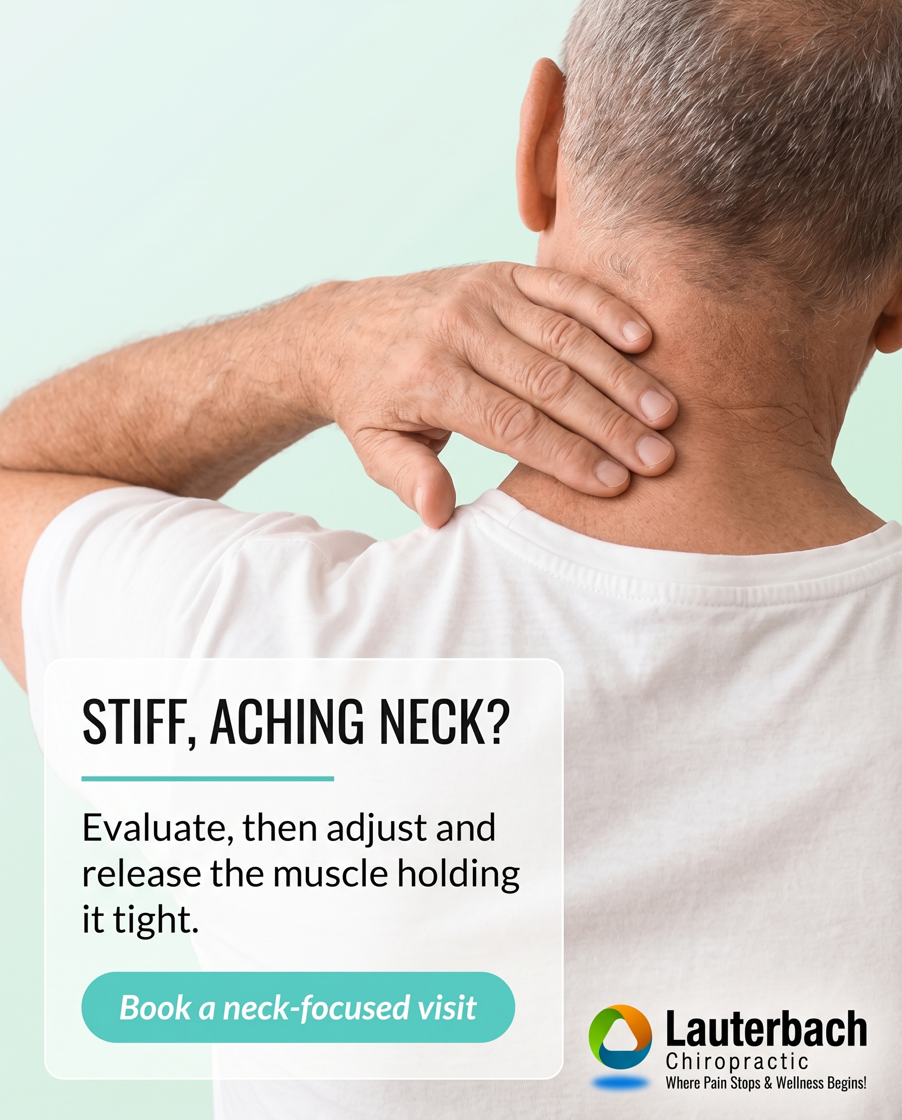
1856×2304
T8S2A2
v2
FAILED
API returned 503: {
"error": {
"code": 503,
"message": "This model is currently experiencing high demand. Spikes in demand are usually temporary. Please try again later.",
"status": "UNAVAILABLE"
}
}
C1S3
v6
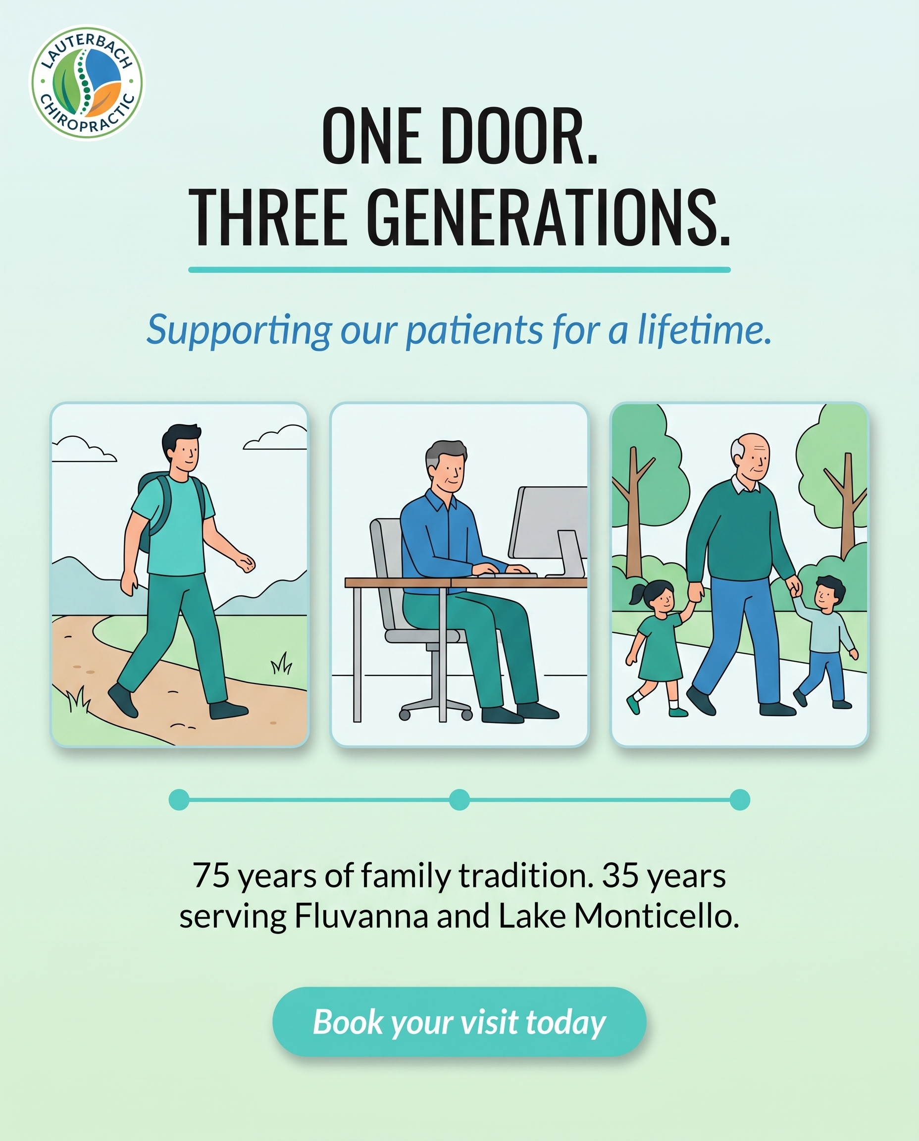
1856×2304
L5S4A4
v3
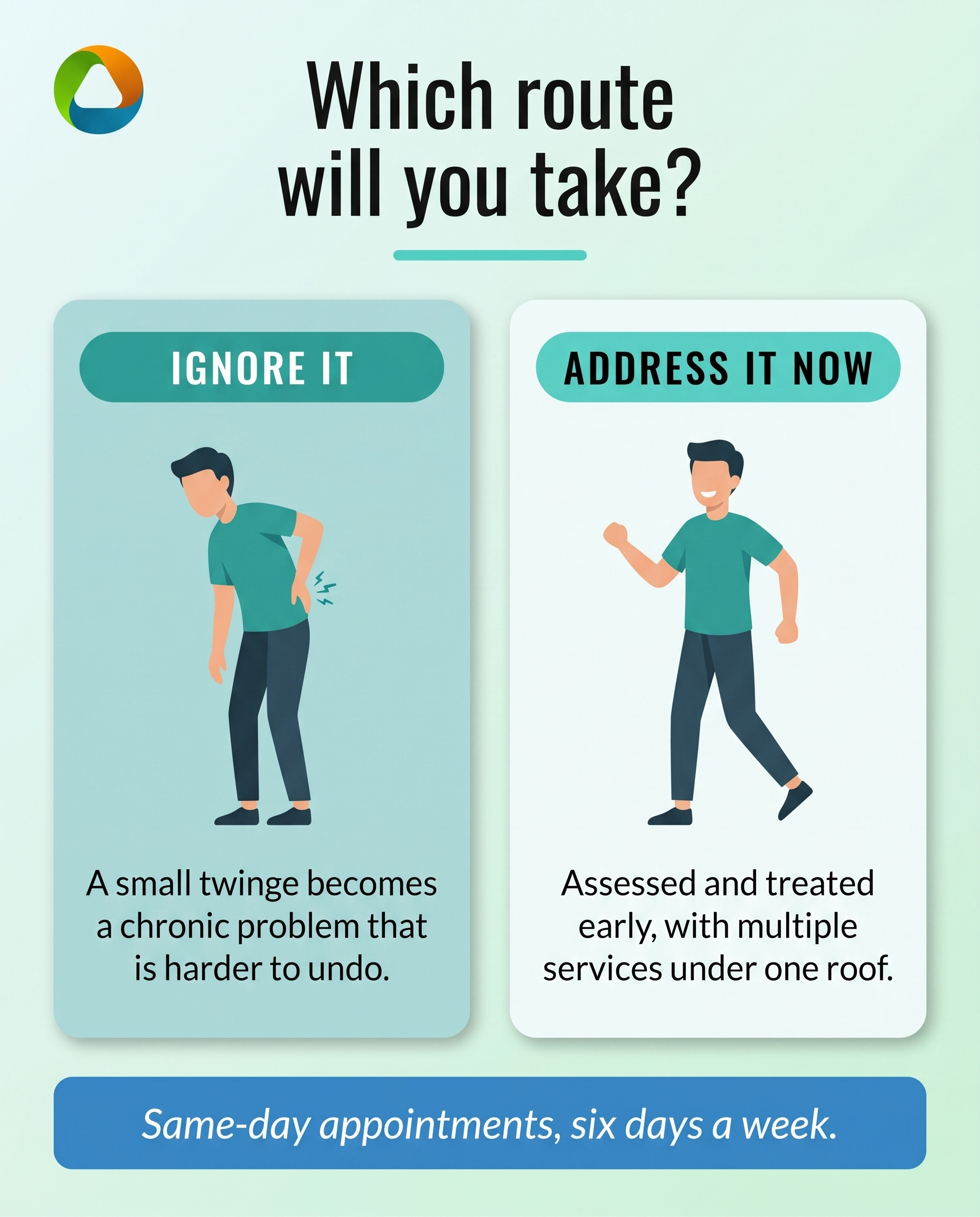
1856×2304
T3S5A2
v3
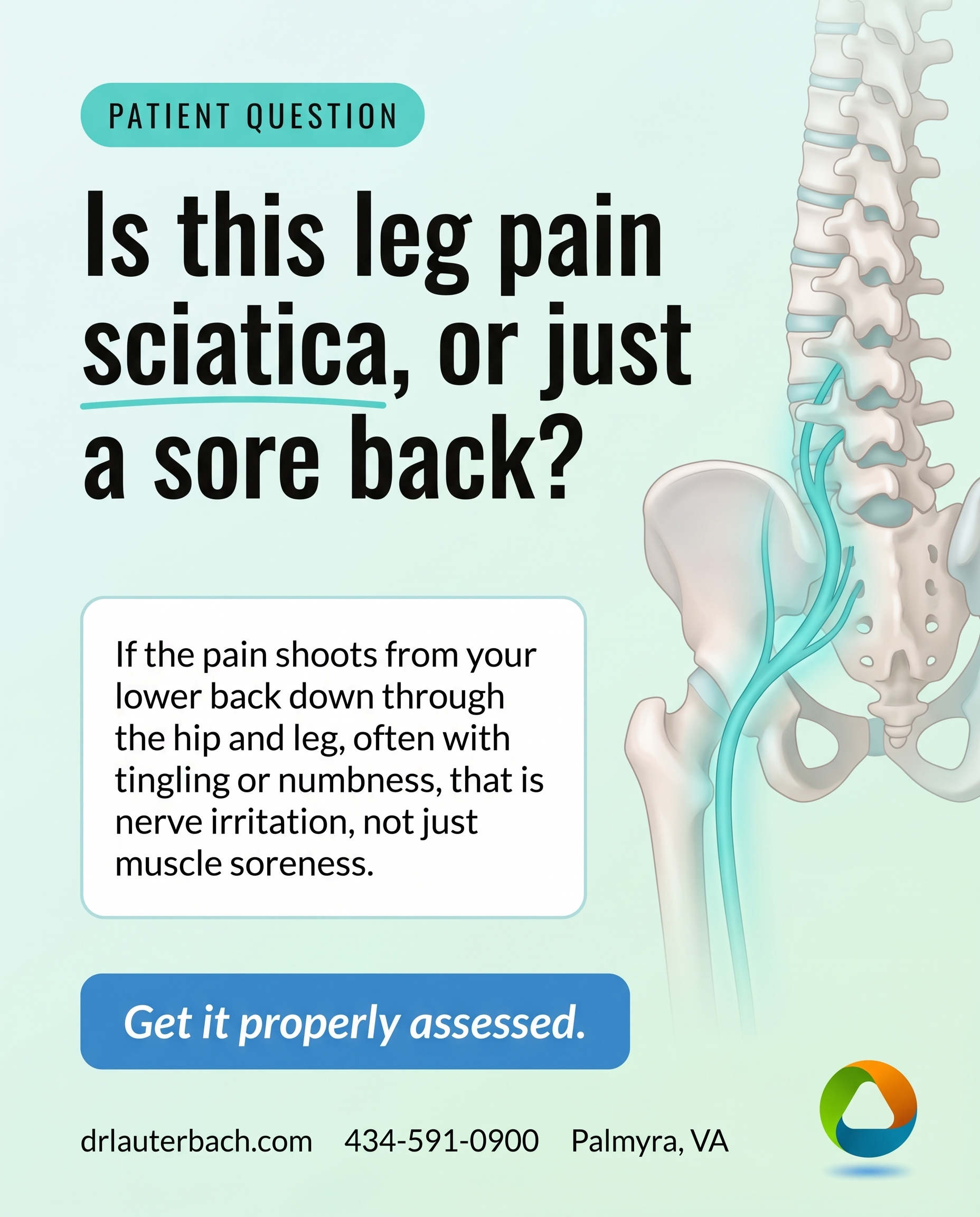
1856×2304
T5S6A3
v2
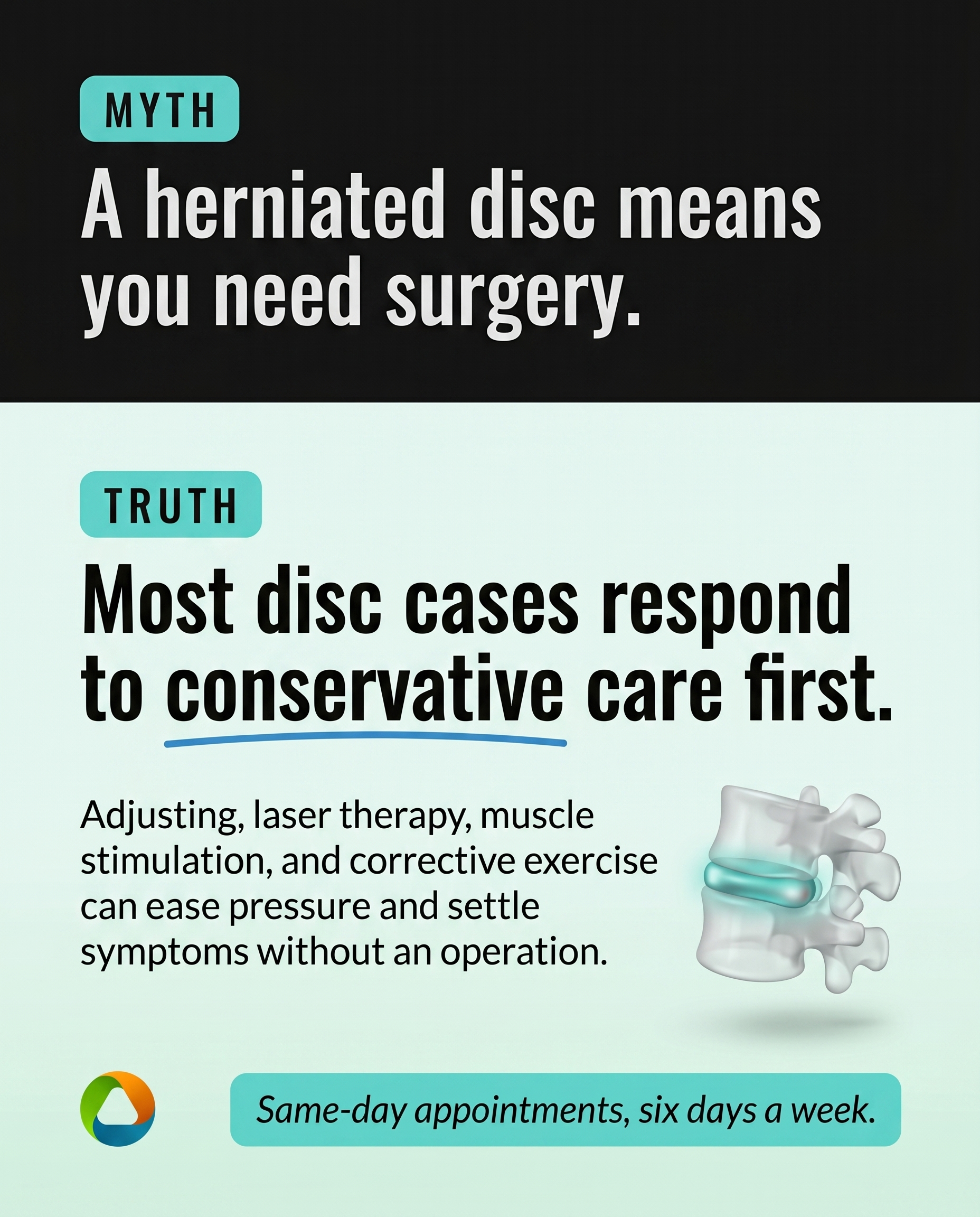
1856×2304
T11S7A2
v2
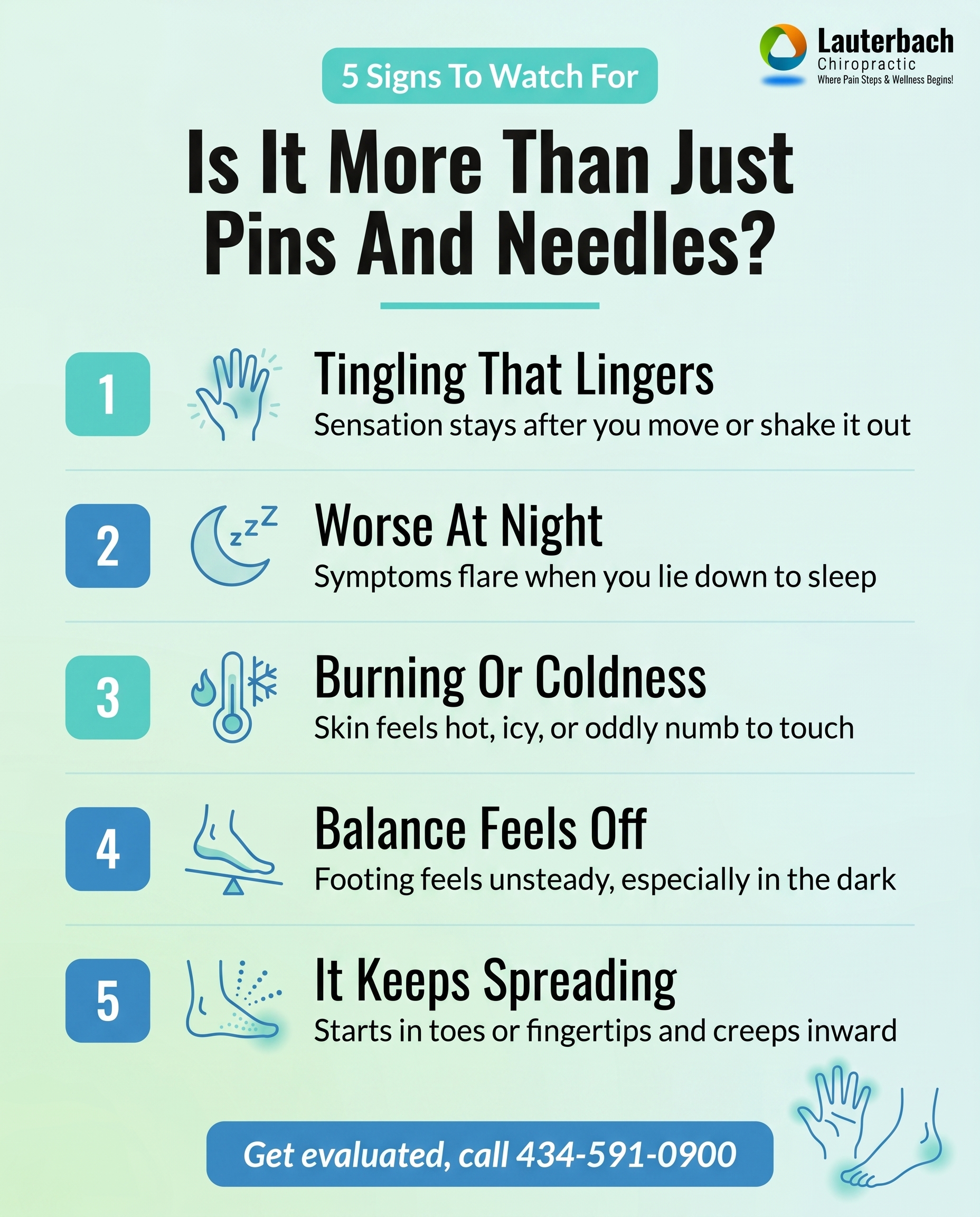
1856×2304
L2S8A2
v6
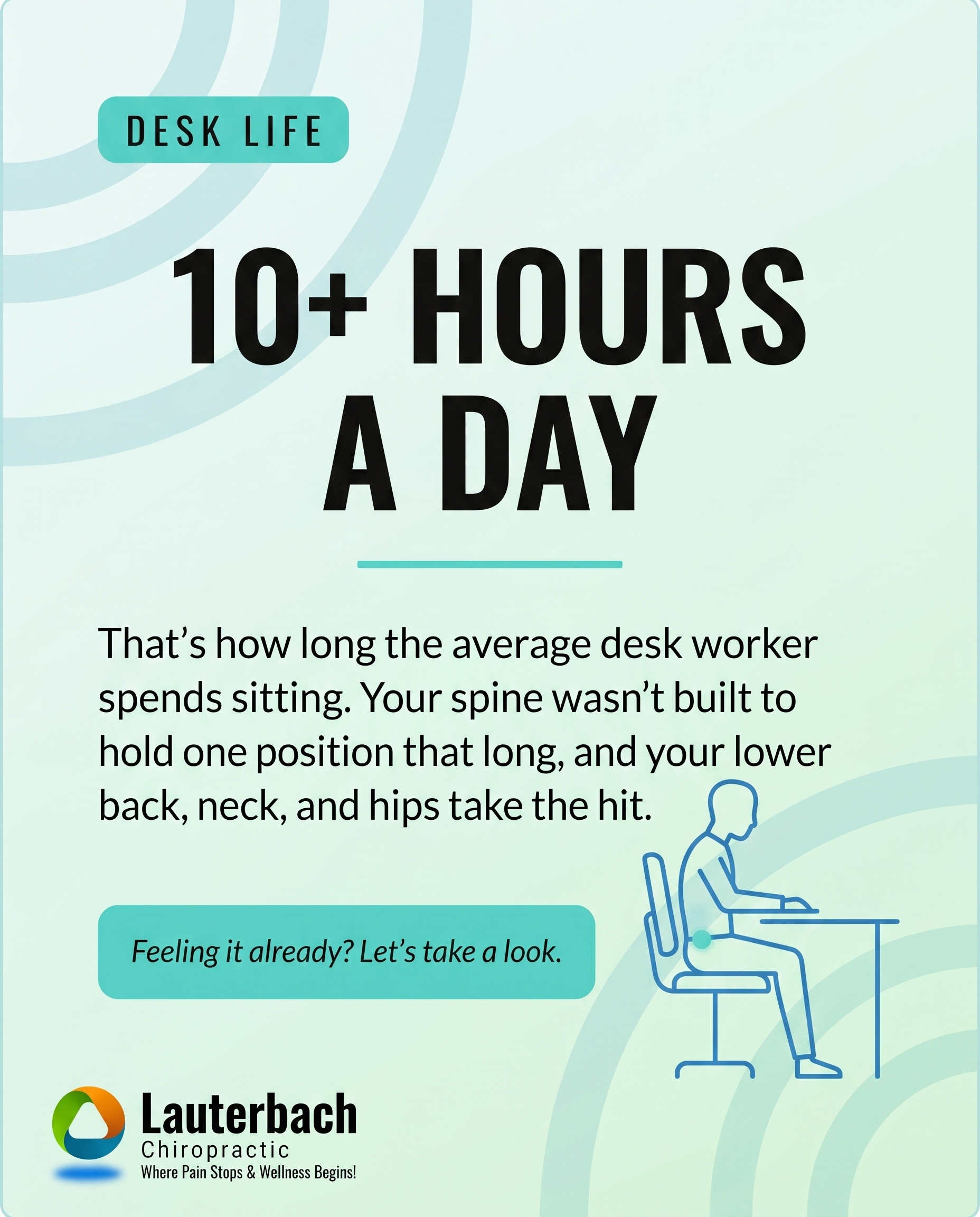
1856×2304
T6S9A3
v2
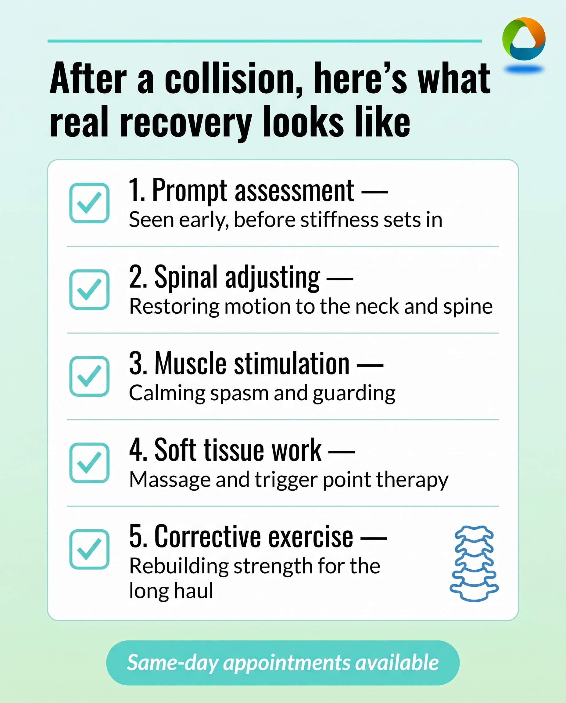
1856×2304
T1S8A3
v3
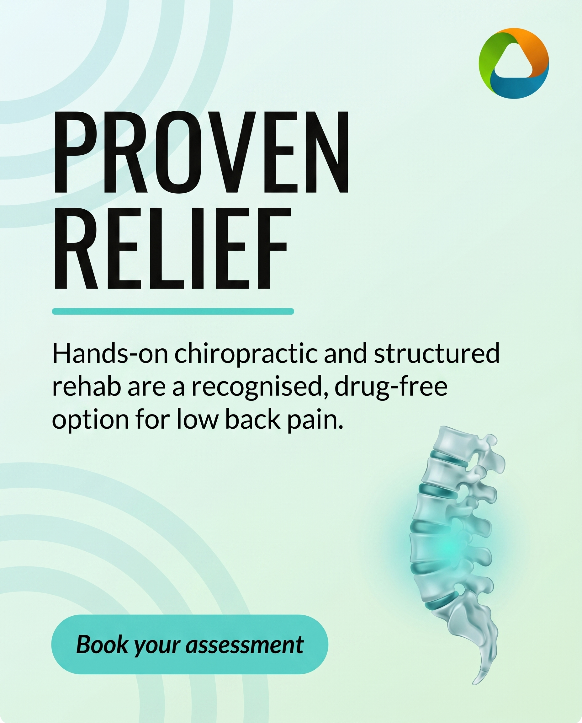
1856×2304
T4S1A3
v4

1856×2304
T7S4A2
v2
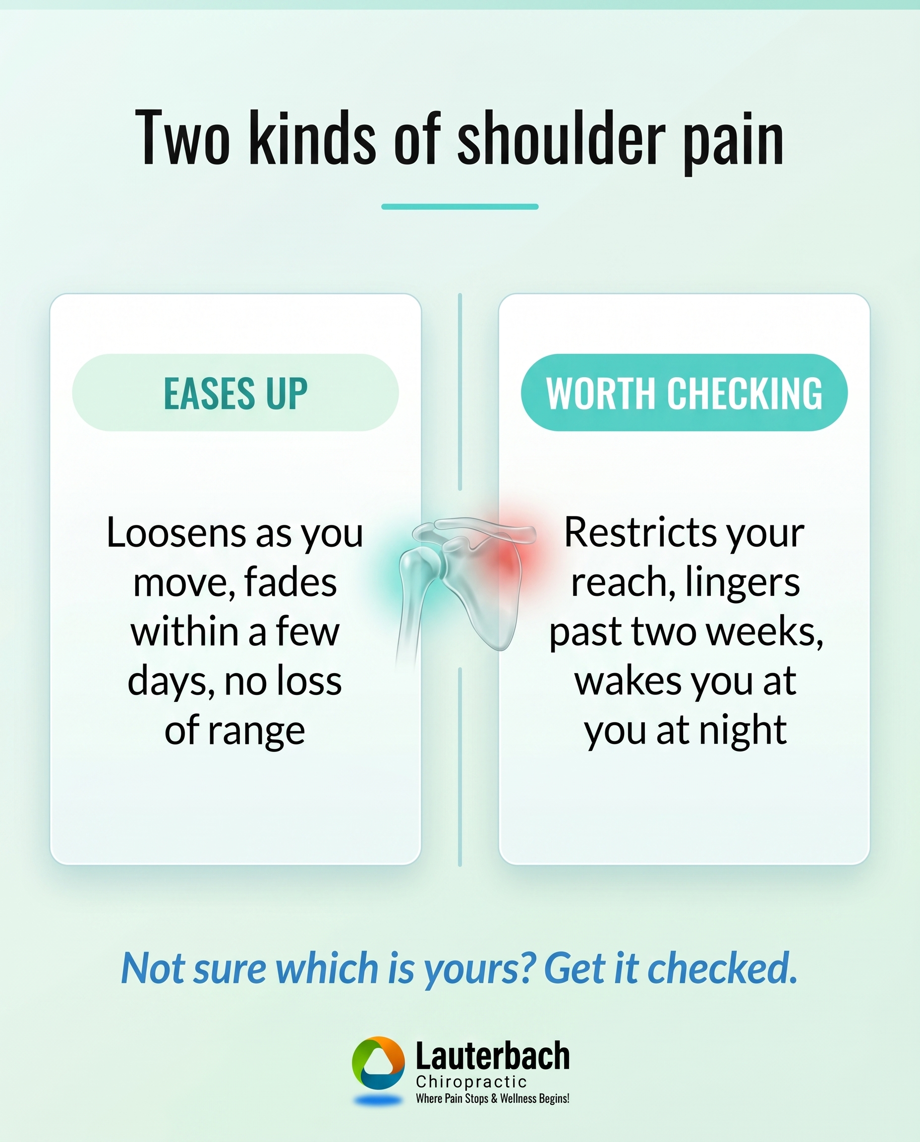
1856×2304
T12S7A1
v2
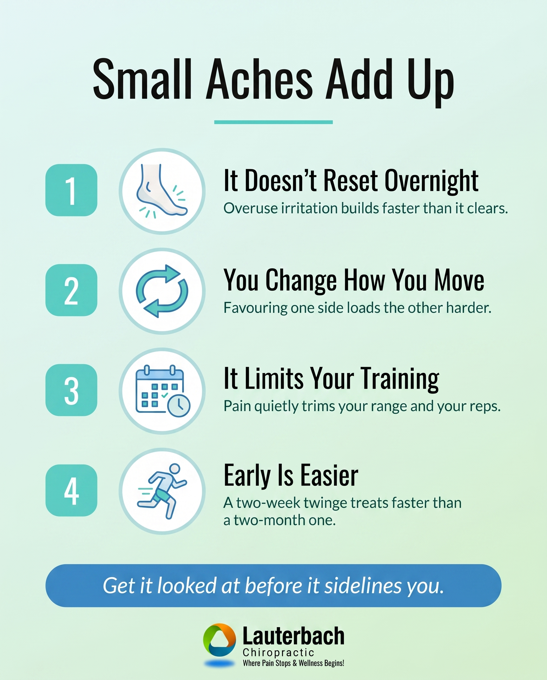
1856×2304
L3S9A1
v2
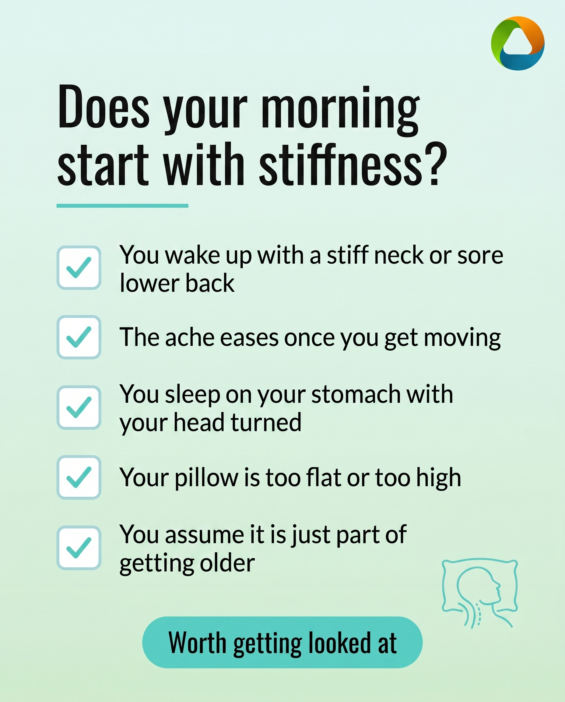
1856×2304
C2S2
v3
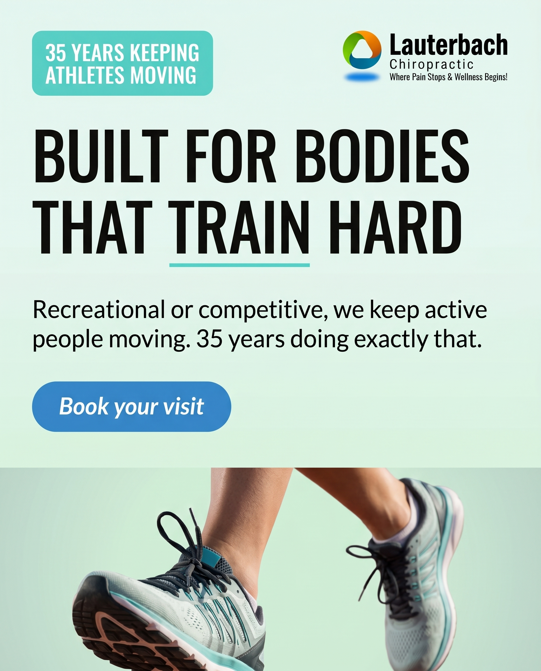
1856×2304
6
Samples Page
Ready to build
Part A — Practice Name
saved
Part B — Select 4 Images
(0/4 selected)
1
2
3
4
Part C — Build Page